Lessons
Day 1
1How to Make Your Own Paper - Part 1
23:24 2How to Make Your Own Paper - Part 2
34:33 3Using Paper Additives
23:54 4Invitations and Luminaries
20:36 5Signage & Streamers Garland
28:51 6Creating Your Own Rubber Stamp
17:14 7Stamp Carving Techniques & Design
33:26Making Roller Stamps
07:30 9Paper Marbling - Part 1
25:44 10Paper Marbling - Part 2
26:29 11Marbling Stationary Set
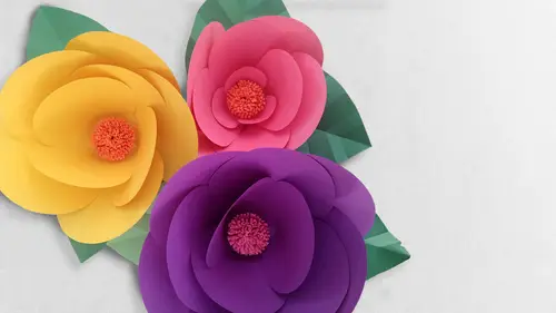
16:27 12Making Paper Flora
24:40 13Giant & Miniature Paper Flora
29:26 14Crate Paper Flower Varieties
32:06 15Paper Boutonnieres & Centerpieces
23:43 16Photo Backdrops & Lanterns
26:16 17Paper Mache Fruit: Pulp Method
21:18 18Paper Mache: Creating & Waxing Leaves
24:09 19Paper Mache Fruit: Finishing
15:23 20Paper Mache: Pendent Light Base - Part 1
26:25 21Paper Mache: Pendent Light Base - Part 2
21:30 22Finishing Touches: Decoupage & Cord Kit
26:27Day 2
Lesson Info
Marbling Stationary Set
We've got some blank stationary elements, um, each of your stations, we've got blank white folding cards. And I have to say the nice thing about the blank white folding cards is you can simply hold on to one half of it when you lay it down into the water bath and use that almost as a handle, the lifted off and set it off to the side. So we'll see just by way of experiment, how this takes our inks and in a similar fashion let's, try some light colored envelopes because I'm curious what the color combinations are going to look like when we were working with a lightly colored surface versus just a white surface. So go ahead, load up those brushes, buildup another pattern and for this go round, really manipulate. Think any way you'd like. If you want to use the handle into the brush, is if you want to use the ink comb. If you want to blow on the surface with a straw, whatever your pleasure. You're five drops could you mix in your trade? You absolutely can't change it yes because it does th...
ey do come in this limited six color palette but you can certainly experiment with mixing them together and I think that that could be an interesting way to perhaps I'm going to do that as well see if we can't get maybe a deeper blue by heading in a couple of drops of black to that and see what that does and I'm actually gonna add in a couple drops of orange to the red and see how that affects it now for the mixing the colors I'm just gonna mix it around with my brush a little bit and then sort of hold it stationary for to allow it to soak up into the bristles the same with blue black combination and heading back over to the water bath just going to start tapping the surface and I know you can really get a pretty good view of that from our overhead camera but even in person when you're right on top of it it just really is kind of lovely the way these colors shoot across the surface of the water and kathy I don't know if you did you make some of your colors I just added like an extra yellow dropped when I blew on it because I'm kind of just interesting I'm seeing with the blue in the black that I mixed together that obviously I didn't mix it super well in the paint palette so as a result on the surface of the water and getting some lovely sort of like blue and black striations within those circles which I kind of like again a reminder the longer you hold your loaded brush on the surface of the water the larger ah circle it will create because you're allowing more of the anc to flow out onto the surface of the water way not beautiful page we're just doing you could do honestly whatever you'd like with the stationary and you can do both halves or you could just try and see how much of it even capture on the front of the card so he's kind of pick a portion because that's really the whole thing and well more than likely because you're working with a smaller paper size and can get more than one car design from that particular okay marveling pattern that you've created um I saw some beautiful stationary examples recently on pinterest with marble paper where this particular person had marble the front of an envelope um in fairly dark hues and then they went back through and they had a calligrapher address the envelopes in a way dwight ink and I have to say the contrast between the two was just stunning it was really, really lovely look how nice that took it I love that madeleine okay, great now I'm excited to get mine so madeleine you're working with the, uh, green and the black there's actually green black and then I mixed in yellow with my green ok, nice so get almost really more citrusy ok? And it looks as though it's translated into somewhat of a mint you and I yes of the this's the original green and then you can see cool where I mixed it with yellow okay, here we go with my card so I've mixed a combination of sort of blue black and red orange and I'm just going to do the face of the cards and the holding it by the one side I'm gonna pick a portion of my design that I like I'm just gonna gently lay it down on the surface one, two, three, four, five and pull it up oh my gosh, I love that it ended up being with the addition of the orange to the red it has almost a pumpkin like color to it or a quarrel even in a dab away that access I love it. Okay now, just by way of experiment I'm going to take one of the blue envelopes and I'm gonna hold that down and just see how that takes the design again just about five seconds you absolutely could add create a personalized stationery set tohave off some of that interesting it's a very sort of like a subtle contrast but I like the way it lays on the blue paper and it makes me want to actually experiment with other light colored papers just to see what kind of results I might get um again with um elements like the envelopes where it is made out of a lighter text wait paper there is likely to be a little bit more warping during the drying process eso you'll just be mindful of this and again as we have said a couple times before you you press it between a couple of pieces of paper towel under a stack of books or you wait for it to dry completely put a cloth over the top and give it a really light pressing with your home iron how you doing cathy yeah have you worked all the way through all of those stationary pieces you know I'm kind of watching you actually get actually only dropped an envelope direct you know straight and it kind of stirred up my pot there but it did have an interesting it's very light interest it's kind of sweet have to make sure you don't get the flat yes exactly that is a really good point with the envelopes you want to try and keep the gum line along the flap from getting into the water because obviously the gum line is moisture activated that's what allows you to seal your envelope and so we want to be able to do that at a later date I dropped it in this way and then flipped it and it's dark on one side never got the real life on the other side. Ok? That's cool. Just that's really pretty well, that's a little bit what we were talking about earlier about sort of experimenting with doing both sides of the sheet of paper and look the color with the blue and the colors that I used to work there love it on the on the lives I really like that particular combination with blue in the yellow with these sort of like, pool blue envelopes I think that's nice. I'm getting a lot of what's happening. I've gotten a lot out of mind out of the one one path or out of the one mixture. Yeah, master, not really nice. Uh, nice to see and I almost think for the face of an envelope, the subtler is, um you know, that could work in your benefit. It's obviously going to make the addressing of it, stand out a little bit more. We're taking a wait. Okay, so I have done a couple of passes with this color combination, and I think I want to do at least one more, um, color combination and design with the stationary I am really loving the color palette that phyllis using and seeing how it comes out with a look so I think I might follow suit now, rachel, it almost looks as though you're getting a purplish effects from some of those blacks black ok, read into the yellow okay. Oh, so the nice I like that because again purple is obviously not one of the colors that comes in this pallet, so that was achieved by mixing some of those colors together. So for those of you at home that are going to be experimenting with this method of marbling, sumana gashi I would encourage you to before you begin perhaps get a stack of different types of papers to experiment with. As I have mentioned, we are using an inexpensive construction paper, but even within the realm of construction papers there are different qualities, different varieties, and as you can see, just in contrast between using our construction paper and some of this stationary paper, we're getting slightly different results. The inks are acting a little bit differently to each pass, so I think it's nice if you're going tio tackle this to be able to see the variety and be able to sort of can't cut a parent. Contrast the effects with the various papers now again, we have been going over various and multiple ways to manipulate the inks on the surface of the water so like I said, I'm going to do one more bath here one more run with some of these banks just to use up of the last of those stationary pieces in a different color palette I'm going to add a little bit of yellow in this time around because you said earlier you're actually a graphic designer india's your background have you worked with thinks in this way the force is a completely new medium feeling here, you know, enjoying a taxi or you're doing some of the stuff oh, thank you know, um actually I don't work with liquid as much you might think it's sort of that uncontrolled, you know, it's it's been a lot of fun though getting don't even that messy really, but I was going to say getting messy but um this it's just really fun what about your mother and you work with and this is what was a lot of paints I've done a lot of like working with calligraphy not to do lettering, but did you drawing with? So I have worked a lot of things. I really like this like I like that the you don't really know what you're going to get, you can kind of manipulate it to certain extent with colors and shapes that it's really I'm alive fascinating, seeing all of four of you working and robertswork as well is that you're each dip in the bath whatever the correct word is is coming on this something slightly different so you're getting a set of something very very similar each piece is unique which is very, very nice yeah now I'm one of mix all the colors you started experimenting with that right? Yeah makes these on what it's like but what colors you using for this? Uh I've makes the red and the blue and I think there was a little bit of green mix got mixed into so I'm leveled in that with the brown I don't know what all but that could be pretty tope maybe rachel, is this a new format for you? Um I did a lot of mumbling like once is part of like the from making class in school but, um this is ah mostly there's a new technique I really like the cold because they get such intricate patterns and it's true what madeleine said there is a certain quality or aspect to this process that is uncontrollable. You can manipulate it to a certain extent, but it really each poll is a little bit like a gift you just don't know what's going to come out at the end now I and loving phyllis I really do think that such a good color combination the two that you used there that blue almost perfectly matches our envelopes I just and it's a nice that's a nice happen stance a happy stance while ago I ended up with a real pretty purple nice with the young so I'm going to try the same color combination now with one of the envelopes again just picking a portion and setting it down on the surface uh being mindful just to hold the envelope flap up to keep that gum side from getting wet oh that's nice again sort of super subtle but really lovely all right, well I really feel like uh our studio our students in the audience have really taken to this everybody's got a nice stack of beautiful designs um and I think we probably all have ones that we like a little bit more than others and that's really just the process of working through those materials again the process of doing something repetitive lee it's not going to be perfect the first time around again there is that uncontrolled element but I think that you can you obviously can control your color palette and you have minimal control and manipulating it but I certainly think that you could create something from this for an event in a specific color palette be that stationary and a lot of these papers that we created today the the segment that we did earlier where we were showing party supplies that we had ah party decorations that we had created from the handmade paper they could, in a very similar fashion, be created from the marbling paper. I actually think that we have this lovely garland that we strung across the front of the workstation here. If you were to do that and marbling paper and strips and cut that out and sewed it down the center, I think that would look fantastic. And the same could be true of some of the sign ege that we did earlier, where we were taking large sheets and cutting out silhouettes of letters and backing them with a solid color. There's. Absolutely no reason that you couldn't do that with some of the marbling sheets as well, to some pretty spectacular effects.
Class Materials
bonus material with purchase
free bonus materials
Ratings and Reviews
user 1400000665814257
This class if filled with new and fun ways to use the paper that we have in stock. In addition, the paper technique that utilizes Suminagashi Ink is mind blowing! Anyone who loves to create beautiful things will enjoy this class. Robert is one who is an exceptional instructor, in that when he is demonstrating a new technique, he has an ability to use clear concise language. I have enjoyed the class, and plan to use the gorgeous floral pieces in my studio and home, along with creating a lovely party. Thank you!
a Creativelive Student
Really enjoyed watching this two day Paper Crafting course with Robert Mahar. It was full great paper techniques and inspiration. Roberts has such a calm and positive teaching style. Watching him work through step by step of each project you really pick up lots of wonderful tips and tricks of the trade. Highly recommend it.
Holly Herick
Robert Mahar is an excellent teacher with many great examples on paper crafting. Robert has encouraged me to continue working on my sculpted watercolor paper flowers—now I have a bunch of new tips and tricks to try. This class is well worth the price
Student Work
Related Classes
Paper Craft Ideas