Lessons
Day 1
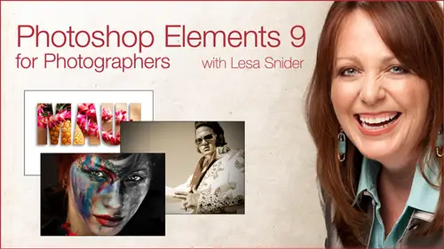
1Introduction
16:10 2Intro to Elements Workspace
15:32 3Guided Edit Mode
39:35 4Quick Edit Mode
19:26 5Full Edit Mode: Layers and Masks
1:03:29 6Smart Brushes pt 1
17:30 7Smart Brushes pt 2
31:27Portrait Makeover with Detail Smart Brush
37:39 9Retouching Techniques
39:53 10Recompose Tool
12:27 11Gorgeous Grayscales
36:32Day 2
12Gorgeous Grayscales Continued
55:54 13Quick Color Tints
09:15 14Adding a Vignette
07:05 15Correcting Color and Lighting
49:07 16Fixing a Stubborn Color Cast
15:36 17Lightening Wrinkles and Shadows
18:47 18Selective Softening & Sharpening
25:47 19Placing Text Behind an Image
30:48 20Pushing a Photo Through Text and Other Shapes
41:18 21Blending Images Together
38:31 22Deleting Backgrounds with the Magic Extractor
27:51Lesson Info
Pushing a Photo Through Text and Other Shapes
So the next thing I want to share with you ISS we just placed text behind an object in the photo. So now less push a photo through the shape of text. It's a really fun thing to Dio makes you look so incredibly creative. So we're working with folder number 23 photo inside text, and I'm gonna show you what I create and then we're gonna go back and look at how exactly to create it. So this could be a little bit too big. This could be a an entry page into a photo gallery. This could be a photo postcard that you sent for any occasion. This could be a business car. Any time you want to highlight one of your prize winning photos, this is a tremendously creative way to do it. So all we're going to do here is we're gonna create some text and then we're gonna position are layers such that the photo that we want to push through the text lives above the text layer because elements and photoshopped as well have this ability for you to say Yeah, take this layer and shove it through the shape of what...
ever is on the layer underneath. That could be text. It could be a brushstroke. It could be a shape. Could be something that you hand drawn. It could be a shape that's built into elements that could be several different things. So, as you can see, it's really beautiful effect. So I've done a couple of things to this one. I push the photo through the text. But then I also added a drop shadow. Very soft drop shadow. And then I added an outline of the letters themselves. Very thin. One pixel outline and elements I believe calls outlines a stroke. Yeah. At least elements had the decency to put outline and parentheses over in photo shop. It's stroke. What exactly are we talking about here? It just means to outline. Okay, so we're going to do all this, So I'm gonna go ahead and cheat a little bit and copy my text. So I know the size and everything in the fun, and we're gonna turn off all these other layers. Actually, I'm a throw away that layer. We create that one as well for a way that Okay, so now we're basically back to the point where you would be if this were your own photo. Okay, I've got a little bit of extra space around here. In fact, let me show you that I'll show you had it created that extra space. So I'm gonna go ahead and crop this image back to what it used to be. I've got a restriction on my crop till someone take that off. Okay, so here's what the image would look like. Should you start this technique on your own? I know just from the experience of doing it that the part of the photo that I want to push through the text to make it all extended on the page, I need to add a little extra canvas room toe work with along the edges of the photo. So I'm gonna go ahead and do that now, in a quick way, to add more space to work with is by using the crop tool. Okay, so this is handy if you've got a photo that you want to add a creative edge effects and you want to add a drop shadow, but you don't have room for that drop shadow got add some extra canvas space, so we're gonna do that using the crop tool. So I've gotten the crop tool active, and it's this little guy right here, and I'm gonna draw a box around my image. And you do want to make sure that you're not working with a locked background layer. If this layer right here said background had a padlock, you need to double click it first. But that's all you have to do. Just give it a quick double click and that unlocks it, and then grab the crop tool, draw a box around the whole image and then extend the crop box beyond the bounds of photo itself. And as soon as you do that and you accept the crop by either clicking the green, check mark by pressing return or enter or by double clicking within the crop box, then you're gonna get more canvas space. It's a great way to visually add more space. You could do it manually by going up to the image Manu choosing resize canvas. But then you'd be in a situation where you had to tell elements exactly how much space you wanted and where exactly he wanted it. So I find using the crop tools and much more visual way to do that, and I'll go ahead and undo that. Do more time, so double click the background layer to make it edible. If you have not already done so, grab the crop tool draw box all the way around the image and then drag diagonally outward one of the corner handles or one of the side handles to give yourself more space in that area, and then this press return or enter and that's it. Now we're ready to add our ticks, so we're gonna go over here and grab the text tool. Or you could Desprez the letter T, which is the text tools keyboard shortcut, one of the few that makes sense that in the brush tool being anti that's about it. O. C. For crop. So we'll go ahead and press T for text, and I'm gonna click on my image and go ahead and paste in that text. It didn't come in at a big enough size, so I'm gonna go ahead and give it a double quick to highlight it, and we'll use our keyboard shortcut to increase the text size. And that's again shift command greater than or shift control greater than on the PC. And for this technique, you definitely want to use a big, fat, thick font. Okay, Because and pushing the photo through the text, you want to make sure that your letters air thick enough to see the dad gum photo. If you use or those beautiful script e cursive fonts, it's gonna be so thin you won't see the photos. So you want to make sure that you use a big thick font Ariel Black works really will impact works really will. Even some of the boulder Helvetica is work really well. Anything that's thick. I also try to stick with San Serif fonts meaning fonts that don't have the little feet on them. For example, See the little feet on this one. These things are called Sarris. Okay, little slabs that the letters sit on eso I try to stay away from that. So I'm gonna go back to impact up here because you want maximum surface area for your photo. In fact, I might make this a hair bigger. There we go when I'm finished with the text. Don't even worry about what color the text is because you know that we're gonna be pushing this photo through the shape, the text. So the text color has absolutely no bearing on this technique at all. It can be any color. If this text were hot pink, maybe I'd used hot pink recently, and that just happened to be the color I had active as my foreground color chips. It wouldn't matter because the color is going to go away soon as you push the photo through it. Now, the most important part of this technique is layer stacking order. In order to push this photo through the shape on that layer, the photo needs to be above that layer. Okay, so the photo always has to be on top of whatever you're trying to push it through. So you can either click and drag the text layer and drag it. Be low the photo layer, or you could click and drag the photo layer up above the text layer Does not matter which, but the end result needs to be that the photo is above the shape. Now, you've got a real quick and easy way to do this. You can go through the menu system or you can use a quick keyboard shortcut in the keyboard shortcut. Is museum back in? Hold down the option key or Ault on the PC. Okay, in heavy your cursor over the dividing line between those two layers to see how my cursor changes as I hover over that dividing line. That's because I've got the option. Chiana Macro Altana PC held down, and as soon as you see that intersecting circle, cursor, click one time and what's happening here is elements. Scooted the photo layer thumbnail over to the right and added this downward pointing triangle. And that's the equivalent of elements saying this photo let here this one. I scooted over to the right. It's being pushed through the thing that's on the layer below it. And again, whether that's text a brushstroke, some shape, it doesn't matter what it is or what color it is. So as you can see, our photo went right through that text. Now, if you want to reposition the photo within the text, that's a simple is grabbing move tool. So as I grabbed a move tool, I have the photo layer active as I moved the photo around. It's moving around inside the text now you do have to be congressman of the edges of the photo. Because, as you can see, if I move it too far to the right, I start encountering, you know, empty space over here. Or why now if I want to move the text around, but not the photo, Then I could click the text layer instead. And now I'm moving. Actually, exactly the same thing is happening, so you could move them both at the same time by activating both of the layers the same time. And you can do that with either the shift key or the command key so you can just shift, click the next layer, and now they're both activated. So now when I move them around, I'm moving the whole mess around instead of one thing or the other. Okay, Now, what we can do is create a new background for our noodle piece of art, because now it is a piece of art no longer photograph its artistic. So we've been talking about a Justin lawyers a lot. We looked at some of these yesterday. Solid color adjustment layers are a great way to add a whole new background to your composition. so we can create one of those by clicking the half black, half white circle with the bottom of the layers panel. And this time we're gonna choose solid color. Or we could choose Grady, and we want to put a nice, radiant back there. We could do that, but for this technique will go ahead and choose solid color. Alums is gonna pop open that color picker, and at this point, you have the ability to choose a color on your own or once again hop over to the picture and snatch a color that lives in the photo itself so you can do that. It was good. Stick with white for this technique, so soon as you press OK, elements is going to fill the hole layer with color now. It didn't happen on ours because look at the positioning of that solid color adjustment layer because I was on the photo layer when I created the adjustment layer. That's where the adjustment layer went. But as with most things and elements don't panic, all you have to do is click and drag that adjustment layer down to the bottom, which is where the background would logically live. in a soon as you release your mouse than everything. Looks normal. Like you would expect it to. Okay, Now we can turn on the little extra text that I added. Here, click to see the photo gallery. I'm gonna make my text box a little bit bigger. I don't know why that other line of Texas not showing up. I know it's there. There we go. I don't think we have the font that I use for that one installed on this machine. So that's why it was looking like it was chopped up. Anyway, Skip O'Donnell actually is the gentleman who took this photo. Get someone from Istock photo that I downloaded. So I've kind of created a fictitious, uh, photo gallery entry page for for him. So now let's dress up the text just a little bit more or dress up this part of the text. Rather, uh, in the previous version, I'd added a drop shadow to in a tiny outline. So let's go ahead and add those things. Doesn't matter which one you at first. What does matter, though, is that you get on the right layer. So we want to activate the Maui layer we're gonna come back up here and expand our effects panel again. And since we've already got drop shadows open here in the category, we may as well go ahead and add that so we can double click to add our drop shadow. Here we go. So now let's go. Try to find, um, be outlines and I believe in elements. Yes, you can add a outline as a layer style. So we just click the little pop up menu. Never gonna cruise on down two strokes. Just switch that word outlines in your head and elements is going to give you a lot of different varieties of strokes so you can click one of these guys, actually double click it to apply it. And then, if you want to find tune that particular stroke, let's say we want to You change the color of the stroke, change the width of the stroke. Then we want to go down to our layers panel and double click that tiny F X that appeared when we added the layer style. So we're going to give that a double quick. We're going to bring up a dialogue which lets us at it all the things that we've done to the photo. So here's the drop shadow area and these little flippy triangles right here they simply expand or collapse that the settings for that thing. OK, see how I'm clicking the flippy triangle in this expanding or collapsing moves. Okay, so when you first get into this dialogue elements automatically expands the effects that you've tacked onto the photo. So the reason glow and bevel our classes because we haven't actually added those, we could add them right here. If we want to, just like clicking the little check box, we could turn those offer on. Okay, So I'm gonna leave the drop shadow alone, and we want to do a little work on our stroke here. The first thing I want to do is make it much thinner because I wanted to be very subtle. I want it to be barely there, and I'm simply doing it to give the the edge of the letters a stopping point. Because when you feel letters with a photo, if there's any color in the photo that matches the background, it can look like that letter is open. Okay, So, for example, if I turn off my stroke here. See how there's white in a couple of areas next to the edge of the letter here that can kind of feel like the letter is hanging open in that one spot. So I like to close it up. So we're gonna turn on the stroke again and I'm gonna change the size toe one pixel. There we go. That's nice. And then now I want to pick up a more subtle color. So any time you see a little color swatch beside a setting of some kind, that is how you change the color of whatever that thing is okay up here. Remember how I said he could change the color of the drop shadow by clicking? That's watch. If you want to change the color of the stroke, you need to click this watch, which is down here in the stroke section. So give that a single click and your color picker pops back open. Now we're gonna slip on over here to an area that's kind of dark brown. There we go, picking up a color that's in the image. See what a huge difference that made just from changing the stroke from black to a color that lives in the image. Now it feels like a cohesive, that thing that's been designed instead of tax together, we're gonna go and say OK, and if you wanted to make the stroke even more subtle, you might reduce it's opacity ever so slightly and say, Okay, when you're finished and that's it, save this thing is a Native Photoshopped document. If you really were building it to go on your website, then it be a great opportunity to choose file, save for Web and then choose J Peg from your format poppet menu and then decide how much quality want to throw out with the J pic. I try to go for high. I try not to use anything. I try not to use less compression than comes along with the high setting. Okay? And that's about a 60 over here in the quality. So this poppet, many corresponds to this new mayor community over here so you can change the compression level with either one. You change one, the other one's gonna change. Okay, so when I email photos, sometimes I do leave it on very high maximum just for it to look really, really good. But when posting on the web, I try not to go, um, higher than high. And that said that you could say OK, and that would end up as a J peg that you could upload to your website. We're really doing that for real on the web. We would we would top out just the artistic portion of it and try to do the rest of this with Whip actual text characters. So go ahead and click. Cancel as a fun technique to do you absolutely love it. Let me show you one more variation on it. But I've included in the workshop files just to give you another idea. So this is exact same technique. But instead of pushing the photo through text, I pushed it through a shape. Another great idea for accentuating some of your price photos. Maybe this is a business card. Or maybe this is a logo of sorts. You know, we all kinds of things. Any questions on any of that? I think we can keep going. Awesome. Okay, So I'm gonna go ahead and, uh, kind of show you how this one was created. Since this pushing the photo through through the shape has already been done. You can undo it with exact same keyboard shortcut. So if we hold down the option key on a Mac or Altana PC and hover between the dividing lines of those two layers, I get that same intersecting circle icon. Well, if I wanted to release the photo from the shape of the layer underneath it, I do the exact same thing. I just click. Once I see that icon, just click, and now I'm back to where I started. So there is a menu command for that same thing. If you can't remember the keyboard shortcut and please don't feel like you have to memorize all these keyboard shortcuts. If once you do this stuff more often, they will seep into your brain and you will memorizing anyway. So if we wanted to shove this photo through the shape that's underneath it, incidentally, that shape is just an illustration that downloaded from Istock photo so I can come up here to the I believe it's in the layer menu. Yes, create clipping mask. That's actually what we're doing. So if you think about what the heck is a clipping mask, well, if a mask if a regular layer mask is your equivalent of digital masking tape, it lets you hide part of what's going on that layer. Okay, that's what the mask means. Clipping is simply the act of taking what's on one layer and clipping it, kind of like a paperclip to the layer underneath it. So you've kind of grouped them in a way, but really clips them together. And you just think of it like you took, uh, text, that maybe you've cut out with construction paper or whatever and you paper clipped it, you know, on top of a photo. That's kind of what you're doing here. You're clipping two layers together, keeping them together. So and then the mask part is telling you that anything outside of the shape of what you've clipped the layer to is gonna be hidden. It's gonna be masked, so that's kind of please my reasoning of why it's named that way. So as soon as we press this mini command, then we get the exact same thing as we had with the keyboard shortcut. I think the keyboard shortcut is faster because you don't have to try all the way up to the layer menu. And again, if you don't remember which key it waas, I'll just undo this one. You can just come over here between the two layers and remember always to put the photo on top of the layer stack of what you want to shove it through and then just start holding their own keys as you're hovering over this dividing line. Well, Commander Control doesn't seem to do anything. You know, shift doesn't do anything. Option. Jiggle it around a little bit O option or all that must be the one. So don't worry if you can't remember those things, just keep clicking on keys and eventually will you will get it. So this file was set up exactly the same way as the previous file. See, I've got a solid color adjustment layer down here below, and I know it's an adjustment layer because of this icon right here. Another great reason to use and adjust a solid color adjustment layer for creating new backgrounds. Once you've done some masking like this, you know, to cover up the transparency parts is that you all have seen all day today me double click the layer female of adjustments to pop back open that levels adjustment to pop back. Open that hue saturation sliders? Well, if you double click the layer thumbnail of a solid color adjustment layer, you get the color picker, which is a super fast way to experiment with other colors of backgrounds. So if I decided well, you know why it's kind of boring than I could pop open this color picker. Come over here and pick up another color that's in the image. Whatever that might be, the only other way to do that would be, too. Add a new layer at a new layer. Come over to your color picker or, rather, your foreground color chips. You could use the same color snatching technique, but then you'd have to go fill the layer with color. So how many steps is that? I had to create the new layer. I had to set my foreground color chip to the color I want to use. Now. I've got to do what I've got to go up to the edit menu and I've got to choose Phil Layer. Holy cow, I've got a click. I've got to tell it what color to use here in the use poppet menu. Okay, use foreground color. Oh, my gosh. There's four clicks. Finally, I've gotten a new background color. And if you ever decide to change the size of this document, let's say, for example, you want to use the crop tool trick to give yourself a little more space. Maybe all way around the image. Now you've got extra space to refill. So now you've got to go back to this color layer. Make sure your color ships the right color. Go to the edit menu. Choose feel. Oh my gosh, do all that again. Whereas let me undo a few steps there that layer away with the solid color adjustment layer. And again, I just click the half black, half white. Circle the bottom of the layers panel I chose solid color color picker pops open. Come over here. Pick which calorie? 12 years. Say OK if you need to drag it down to the bottom of your layer stack. Now watch what happens if I decide I want to change the size of mine canvas because it's a solid color adjustment layer, it's gonna automatically feel in the extra canvas space with color. It saves an enormous number of steps. Okay, this is one of those new things we're talking about yesterday that were a neat kind of crossroads in our photo shop in elements lives where, as you can still do techniques in the old way, like adding or an image layer in filling it with color. But with the advent of adjustment layers, they're way more efficient to use. So it's at a time where we're changing. We're still doing the same techniques we've always done. But there's faster, more efficient ways to get them done. And this is a good example of that. So I hope I will see all kinds of wonderful photo shoved through shapes from you guys one of these days. It's a lot of fun and very artistic, I think. Okay, so go ahead and close that close. This one ensure is a great way to show off a prize winning photo. Okay, so the next thing we're gonna talk about and again if you want to play with all of these, the full layered files and the individual photos that I've used are in these folders. So for the photo inside text, here's the I sock image that I started out with. If you want to start from scratch, you can absolutely do that. And then in the folder number 24 photos Inside of a Shape, I've also given you the I stock image for Maui as well as the illustration of turtles, so you can try plain with that one all by yourself if you like. But you've also got my full layered file that shows you how the technique was created. So let's take a look at one more technique involving shapes. No, this is not my dog thing is an act stock photo dog. So this shape was created with a fabulous tool in elements that Photoshopped does not have. And it's called the Cookie Cutter tool. And it does exactly what you would think if you took a star shaped if you print it out. This if you printed out this photo and you took a star shaped cookie cutter of real physical metal one and you pressed it down on top of that photo, your photos edges within B star shaped right. That's exactly what the cookie cutter tool does inside of elements in this, a lot of fun. I have the attention span of a gnat on a good day. And so I'm always, you know, writing and doing videos and things like that. I'm always dealing with photos with square edges and I get so sick of square inches. So I like doing funky edge techniques. Justice spice things up in my little creative life. So let me go ahead and delete the layer that I created actually will delete both these guys. So here's the photo as we might start out with it. So let's say we're gonna post us on our website or what have you, and we're gonna give it a creative edge. So I'm gonna come over here and grab the cookie cutter tool. And the cookie cutter tool lives towards the bottom of your tools panel. And it's icon, depending upon the last tool you used, could look like a heart shape. These tools sets your your last year's tool is the icon that you see when you go to that tool. Okay, so what you want to do is you want to come down and grab the custom shape tool. Oh, you know what? I grabbed the wrong one. It's this star right here. Uh, it looks like a cookie cutter. Okay, this is the rial tool. It looks just like a star shaped cookie cutter. So you're going to give it a click. And with all tools, it has myriad options that you can sit in the options bar at the top of the screen. So what you want to do is you want to trot up here And just like we've been using the brush preset picker in the radiant, preset Pickard, all those preset pickers, they all live in the same spot. So to customize this tool that start out here at the cookie cutter preset picker. So we're going to give that little downward pointing triangle a click, and you're going to see the lame ist set of shapes you've ever seen in your life. Here again, all the shapes were being hidden from you say, for these, the way you load or turn on additional shapes is to click this little a double right pointing triangle at the top right of that panel. And you're gonna get a pop up menu, or rather, a shortcut menu in which you should choose all elements shapes now why this one isn't turned on by default. I have no idea. So once we do that and we zoom back out, I can expand this panel by clicking the little three ridges at the bottom right, and you can see how maney shape to really built in. And there's a lot of fun ones. My current favorite cookie cutter shapes are these guys right here and they look like you've given your photo painted edges. Okay, so it's all of these guys right here. But there's a lot of fun ones. There's starbursts. I mean, just all kinds of seals, flags and all kinds of stuff. So let's say, for example, that we want to give our photo this edge right here. So you just single click the shape that you want to use. Close this big hunk and panel by clicking the little X. Now, before we draw with the shape, we have the option to make elements softened the edge of that shape ever so slightly. Okay, so any time you see the word feather in elements, switch that in your brain to soften. That's really all it means. So if we wanted to soften the edges of the shape. We could add some pixels in there, you know, maybe five pixels for a little bit of a soft edge. Okay, now, what we're gonna do is you're going to get across hair cursor when you mouse over to your document and we're going to click and hold down the mouse button in draw diagonally downward to create the shape so you can see we're kind of seeing where the shapes going to go. But you don't even have to worry about positioning it perfectly just yet. Okay? Because when we release the mouse button here, we get a bounding box. That's what this guy is, right? Here's lines all around the image with little handles that we can grab so we can grab any of those handles to increase the size of the shape you can grab the corner handles. You can grab the, uh, handles on the side any which way you want not to move the shape around on top of the image. You just click within the bounding box and then hold down your mouse button and move it around. And when you get it positioned just right, you can click the little green. Check mark underneath it to accept it. Or if you want to bail out of it, you can click the little circle with a slash so we'll go ahead and click the check. Mark, you can also press return, press inner or double click somewhere inside the bounding box that all does exactly the same thing. And if you remember from yesterday, that's exactly the way you accept a crop except to resize anything like that. So go ahead, press return. And now our photo has those painterly edges and they're a little bit fuzzy around the edge because we added that five pixel feather. Okay, so that's one way of doing this. I'm gonna undo a couple of times, actually just wants to get back. Now. You'll notice that when we accepted that cookie cutter shape, elements threw away the rest of the image. Okay, that's a little bit of the caveat with this technique to keep that from happening, you could do that on a duplicate layer. You could come up here to the layer menu and say duplicate layer, turn off the visibility of the original that way, kind of keep it hanging around for safekeeping. and then you come back over to the cookie counter Tool will choose a different shape. This time we'll choose this one because it's really funky, and we're gonna take off the crops. Almost set that back, Teoh zero. And now, if we were to turn on the crop, yeah, the way told him if we were to turn on the crop option, then instead of getting the empty area elements would automatically reduce our canvas space down to as close as it could get to the image. But we're gonna add a drop shadow this time. I don't necessarily want it to get rid of my extra space. So now we're going to the same thing again. Just click and drag diagonally downward until you get the shape you know, about the size you want. Release your mouse, but you still have this opportunity to fine tune it. I'm gonna make this one a little bit bigger since I get it all set all press return or click the green check mark and again, elements threw away, uh, the outer edges of the image. But if I decided I wanted experiment with another one, I could simply throw this layer away and go back to my original layer right here. So now I want to add a drop shadow. Just pop open the effects panel with a quick double click. Make sure you're on the layer styles category, and from that poppet menu, make sure you choose drop shadows and then just double click to apply. The shadow here again is a great opportunity to add one of those solid color adjustment layers to fill in the rest of the artwork. So I'm gonna go down here and choose the half black, half my icon choose a solid color now, this time because of the layer I was on when I added the adjustment layer, I can't actually see the photo in order to snatch a color from it. But never fear. Go ahead and take an arbitrary color click. OK to close that dialogue box, I'm gonna collapse this panel so we can see our layers panel and simply click and drag the adjustment layer below the image layer. And then, if he wanted to go back and snatch a color, all you have to do is double click the thumbnail of that solid color adjustment layer. Now I can see the photos, and I'm gonna come over here and maybe grab the dark pink to see what that looks like. So all kinds of wonderful possibilities with this kind of thing, let me show you slight variation on that one. Is this one exciting at all or is it kind of? It's kind of exciting it, But so, yeah, play around with thes thes cookie cutter options because there are just bazillions in there. We haven't even scroll down all of them. I mean, there's all kinds of shapes in there, but again, right out of the gate, you're only going to see that Meaning So be sure to click this little right pointing triangle and choose all elements shapes. Once you do that, it will stay set to all the shapes until you change it back. So you only have do that one time. Really? So let's take a look at a variation on that. I'm gonna go ahead and delete these two layers now with the cookie header. Tool elements does delete the outside of the edges full. What if you want to use a layer mask instead? OK, because I've been telling you all day layer masks from the only way to roll. Well, that's when you need to switch tools to the custom shape tool down here cause you can get at some of those same shapes. But if you're using the shape tool, you will simply be drawing the outline of the shape, and then you can just add the layer mask and that will hide the edges. So let's do that. Now we go and grab the custom shape tool, and it is shaped like a heart. Soon back out, trot up to the options menu. We're gonna click that same shape preset picker. And so you get all the same shapes here. Okay, I had already turned on all elements shape, so that's why we're seeing all of them here. So this time I'm gonna use this little vaguely oval shape. Close that panel and it's the same thing. You click and drag to draw the shape. Now, this is another little tip for you. While you're drawing it, you can hold down the space bar, and I have not let go of my mouse button yet, So I'm still in the act of drawing this thing. If I see immediately that I want to place it somewhere else on the photo. I can press and hold the space bar, and I can move that shape around while I'm drawing it. So now I'm gonna release the space bar and keep dragging it out. So then when I get finished, I can let go in this time, the shape occurs on its own layer. Well, if you remember the last technique where you learned how to shove a photo through any shape at all, this is how you can use the cookie cutter tool non destructively without having a duplicate your image layer. So but, you know, from the previous technique that the photo has to be on top of whatever you want to push it through, OK? And you can think of that as a physical pushing motion. If you think of it pushing down, then it makes sense. The photo has to be on top to be pushed down. I'm always trying to think of ways to help you all remember this stuff. So I'm gonna drag my shape layer beneath the photo layer. And if this was a lot to background layer, it would not let me do that. Okay, so you'd have to double click this layer first to unlock it, but we've already done that. So I'm gonna drag my shape layer underneath the photo and with my keyboard shortcut of option or ault and positioning my cursor above the dividing lines. Between those two layers, I could do the exact same thing we did with the text and the turtle. So six and one hand, half dozen the other. Whether you want to use the cookie cutter tool, in which case you ought to duplicate the image layer to keep for messing up your original, or to experiment with different shapes. Or, if you want to use elements custom shape tool, which lives down here towards the bottom of your tools panel. And in that case, this shape is going to end up on a whole nother layer that you can then push the photo through like we did on this one. So you get the same effect, but a little bit different way. This way. It's slightly more efficient because you end up with fewer layers. And now from here we can absolutely do are a solid color adjustment layer. Come over here grab nice pink from the photo, say okay, drag it down to the bottom of our layers stack. And then, if we wanted to add a drop shadow to this guy, we could absolutely do that in the same way that we've been doing before. Now, with the shapes, you'll notice that we've got a thin outline of the shape itself that is, Onley elements saying, Hey, and elements built in shape was used here. It does not print, so don't worry about it. If we click on any other layer, or if you choose any other tool that outline well, click on another layer in that outline will go away. So so that several ways to get artistic with photos in pushing them to the shapes of all kinds of different things. Where there's tests, text brushstrokes, built in shades, custom shapes, all kinds of wonderful things
Class Materials
bonus material with purchase
Ratings and Reviews
a Creativelive Student
Amazing class, Lisa is fun to listen to and she knows her stuff. She made the confusion over so many parts of PSE march in straight lines so I could understand.
John Carter
Because Lesa did such a good job showing off the new features in Elements 9, I just had to buy it. And here I thought I would be happy with Elements 8 forever. Thanks, Lesa.
a Creativelive Student
A very useful course. I enjoyed it and hope I get time to go through all of it again to cement everything in memory. Hopefully, it will stay available long enough for me to do it slowly. I've already been able to use some of what I learned in the first session, but there was so much! It will take awhile!