Lessons
Day 1
1Course Intro
05:55 2Layer Masks
15:37 3Adjustment Layers
23:47 4Clipping Masks
08:38 5Intro to Groups & Smart Objects
23:44 6Quick Mask
09:18 7Defining & Creating a Brush
14:49Smart Objects & Filters
20:56 9Smart Objects from Adobe Camera Raw & Lightroom
13:23 10'Blend If' Sliders & Blend Mode Shortcuts
09:35 11Photographing & Scanning Textures
28:08 12Scanning Objects
10:23 13Photographing Smoke
30:17 14Building Frames from Illustrator Brushes
16:59 15Using Adobe Brush CC
35:59 16Managing & Saving Brushes
13:13 17Changing the Behavior of Brushes
23:25Day 2
18Type Techniques
17:22 19Type Tool Presets
18:06 20Patterns
33:52 21Overlaying Texture
15:31 22Layer Mask Edges
45:01 23Refining Edges
08:05 24Adding Borders
15:53 25Displace Filter Edges
20:45 26Using Illustrator Elements
15:33 27Creating Reusable Effects
09:27 28The Role of Actions
35:46 29Smart Filter Techniques
30:56 30Basic Painting Tools
05:53 31Turn a Photo into a Painting
19:43 32Oil Painting Filter
18:45Day 3
33Making Color Pop
23:48 34Color Grading
20:10 35Split Toning
08:50 36Luminosity Mask & Feathering
16:57 37Other Artistic Effects
12:22 38Creative Layout Options: Layer Comps
17:26 39Building Basic Templates
23:26 40Creating Smart Object Templates
25:44 41Quick Retouching: Skin
32:49 42Quick Retouching: Teeth
09:04 43Quick Retouching: Hot Spots
08:05 44Quick Retouching: Eyes
08:32 45Quick Retouching: Content Aware Move & Extend Tool
19:41 46Quick Retouching: Glass Glare
03:44 47Adding Finishing Touches to Photographs
19:57 48Displacement Filter
10:21 49Adding Suggested Elements
20:14 50Saving Files
19:20Lesson Info
Displacement Filter
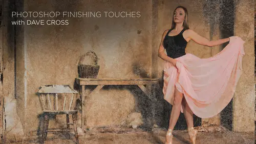
so I'm just gonna very quickly do something else. Just so I have that brief mental break show you some other thoughts of how we can experiment with things. I do want to show you this in the context, though, of a filter. That's kind of interesting. And I'm deliberately doing this to distract you away from the dancer for a few minutes to show This is what it feels like when you then come back and start again. So I've got this photo I took of just some nice little wall I thought look cool if it had say, ah, logo or some words as if it would been painted on that wall. So let's do it with words just cause it's easier and take advantage of one of my little creative cloud things because he can access all these cool type kit fonts. They're in there, and I know there's a couple in here that are what I was picturing fix that this shouldn't have to me as much tracking something like that. Now, I could make it bigger now this has a to me, a very slight angle, like the thing is angling away, so I m...
ight do free transform. If you hand hold down, let me think. Is that command options shift? I believe it must be option shipped. There's a way where you can do a little bit of distortion and perspective, so it kind of fits a little better. Let's get closer to this part. So I want to make this text look like it's on, actually painted on this steel door, and it's probably been there for a while, So how could I do that? Well, first thing I might try again is some kind of blend mode like Multiply. It would depend on the color a little bit once you see all the things that blend. If sliders conduce for you, I would suggest you that that will be high on your list of Let me try this because that's just off nothing that's like, That's kind of cool. So let's try it. In this case, take the underlying layer, start toe, pull the long, and just by doing that, it's already you can see the kind of the lines coming through. By pushing all further, it looks a little more faded, so I could, in theory, to say, Yeah, that's kind of what I was imagining. The nice part of this is it's not tied to that specific position. Other words. If I moved somewhere else, you'll see that the blend of sliders kind of keeps reapplying itself, which is kind of a nice ability. And, of course, this is still type, so I can still added it. I'm gonna put this back from when I probably will come back to this in a second, but I want to show you I used, um, one of the other days, the displace filter as a way to kind of make a cool edge effect. But I didn't really show you exactly what's happening when you use the displacement map. So this is a a different example of how we do displacement map for something like this. Where I have the type player that I want to, I feel like it's actually following any contours of the whatever's underneath it. So in order to do this, I need to make a copy of this. Whatever the background photo is so duplicate layer into a new document. And really, all I have to do is save. This is a PSD file now, depending what it ISS here. There's quite a bit of texture on their, but it's not too too much, especially in the area where I was, where I'm trying to distort it. If this was, let's say, a brick wall and you could see every little tiny detail of the brick that might be almost too much. So One thing you can try if you feel like this is gonna be a bit much is use a filter like D speckle de speckles. Interesting filter cause almost like a very slight blur. But it keeps a lot of details of blurs, almost like the middle areas, if you will. So I might do that sometimes once or twice, just to make sure I'm getting mostly the big detail areas. Not all the fine little detail. Then I save this as a PSD file, and it's absolutely not necessary to put the word map in the name of the file. I just do that. So I remind myself, that's the correct one. So you don't have to do that at all. Could be anything at all. Just I've got that habit of doing it. So I remember Oh yeah, that's the one I want and we hit safe. I won't do that. We can close that document. So back over here, here's our type player in order to be able to apply a filter to it first of all, and secondly, to be able to edit that filter, this type needs to be a smart object because if you may remember, if I try to just go filter, distort displaced, it's going to say this must be rast arise or conferred too. Smart object. So I would say yes. Please convert to smart object. So now this is the part of the displaced filter that is usually the challenges knowing what numbers to put in there and they're frankly, is no way to really know. You just have to try it, I would say. Generally speaking, 30 to 40 is pretty high. So once you get do, I can't remember a number of time ever put like 80 as a number, so I usually try it somewhere depends on the photo. Somewhere in the 20 the numbers don't have to be the same. You can put if what you're looking as it's mostly a vertical thing was horizontal. Sometimes just best to try it I lead. Leave everything else as it is by default and click OK that it says, What would you like to use to displace this type? And I say this one because that's the one I saved a moment ago. It open and you'll see it distorts it. So it's now following the contours of that. I look at that and I think it's just maybe a hair much. So now that I know that, let's try and 10. Okay, same displacement map. That's a little better want. Now that I've done that. Let's see what happens if we go back and try this same thing we did before. What we're kind, whether it a little more. That's looking kind of fun to look closely at it. I mean, it looks, I would say, pretty realistic, given the fact that it really wasn't painted on there until a couple of moments ago. And that's just really not a lot of things is just two things. The displaced filter and bland. If sliders. The thing we have to remember and that throws people off is the displaced filter for this only works. If you have first created a copy of that background as a map when you're doing a arbitrary Hey, let's make a weird shape. You can pick any PSC file, not even know what it is is I did the other day. But in this case, I want it to be this specific. The only other thing that's worth noting about the displaced filter is it is kind of a one shot deal. In other words, the text in that position when I applied the displaced filter it, displace it based on its position. If I decide that I wish it was in a different place, this is what it have to do. I'd have to move it and it's gonna look off now. So I have to reapply the displaced filter a second time, and then it kind of updates. But you can't exactly. It's not like, Oh, darn, I'm kind of stuck that way. And the other thing about this and one of the recurring things, I just so thrilled to use smart objects. For this reason, I do all that work, and then someone says, Yeah, I love it, but whatever could it be? You spelt it wrong or it's the wrong fodder. How about. We use a different color. Well, each case I go double click back to my contents, and now I can change whatever it is they want me to change. Let's make it a different color, too, and a little bit smaller and do that. So now I obviously made some fairly significant changes. I save it, and back here, it just that beats everything. Now it's possible that once I've done that, I might want to revisit the blend of sliders because now the color is a little bit different. And I might on top of that say what if you also did multiply or something? I don't know. But as we just said a moment ago, the good thing is you can change that. So it's not like, Ah darn now everything I just did there, right back at square one, pretend for a moment because I don't want to do the whole thing again that I, instead of typing with the text tool, took a logo and slapped it on there. The process would be exactly the same, but now you've got logo on there. If this was a project where maybe when I took this photo was. Actually I had all those high school basketball players there and took a photograph of each one of them, and I wanted to put their name as if it was painted on the wall. That would become a template, because now I would have that ready to go. And I just have to drag the next one into this photo and retyped and experts are saying, but all the other parts, the blend, if sliders and everything else has already done so. I'm not suggesting in any way that every time we do something, it's gonna be a template. But it has that possibility because of the nature of the way smart objects interact with other objects. You always have ability to replace the contents or do it with something else. And I have done people who wanted to put like I wish it looked like an American flag was painted on this wall. Okay, well, we'll put a flag there instead of words. The wall. I don't think I have American flag photos sitting on my hard drive right now, but if I did, I would show you that as well. So that's how the displacement filter works on a what I call typical bases, as we saw the other day. If you have a shape on a layer that has some transparency into displacement map with any PSD file, that could be a nice way to create a really cool outer shape around something, no matter what it is.
Class Materials
Bonus Materials with Purchase
Ratings and Reviews
karlafornia
I like Dave's teaching style: methodical, well-organized, VERY knowledgeable, interesting, relevant, and delivered with a really good sense of humor (he's a very snappy dresser, too!). Most of all, his lessons are most useful in teaching me how to save time processing my photos in a NON-destructive way and with a stream-lined workflow. This particular class is not only versed in technique, but I LOVE how he encourages creativity through experimentation and "playing" and pushing the envelop with the program. that is not as scary as it sounds because Dave is all about working with smart objects, smart filters and other such ways designed to save us from destroying our photos or work that has to be redone or scrapped because we went down a road of no return.
a Creativelive Student
Dave has a brilliant (as well as humorous) way of teaching and I always learn something new from him. I have purchased many of his previous classes and love every one of them! Thank you for another great course!