Lessons
Day 1
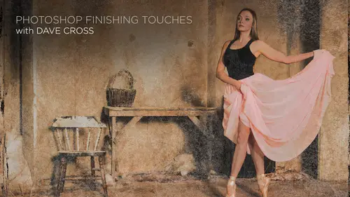
1Course Intro
05:55 2Layer Masks
15:37 3Adjustment Layers
23:47 4Clipping Masks
08:38 5Intro to Groups & Smart Objects
23:44 6Quick Mask
09:18 7Defining & Creating a Brush
14:49Smart Objects & Filters
20:56 9Smart Objects from Adobe Camera Raw & Lightroom
13:23 10'Blend If' Sliders & Blend Mode Shortcuts
09:35 11Photographing & Scanning Textures
28:08 12Scanning Objects
10:23 13Photographing Smoke
30:17 14Building Frames from Illustrator Brushes
16:59 15Using Adobe Brush CC
35:59 16Managing & Saving Brushes
13:13 17Changing the Behavior of Brushes
23:25Day 2
18Type Techniques
17:22 19Type Tool Presets
18:06 20Patterns
33:52 21Overlaying Texture
15:31 22Layer Mask Edges
45:01 23Refining Edges
08:05 24Adding Borders
15:53 25Displace Filter Edges
20:45 26Using Illustrator Elements
15:33 27Creating Reusable Effects
09:27 28The Role of Actions
35:46 29Smart Filter Techniques
30:56 30Basic Painting Tools
05:53 31Turn a Photo into a Painting
19:43 32Oil Painting Filter
18:45Day 3
33Making Color Pop
23:48 34Color Grading
20:10 35Split Toning
08:50 36Luminosity Mask & Feathering
16:57 37Other Artistic Effects
12:22 38Creative Layout Options: Layer Comps
17:26 39Building Basic Templates
23:26 40Creating Smart Object Templates
25:44 41Quick Retouching: Skin
32:49 42Quick Retouching: Teeth
09:04 43Quick Retouching: Hot Spots
08:05 44Quick Retouching: Eyes
08:32 45Quick Retouching: Content Aware Move & Extend Tool
19:41 46Quick Retouching: Glass Glare
03:44 47Adding Finishing Touches to Photographs
19:57 48Displacement Filter
10:21 49Adding Suggested Elements
20:14 50Saving Files
19:20Lesson Info
Making Color Pop
we're going to start off talking about the wonderful world of color in many different ways, not as much technical color correction. Because this is mawr. I'm slanting this more towards kind of the artistic side of photo shop, So it's MAWR. I'm not gonna worry about calibrating monitors and making color matching toe perfect. You know, it's more. I'd like my photo look a certain way. I like the colors toe pop Mawr, right? Like do kind of interesting effect with my colors or things of that nature. So in this saying, we're going talk about colors and also some kind of effects you can do to add on top of that. So hopefully along the way, for the most part, I'm going to try to continue my normal theme of nondestructive ways of doing things. There's a couple of exceptions to that rule because there's no choice. So my way of working in photo shop is I'll try to do everything in the whole smart object way of working. But if you, for example, as you'll see, make a smart object and then try and g...
o down to a certain menu item, it's great out that tells you Well, you can't do that, so you have to kind of come up with some other plan. And usually that involves duplicating the layer when you can't have a smart way of doing things so that for the most part, like I said, we'll still try to do things in a flexible way. But there will be a couple of examples where that's not the case. So first of all, let's talk about some ways of making our colors pop a little bit, and that's just a way when you have an image where you really like it, we just want toe pull a little more out of that and there's various ways of doing that. So there's none of these. What I would say is the best way or a favorite way. It all depends on the image. And, like a lot of things in photo shop way, always know there's multiple ways to do things in my mind. This is example where that's a really good thing, because on some photos you'll say, Oh, I'll just going to curves and do this you're like, That's great and other ones, like not so much, What else can I do? so we're going to try and explore some of those options along the way. So the first example here I have I'm just gonna do a quick little jump into curves. But it once again notice I'm not going to the image adjustment. Many do that because that would be very permanent. I'm going to the Curves panel as an adjustment layer and curves is an interesting challenge because, especially for beginners, I remember the first try and teach a class for a brand new beginning. Let's going to curves and look on people's face when this opens, and they're just like this diagonal line and they kind of like, uh OK, what what I do now? So one of the best things that came in recent memory and photo shop is this little gizmo here, which is technically called the targeted adjustment tool, or tat. And what this lets you do is say, this area right here. I'd like it to be a little brighter. So instead of having to worry, where should I click on the curve? And should I drag up or down up his brighter down, his darker. So if you go to any part of an image say this part over here. I'd like to be a little darker just by doing that. I'm not even really looking at the curve now. Once I finished, I'll look at and go. Oh, it created kind of a little shaped like that. Maybe in a future example, you'll kind of have a rough idea to do it that way. So if you're have been struggling with curves to kind of go and still not quite getting how it works, two things I would suggest to you. This is a wonderful way to start off doing it because you're just saying that part right there. You have to be a little careful because while you could technically add multiple points on the curve, then there's a danger of it's something getting a little wacky very quickly. So use the target adjustment tool. If you really want to learn about curves, go to creativelive and search. Ben Wilmore curves because Ben is like the the guy that the man when it comes to explaining how curves works if you really want to dig inside of it. From a technical standpoint, I'm deliberately trying to be the non technical one today and just doing things like this, we're going that part right there. Looks better to me because it's an adjustment layer, of course, were never completely finished because we still have the ability. If we wanted to, to go into a layer mask and say, Well, this area down here, I don't like it being affected or change it and or you always have the possibility Even I've already made an adjustment to say What if I then took this adjustment layer and change the blend mode to something else? So now that's dramatically altering its still taking that curves adjustment. But now it's blending it with the underlying layer. So that's giving me another opportunity to try something say, Well, what if I did this? The nice part of doing it this way is as we've talked about before. Ultimately, the original photograph is not touched because we're applying the adjustment layer or add any adjustment layer to make it look that way and then taking that blend mode to take one extra step. But at a certain point of you know, I don't like that all they want to start again. I could, of course, just delete the whole thing, and then nothing has happened. So that's one option. The second thing that's interesting to try is a command called Apply Image and most people, I think, when they first start out, if they look at apply image, this is the way they would use it. They open it. It has a dialog box. It's kind of like layer Channel blending. What? No. So here's an example of one where you cannot do this to a smart object. So I want to show you what this dialog box looks like to begin with. Because, frankly, most people look at this and the way they would use is kind of go. Yeah, I don't get it and they hit. Cancel because it's just like That's way too complicated, kind of figure out. So because I can't do it in any smart, edible way, I would be duplicating my background layer. Command control J. That way I can still do the apply image, but I'm also not doing anything that's going to be permanent toe. My background layer solves quite as nice is having an edible thing. I can double click on, but least it's better than applying it directly in the background there. So again, the approach would be if you, for example, to show you what looks like. If I convert this to a smart object and I goto a menu and it's ah, it's great out. That's the way I know. Okay, that's not gonna work. So I have to undo the smart object. That's why would make a very rarely if ever, I would say, Would you want to apply something directly to the background layer? Because unless likes was, if you had a backup copy of it somewhere. But even then, I still want this flexibility. So apply image looks complicated, but it has two things in here, which I briefly mentioned. I think it was yesterday is permission to experiment, which is preview and cancel. So if you have no idea what to do with this, that's OK, because you can very quickly see the place I usually start is in the blending and just choose something like overlay. Let me turn the preview on. That was my original photograph, and that's now by doing nothing else than just saying overlay and apply image in effect, Not quite, but in effect, is like we're saying duplicate the layer and then change the blend mode of the layer to overlay. So technically, if that's all I wanted to do, I could do it. That way. I could go just It's a duplicate layer. Change the blend mode overlay, and I get pretty much the same effect is this. But where this takes it a step further, as you can dig inside this a little further ago. What else? And this is where the cancel preview part comes in because as you're playing Humana going with something, we're like, OK, that's not good at all. So, for example, you could say I only want the Red Channel to be fact. Look how different. Just by doing that, it looks now we changed the Green Channel. If I invert it now, definitely not. That's how we try it to see now in Bergdahl's I still like that. That's looking pretty good there, blue. Now I'm still in overlay mode. Or what if I went too hard light instead? So there's no formula here. That's the point of this is this is an experimental thing on in this photograph, it might end up being hard light in with the Blue Channel and another photo. It might be completely different because it depends a lot on the photo. This one has a lot of blue in it, so that happens to help. But you don't have to do it that way. You can also click on this mask, but and right now I don't have any other photo toe work with. But just by saying, I want to say, Use the Red Channel and inverted and again just seeing a subtle change happen. So the supply image could be really interesting because it's got so many options will be different for every photo. Just make sure that you duplicate the background layer. And if you were thinking ahead, I suppose there might be some way where you could capture this information to remember how you did it. Because unfortunately, in this case, once I click OK, there's no option for me in any smart way through double click and say, How did I do that again? And that's I wish there was, and maybe someday there might be. But right now there is not. So that's kind of the oh well, have to live with that. I'm going to stick with this image for a moment, and I'll switch to some other ones to show you on option. One of the things that we can do in photo shop, especially for working with color and making colors pop a little bit, is using this mode called L. A B only were working RGB Mobile. We can also use L. A B moat. Some people call it lab color, but the fellow who literally wrote the book called A L. A B and was very clear on telling people it's L A B. So I got the habit of saying that just in case he's ever listening is like so it doesn't really matter. But But here's the thing with you have to be careful with L. A D mode. What happens normally is this all. Just show you what's set up here So normally when we open a photograph, that's RGB are channels panel Looks like this rgb red, green, blue and those are the the makeup of our document. By change the mode over here to L. A B color, then you see now the description of the channels is quite different. It says L. A B lightness a B And if I look at these channels now, the lightness is kind of like a gray scale photograph and the A and the B channels are these really weird channels that you would like? What is that? And the bottom line is, don't worry about that. It's just those were just That's just the way that l. A B works. But as cool as it is, here's the danger with it. If we do it this way, if we just change a document l A B mode is I can change the l A b apply, do some effects, then put it back to RGB. That's fine. Not gonna lose any color information. But what you will lose is this. So if I go in and say I'm gonna do curves in L. A B mode and let's use this same targeted adjustment tool to do something crazy and then I say Okay, all right. I don't leave it like that. No. Normally, the whole point of using adjustment layer, of course, is it stays there from now on, so I can edit it any point. The problem is, if I change the mode back to RGB It says you have two choices. It's gonna either discard the adjustment layer or you have to flatten. So there's no way when you switch from L. A B back to RGB of preserving the fact that there's an adjustment layer. And that makes me sad because I want to have the best, the best of both worlds. I want to be ableto use l a beef some of things I'll show you in a second. But I also don't want tohave it Go away. So unfortunately, that's a bit of a problem. So let's go backwards a little bit here. All right, so let's do this. We're back in RGB mode, and when you get when you just switch back for two in L. A, B and RGB, normally there's no worry about shifting of color. Some people worry about that because between RG B and C. M Y K, there is a difference in color. So a lot of people find that they're working and rgb they're doing all this color stuff and then someone says, Oh, since your printing this in a magazine, we need c n y que color. They switched to that mode and almost on all their colors look different. That doesn't happen between RGB and L. A. B. There's no worry about shift of color. The worry is the ability to edit will disappear. So the solution, as it often is for me, is smart objects because this is actually really interesting that this is kind of almost bordering on mind boggling. A little bit, actually that this works. So if I convert this to a smart object, you remember the concept of smart object is like is put it in this protective container. If I want to edit the contents, I have to double click on it for that second window. Right. Well, here's what I realized I was doing this because in this protective container I can change this one to L A b color and I've got l A b color inside an RGB container. Say what now? What it means is now I conduce you things like curves, adjustment layers and I just close and save This document is I'm not converting it toe rgb understand Keep the contents in l. A B, but view it in that rgb container a little. I know it's a little weird of a concept this early in the morning, but it really opens up some interesting possibilities because here's one of the ways that that I use this and I got to give credit to Dan Margolis, a za fellow that broke this L. A B color book many years ago and frankly, 85% of it. I was just like what now? Because it's very technical. But there were a couple of techniques he showed, including this one, which I still use today is I think this is an awesome way if you're just trying to give all your colors kind of that extra pop So when we're in the curves now remember, this is my contents documents. So I'm in L A B mo technically. So when I go in the curves adjustment layer. Now, instead of seeing red, green, blue, I see lightness a B So I leave the lightness channel alone. I go to the a channel and you can see sort of you see in the curse dialog box. There's like a little grid of squares. Do you take the top of this curve and take it either one or two and possibly even three. But I think three would be a little extreme. Let's go to squares and just dragging it straight and then do the same thing here and then go to the Beach Channel and do the same thing. Drag this in, drag the sin. Now we show the difference. See how the colors were just popping? Hold up more. But the difference is now I say this, and when I go back to my contents, document it update. So I didn't have any message saying You have to flatten or discard the adjustment layer because it's in that container. So yet another really interesting advantage of the smart object concept is you can actually have two different color modes in the same document, which is just weird but awesome at the same time, because it solves some problems that used to run to. I used to love to take an L. A B document at three adjustment layers, and all of a sudden I go to switch back and be like, new. How would you like to flatten? And I'm like, No, I don't want to flatten it. Well, now I don't have to, so that's pretty cool. So let's take that another step and see What if I I'll just hide this for a moment and in here, I'm going to duplicates. I wanted to apply image. I mean the contents document Now again, back in the l A B. So when I showed you apply image before I was in RGB. So the options it gave me were RGB related. Now in here, if I go back to apply image now, it's asking me, Do you want to use the same kind of things? But the difference is, I can go l A b lightness. Probably not a be that's different, kind like that, and we can try and see what happens if we play with that. I like that kind of a lot. If it's a little intense, I could either lower the opacity here or since I duplicated the background layer, I could lower the opacity there. So apply image. It's the same command, but because we're currently in L. A B mode, the options are slightly different, and therefore the results will be slightly different. So I'm still using the same kind of concept of playing. I didn't have any great plan to say. I know for this photo. I should use overlay in B Channel because I didn't I just tried it and saw what I got. And I like what I got. So in this case, click okay, and I might lower the opacity. But see what happens if I turn that back on its a little too much now. So maybe I'll take that one and lower the opacity down. So it's not quite so intense, but still pretty nice change from there. Teoh here. And just by the way, all I'm doing here, I have three layers. I'm holding out Option Ault. Clicking on the eyeball at the bottom means high. The others show them again. So it's a nice little toggle switch if you're trying to compare. So now when I hit, save and close this document cause that's my contents. Here's my container Smart object. So now I can continue with other things like outside of color, like adding filters and all those other smart things we were talking about before. So that's a really nice solution of working around the fact that for years there were all these cool little solutions, said switch to L. A B mode. But then somewhere along the way, you'd have to feel like, Oh, well and kind of making a permanent choice now is to switch back to RGB. I'd have toe flatten or are get rid of any of those layers. And it's not just adjusting was what it was. Any layers. So if you're in l. A B mode, you add any kind of layer it's gonna want toe make it go away. So this is a good solution around that. Now. Someone asked me a day. Could I do the same thing in a smart object with some other mode like, you know, C M Y K. And you could. But usually when you're preparing for print, ultimately you want the final document to be in seem like a not the contents. Since I opened that little can of worms, let me just mention one other thing. If you are, it's not. I don't think Well, I should say it's not that common, but it's less common. When Photoshopped first came out 20 something 25 years ago, almost everything we did was preparing for print. So therefore, files would always end up in see him like a at some point So there were two schools of thought. One was Well, I'm just gonna convert to see him, like right away. And then everything I see I know the colors will look fine. The problem with that is when you switch the actual mode to see him like a ah, lot of filters and other things just are great out because they don't work in CM White came out so one of things that I would suggest Let's just get a different photograph for the sake of argument. Actually, I think I'll use another one that I have. Let's use one of these ones like here. Okay, so we're going to do a nice apply image, and right now I'm doing it directly to the background lower, which is bad. But this is just for the purpose of demonstration on Lee. Don't try this at home. So here is my image of saying, Yeah, that looks great. I'm gonna get ready to print that and see him like a But if I change the mode to see m y que color, what's likely to happen is little subtle there, but you might be able to see that a lot of the blue intensity is going away because C m y que. There are certain colors that seem like a just can't replicate especially bright, vibrant colors. So instead of actually changing the mode to see him like a color, what I would suggest is if you and this is just for specific instance, where someone says, I need you toe, prepare this file for C. M. Y que printing than what I would suggest instead is you just go to this option under the view menu called Proof Colors. Now what happens when you do that? It's a little subtle, but look up at the top of my document. It's saying, rgb slash C m y que And that means technically you're still inside an RGB document. But I'm previewing what the colors will look like in C m. Y que So that way you don't get any surprising and we're done all this nice work and then you convert your boat and go, Oh, what happened? All my colors. This is a much more of a live way of doing things. So let me just show you what an example of that. If I go to the color picker here and I'm going to pick an extremely bright blue color paintbrush. Get to a regular kind of a brush here and I do something and again. Please note. I am going to paint directly on the background layer strictly for demonstration demonstration purposes on Lee, Don't ever actually do this, but I want to show you that I got a little passing. Nice. What happened to that nice, bright blue look at the difference in the color picker where I've got this really vibrant blue and this is what I'm getting. That's because that's what Percy N. Y Que would print as opposed to this. So if you're choosing colors in C. M. Y K, and you see this warning symbol that's telling you warning, this color cannot be replicated in C. M. Y que So your choices either just ignore it and then be surprised when you switch to the mode and you see the color looks so different. Or click on the little box itself and it will say, Look how far it moved. That's the closest C M y Que can replicate that color. Yikes. But that's the reality of it. It's not like there's no one's fault. That's just the way it works. So I see people all the time that on those rare instance where they're saying, Hey, we're gonna print your photo in a magazine to say Great and then they get it back and go Oh, I really like the way that looks is because they didn't put in paying attention to the choice of colors and the way color works in C N y Que. So here's a cool little trick that I like a lot. Gonna get rid of that blue thing on there and let's change. Get rid of that. Prove colors for a second. By the way, there's one other thing you can do. Proof colors just says. Give me a really good impression off what the photograph will look like when I switch to C and Y K. But if you want even mawr information about which areas are the problem areas, the other option is one that's called gamut warning. And when you do that, it puts gray over any areas that it's concerned that will switch and see him like a so you can see in this case quite a lot now it might only shift a subtle amount, but this is warning me. These are all the areas that won't work. Look the same and see him like a So let me turn that back off again. So that's a magic moment that I'm working on this photo, but I want to add some of my own color toe, put some information on it or whatever it might be. So if I go to the color picker again, we have to remember to watch that little warning symbol. But here's a cool little trick that someone figured out like many years ago. Once you're in the color picker, if you turn on the gamut warning now the color picker has a warning to say, Don't even bother. Look at how much of that is great. I mean, none of those colors would be good for C. M y que. So as I move this around, you can see it's like those blues. It's not bad, but it tends to be in the very vibrant colors, like vibrant violet, red and so on. So, as you can see, there are some colors. They're just like, no, like that who almost half the whole thing is saying don't bother picking any one of those. Now, just as an aside on April Fool's Day do, this is someone else's machine. It freaks them out because they're like What's happened in my color picker. Don't actually do that, cause that be mean, but be pretty funny, too. So that's if you, this again is only if you're in the world of C M. Y Que. But it's worth noting because again, you don't wanna prepare an image to make it look actually perfect to you. And then when you see the finished print, you're like, Oh, that's not now, unfortunately, it's the saturated, vibrant colors where this happens the most. If you do these things like apply image and all these cool things, that's where you're likely tohave the problem occur, which is unfortunate, but that is just kind of a reality. So that's just a little kind of a quick look at the world of color modes. If you are going to consider doing that switch to L. A B. I strongly recommend that you do it the way I just showed you have taking a smart object and then making the contents L. A. Because that will make you the happiest in terms of being able toe switch around, go back and forth
Class Materials
Bonus Materials with Purchase
Ratings and Reviews
karlafornia
I like Dave's teaching style: methodical, well-organized, VERY knowledgeable, interesting, relevant, and delivered with a really good sense of humor (he's a very snappy dresser, too!). Most of all, his lessons are most useful in teaching me how to save time processing my photos in a NON-destructive way and with a stream-lined workflow. This particular class is not only versed in technique, but I LOVE how he encourages creativity through experimentation and "playing" and pushing the envelop with the program. that is not as scary as it sounds because Dave is all about working with smart objects, smart filters and other such ways designed to save us from destroying our photos or work that has to be redone or scrapped because we went down a road of no return.
a Creativelive Student
Dave has a brilliant (as well as humorous) way of teaching and I always learn something new from him. I have purchased many of his previous classes and love every one of them! Thank you for another great course!