Lessons
Day 1
1Free Preview: Camera RAW: Exposure & Contrast
42:43 2Camera RAW Q&A
20:25 3Camera RAW: Color
23:03 4Understanding Histograms
07:57 5Camera RAW: Localized Changes
35:36 6Understanding Saturation Clipping
09:42 7Camera RAW: Noise Reduction & Lens Correction
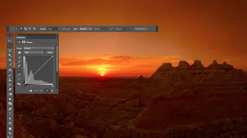
16:34Curves
44:44 9Curves Q&A
20:46 10Keyboard Shortcuts & Adjustment Layers
24:41 11Review of Curves & Adjustment Layers
16:13 12Hue/Saturation
19:08 13Day 1 Q&A
14:27 14Day 1 Wrap-Up
03:40Day 2
15Day 2 Pre-Show Banter
13:26 16Review of Day 1 Process
38:53 17HDR
33:41 18Advanced Layer and Masking Techniques
29:29 19Using Curves with Color
39:42 20Color Correction
35:04 21Color Correction Q&A
14:30 22Example Photos with Curves and Adjustments
25:09 23BONUS: Printing Tips
03:42 24Retouching
23:27 25Advanced Retouching
19:49 26Directing the Viewer's Eye
16:43 27Day 2 Wrap-Up
01:12Day 3
28Day 3 Pre-Show Banter
10:52 29Fixing Lens Flare
14:36 30Hiding Clouds
15:47 31Color, Hue, and Saturation
08:21 32Essential Keyboard Shortcuts
13:18 33Technical Issues
15:00 34Preparing Images for the Web
18:36 35Exposure Bracketing and Photo Stacking
15:52 36Blending Modes
35:07 37Review and Q&A
05:05 38File Formats
21:12 39Brush Tools
14:34 40Transplanting Clouds
20:39 41Selective Focus
18:00 42Converting to B&W
20:03 43Color Spaces
22:03 44Thanks + Credits
03:56 45Fixing Extreme Problems
20:33 46Sharpening Images
23:41 47Day 3 Wrap-Up
04:59Lesson Info
Camera RAW: Color
But now let's look a color. So this image not so great and this is what it looked like straight out of the camera, we can double check that. I haven't done anything weird. It's on camera. Defaults in my camera was set to, I think, out of white balance or something. It just didn't do a good job, right? And so we have to think about how to fix this. So if the issue that you have with your image is the color one, it's that it's too much of one particular colors to orange to blue, to yellow, to whatever, and it affects the entire picture. Then you wanna work with white balance. There are three ways of changing white balance. The first I should mention that first off, all three methods in the end, used the same thing, which is these two sliders to make the adjustment. These two sliders collectively, are your white balance. If you go to this menu to change it, all you're doing is using a preset. It's the same as just typing in numbers here and here that are always the same numbers, whatever ...
saved in that preset. So if I think it was shot on your daylight. This will type in the proper numbers for correcting for daylight. If it was cloudy, day cloudy is a bluer day. Then this will end up making it a little less blue. You know that kind of stuff, and you can go through all this. You'd have to kind of guess it with the lighting was, if you knew, is your office. There's fluorescent lights in there. You could just pop into whatever you want. Auto is similar to having your camera set to auto white balance. It will look at the scene and will try to guess. Okay, in as shot is whatever your camera gave you. So that's one way. And that's mainly if you know what the light source waas and just want to get to it quick, you pop there. Another way is at the top of my screen, where all these tools are. You'll find two different eyedropper tools. The eyedropper tool in the left. The one closest to the hand tool is the white balance tool, and I'll click on that. This tool is designed to click on anything that would be a shade of gray in what I mean by a shade of gray is something that shouldn't contain color. Most people, when they think of shade of gray in your head, think about a specific shade of great like the shade of gray, the wall behind me. I'm not thinking about something like that I'm thinking about I don't care about the brightness. I only care that it wouldn't have color if I saw it with my eyes under normal lighting. So that means any shade you'd find in a black and white photo. White is a shade of gray is just a bright one. Blacks a shade of gray. Just a dark one. Any shade, regardless of brightness that should not contain color. So in this photo, this is at a winery. Ah, bunch of wine bottles and other things in here. And I'm just looking for anything. I'd recognize that if I walked into that scene would be a shade of gray. And so I've got my white balance eyedropper already in. I see two things in here. One would be a wine label right here. But I don't remember not all wine labels or white, but it's a guess that a lot of them are white. So that's one. Also, there's a picture right here, and within that I can see kind of the whites within it. And I'm guessing that might be I'm just guessing eso I'm gonna try those two spots. So I'm gonna try right here, quick, And what it does is it looks at this area knowing that it should be great. Meaning shouldn't have any color whatsoever. And it says, Hey, what color is actually in there? Is it blue? If so, let's make the entire picture less blue or is it red sitting in there? If so, let's make the entire picture less red until no color shows up right here. And so I'll try that spot. And I'll also try my wine label and you're gonna get a slightly different result in each place you click. So I experiment with all the areas that I'm guessing might be shades of grey until I find the one that makes the color look the most pleasant. After that, then I might come in here and say, Hey, this could use some shadow detail. I see a spike on the left, right. That means I go for blacks. Bring it up till a spike goes away. Then if you want more shattered detail, I could go to shadows. And if the images the hole is too dark and go toe exposure now I'm adjusting it for the screen I'm seeing in front of me. And I have to tell you, this is a lot darker than I'm used to seeing on my laptop. So I don't know if on the Interwebs it sounds like it looks like this. But know that moving shadows up this high would usually be a much more radical change than what I'm seeing here. Just so you're aware. So if I turn preview off, I can see before and after a little more usable. Yes, so. But in the end, this pop up menu here is just typing in numbers for temperature and 10 their preset numbers. This eye dropper when I click on the picture is also moving temperature intent based on what I'm clicking on and when I click and it says, Hey, that's way too yellow it's saying, because it's moving this away from yellow that moved away from young and it left this pretty much the same. But if I grab that white balance eyedropper and I just click on random things in the picture. Watch the temperature in sliders. You see, they're moving around, so all it's doing is it's figure those out. So in the end, regardless of how you set your white balance, it's these two sliders that are doing it. So once you're done, you can glance at your picture. And if you want to find, tune it, that's where you do it. You come up here and say, I want a little warmer in there, just like the warm feeling or now it still looks a little too magenta. Then you come in there and find Tune it because we don't all want things that look like they were lit under white light. Sometimes you want the warmth of a fire place or something. Here's an image. Is his Cadillac Ranch in Amarillo, Texas. 10 Cadillacs buried nose first on the ground, and I lit the cars. He's in a flashlight now. It's not just any flashlight. It's called a Cyclops. It comes with a shoulder strap. It's that big. Ah, and I'm off outside the camera's view on the left side in I painted light across all the cars. This car's further away from me. Then this one. I should have spent more time getting light on it because it's like goes further away. It falls off more, but I didn't. The color coming out of the flashlight was kind of ah, orangish color. And I want to see if I'm correct for that. So I'm gonna zoom up on the picture because these cars have spray paint on them and I hope somebody used white or silver paint. I'll grab my white balance, eyedropper. I'm gonna go for white or silver paint. I'm gonna click on it and it's gonna measure the color of the light that was falling on that incorrect for it to make it look as if it was white light. That's what White Bounce does. So the reason why I ended up using that color of light to light this is to make the sky that was behind it go more blue. It's kind of weird, but watch you see the sky How much more blue it gets. So sometimes what I do in lighting is I plan ahead of time that I'm gonna mess with white balance And let's say I was gonna take your photograph in this room in the backgrounds, boring. What I'm gonna do is light you with a flash, and I'm gonna put a colored gel in front of the flash that's gonna make you look weird. Let's say you look all orange. I'm gonna make sure something on you is gray. You got a great top. Both of you guys have great times to get graze on them. I can click on, uh otherwise, I'm gonna put something in there in the scene that I can click on. And I'm gonna white balance for that. And that's gonna make it look like the colored flash that was the light coming on. That flash looks like white light in it'll color correct you so that instead of looking orange, she looked normal. But it's also gonna shift the background the same amount, and it's gonna move it to the opposite color because as you go away from orange, you're going towards its opposite. And so that's one thing you could do here is light your subject with a different color of light and use it to shift the color of the background. All right. Other times I miss things like usually sunrise because I'm sleeping. I'm a night person. So sometimes I I need to adjust things a little differently on this image. Really show you what it looked like with default settings. That's what it looked like. The time of day I got there, but I wanted it to look more like sunset or sunrise. So instead of correcting for the light in the scene, I forced it towards a certain color. So if you look at the white balance, the temperature in 10 sliders, I'm gonna choose undo to show you the end result that I had. Do you see how they all got shifted towards the right in what that means is moving this one towards the right means make the image more yellow? Moving this one towards the right means making more magenta. The two combined gave me this color, and this was with the old version of photo shop like click that symbol. It'll bring me to the new version, and I could maybe bring up my shadows and here to show you a little more detail. So sometimes it's not a matter of correcting for it. Sometimes is cheating to shove it towards a color that you would rather have. That's not uncommon for me to dio, but white balance is what I'm using to make those color changes. Other slaughters that I end up using show you one here. Here is default sightings. This will be the old version. I'm assuming again there's the original. Here is my end result. Look at those temperature intent sliders. Here's original. Here's end result. Do you see him being pushed towards yellow and magenta? You need make this thing look warmer, right? But that's not all I did. Um, with this image, I brought up shadows to get more shadow detail out of it. On this monitor, I bring it up even further. In fact, we have a gap on the right, and I bet you if I didn't have the shadows up so high, we'd probably have almost a spike in the left. I could bring up exposure for this screen. But the other thing I did hear other than messing with temperature intent is down here. We have vibrance and saturation. Let's talk about those moving both of those slaughters. Either one towards the right is gonna make my image more colorful. Moving the slaughters towards the left is gonna make it less colorful. Uh, the difference is that the saturation slider treats all colors equally, so every color and your image will get unequal boost from where it was before get that much more colorful. Vibrance, on the other hand, is different. Vibrance is gonna concentrate its adjustment on the most mellow colors within your image, so things that are not all that colorful to begin with. That's where the main change happens. And as it gets into more and more and more colorful areas, it applies less and less and less. What's nice about that is that sometimes you have something that has a good amount of color in, Let's say it's a flower or something. It's very vibrant. The background, which might be some brown dirt, is not very vibrant. And if you bring up saturation, everything gets an equal boost. Well, that flower can start looking artificial once you boosted too far, but then you're brown dirt. It could probably use a lot more before it looks artificial. So with saturation, both of those things will get unequal boost. But with vibrance that brown dirt that isn't all that colorful would get a larger boost than the flower itself because the flowered already be colorful. And so vibrance allows you to bring out a lot more on your picture for a couple other reasons, too. Another advantage of using vibrance is it tries not to overly saturates skin tones. If you have people in your photograph and you bring up saturation their faces, they're gonna start looking sunburns or just weird pretty quick. But if you bring up vibrancy, tries not to over saturate skin in. Therefore, you can get away with making your image a lot more colorful when you have the skin tones in it, if you go for vibrance instead of saturation. Uh huh. So in this image, if I bring my vibrance down, here's what it looked like. That's just from having my temperature and tent making the image look warmer. And that was nice. But then I brought up vibrance to say, Hey, really bring those colors out, see how they come out like it up there. You gotta be careful, though. Any time you saturate a picture, it's very easy to overdo it. And if you overdo it, you will lose detail. That's Brighton this guy up a little bit. So if I look at the bar, chart the history Graham, remember before I said, Look at the white part of it that talks about the brightness of your picture. Now, instead of looking at the white part of it, we want to look at the colored part of it. The colored part I look at when I'm thinking about color in the primary Part of it I look at are the ends and you notice on this image. The left side has a really tall spike on it. Any time you see a really tall spike on the left or the right that's in color, it means that you might be losing detail in the most colorful areas of your picture. All right, what happens behind the scenes is your pictures made out of three black and white images that combined together, Um, you'll learn about this probably more later on today or tomorrow, but behind the scenes, you hear about your image being an RGB mode. Remember, if you ever heard, that means behind the scenes made out of red, green and blue, and there's actually three grayscale pictures that represent how much red light How much green light, How much blue light Make up your picture If you see a colored spike on one of the ends, you're losing detail in one or two of the three pictures that make up your image. The red, green and blue part. A little technical there. But the main thing is colored Spike means you could be losing detail. Watch the colored spike when I bring down saturation. I'm not having done this image before, but eventually to see the color spike go away Now we're not losing detail in the dark. Part of them are not the dark part in the most colorful areas, and so on my images, if I started out without a colored spike on the end, and then I went into a just saturation or vibrance and I noticed one develop, and it's okay if it's really, really short. But if it started getting pretty tall, I would start inspecting the image closely to see if I'm losing detail where it's most colorful. What you'd end up seeing is if you look at this one, I'm thinking maybe his his nose. You can see the texture of the fabric in here, can't you? Little hints of it, that texture in the fabric will suddenly start to go away and you'll just see more of a solid red area. So let's see if I can get it to happen. I don't know if I will be able to, but watch his nose, but I just thought, Start, watch right about in here and we bring it down first so we don't have that spike. Okay? And now keep an eye right in here and see if you start seeing less texture like right there, I'm seeing. I'm not seeing much texture right there, are you? That's because my saturation is getting too high, and that's what's known. A saturation clipping, saturation clipping means against spike colored spike on the end. So I would say in general, adjust your image until you like the look of it and then glance at the history Graham. See if you happen to have gotten colorful spikes on the end, And if you did inspect the most colorful areas in, see if you're losing detail that was important. It wasn't important detail. Who cares? But if it's you know your product or something that's there is gonna show up is a colorful spike on either end of the history. If you want to see where it ISS, I can show you exactly where it would be happening. So you know where to inspect within your picture. There's a hidden feature in here that can show you where it ISS. If the spike is on the left side in the history AM left side usually means darkest area when it comes to saturation. That's not always the case, but we still need to think about brighter, dark end of the history Ram. Then go for the slider that you would usually go for to fix a normal spike on the end. If you weren't thinking about color, your thinking about brightness and the one you'd go for in the left side would be black. So it's not that I'm gonna move it. There's a hidden feature within it that will show me what's happening in that part. What you do is you hold on the option key, Alton Windows, keep it held down and click on the black slaughter without moving it. But watch what happens to my picture Okay, You see that colored stuff? That's where we're losing detail. That's the part of the image you should inspect to see if it's a problem or not. On some images, it won't be a problem because you, like who cares about that part's not important. My picture. You know, if it's a logo, it should be solid. Colored shouldn't see texture in it, right, so you would have a spike in the end. Now, if I bring up saturation further, then I go back to the black slider. Now it's a bigger area, but that gives you an idea of what part of the image to look at then? The other thing is, if the spike is on the right side instead of the left, then you're going to go for the whites slider because that's what you'd usually go for it. If you're adjusting tone ality, the brightness part of it, you just think about what side is. It tells you the slider to go for. So what I could do is I could bring down my saturation until a spike goes away, and then I could bring up vibrance Instead, Vibrance is gonna have less of a tendency of making a spike on this image. Since it's so colorful to begin with, it's still going to give me a spike. But on a lot of images, it wouldn't because it affects the image less and less and less as you get into more and more colorful areas. And so, if I opened more of a normal photograph that doesn't have ridiculously saturated colors, and if I bring up saturation, let's see you see a spike on the left. I'll choose. Undo. Let's bring up vibrance and you'll see I can't get a spike out of it on a normal picture instead of one that's massively saturated, you'll find that vibrance will be hard to get. Spikes. Saturation will be much easier to get spikes. So if you have something that has vivid colors or you start noticing, those spikes start tending towards using vibrance instead of using saturation. So when it comes to the highest a gram, the white part talks about tonality, meaning brightness. The colored part talks about color, and I primarily look at the ends and I look for spikes. Spikes means I could be losing detail in the most saturated areas. I'm shooting a flower or something else, then I want to zoom up on it. See if that's important to me and I might back off on it until the spike goes away. The colored one and I might see that detail come back in. But the question is, does Ben prefer sliding? Sliders are bumped them 10 points at a time via shift Arrow. I prefer sliding sliders. OK, but if you like Aero case, that's great. It's not more control to be. I like taking a slider and pushing it past where you think it should go, because you never know how far you should move it until you've moved it too far. Otherwise, it would be like all carefully. I moved it up. Six points will say, and it's like, Well, yeah, but would it have looked better at 46 in? So I prove it way up and then back off, and I try not to look at the slider all the time. When I'm adjusting, I'm looking at the image, and then sometimes I look back and I'm surprised, and I'm like, Oh, actually lowered saturation on this image because the image that matters, it's not sliders. And so I try to move past where I think it should go even further until it's way too much back off and be looking at the image. Will I do that? Sometimes I glanced a slider. I'm like, Dang, I did the opposite of what I thought I was going to, but it made the images better. Yeah, the other. A question from little is when pushing the sliders all the way to 100 Doesn't matter what color space, your end. In terms of the amount of leeway it does matter what color space you're in, we're gonna talk about color spaces that later on. What's gonna happen is first. I'm trying to get you somewhat comfortable with things right away. As far as using sliders and actually getting stuff done after we've gotten, you're doing some of that. We'll start taking little breaks tomorrow where we talk about what I call the technical crap. You don't want to know, but you really should know. And that's what we'll talk about. Things like Resolution will talk about color spaces and other things, and I'll give you my general opinion about but in general, yes, your color space, which is like s RGB versus Adobe RGB versus Pro Photo. What that determines is how quickly you'll get those spikes with S RGB. They'll show up the soonest with Adobe RGB. They'll show up a little last, and with pro photo, it will be much harder to get the spikes. That's one place, though It is an important noted, and that is light room is different than Photoshopped, and that's that part. And that is in light room. The history Graham is not based on your color space you've chosen. It's based on one that's built in, and that one is closest to pro photo, which means it will be harder to get spikes to show up in light room. But once you open the image in photo shop, you might see spikes because it's not the hissed. A gram is not based on the color space you've chosen. So just one thing that keep my butt in Kamerad is
Class Materials
bonus material with purchase
Ratings and Reviews
Jim Pater
I taught Photoshop (version 5) to graphic design students at the college level. I had great fun teaching. This is the perfect course to show others how they might go about teaching a Photoshop course. Congratulations Ben, on your excellent teaching style and methods. I thought I already knew quite a bit about Photoshop but this course made me aware that there's always more that you can learn.