Lessons
Day 1
1Free Preview: Camera RAW: Exposure & Contrast
42:43 2Camera RAW Q&A
20:25 3Camera RAW: Color
23:03 4Understanding Histograms
07:57 5Camera RAW: Localized Changes
35:36 6Understanding Saturation Clipping
09:42 7Camera RAW: Noise Reduction & Lens Correction
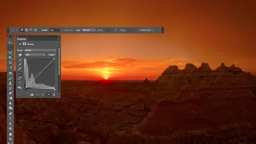
16:34Curves
44:44 9Curves Q&A
20:46 10Keyboard Shortcuts & Adjustment Layers
24:41 11Review of Curves & Adjustment Layers
16:13 12Hue/Saturation
19:08 13Day 1 Q&A
14:27 14Day 1 Wrap-Up
03:40Day 2
15Day 2 Pre-Show Banter
13:26 16Review of Day 1 Process
38:53 17HDR
33:41 18Advanced Layer and Masking Techniques
29:29 19Using Curves with Color
39:42 20Color Correction
35:04 21Color Correction Q&A
14:30 22Example Photos with Curves and Adjustments
25:09 23BONUS: Printing Tips
03:42 24Retouching
23:27 25Advanced Retouching
19:49 26Directing the Viewer's Eye
16:43 27Day 2 Wrap-Up
01:12Day 3
28Day 3 Pre-Show Banter
10:52 29Fixing Lens Flare
14:36 30Hiding Clouds
15:47 31Color, Hue, and Saturation
08:21 32Essential Keyboard Shortcuts
13:18 33Technical Issues
15:00 34Preparing Images for the Web
18:36 35Exposure Bracketing and Photo Stacking
15:52 36Blending Modes
35:07 37Review and Q&A
05:05 38File Formats
21:12 39Brush Tools
14:34 40Transplanting Clouds
20:39 41Selective Focus
18:00 42Converting to B&W
20:03 43Color Spaces
22:03 44Thanks + Credits
03:56 45Fixing Extreme Problems
20:33 46Sharpening Images
23:41 47Day 3 Wrap-Up
04:59Lesson Info
Color Correction
we'll refine. We've done when it comes to color correction. And then we'll talk about general color adjustments like how he might deal with sunburn or if you just want to make it image warmer or cooler. How weaken Go about doing that? Curves. So let's just pop in and see what we come up with. Uh, when it comes to working with the eye droppers in curves, I only used the eye droppers that help. So if there's anyone that ever makes the image not look good, I simply typed commands the controls and windows undo and don't use that one. So with a lot of images, you'll find that certain I'd rappers really don't help. One example of that is if you have a picture that was taking at sunrise or sunset. The white eyedropper, usually the brightest part of the photograph, will be the color of the sun. Who will be the color of the sun, and, uh, clicking on it will remove the color of the sunset or sunrise. From You were image, and it's gonna make it look more like the noonday sun, and that's going to ...
be something you don't like. So when it comes to sunrises and sunsets. Usually the white eyedropper is one that I skip, Um, but on other ones, sometimes it's one of the other eye droppers that might not make it look good. So here's an image I wanted to a just end What I want to stay with. This one is first off. How do you find the bright and dark parts of your image? So you don't have to guess? Because if you guess wrong, anything that is brighter than what you click on you'll lose detail in were darker than what you click on with the other eyedropper. You'll lose detail in because it'll go into blackness or pure whiteness. So one way you confined where the bright and dark areas are, is when you're in curves at the bottom of curves. There are two triangles in with those two triangles. They work just like the outer two sliders in levels in levels. The slider in the upper right would force areas toe white is bringing in in. The one on the left would force areas to black, and all they dio is they move the dot that is directly above the slider over. Like this So if you think about the way Curves works, remember, it's like dimmer switches, so it's forcing the dimmer switches all the way to the top to make solid white. And so if you look at that area where it's going flat up there, it means anything that's straight below that. Anything in this brightness range right here would have gone solid white. That's what it does. And pulling in the opposite one does the same for the dark portion of your image, forcing things to solid black. It's bringing the dimmer switch all the way to the bottom to turn off. What's nice about that is there is a hidden feature built in that can tell you where it's happening in. So when you bring it in, the first thing it shows up will be the brightest part of your picture. And so let's take a look at it. So what I'm gonna do is I'm gonna hold down the option key, which is all time Windows, and I'm gonna turn off this little keyboard overlay just because it will be in my way. It'll cover up the part of the picture I might need a look at, um So am I gonna grab this white slider? I'm gonna hold down the option key all time Windows. I haven't held down right now and I'll click on it and that gives us a different view of the picture. A lot of the times when you do this, you won't see anything other than solid black, and you'll have to move the slider in. And before you say anything, show up. In this particular case, the highlights air blown out on this picture. Meaning the highlights are solid white. So something showed up already right at the beginning. But that would tell you where the bright part of picture is. I'll go to the opposite end, hold down the option key, grab that one and this one as well. When I first click on it, I see something already showing up in those areas that are black are the darkest part of my picture. But on most images, if I were to do that when we open a different one, where is that diner shot we had before? There it is. That one I don't think is gonna have at least the shadows don't look black to me, so I'll go in there and do curves on it. I'll show you what it might look like. Some other images. So here I'm gonna hold down the option key. Click on the black slider and you see how the screens completely white. What that means is nothing's black yet in the picture. And if I move this over once something gets forced, the black will start showing up. Well, the first areas that would get forced to black would be the absolute darkest part of your picture. So I'll pull that in until I don't just see color. But I see black. Wherever the black first shows up, is the darkest part of my image. It might be underneath the curves panel right now. See if I could. I don't know why it doesn't let you move that there. I'll zoom out. So I'm looking for the first area that shows up is black, and I'll try to visually remember where that is. Just make a mental note of what part of the image it's on. I'll let go the mouth so I can see what part of the image that waas and then it's very important that I take the slider and put it back to where it was before because I didn't really want to force those areas to black. I just wanted it to show me Where is the dark part of the picture? And that's how you can do it. Let's try it on the opposite end. I'm not sure if this image looks like it might have some white to begin with, but ah, hold option. Grab the slaughter. No, nothing like to begin with. Then I start to move the slider over, and the first thing that shows up that's not a color but is really white is the brightest part of the picture that I want to click on. And I can see it in the middle of a I think in the middle of a white yellow blob there's a little bit of white showing through, and then I let go. It was right about in here, and then I moved. Very important. You move this slaughter back to where it started because you're only using it to reveal where the bright and dark parts aren't. You don't actually want the adjustment that would be made by moving them? Uh, yeah. Can you do something with a threshold layer. Uh, that's what this is is it's what's called Threshold mode. And yes, you could do the same with the threshold adjustment layer. The only difference is you wouldn't see the color showing up. You would just see black or white show up, but you could do a threshold adjustment layer and drag the slider around. The main thing for me is, since I'm already going to be in curves to get to the eye droppers its convenience sitting right there. But just so you know, that feature is called threshold mode. So with this image when I did that, we already have blown out Highlights. These highlights are solid white. We already have solid black shadows, and so clicking on those two isn't gonna do anything. This is already neutral, meaning that's not blue or yellow or orange. It's solid white. So clicking there is not gonna help clicking in the dark part of the photos. Also not gonna help, because when I go and do this preview, it shows me right away. We already have white. I haven't moved the slider. Go to the opposite end. We already have black, so in this case, only the middle eyedropper is needed, and I'm gonna completely guess that would should be grey because there's not any overly obvious references here. There's not a white sheet of paper in the scene. There's not something else. I recognize. This could be some white paint here where shipping away out of, I don't know, but I'll click there. It helped. I'll try another area. Maybe this is painted white are gray. If it doesn't improve the picture, it means you. Your assumption was incorrect. It means that that was blue or yellow or something else if you were to be standing there. So I'm just trying different areas that visibly looked like they could possibly be a shade of gray if I was standing in that scene. And I'm just experimenting, clicking between them to see which one gives me the most pleasing color in which everyone, that is, it's the one I'm gonna go with. So it's not always a blatantly obvious thing where you're completely recognized it. Sometimes you have to guess and say, Would this be something that wouldn't have color in it? If so, click on it. If your picture shifts to a really weird color. Nope, That wasn't something that should have been a shade of gray. But if the color suddenly dramatically improves than it waas, So let's take a look. I'll turn the eyeball off before, after it looks a lot better. But the main thing I wanted to share with you there is that you could use thes triangles on the ends to find the bright and dark part of the picture, so you don't have to guess, and that could be really nice. Another thing you can do with those eye droppers is with default settings. When you click with a white eyedropper, it will make the area that you click on solid white. The problem with that is solid. White has no detail in it. So wherever you click, you're gonna lose the detail. And that's not always a great thing. I usually reserve solid white for things. Notice, speculate highlights. A speculative highlight is we're light can reflect off something like the sun can reflect up to something like a mirror so of chrome bumper. Sometimes water somebody's windshield when the sun catches it at just the right angle, and you get that reflection directly back to the camera, Those areas I allowed to go to solid white. Those are also areas that I ignore. When I'm looking for an area to click with the white eyedropper, they're not gonna contain any detail. So what I'm looking for is the brightest area that has details. Whereas the noonday sun and the reflections of it off of mirror like surfaces not gonna have the detail. So, um, we can change this eyedropper, though, so it doesn't force things to solid white so that instead it delivers a little detail where you click and the way you can do that is you condone will click on the white eyedropper when you double click on it in old versions of Photoshopped, it would bring up a color picker. That's an old versions, though in new versions of photo shop, you're gonna have to most likely go in here in shoes. Let's see if it's under curve to split. Now it's under. We're gonna go to auto options, should be able to set it there. I went to the side menu and choose auto options. Sorry, it's been a while since I've been in there changing it in here. You're gonna find three rectangles of black. Want a gray one in a white one. And if you click on either any one of those three, you're gonna get a color picker where you can say what color or brightness Do you want it to change things too, when you go with the white eyedropper, the black eye dropper or the gray eyedropper? And so right now, it would say that this is going to be 100% right. It's going toe, have no detail whatsoever. So what I would do is I would click right here with the number says right there. And you can use the down arrow key to say wanted a little bit darker. And it all depends what you're gonna use your image for. As far as how dark you should make that I frequently think about printing on a printing press because sometimes the images are reproduced in magazines and newspapers and brochures and all that. And if that's the case, I actually watched the numbers that say seeing like a over here, because that will tell me how much ink lined up using and I could go down down and they see those numbers, and if I get those numbers, you can ignore black because it is not going to use black in the bright part of your picture. If you get those numbers to be at least three, it should be reproducible on just about any kind of printing. Eso that usually you can't reproduce absolutely tiny dots and certain kinds of printing presses 3% not is usually relatively easy to reproduce unless you're printing on something like a cardboard box, where the printing process is so crude that you still can't reproduce the 3%. Not if that was the case, you you could talk to your printing company and say, What is the brightest shade of gray? You can print that before the dots disappear, and whatever that number is is where you could click on the number for brightness. Use the down arrow key until you hit where the numbers for seem like a hit, at least the number they told you. But for me, three is usually pretty good for that, and that's good for other things, too. It's just printing is what defines my particular standard for that, and if you look then here this shows you before we were gonna force things toe white, but now only click with the white eyedropper. We're not gonna force things toe white. We're gonna instead get a shade of gray there, which means we'll stop detail. So I got to this click. OK, I want to save those with the new defaults. Yes. Ah, got to that by going to the side menu on the Levels Adjustment layer area. And there was a choice called auto options. And that's where I found these three. I clicked on the white one and I clicked next to the letter B for HS because that stands for brightness. The reason why I used that one is because that's going to make sure that it remains neutral. It doesn't suddenly become bluish or yellowish or something else, because I'd mess up some of the other numbers. If you only change brightness, you're just gonna make a little dark. But it'll still be neutral, and it will figure out the proper mix of seem like a or anything else needed. So it's only the brightness number I change, and I just might change it based on the numbers that show up here. So I do that I don't usually change black one. Remember when we were in Kameron? I said, I like to have a little bit of black of my picture. Well, leaving that one alone, it solid black will ensure that. And I'm not concerned with printing on a printing press there because if you ever convert your image to see him like a mode, which is what it needs to be in when it gets sent to a printing press in that process, there are some settings that will be applied to the dark part of your picture to make sure you're not using too much ink. There's a setting called totaling Clement in black inclement, and they will be applied automatically to the dark part of your picture to make sure that you don't have solid black if you end up in seem like a mode, which is when it would be important. So I leave the others. So now when I use these eye droppers, the white eye dropper is going to leave some detail, which could be nice. Eso you're no longer going to see their overly bright spots, so I'm gonna do this again where I go to curves and let's just adjust this image, I would hold down the option key. Grabbed the slider that's in the lower right. I have the option key held down right now. Pull this over until I see the first area that goes solid white, and it's somewhat hard for me to see because the screen is physically far from my eyes. But it looks to me like it's in the middle of a yellow blob up in a cloud right about here. Then I'll do the same thing for the black eye dropper holding on option ultimo windows. Pull this in until I see the first blob. Not a speck but a blob, meaning, you know, at least three or four pixels. And for me it looks like it's in the letter I of the name of the restaurant. It's F I G. I am. I can see some black up there. It's important that I move these sliders back to their default locations, and then I can come in here now with the white eyedropper and click on where it showed me to go with the black eye dropper. Click on where it showed me to go. And there I might have missed it because I'm zoomed out of my picture and I can't see accurately here. When she was undoing, Zoom up. Remember if any eyedropper ever causes an issue when you click with it, don't use that eyedropper or you clicked in the wrong spot so I can double check that. That was where first black showed up. I thought it was Oh, it's the edge of that letter. I clicked on the middle of the letter. Do you see how the edges black with the middle is red? Uh, so I need to get on the edge of it. No, zoom up even closer. That's odd that it doesn't actually look like the darkest so something that there's an issue there. I'm not sure what it is. Let me see if I can find a different spot. Okay, Get in black, in a bush, on the left. If they bring it to here or the bottom of the building on the right side, I'll try that instead. I can see the bottom of the building right about here, There So he doesn't work. Try to get moving in a little further and say something was weird at that spot most of the time, and I most the time. I mean 90 plus percent of the time you'll be right on when you that in this case it wasn't then. It's only the middle eyedropper where you have to really guess an experiment, and that's where I click on anything that could possibly be a shade of gray in C. Which one gives me the most pleasant color? Whatever one it is I go with. So that gives you a little more detail about using the eye droppers as far as making sure you maintain detail in the highlights and how I end up finding the brightest and darkest parts of the picture. The other thing is, when you do this and you click on your picture with default settings, photo shop ends up looking at one pixel right underneath where you click. The problem is, if your images noisy or just contain random information, you might click on a random, weird pixel like if it has noise, it might be a green pixel. It doesn't really belong to the picture. It was more like an air that the camera delivered when it tried to get some detail in the dark party or picture. So if you go to the eyedropper tool, um, in Photoshop, at the top of your screen, you're gonna have some options, one of which is what's the sample size? How big of an area does it look out when you click in point Sample isn't always the best. Three by three average is pretty good. That's gonna take an area three pixels wide and three pixels tall little square and average the colors when you click in. That way, if there's a single odd pixel in there, it's gonna be averaged into the surroundings. And it's not gonna mess you up so much if you work with ultra high resolution pictures of five by five, average could be used, but three, by theory is fine for most things. You want to be in the eyedropper tool in order to see that option on in most versions of Photoshopped. So anyway, that's what you use for that. Now let's look at other things we can do with curves when adjusting color. Where is our little sunburn guys? You must be in a different folder here. There they are gonna bring up the vibrance on them just to make it a little more obvious that there actually vibrance isn't gonna do it. It's much because it protects some skin tones. So I'll bring up saturation. And I'm gonna do my white balance just to make sure that we accurately have sunburn in here. Um, I think this wheel back here, it looks like it would be a mellow gray. So try that, uh, and I'm gonna open this image. So in this image, if we zoom up, you can see that these guys have, in general some sunburn. But the neck right here reveals what skin tone would look like if he wasn't summer right. And that's the keys. If we can see an area that is the right color that we want tohave, then we can force any other picture area of our picture to that color in that other color could even be in a different photograph. So if they if they fell asleep on a surfboard and their entire exposed body was beet red, you could find a picture of him taking the year before with his normal skin tone. The only thing you have to be sure of is that the color space on both images is the same, like S RGB, Adobe RGB or pro photo RGB. You can find out what that is by going on your image. And if you look at the bottom edge of your image, there's a numbers that show up in the lower left. There's a little arrow right next to the numbers, and if you click on it, one of the choices is document profile and something will show up. It's either going to say ass RGB, adobe RGB or pro photo. You need to make sure that that is the same on both photos. We should talk about that in more detail later on, but in essence, what it means is your images made out of red, green and blue in that little choice defines what color of red, green and blue exactly is it made out of? Is it a really vivid red color that everything's made out of, or is it a mellower one? And so if that number is that setting is different on two documents, the numbers in the Info pal, it can't be used between the two. They have to match so just double check to make sure they match. All right, let's see what we have to do. I'm gonna go here to the info pallet, pop it open, and I'm gonna pick an area on this guy skin. He is the one I'm gonna try to correct for now. And I'm gonna put it it over here on his non sunburnt skin. It's sitting out if you can see it, but it's right there with my little hand is And I'm gonna look in the info palette. I'm just gonna write down the numbers that show up. So I have to 32 to a one in 1 Those numbers mean nothing to me, but I know that there are an accurate description of the color that my mouse is on right now, and that's what's important. Then I'm gonna do a curves adjustment layer and in curves. I'm gonna click on the little hand symbol. So it knows if I click on the image to do something in curves and gonna move my mouse onto the area of sunburn. Now, the problem is, if I just click the mouse button, it allowed it one not to the curve. If I move that dot upper down, it will adjust brightness, and I don't want it to adjust brightness. What I want to do is work on the individual curves of red, green and blue. And there's a little hidden feature that when I click here, will add a dot to the red to green and the blue curves all at once. All it's going to do is it's gonna look in the info palate at whatever numbers are showing up in the dot that it added, its and curves were represent that brightness level. In fact, if you look at the bottom of curves when I move around, you see numbers changing. Those are the same numbers. It would appear in the info palette. If I went to the red curve, you'd see it one number. If you went to green, you see a different one, and here's the little Tricky is so after you've already clicked on the one hand icon. So it knows that when you click on your image to do something with curves, put your amounts onto the sunburnt area and you have to hold down two keys on a Mac it shift in command on windows. That would be shifting control. I have those two keys held down Right now I'm gonna click the mouse button and let go. And now, if I changed my curve from RGB two Red, do you see a dot on the curve right there. It added that dot when I clicked in this number down here to 02 would have been the number that showed up for reading the info palette for that area. I go here to green, there's gonna be a dot on in the number that's down here would be the number that would show up in the info palate for the sunburn. And then I got a blue and it at another dot on the number down here indicates what would be the info palette. Eso it did that for me. It added those three dots. Now here's what I need to dio at the bottom of curves. We have numbers for input and output. I don't really like those terms. What they really mean is before and after input means before output means after. So I clicked on the sunburn in it, typed in numbers for me and all I need to do is select the number for output in type in the numbers I wrote down for where he wasn't sunburnt. So I have those numbers written down for red. I had to 32. Then I'm gonna switch this menu to green, select the number for output, and I'll type in the second number I have written down, which is to a one. Then I'll go over here to Blue. I like the number for output, and I'll type in the third number I have written down, which is 1 All right, so in essence, curves looked at the sun burnt area and it wrote down the numbers for that for me there in the input area. Then I wrote down or typed in the numbers for output based on the numbers I got when I had my mouse on top of the area, that wasn't sunburn. Now I know you guys. I want to see the picture. The sun burns not gonna be fixed, because what happens is that this adjustment is applying to the entire picture and we don't need it to apply to the entire picture. So the entire picture is becoming more blue because the blue got moved up. The entire picture is becoming more green because the blue green got moved up in the entire picture is becoming more red as well because it needed to brighten the image. So it needed to move all three of them up in things. But I don't need it to apply everywhere. So this is where I'm gonna paint on the mask to say only apply in the areas I needed to. And I don't know if you remember yesterday when I wanted to paint on a small area where ended up doing is I inverted the mask first in inverting the mask made it so it didn't apply anywhere it all. I'm gonna do that right now, and I'll do it by typing command. I control I and Windows, so I'll do that. And then you grab your paintbrush. Can you paint with white? White is what will paint the adjustment in your image. And now I have an anti sunburn brush. So let's see what happens when I paint right here. Sometimes it will be a little too strong because you'll have picked an area of sunburn that was a little off compared to the area of non sunburn as far as what it looks like. So sometimes you have to lower the opacity just a little. But if I paint this in, I should be able to lessen the sunburn quite a bit. I might need to do a separate adjustment for his ear because he is here was more sunburn, the rest of his body. If I wanted to really target that, I should have used the numbers for that. Now I'm gonna just the opacity of that layer. I'll bring it all the way down and slowly bring it up and see how much I need to shift his skin. And where I get to be a little too much because the area I picked two changed towards the color of his neck was kind of in this area. He might be a little bit more sunburn and here And if I hadn't picked that area, we're not gonna completely solve that sunburn. Let's try it on a different one of these guys here we have his neck area that is not as sunburn as an area up here. Let's see if we can get this area to look more like that area. I'm gonna do a curves adjustment layer and I'm gonna open the info palette. I'm gonna put my mouse on top of the area that I want to match, which will be down in here, and I'm just gonna write down the numbers. 2 23 1 77 1 51 In essence, I wrote down the color that's underneath there. Then in curves, I click on the hand. I hold down the two keys that I mentioned previously, which is the shift key and the command key that would be shifting control on Windows. And I go to the area that needs to be changed, and I click. So I had shifting command held down just now. That's what's gonna add dots on the red, green and blue curves. And what I need to do is simply type in numbers for output. I just wrote down those numbers from the other part of its skin, right. So I'm gonna type in 2 and I'm ignoring the picture completely because the entire photo is going to change and I only need a small portion of it to change. All right. After I've done that Now I'm going to invert the mask, but I've been command. I make sure the mask is active, Mandhai. And if the mass doesn't invert when you typed command, I click on the mask to make sure it's active that way. The command I worked in that area, I'll grab my paintbrush and then I'll paint this into my image. Now it's gonna make it. Not only the same color is this, but the same brightness. And if you don't want the brightness change toe happen, remember, you can use a blending mode. Remember, you can change it to color. Color means only change color, but do you see how it's pulling a lot of the color out of here? What it might be is that I don't want to apply it at full strength in all areas. Let me choose, Undo for a moment. What I'll do with my brush is lower, the opacity of it, the top of my screen. Maybe I'll bring it down to No. 50% or maybe didn't 20% and now I can build it up wherever I'd like. I can paint across the entire Davis face to get 20% of it applied. I let go the mouse button and click again. Now it's playing 20% mawr here and maybe in here. Let go of the mouse again by 20% mawr, 20% more with each click. In that way, you don't have to apply it evenly on a face because it's not always and even burn you somebody. The tip. Your nose usually burns more than other areas, and so you can slowly build that up. If you have the opacity of your brush, turn now and then. Finally, if you didn't like the brightness change, you could change the blending mode and you could change it to color. He'll go back to the brightness he usedto have, but the color change will happen. I don't know if I like that or not. Yeah, it looks just kind of weird to me, but on occasion will need to do that. So let's see what that's doing before After getting closer to the color of his neck. It's too much of a change. Lower the opacity a little bit. This isn't just for sunburn and other things. You can use it for anything at all. If you need one area toe look like another so that I've used it on, like, this image if you want the sky in the left. Look, this guy on the right exact same process to get it to happen. I have an example here. And if I turn off to adjustment layers, you'll see that the sky in one side was previously darker over here and not as colorful. But after doing this process, I could brighten it up on the horizon. It wasn't quite as colorful as over here, but I could steal the numbers for over on the left and put him over there with a different adjustment layer. All I'm doing is copying the numbers. Okay, so the numbers might not mean anything to you personally, but they mean a lot to photo shop, and they're an exact description of a color, and so we can use them to make all sorts of changes. I'll show you one other inventory used this in this image, I believe the top layer, this one. You see the very top where it used to be brighter up here, and I wanted to darken it in there. But if I generically dark and it doesn't mean, the colors are gonna look the same as what we have over here. So I just stole the numbers from over here and used an adjustment of this area to change it and painted it in the mask inner lobby to do that to get it Teoh match up. So this image is a whole used to look like this. That's the original. And through a bunch of adjustment layers, make these large enough looks like mainly curves. And this is a hue and saturation couple of those. I was able to transform it into that.
Class Materials
bonus material with purchase
Ratings and Reviews
Jim Pater
I taught Photoshop (version 5) to graphic design students at the college level. I had great fun teaching. This is the perfect course to show others how they might go about teaching a Photoshop course. Congratulations Ben, on your excellent teaching style and methods. I thought I already knew quite a bit about Photoshop but this course made me aware that there's always more that you can learn.
Ron Greathouse
This course is one of the best Creative Live Courses that you have made available to us. I have purchased at least 12 courses and this course is my personal favorite. Ben is an excellent instructor and should be teaching at the university level. He is great!