Lessons
Day 1
1Free Preview: Camera RAW: Exposure & Contrast
42:43 2Camera RAW Q&A
20:25 3Camera RAW: Color
23:03 4Understanding Histograms
07:57 5Camera RAW: Localized Changes
35:36 6Understanding Saturation Clipping
09:42 7Camera RAW: Noise Reduction & Lens Correction
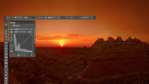
16:34Curves
44:44 9Curves Q&A
20:46 10Keyboard Shortcuts & Adjustment Layers
24:41 11Review of Curves & Adjustment Layers
16:13 12Hue/Saturation
19:08 13Day 1 Q&A
14:27 14Day 1 Wrap-Up
03:40Day 2
15Day 2 Pre-Show Banter
13:26 16Review of Day 1 Process
38:53 17HDR
33:41 18Advanced Layer and Masking Techniques
29:29 19Using Curves with Color
39:42 20Color Correction
35:04 21Color Correction Q&A
14:30 22Example Photos with Curves and Adjustments
25:09 23BONUS: Printing Tips
03:42 24Retouching
23:27 25Advanced Retouching
19:49 26Directing the Viewer's Eye
16:43 27Day 2 Wrap-Up
01:12Day 3
28Day 3 Pre-Show Banter
10:52 29Fixing Lens Flare
14:36 30Hiding Clouds
15:47 31Color, Hue, and Saturation
08:21 32Essential Keyboard Shortcuts
13:18 33Technical Issues
15:00 34Preparing Images for the Web
18:36 35Exposure Bracketing and Photo Stacking
15:52 36Blending Modes
35:07 37Review and Q&A
05:05 38File Formats
21:12 39Brush Tools
14:34 40Transplanting Clouds
20:39 41Selective Focus
18:00 42Converting to B&W
20:03 43Color Spaces
22:03 44Thanks + Credits
03:56 45Fixing Extreme Problems
20:33 46Sharpening Images
23:41 47Day 3 Wrap-Up
04:59Lesson Info
Color, Hue, and Saturation
we've talked over last few days about adjusting color in win adjusting color. We had two main adjustments that we ended up using. We use curbs, and we used hue and saturation. But the thing I didn't really get to with that was how I really think about them being distinctly different from each other in here. Is that what that difference is? If you ever adjust color using curves? If you look at my screen, I have a color wheel on here, which has all the colors in a rainbow in it, using at least the most colorful ones. If you end up using curves, you're gonna have the choice in curves of adjusting red. When we get to my capacity up here, you're gonna have the choice of adjusting red, green or blue because that's the mode your pictures in. Remember that with a little menu. And if we tell it to have mawr red, green or blue, that means we're pushing colors towards red green for blue. But then that's not all we could do in curves. We could tell it to use less red, green or blue, right? Remembe...
r, every color has an opposite, and so If you were to move the curve away, remove it down away from red, green or blue. You could move it towards the opposite colors, the opposite of red with scion the opposite of green waas magenta, and the opposite of blue was yellow. And if you didn't remember that relationship with the opposites were, you could go and open the info palette in the info palette. They were directly across from each other opposite of red sun. An opposite of green is magenta and so on. He didn't have to remember it, but if you end up using this, these techniques a lot. You'll get used to that. So the time that I use curves is when I find an image looks to red to green, to blue, to science to there's too much of some color or not enough of that color. So that means that the image is usually either too warm or too cool. Curves is what I call a warm, cool adjustment, because when you work with a dot on a curve moving in one direction, let's say up might make the image warmer. Moving in the opposite direction will make it cooler, so all of them would move it up or down. You're gonna warm or cool, depending on what direction you move it. Human saturation, though, uses a completely different thought process. It doesn't have choices of red, green and blue in it instead, and if you remember the choices in there. But the sliders were called hue, saturation and lightness. Hugh means basic color in a color wheel. That's what you have spinning around the wheel. So what that means is, if I used the hue slider in hue and saturation, it's the equivalent to going like this or going the other direction to paint in what direction I move the slider, UH, one way or the other. And so that's great. But if you apply it to the entire picture, you might have green grass. It'll become yellow. If you have a red car at the same time, it's gonna become magenta. If you have a blue sky, it's gonna become scion. It's spinning everything around the circle. That could be great. If you've isolated an area, you've isolated a car or you've isolated from red flowers. You can change the color of it with the hue, slider, the saturation slider would push colors towards the outside of this ring were the inside of this ring. But what I mean by that is, if you look towards the middle of this ring, that's where it's not very colorful, and out here is very colorful, So saturation is going to make things less colorful or more colorful. There's gonna do it every color in your entire picture, so every color will get pushed either out towards the outer rim or in towards the middle. For some of you, that will be really helpful. Um, then the other thing is, with curves, you can isolate areas based on Leon brightness. If you need to isolate it based on anything else, you'll need a selection around the edge. With hue and saturation. You can isolate things based on Hugh, which means basic color. I want the reds to change. I want the blues to change. So when I try to decide which adjustment to use, I think in my head what kind of stuff do I want to isolate? So I want to isolate a color, or do I want to isolate a brightness? If it's a brightness, curves might help. If it's a color, hue and saturation might help to do that. The other thing I think about is what kind of changed I need is so I need to make the image warmer or cooler. If so, it's curves that I want to use. Where do I want to blatantly change the color or how colorful, if so, hue and saturation is what I want to use? But that stuff that I didn't get didn't quite get into on the other days, and I want to make sure that I covered. Are there any general questions about what we've gone through so far this morning? Got a question from Michael? Is there a preview option available When you be, you have a selection and you do refined edge. Is there a pretty when you do refine edge? There is a preview when you do refine edge taken feather with Yeah, If I go to the select menu, there's a choice called Refine Edge in Refine Edge. You have a bunch of different sliders, and I got to refine edge by just going to the select menu. Just fine edge. I went in there fast and by default. This is the preview. I'm getting, which is it's replacing the areas that are not selected with white. And then we have a feather slider and it could bring this up. If you want a different kind of preview, you can do that up at the top. If you click here is asking you what kind of you would you like? And if you would like the same look that you had a quick mask mode, which is what I used, You can go here and choose overlay. If you choose overlay, you get a red overlay just like quick mask mode, and then you have that feather slider and you get the same result. So if you prefer, it's an alternative to what I showed you. You could go to the select menu and choose Refine Edge, and then you can make sure the top thing is set to overlay and then move your feather slider to see how soft it's getting. But what's nice and here is you're not stuck with the red overlay. You could also go in here and put black around. It might be easier to see in certain situations, or you can put white on it or let's say you don't even want to see the picture at all. You could just say black and white. And that means show me the edge of the selection. Not related to the picture all by itself. That's everything. So, yes, you could do that. Thanks. Yep. Other questions. You guys anything? No. Okay, that was really eye opening for me. So thank you. In terms of, like, the whole thing shifting with you altogether. Yeah, well, that could mess things up, though. If you work on your entire picture, it's just gonna look psychedelic when you do it because you're gonna blue sky will change to something else. Green grass to something else. And it just all looks weird. But if you isolate an area, you know that a shirt I can completely change the color of the shirt of the hue slider. I can completely change how colorful days with saturation. And so it's extremely useful, but much more useful Once you've isolated something than apply it to the whole picture.
Class Materials
bonus material with purchase
Ratings and Reviews
Jim Pater
I taught Photoshop (version 5) to graphic design students at the college level. I had great fun teaching. This is the perfect course to show others how they might go about teaching a Photoshop course. Congratulations Ben, on your excellent teaching style and methods. I thought I already knew quite a bit about Photoshop but this course made me aware that there's always more that you can learn.
Ron Greathouse
This course is one of the best Creative Live Courses that you have made available to us. I have purchased at least 12 courses and this course is my personal favorite. Ben is an excellent instructor and should be teaching at the university level. He is great!