Lessons
Day 1
1Free Preview: Camera RAW: Exposure & Contrast
42:43 2Camera RAW Q&A
20:25 3Camera RAW: Color
23:03 4Understanding Histograms
07:57 5Camera RAW: Localized Changes
35:36 6Understanding Saturation Clipping
09:42 7Camera RAW: Noise Reduction & Lens Correction
16:34Curves
44:44 9Curves Q&A
20:46 10Keyboard Shortcuts & Adjustment Layers
24:41 11Review of Curves & Adjustment Layers
16:13 12Hue/Saturation
19:08 13Day 1 Q&A
14:27 14Day 1 Wrap-Up
03:40Day 2
15Day 2 Pre-Show Banter
13:26 16Review of Day 1 Process
38:53 17HDR
33:41 18Advanced Layer and Masking Techniques
29:29 19Using Curves with Color
39:42 20Color Correction
35:04 21Color Correction Q&A
14:30 22Example Photos with Curves and Adjustments
25:09 23BONUS: Printing Tips
03:42 24Retouching
23:27 25Advanced Retouching
19:49 26Directing the Viewer's Eye
16:43 27Day 2 Wrap-Up
01:12Day 3
28Day 3 Pre-Show Banter
10:52 29Fixing Lens Flare
14:36 30Hiding Clouds
15:47 31Color, Hue, and Saturation
08:21 32Essential Keyboard Shortcuts
13:18 33Technical Issues
15:00 34Preparing Images for the Web
18:36 35Exposure Bracketing and Photo Stacking
15:52 36Blending Modes
35:07 37Review and Q&A
05:05 38File Formats
21:12 39Brush Tools
14:34 40Transplanting Clouds
20:39 41Selective Focus
18:00 42Converting to B&W
20:03 43Color Spaces
22:03 44Thanks + Credits
03:56 45Fixing Extreme Problems
20:33 46Sharpening Images
23:41 47Day 3 Wrap-Up
04:59Lesson Info
Curves
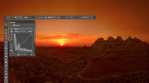
in. So I'd like to show you by the two adjustments that I use the most in Photoshopped. If I just generically open an image all the way in the photo shop hitting the open image button and camera, get it in here. I choose image adjustments. And look at this huge list of adjustments, I would say literally 80% of the time. I used two of these, and so I would like to concentrate our time on those two adjustments because I find they can replace the vast majority of what's in here. So what Adobe tries to do with this is they try to give you some choices that are overly simplistic. So if you're new to photo shop, you won't be intimidated by you have just two sliders or one slaughter, make it easy. And then they try to give you things that are more sophisticated that are like professional level tools. But you're not gonna learn them just by popping in there and playing around, you're gonna have to have somebody introduce you to it. Yeah, and I'm gonna go for some of those there. You need some ...
introduction to it because I think it's literally the most powerful adjustments that are there, And I think if you get a friendly introduction to it, it's not that hard. And it's only if you're trying to figure out on your own that it's really difficult to deal with. So let's see how I think about this. If I can sneak up here, camera people are going, Oh man, what's he doing? So in our list of adjustments, the top adjustment is brightness and contrast. I'll just put up here be dash C for brightness and contrast, and then that one's running out. Then we have levels, and then we have curves. So its brightness and contrast levels in curves. The top three adjustments. This up here is simple, in extremely limited in what it could do. This down here is extremely powerful, the most powerful adjustment in all of photo shops right there, but not easy to learn on your own. Now I say on your own, that means you playing in there without somebody telling you how to do it doesn't mean it's gonna be hard for you to learn. I'll teach you. But curves could do everything that levels could do in a lot more levels could do everything that brightness and contrast can do and a lot more so if you know how to use this. You don't need these things. Uh huh. And curves is what's being used behind the scenes by a lot of the other adjustments. Just looking at the menu. If you see, uh, Post arises using it, invert is using it. Threshold is using it. Uh, the color balance is using it. Uh, meaning anything I could do in those adjustments can be done with curves. So if you get used to curves, you don't in general need a lot of those other adjustments. It's not that they're not useful. It's just that if you're going to spend a limited amount of time learning and you want to get the highest quality and have the most versatility with what you're doing, this is where I'd spend your time. Okay. A lot of people, though, that use curves. Use it generically, and when you talk to them about it, they'll just give you tips. They'll you'll hear. A common tip is making s curve. Hey, and an s curve would be here. Curves. Looks like this. It's a rectangle square with a diagonal line in it and they will tell you to make it look like I didn't drive her a good one. But an s and that will be their tip in little booster contrast, you're like, cool. You don't need to make an s curve. Making a NASCAR is exactly the same is going to brightness and contrast in boosting your contrast. If you ever hear anybody saying making ask curve and they make it perfectly centered in the middle and they're doing it, they should be up here would be much easier to dio. I find that a lot of people that use curves use it on such a basic level that they're not taken advantage of it. They're making their work for more difficult by using a sophisticated tool to do such basic things that they should be in brightness and contrast there. Just embarrassed to be there because there's it looks cooler to do it curves client might be looking or something, but I want to show you how to use this where it becomes dramatically more powerful than brightness and contrast her levels and makes it so. It's the tool on the I use curves on, I'd say 90% of the images that I open all the way to the photo shop. If I can't fix it in camera, it's probably gonna be hitting curves at some point. But also, I will tell you that with curves, it's rare that I'm applying a curve to the entire picture. So when we first talk about curves, you'll see me working on images where the end result doesn't necessarily look awesome. And that's because I'm letting it apply to the whole picture. After we're done talking about curves, I'll show you how I isolate small areas so that that particular change would only happen in one spot of the image you know, kind of thing, and that's when it becomes really powerful. And you just got to be patient with me to get to the point where we're talked about that stuff. Yep, curves can do everything that levels of brightness and contrast can do. Um, I'm just I don't understand the specific differences between levels and curves. That's all right. Uh, I mean, just generically, let's take a quick glance at them. So first, brightness and contrast has two sliders. If your images too bright. You move it down and they just too dark with the other way. But I don't have any control whatsoever, So if it's the sidewalk is too dark. But the bicycle is not. I can't do anything about it in here. It's not gonna just one sliders generic. Um, if there's too much contrast, I could lower contrast here or increase it, but I have no control over it whatsoever. I can't say there's too much contrast in the sidewalk and I need more thought. More contrast in the bicycle, there's only one slaughter. Can't do it right. If I come in here to levels levels, we got more sliders, five of them in there. If you just want to know what levels does this slider here forces areas to solid white. It's like the white slider in camera. I can force more and more areas toe white. You know, brighter part of the image will get brighter and brighter. This is similar to the black slider in camera. It's going to force more and more areas to solid black. I just can't move in the opposite direction because I can't get back shadow or highlight detail after I've left camera. The middle slider is an overall brightness slider, so you can brighten the image or dark in the image. It would be somewhat similar to the exposure slider in camera down here. This means take things that are already white in darkened them to whatever the slider points to. So what used to be widened? Your picture would now become that shade. This slider takes things that are already black in your picture and says, Don't have a black become instead the shade of gray This points at Make it that right instead. But notice that when I do every single one of these sliders in here affects the entire picture. There's no way for me to isolate an area without making a selection or something else. Every one of them infect the whole image curbs. On the other hand, I can isolate things based on brightness, so without showing you how curves works yet, um, I'm just gonna go in here and isolate the bike to say, Don't frighten me. Nice, late, tired. They don't frighten me. I'll go over here to the sidewalk and I'll say darkened me. I can adjust that sidewalk separate from the bike if they're different in Bryce brightness. If I know how to deal with this shape and how to do things, I want to teach you that and show you how you think about it in general. Then show you how to apply it to small, isolated areas of your image. So you'll have really the most control that you can get with it. Man, it'll just take me a little while to Teoh get to that point. So we're just gonna work on random images here, do random things to them, knowing that none of these will probably look amazing when I'm done because I'm gonna need to learn more about how to work in isolated areas of the picture. And then we'll see. So here, this, I think, needs some contrast. Can you see any detail, that statue? So if I come up here and go to curves, the general idea in curves is that this bar at the bottom shows you all the brightness levels you could possibly have in your picture. So there's solid white on the far right, solid black on the far left, and all the shades gray in between. There's a diagonal line in here, and that diagonal line tells you how much light is needed to create those shades of gray. So to make white, you go straight up from it. The diagonal lines all the way to the top because you need to use as much light as you possibly could to make white above black. It's all the way to the bottom, because to make black, you don't need any light at all, right to make this shade that's right in here. Just go straight up from it, and you need that much like whatever is directly above it on that diagonal line is telling you how much light would be used there. Then I can click anywhere in this line and push it up or push it down. And if I do, it's just like having a dimmer switch on the wall. If you go to your kitchen and there's a dimmer switch there, if you push it up, you add light, right? Everything gets brighter. If you push it down, you take away light and everything is darker. It's exactly the same and curves so this is like having a bank of dimmer switches. Imagine you had 10 dimmer switches sitting next to each other, and that the dimmer switches would be where the bank of dimmer switches on the far Ryan. Your dimmer switch would be all the way to the top. Whatever dimmer that ISS on the far left of your dimmer switches, it would be all the way to the bottom. The middle one would be halfway up, and they just be kind of in a little configuration like that. To start with, the top one controls the brightest part of your picture. Is it too bright? If so, bring it down. The bottom one controls the dark party, your picture too dark? If so, bring up that dimmer switch. It's just like having a bank of dimmers. So let's see what we can do in this particular image. If you look at what we have, it's really dark, and you can actually see it in the history. Graham. That bar chart the bar chart. All it's doing is telling you if you have these particular shades in your picture, right, just like in in camera raw. And so this really tall spike here is saying you have a lot of stuff that's this brightness range. I'm guessing that's the statue guy also have a really tall area over here, which says we also have a lot of stuff that's in this brightness range. That's probably our sky, the sky various more because see how wide this is. It varies from being really bright to be in medium dark. That's a wide That part is this part here, though real skinny, and that means that that stuff doesn't very much in brightness. It's only in that little range right there. You don't have to really understand that, hissed a gram. Just it's nice to one day understand it where it's useful. So all I'm going to do is come in here and I'm going to click right here. This is near the darkest part of the statue because as you go left to get darker and darker and darker right and you see the really tall spike, it's near the left edge of it. Then I'm going to click again on the opposite edge of that spike. That would be the brightest part of the statue or close to it. The actual brightest part is over here a little bit in the ad Adat for that, I'd have to go straight up from that where the curve is and more like here. We're close enough. Now, if I want to get more out of the statue, all I'm going to do is take the dimmer switch, which is the dot I just added here for the bright part of the statue, and I'm gonna drag it straight up. The lights were pretty dark in there, so I gotta turn the dimmer switch up way up before you can see it. But you start to see detail in there. Good luck getting that detail with any other adjustment. Because if you take the slider called contrast, which is what we're doing here is adding contrast with this kind of an image. It would have darkened that statue instead because it wouldn't know how to figure out what part of the brightness range within the image to effect. Now I happen to use the bar chart to tell me where the statue us. But you might not be at the stage where you think about history, rams in your head and can associate what's in it to what your picture looks like. Least I wouldn't I didn't. When I was, I hadn't been using photo shop for 20 years or something. So there's another method you can use. There's a little hand icon near the bottom left, and if you click on that, it means that if I move my mouse on top of my picture, do something related to curves. And if I click on my picture, do something related to curves. So I'm going to move my mouse on top of my picture. Now, do you see a circle show up in curves? You see that circle right up there? Little little do that up there, that showing me how much light is in the area. My mouse is over. So if I want to see what part of the curve would affect something within my picture, all I do is move my mouse on it. It tells me that part of the curve where the circle is would affect the part where my mouse is. So if I want to see what part would affect the entirety of the statue because it varies and how bright it is, I'll just drag across it like this, trying not to the sky, and you see where that circles jumping around, it's saying, adjust that part of the curve, huh? So what happens with the curve is this. The curve starts out as a diagonal line. You either collect directly on the curve, or you can click on your picture, and it allowed a dot to your curve. That not is exactly like a dimmer switch on your wall. If you move that not up, you're gonna brighten your image. If you move the dot down, you're gonna dark in your image and just like a dimmer switch. If you move it a small amount, you make a small change. If you need a huge change moving a huge amount, but you're always gonna move it straight up or straight down. If instead you move it side to side. That would be like walking up to a bank of dimmer switches, grabbing the middle one and then sliding your hand over to a different one before you're done. It's like Why didn't you just grab for the one you needed to begin with? So imagine you had a banker. Dimmer switches. Here's your These are little slots where the dimmer switches go on and you're dimmers started out like this. They look look like that and you grab for this one and you thought about moving it. But you moved your slit your hand over here before you were done. And it's like, Well, that doesn't make any sense at all. Why wouldn't you just grab the one you really wanted to adjust to begin with and moving? So when I click on a dot, if you ever see me moving horizontally, I'm doing it by accident, Okay, because it's like a bank of dimmer switches. Why would you grab for the one you didn't want to adjust to begin with? You wanna grab it, move it straight up or down. Now, there are some people that move it diagonally for other purposes. But in general, when you're trying to understand it, move straight up or down. And if you ever see me move horizontally, it's just me using a mouse and not being able toe be perfectly straight. I don't have a ruler for my hand, huh? So then you click on your picture and you see a circle show up on curves and all that circle is doing. Is that the bottom of curves? is a bar on the left side of the bar. It's black and it gets lighters against towards the end with white on the other side. It all it's doing is looking at your picture and saying, What brightness level are you clicking on within your picture? And it's finding it down here, finding it, say he's clicking right there on that within a picture, and then it's going straight up insane. That's where they're dimmer switches for that particular shade. It's you're saying this is how much light is currently in there. This is what it was when we started, and now the height of this determines how bright it is. This is looking more complicated than it needs to be or is. Let's get into adjusting. Let's see Awaken dio. All right, so with this thing, if I wanted to adjust just the statue, what I would do is click in the little hand icon at the bottom occurs. That's how it's gonna start thinking about your image. When you mouse over it. I'm gonna drag across the statue like this, and I'm gonna try not to bump over and hit the sky at all as I'm doing that I glancing curves and you see the range of that circle is going between. You see it? I'm Whoops. I bumped in the sky there for a second. Um, I'm gonna add a dot at both ends of where that circle passes over. Okay, so I'm gonna add one right about here one right about there. I'm guessing that's where it passed over. It's hard for me to see both things at the same time in the lower dot represents the darkest part of your statue because think about a dimmer switch if you had to. Dimmer switches, one of his lower than the other, the lower ones probably talking about the darker part of your room because it's turned down so I could grab either one of these or both of them. They move him up or down. What I usually like to do if I want to add contrast and bring out detail is I'll just look at that object and say, Do I need to bright never to darken it In glancing at this, it's pretty obvious I need to brighten. If that's the case, I grabbed the upper dot and move it up higher. If it needs to be brightened. I grabbed the upper dot and move it higher. If on the other case, if it needs to be darker when I glance at it, then I will grab the lower dot and move it lower. But don't put that in your head the way I said it. Just think about dimmer switches. What would be the darker part of the picture? It be the dimmer switch that's lower. Wouldn't that part that has less light? What would be the part? That would be the brighter part of the picture. It would be the higher one, because that's where you'd have more light. So if I want to brighten it up, what happens is the steeper it gets between these two, the easier it is to see detail. And so I want to leave one of them down there where it started out and just move that up. But any time you make it steeper, you're adding contrast and it's gonna be easier to see detail. So here I'll turn preview off before see the detail in the statue after seeing the detail of statute. But look what's happening in my sky. What if I don't want my sky to go white. Well, move your mouse on top of the sky, moving back and forth and see where is it represented in your curve. You see what that circle going? That's the part of the curve. You would need to adjust in order to affect your sky. So why not add a dot there somewhere near where it waas? And if it's dimmer switch? How would you dark in your sky put you down? Now there is something going on here that's gonna cause my sky to have odd colors in it. It's something we'll talk about in a little bit. But you see how this is more yellowish orange, a little more blue here. There's a very simple thing going on in my curve. We just haven't discussed it yet. I have to do this and now you see, it's all blue, but we gotta talk more about that in a little bit. But the main thing is, you can click on different brightness ranges in your picture. You can add a dot and pull up or down. Up means Brighton Down means dark. Let's work with some other images, just the vertical. I e somewhat. If you're making your change by clicking on the curve itself in dragging the dots straight up or down, there's not something that I can think of that would limit you from just moving up and down. But watch this. If you click the hand icon, you move your mouse on top of your picture. And let's say this is a church in Iceland. By the way, let's say I want the dark part of my image to remain dark because otherwise it cannot have a foundation kind of its look almost foggy if you lighten it up too much. So I'm gonna go to a really dark area in here and I'm just gonna click. That added a dot and I'm not gonna move that. Not so, in essence, Was that so doing? Is it saying, locking the brightness of this area so I can't mess it up with whatever else I due to the picture As long as I never move that not. Then I'm gonna go to a brighter part of the church and here where I can see a little detail, I'm gonna click and I'll check this out. I'm just gonna be right on top of my picture, I'm gonna drag straight up or drag straight down and going side to side won't do anything. So if you're click and drag on your picture, then you can move straight up or straight down without messing up by going sideways. So that's one way that could be nice. So I'm gonna bring this up and see how much I could get out of that thing. I'll turn preview off to show you before and after. See how much easier it is to see the detail in the church any time you make something steeper, and curves would be much easier to see detail. But look at the sky sky messed up, so I don't move on top of the sky and do you see where it is? On the curve, You see the circle. I'm not surprised that it's white, cause where's my dimmer switch since high as it can go right there. So I want to click there and just drag straight down to say dark in that stuff up and I can darken up my sky. Try doing that levels or brightness and contrast or any other adjustment other than I can think of one which would be shadow highlight could possibly isolated but you won't have this kind of control. But then let's figure out a few things that we want to avoid because it's those things that can really mess you up. And those are the things where if you try to learn curves on your own and you run into these two things you'll give up, it's why I'm a lot of people have given up on curves, so I'm gonna go into curves, command em on a Mac, control him, and Windows would bring up curbs because command sees already assigned a copy so they'd use something else. Command them, Um, and what I'm gonna dio is I'm gonna make the curve go flat to begin with. All right? So here I clicked on the dark area within the church in one of the little windows looks real dark. Then I'm gonna click on a bright area, the church and I'm gonna move that to the same height, the two dots the same height. So it flattens out between them and actually might need to extend it out a little bit further because I don't know that I precisely clicked on that window. But if you ever make the curve go flat, you're gonna have no detail. What's happening is you're getting the exact same brightness level in more than one area where it used to vary. So if you think about your curve, the curve starts out like this. And that means that every area on the curve has a different brightness level. Because if you pick this area and compared to any other part of the curve, it's going to be at a different height on it. Which means the higher it gets, the more light there is in it, and therefore the brighter it is if you adjust to curve by adding a few dots and it ends up looking like this now in this area right here where it's flat, you now have the same brightness level across the whole area, so you can't see the detail. Imagine you have wood grain and one dot here was for the dark part of the wood grain one dot here was for the bright part of the wood grain used to vary in how bright that waas, so the the grain itself was darker than the base color of the wood. But then you move the two dots to the same height, and now the grain that's in the wood is the exact same. Brightness is the base color of the wood, so you can't see that detail. Does that make any sense as far as are you thinking about? So if you ever make it flat, there'll be no detail somewhere where Well, if you looked at the little Barth bottom with black, it left white light. It's whatever. Straight down from that, this general region right here, wherever you have that brightness range in your picture, will be no detail whatsoever. So that's something that I don't often need to do. Unless I had that statue. I've had some where it had actually some nude pictures they need to hide detail in because I could only show for my couldn't show detail. And so there are some spots I didn't want to see any detail. I clicked across him, made a flat. You couldn't see a thing. I was like Fine. Now I can show a picture, you know, that kind of thing. So it's rare, though, for me to need to do that So that's one thing that I usually try to avoid Win working with curves, letting part of it flattened out. And then the other thing that I usually try to avoid show you I'll just make the entire curve do it is check this out. Um, what I'm gonna do is I'm gonna take part of the curve that's really high and make it really low. Now we've turned off all the dimmer switches, so it's all black. Then I'll taken area that used to be really low, and I'll make it really high way Just inverted the picture made it a negative of itself. So things that used to be bright became dark. Things that used to be dark became bright. Any time you let the curve go downhill, if you're going from left to right, you're gonna get weird stuff, especially in a color picture. It's gonna look posterized. It's gonna look soul arised. It's gonna have the opposite colors than what you expect. It's gonna have some really weird stuff, so that means on my curves. If I ever have a curve and it ends up doing this, just think about going from left to right going from left to right. It should always be going in this direction uphill. All right, if it ever doesn't go from left to right going uphill the whole time. So if you ever get here where it's going downhill, I can guarantee you your picture looks weird. And that happened to me when you saw the upper left of the sky. I think it was this photo turned kind of orange ish. Another part of the sky was blue. If you saw that, well, I let part of my curve do that same thing. I think it actually happened on the the, uh, statue image. But the reason it happened is that that inverts your picture, but it's only inverting a small portion of it. It makes the colors reverse. It makes the brightness reverse. It does a lot of weird stuff. So what I end up doing? When I had a curve that had this is I added an extra dot somewhere which caused the curve to just kind of do that, and it made it so it didn't go downhill anywhere, and so it didn't have anything weird. So let's try that image again. And let's see how he would have fixed it. And let's see if we run into it on other images and what we have to do about it. So here we go. I'm in a type command M for curves. I'm gonna click on the little hand and I want detail in my my sculpture. So I'm gonna drag across it to see where it is on my curve. I'm just looking at where the circle runs. I add a dot on both ends. The lower part will be the darker part. In the upper part will be the brighter part because dimmer switches lower is darker, less light right then to bring out detail. I want to brighten the bright stuff, but I want to leave the dark stuff what it is now. Otherwise it's gonna not have. Let's just do it once without that other dot Okay? I have, ah, nice bright sculpture, but it has no dark parts to it. If I went into the dark part afterwards, like right here, my mouse, I think it's in the dark area. Or go under here. It's dark. Just bring that back down. You see how it's getting more of a foundation where it gives you much better contrast. So any time I want a detail out of something. I had two dots click and drag across an area at it on the highest point it went to in the lowest point it went to If I want a Brighton, I grabbed the upper dot and move it up. If I want a darkened I grabbed lower dot moving down, but I did that. I might not want to go to that quite that extreme in Brighton. In here is the picture looks kind of odd, but okay, then I said, What about my sky? So I moved. My mouth's on top of my sky, Do you see? The Circle Circle tells you where the dimmer switches for the sky and it's maxed out. So that's why I have a white sky. I click and I bring it down. And now do you see the weird color? In fact, I'll bring it down. Let's see about there. Well, that's because if you go from left to right, you see part of my curve. First off, part of my curve has no detail. See that part? No detail in this part is gonna be weird stuff. And I can guarantee if I click over here or drag over here, that part that looks weird is gonna be in the downhill part. Uh, so what do I do about it? Well, I say this is what I was trying to adjust. That's what my two dots were doing. This is the other thing. How can I fix what's in between? So I might just add a dot in between here, just mess with it, pull it around different ways like that. Now at least, we only have. We only have flat flats much better than downhill. Flat just means no detail. Downhill means weird stuff, and you know they're likes going uphill a little bit as it's going there. Somehow, I added dot moving around until I don't have that problem anymore. I still think this image looks weird because we've done such an extreme adjustment to it. Usually my adjustments aren't that extreme. Let's go to the other one. So in this one command M curves click on the hand. I click on a dark area within the church because if I don't, if I just click on the church and say brighten it I actually didn't look too bad here. That tells me the darkest area, the church's most likely black because that means it's being held down already by this little end dot If it wasn't, it would have looked like this. You see how it looks kind of dull in the dark areas, but usually I'll find a dark area. Click on it to just lock in its brightness. If I bring this area down, won't let me here. I have to do it here. So anyway, usually, here's what I do. Uh, it's something needs to be brighten. Click on a dark part, if you can see it. I can't tell from in there. Then click on a bright part, dragged the bright part up. You pull out detail in just that area. If I wanted to not just think about those two areas instead. Wanted to think about the building as a whole. I would have dragged across the entire building like that to see where its range waas this messed up. So click on it. Bring it down, down down. There we go, getting some oddities in here where it looks like I'm getting a little less detail in the clouds and maybe a little color shift. And that's because Do you see this part that's flattening out? If that's not part, I was purposely adjusting. If I didn't do that on purpose, then I just had a dot somewhere in here and see if I could move it around to somehow get it. So it's a little bit more like the original line, which means going uphill as it goes across. If you really messed up, want to start over? You don't have to click, cancel and come back in. Watch what happens to the cancel button. When I hold down the option key, it's saying, Just reset. That's all. Tom Windows. You could be sent. Just start over. So just sit here and go across your building. Where is it? OK, it's that whole big thing. Had a dot for the dark part. Brighten up the bright part. Cool, then goto what you didn't like. Bring it back and if anything messes up, try to add an extra dot somewhere kind of fix it. Turn preview off. Here's before it was after. If you see the keyboard shortcuts down here, what I'm typing when I'm done with an image is command. W means close the window that I have open, and then it comes up. Since I've made a change to the image and it says, Do you want to save it? Or would you like to instead canceled the saving of it? Don't save. And if I just press the first letter of any one of those buttons, whatever the wording is on it, it's the same is hitting the But so I hit the letter D for Don't save because I want to use these images again, maybe later on today without those changes. So let's see here. Remember, I usually apply curves toe isolated areas within the picture. I just want to let you know what it looks like. A whole image first. Then we'll start doing it on more isolated areas. So let's try it again. Command them, click on the hand. I want there to be a greater difference between the non painted part of the stairs in the painted part, so I will click on the painted part so I can control it. Just added a dimmer switch. For that, I'll click on the dark part so I can control it, and then I have to look at this and decide if I want a greater difference between that. Do I want the bright part to get brighter? We're doing with the dark part to get darker stuff to me. In this case, I'm gonna say bright part brighter so I could come in there and grab the higher dot higher dot means brighter. Just push it straight up. Darker part is not changing because I have a dot in there holding it in place. Otherwise it would get brighter along with the rest. If I turn preview off, do you see the greater difference between the painted and unpainted parts of the stairs? If I could apply that in isolated way where it didn't effect up here, where the guy is, that might not look bad at a little in there, Let's try to do it to other places. I'll reset this over here. There's some like drawing and stuff on the wall. I want to exaggerate it so I could zoom up on this. There's a couple different ways of zooming up. I'm just out of habit, used to one, which is when I'm in the middle of doing an adjustment where most anything else I can hold on the command key in the space bar. And if I do, when I click, I zoom in. It's a shortcut I'm used to. It's not one that I know, I know. I don't know if I would remember other than it's been in there for so many decades that have gotten used to over time. But it's a short for temporarily giving you the zoom tool. So I'm gonna grab that hand and I'm going to say, Why don't we keep this white the same brightness it is currently, So click on that, lock it in. Then let's click on some of the drawing that's there may be the lighter part of the drawing, cause that's really what needs to be darkened and see if I can get another dot in there. Yep, and then I'm gonna drag it straight down. This is Ah, image that at one point was saved is a J. Peguy concedes J peg here, and I can tell by glancing at it. If I look closely at these areas, it has what I call popcorn, which is this kind of weird, randomly shaped junk that looks like popcorn thrown into the image around the edges, ever everything. Those air J peg compression artifacts. And this is why I don't use J. Peg is a working file format final file format to give you a friend or something. Turn in for a project may be fine, but if I'm gonna open that image and ever work on it again, I don't say that as a J pic. Ah, so that's why in here there's some really nasty looking artifacts coming in, but you see how much more of that text really comes out. So if that text, maybe that was not in this instance, but maybe this was some cave paintings, you know, where they just draw a little analyst. But it was so faded that you could hardly see it unless the light was just right. Seen that kind of stuff where it's so faded you can partly in curves at a dock for the surrounding, just so you don't change it and then added out for the cave painting direct strength straight down. Boom! It'll come right out. And then if I was able to paint that so it only affected that area did not affect the boy that's there might be useful depends on what I'm looking to do in that image. I could instead come in here and try to pull out the texture in the stucco, click and drag across it Highest. Lowest points make its deeper between the two. You'd be able to see it here. It looked terrible. Look, this was a J peg and you'd start seeing the compression artifacts being exaggerated as well. Ah, this picture here was taken in Burma. There is an area in Burma called I might pronounce It a little bit off, but things began and in a 16 square mile area, if I remember correctly, there are 2200 temples. It's mind blowing, and this is just one tiny area. So this is a temple that's a temple. That's the temple. That's the temple. That's one. This is the top of one. That's another one. And if you look to your right, you would see twice as many more sitting right there. It's it's somewhat crazy. Um, I want to see more detail in these guys, so curbs grab a little hand. If you could easily see where it's dark and light. You don't have to drag across the whole thing. Just find a dark area, click on it, lock it in, then find a bright area, Click on it and drag up. You're going to see more detail. In this case, though, I think it would be useful to have some areas darker on. Actually, it didn't add two dots. That's why I didn't look right. The brightness difference was not great enough for two Separate it. So try bride or dark area, right? Or do you see how close that circle is to the dock that's already there? If it's really, really close, it'll just move that dot I gotta get far enough away. Do you see how I'm getting it, where you can see the detail more easily? Here's a little trick if I want to not only get the detail like that, but now I want to change the brightness. Overall, you can hold the shift key and click on the other dot See em both. Now you can move them both, so the difference in their height is how much contrast you have, then moving them to gather up and down means brighten or darken both like taking to dimmer switches, moving both same amount. So now I can say, Well, overall, I want that darker, overall brighter. You see, that's easier to pop out the detail, but usually this is more after I'm done with camera raw and I have gotten the images a whole look. OK, and now I want O pop into different areas and get that detail out. Cake popping curves. This image was taken in Iceland, and it's too dark in most areas, so I grabbed a little hand tool. I say, Where is it? Too dark? I click on it and I drag upto bring up the dimmer switch. Okay, After doing so, some areas have gotten too bright sky. So I click on this guy, see if I can find apartment, bring it back down or sometimes I don't just click on the sky. What I do is I've already cooked in the building. I dragged up to get it brighter. Then I just look at the curve and I say, OK, this is what I did right here. My dot what's happening to the rest and the rest of it's just getting a lot higher. And sometimes I just randomly out of dot here and try to get the shape of the curve to look a little bit more like the original. The original was Diagonal and Aiken mellow out the rest. I want more detail in here. I need that part to be steeper. So curves is not all that exciting all by itself. When you just see it applied like this because the images air not ending up being perfect, you're like, Yeah, but look at parts very screwed up over there or whatever you know, So it's not always great, But when you learn how to apply toe isolated areas, then it becomes overly useful. Tohave These can't add two dots close enough, but easier to see wood grain get it flat and more difficult to see what great
Class Materials
bonus material with purchase
Ratings and Reviews
Jim Pater
I taught Photoshop (version 5) to graphic design students at the college level. I had great fun teaching. This is the perfect course to show others how they might go about teaching a Photoshop course. Congratulations Ben, on your excellent teaching style and methods. I thought I already knew quite a bit about Photoshop but this course made me aware that there's always more that you can learn.