Lessons
Day 1
1Free Preview: Camera RAW: Exposure & Contrast
42:43 2Camera RAW Q&A
20:25 3Camera RAW: Color
23:03 4Understanding Histograms
07:57 5Camera RAW: Localized Changes
35:36 6Understanding Saturation Clipping
09:42 7Camera RAW: Noise Reduction & Lens Correction
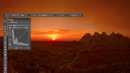
16:34Curves
44:44 9Curves Q&A
20:46 10Keyboard Shortcuts & Adjustment Layers
24:41 11Review of Curves & Adjustment Layers
16:13 12Hue/Saturation
19:08 13Day 1 Q&A
14:27 14Day 1 Wrap-Up
03:40Day 2
15Day 2 Pre-Show Banter
13:26 16Review of Day 1 Process
38:53 17HDR
33:41 18Advanced Layer and Masking Techniques
29:29 19Using Curves with Color
39:42 20Color Correction
35:04 21Color Correction Q&A
14:30 22Example Photos with Curves and Adjustments
25:09 23BONUS: Printing Tips
03:42 24Retouching
23:27 25Advanced Retouching
19:49 26Directing the Viewer's Eye
16:43 27Day 2 Wrap-Up
01:12Day 3
28Day 3 Pre-Show Banter
10:52 29Fixing Lens Flare
14:36 30Hiding Clouds
15:47 31Color, Hue, and Saturation
08:21 32Essential Keyboard Shortcuts
13:18 33Technical Issues
15:00 34Preparing Images for the Web
18:36 35Exposure Bracketing and Photo Stacking
15:52 36Blending Modes
35:07 37Review and Q&A
05:05 38File Formats
21:12 39Brush Tools
14:34 40Transplanting Clouds
20:39 41Selective Focus
18:00 42Converting to B&W
20:03 43Color Spaces
22:03 44Thanks + Credits
03:56 45Fixing Extreme Problems
20:33 46Sharpening Images
23:41 47Day 3 Wrap-Up
04:59Lesson Info
Day 1 Q&A
So anyway, I thought we would, uh, Segway into some questions. Eso make sure we get those done before the end of the day. Got any from the Interwebs? Let's see. From in here were weight. Everyone's brains are full and fried way. This will take a little practice on this part here before you get the hang of it. But it's it's great when you do, we can ask questions and you guys can think about questions. You want to ask if you'd like. Okay, um, this we're gonna go back Not just what we just covered, but kind of do everyone a day Q and A. That's OK with you, All right, Trish to 97 said. I was told if you use adjustments from the top bar and not below the layers panel, they are destructive. Is that true? Say that again. Okay, I was told if he used adjustments from the top bar and not below the Layers panel, they are destructive. Is that true? Well, what I would say is going to the image menu and choosing adjustments. If that's what you mean by the top bar, then you could call them destructi...
ve. Destructive isn't it isn't the best word for it. You could say they're not easily undoable, because if you make in your entire picture black, you destroyed the detail there regardless of how you did it, you know, so that's kind of destructive. Some people use different terms for that. But if you go to the image menu and choose adjustments to get to your adjustment, what you're doing is more or less permanent in some people will call it destructive If, on the other hand, you go to the bottom of the layers panel to get to your adjustment, layer that half black and half white circle or you go to the the panel. Call adjustments way out. All the icons, those aren't destructive. You could say they're not permanent. You can always undo him or turn him off or anything like that. That's my preferred way of working. I don't understand exactly the question, but hopefully that somewhat answers. I think it did. Thank you and R. H. A is asking about the colorized option, you saturation and just asking about it. Okay, The colorize option would be good if I had a black and white photograph, which I will have here in a moment. All right, if I have a black and white picture, then I want to add color to it. The first thing I would need to do would be to go to the image menu to choose mode and get outta grayscale mode because you can't have color when you're in Great Scout. And then next I would go Here's RGB When I'm in RGB mode, I can have color. I would then possibly select an area. Imagine I was more precise than this, but I'm using a mouse, not a graphics tablet, so I will be Messi with it. I'll go then to the bottom of my layers palette and create a hue and saturation adjustment layer. And the hue slaughter won't do anything because the hue slaughter can Onley change the basic color, something that already has color. The saturation slaughter won't do anything at all because it doesn't know what color should be in there. There's no color data in the file yet, so I can't do anything. The lightness slaughter. Sure it could brighten taken darken, but way need to have some color in there to begin with. So I turn on the colorized check box. It will force color into the image will start with red, and then I can move the hue slider to determine what color is being put in and there and then I can control how colorful with a saturation slider. Oftentimes, it's easier to pick the general color if you have saturation turned up to begin with, you get close to right and then bring your saturation down. Andi. I wouldn't touch lightness, but that's one method you can use for colorizing picture. I'll give you a super bonus tip. If you wanted to look at all natural, I mean it all do the following. After you add the color, go to the bottom of your layers panel, where you find the letters F X click on it. The top choices called blending options. It'll bring up this really complex dialog box. So what I did is I clicked on the letters FX at the bottom of my layers panel, and I chose the top choice on the menu, which was called blending options. That's what brought this up. Then we need to do is make sure that your color rising does not affect the shadows as much as it does the highlights, because if you look in a normal photograph, you look at the dark part of the picture. You'll find there's nowhere near as much. Color is in the bright part, but when you do colorize, it gets an equal amount everywhere. So what you need to do is take the part called this layer, and there's a slider on the left side. That slider is actually two sliders stuck together. You see little line separating the two halves. Two. Separate it. You have to hold down the option key. Told you. This is double special here and hold down the option key and just pull it out like that. When you separate those out, I can make it so This will not affect shadows as much. What this is doing is, it says, do not whatsoever. Affect things that are in this brightness range right here. Only apply to the things in this brightness range over here and then slowly fade out across this range here. So it's not an abrupt Indian of your colorizing. It's slowly fading into the dark stuff, so if you do enough of that, you can get it where I don't know the exact ones that have to play with it, where it's gonna look much more natural. I don't know if you'll be able to see it here. I'll turn preview off before after it might need a zoom up. Have to pick a slightly better color. But before look at how much color was in the shadowy part in here makes it look very unnatural after you get a lot less color in that shadowy part and it's gonna look much more realistic. So the colorized check box and human saturation is for adding color to things that didn't have it to begin with. Be careful, though, because if you add color to sell me didn't have it, it might not look natural, and you'll have to go to the letters FX. She's blending options and mess with this too Limit where the colors being at it. Alright, complex. Enough question. Okay, Next question from Les W Photo. When you're using the hand tool and hovering over something, is there a keystroke to anchor the dots in the range on the curves? Uh, just click. If you have the hand to on, you don't have a hold on anything, Just click. If you have an old version of photo shop in some versions, you have to hold on the command key and click toe added dot But if you're again, I think CS five or CS six, all you do is click. So if you hover over the image, you see a circle. If you click, you get a doctor. Keystroke would just be extra work. Okay, So I love my picks. Said when you were working on the yellow Jeep earlier since she said, I can use this on babies now I'm jumping up and down. I've been looking for this answer for over a year. Sunburn. It works great all that stuff. So that that is what she then her question is, if you have if you would have a lot of the same color hue situations like sunburns pink red baby skin, can you make an action? Um, I wouldn't quite do in action because the problem is, although you could do a if you did about six or seven actions, it might work. Everybody. Sunburn is different. Is different brightness some different shade in all that, So one action is not going to be able to isolate really precisely the sunburn. So she if it was a serious, like a photo shoot it? Yeah, it's a Siri's. Yeah, you wouldn't actually need an action. All you need to do is, uh let's say I had more than one image open here. Just open another one. I don't have a similar image, so I'm just gonna open anything. But all you would need to do is if you have one image that has been adjustment, you want to apply to others. Here's what you do. Check it out. I click on the name of that layer in with the name of the layer Click on. I drag to the tab for the other document. It should. Why is it not? Should usually come to the front. I don't know if they change something to see a six that I didn't realize. But before that would come to the front, then I could drag it on top of that document. Let go, and it would apply it to that other image. I'm not sure why it's not happening right now, so let me switch between these two. It might be that they're different color spaces or something else. But usually you can dragon adjustment or something else to the other layer. It will come to the front. You dragging on top of that image once it comes to the front. And it would apply because the destination documents on the sink. No, they're not. This is the destination. This is the source. If you think they're the same, we should have ended the day earlier. No. Anyway, I don't know why it's not. Let me go between right? Can you just use the right hook method, right? Click on your layer duplicate layer and choose the path of where you want it to go. I don't know. It's gonna let me what I could do. Yeah, is I could come down here, right? Click duplicate layer, is it not in there? Right click. I have the right click on the name. Did it somewhere else. If you choose Duke Late layer, There is a pop up menu here that says, What's your destination document? You can set it to the name of the other document. Click. OK, And if you get a warning, don't worry about it on, then that would have copied it over here for me. Great tip. There s Oh, yes, I could do that. And so you should be able Just drag it over. I'm not sure why it's working, but otherwise right, click on the layer, choose duplicate layer, and then choose the name of the other document here. You could do that as many times as you want to get it on other documents. And if all the images air similar, you could do an action that Okay? Did you come? Any questions? You guys are good. Okay. Birth Express would like to know adjusting with curbs to recover areas and Photoshopped, will that create more noise in that area? Adjusted? Uh, it doesn't create noise, but it can reveal noise that was already there. Just makes it easier to see. Just like if I pull out detail in the table that I'm sitting at right here. If I look at the table, I could barely see wood grain in here, But there is some in curves. I could make it steeper for this and I would be able to see that would grant if I do the same thing to a dark part of an image. I'm making it easier to see the noise that was already there. But it didn't introduce the noise. It just revealed what was already there. Yeah, so we're we're getting close to the end of today. I'm just wondering if there is kind of one thing that you think people should take away from today. Sorry, I snuck into one thing they should take away from day. What is the the basic thing that you use the most? I mean, there's so many things today. Well, the things were instead of trying to learn absolutely everything I would think about trying to figure out what the most important things are in concentrate on those and ignore the three other stuff. And that's what I'm trying to do in this class. And that's why in general we didn't use brightness and contrast in anything. We didn't use levels on anything. We didn't use a lot of stuff. Instead, I just distill it down to what I think is the most important. The problem is, if you're not an advanced user and Photoshopped, you probably don't know what those things are. So instead, Photoshopped could just be an overwhelming collection of stuff and it's hard to figure out what to go to. And so that's why I'm narrowing it down to You were using curves and human saturation and we're using Kameron things where it's what I use on, you know, 100% of the images I open and yeah, I mean, the dimmer switch alone and the inverted line to me. Gold golden. OK, so then what are we gonna be doing tomorrow? Tomorrow? We're gonna dio some retouching tomorrow and I'll show you how to deal with things like getting rid of telephone poles, telephone lines. Even if your telephone line goes right through a tree and you need get rid of it, how do you deal with that? Ah, show How did to, you know, really complex to really simple retouching? Then I'll talk about how to use what we've already talked about to try to influence where somebody looks in your photo because I found that when I show photos to other people and I see where they're looking at, what they're talking about oftentimes is completely different than what I really thought they would look at. And so I had to come up with ways to influence where they looked within my image so I could get him to look where I wanted him to. And so that has to do with selectively Brighton and darkening your pictures. Maybe not sharpening the entire picture, but doing that selectively in the same thing with color adjustments. Because you're I can't help look at vivid colors. So you better make sure that there's not an area that is a distraction that's colorful. And so we'll think about all those and then continue on, maybe start doing some talking about technical junk. You don't really want to know what you have to that kind of stuff. Great. Well, I'm so impressed with your teaching style I'm so impressed with today, and it's just been amazing. I'm really looking forward to the next two days. So I think you deserve a huge round of applause. Yeah,
Class Materials
bonus material with purchase
Ratings and Reviews
Jim Pater
I taught Photoshop (version 5) to graphic design students at the college level. I had great fun teaching. This is the perfect course to show others how they might go about teaching a Photoshop course. Congratulations Ben, on your excellent teaching style and methods. I thought I already knew quite a bit about Photoshop but this course made me aware that there's always more that you can learn.