Lessons
Day 1
1Free Preview: Camera RAW: Exposure & Contrast
42:43 2Camera RAW Q&A
20:25 3Camera RAW: Color
23:03 4Understanding Histograms
07:57 5Camera RAW: Localized Changes
35:36 6Understanding Saturation Clipping
09:42 7Camera RAW: Noise Reduction & Lens Correction
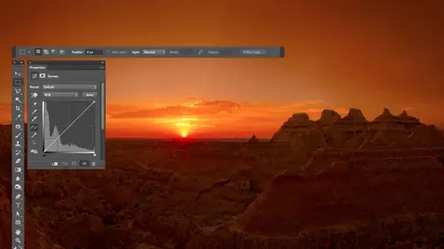
16:34Curves
44:44 9Curves Q&A
20:46 10Keyboard Shortcuts & Adjustment Layers
24:41 11Review of Curves & Adjustment Layers
16:13 12Hue/Saturation
19:08 13Day 1 Q&A
14:27 14Day 1 Wrap-Up
03:40Day 2
15Day 2 Pre-Show Banter
13:26 16Review of Day 1 Process
38:53 17HDR
33:41 18Advanced Layer and Masking Techniques
29:29 19Using Curves with Color
39:42 20Color Correction
35:04 21Color Correction Q&A
14:30 22Example Photos with Curves and Adjustments
25:09 23BONUS: Printing Tips
03:42 24Retouching
23:27 25Advanced Retouching
19:49 26Directing the Viewer's Eye
16:43 27Day 2 Wrap-Up
01:12Day 3
28Day 3 Pre-Show Banter
10:52 29Fixing Lens Flare
14:36 30Hiding Clouds
15:47 31Color, Hue, and Saturation
08:21 32Essential Keyboard Shortcuts
13:18 33Technical Issues
15:00 34Preparing Images for the Web
18:36 35Exposure Bracketing and Photo Stacking
15:52 36Blending Modes
35:07 37Review and Q&A
05:05 38File Formats
21:12 39Brush Tools
14:34 40Transplanting Clouds
20:39 41Selective Focus
18:00 42Converting to B&W
20:03 43Color Spaces
22:03 44Thanks + Credits
03:56 45Fixing Extreme Problems
20:33 46Sharpening Images
23:41 47Day 3 Wrap-Up
04:59Lesson Info
Directing the Viewer's Eye
Let's talk about directing the viewers I bit. So the first step in directing the viewer's eye is to pull weeds, get rid of the stuff that isn't gonna help. The second step is to try to influence where they look in a picture. And I find that your brain is attracted to color in is attracted to bright areas. And so I'm gonna try to make sure that color is being used to my advantage in that bright areas or contrast areas for being used to my advantage. So here's an image that I captured in the Glock Galapagos Islands, and it was pretty cool. There's all these short area with all these rocks and there were hundreds of iguanas. I mean, they were like, on top of each other. There were so many of them and these guys spit all the time. I guess they get salt water or something in them, and they need to get the salt out or something. Spit. I don't know. I'm probably wrong and why they do it, But something like that. So anyway, here I got a fish eye lens. I got down on my stomach and I got as clos...
e to him as it was practical, and I liked the way we had this circular area and then the fish I gave us the curve of the earth, plus his tail curving around it all went together. But I really find that when I look at the picture and when I show it to other people, sure, they look at the iguana that's there. But then there I jumps around and looks at everything else. I want you to be kind of pulled to the Wana and can't help kind of look at it. So there's one thing I've done ahead of time with this image, and that is, I've made a selection of the iguana that I saved in the file because that could take a little bit of time. And I don't want to waste our time right now doing that because we're not talking about selections were talking about What can I do to get somebody's idol? Look at that. So to get that selection, I'll go with select menu and choose load selection, and it's called the Dude. So I'll just click OK, and it will, uh, load it in for me. The first thing I'm thinking about doing is trying to use color to my advantage. What I'm gonna do is select inverse. That means give me the opposite. So I'm gonna have everything except for the iguana. And with that, I'm going to make an adjustment layer in that adjustment layer is going to be human saturation. Or I could use vibrance. Vibrance just gives you two sliders, vibrance and saturation, just like you have in camera. Either one of those would do it. And what I'm gonna do is make the area surrounding the iguana to be less colorful so I can come in here and bring down saturation of I want. And you notice him sticking out already is coming out a little bit compared the way used to be. If I turn off the eyeball here, there's just a little bit less blue competing directly above him. I might bring it further down. I'm gonna try to bring it the furthest down I could bring it before somebody would say you did something, you know, and so bring it down all the way and I'll slowly bring it up to say If I've never seen this shop before where I might be able to get away with it. And maybe for me around here, the only thing is that Sky is looking pretty mellow for a blue sky. So that's when I'll grab my brush toe. I'll paint with Black because black on an adjustment layer will remove the adjustment, and I'll just paint over the sky to say, Bring that back. So now, with just that adjustment, I'll turn it off and let's see the difference before a lot of color to compete after a little bit less above the iguana and surrounding it. But now let's try to get the iguana to stand out a little bit. I'm gonna load that selection again. The dude in this time I might go in, do another vibrance adjustment layer and do the opposite to the iguana. Make the iguana more colorful, so I might bring up vibrance a bit to see if I can get the colors in the iguana to kind of pop because your eyes attracted the color and that might help pull you to it. I want to adjust the exact same area again because this time I want to use curves and one trick you can use which I spoke about earlier but haven't used yet, is you can convert a mask into a selection. And you do that by holding down the command key in clicking on it. So right now, I'm holding down command on a Mac control on Windows, and I click on the mask in my layers panel. It'll load it. Then I'm gonna go to curves in in curves. I'm gonna make it so there's more contrast in the Iguana than what we currently have, so I'll click on a dark portion of the iguana to lock it in, just to make sure it doesn't brighten along with the rest. Then I'll go to a brighter portion of the iguana and I'm gonna drag up. As I drag up, we'll get more contrast and I'll drag up a Sfar, as I think I can get away with before somebody would go. Hey, wait a minute. You know, like that. Let's see what that's doing. I'll turn that curve off before and after. Is that popping more trying to make it so your attention is drawn to the iguana. Other things I can do is when I'm sharpening the image I can sharpen the iguana more so than the rest of the image, and therefore your eyes kind of drawn to it because it's drawn to areas that have contrast in sharpness. There's more interest going on there, so let's see what those three adjustments have done. Here's what the original image looked like. Turn off that little over lake. Cover up the picture. Okay, here's before where the blue surrounding the iguana I felt competed with. Here's after where I think the iguana jumps out a lot more from the background, but does that seem to help it all? So I'm making those kinds of adjustments constantly in my documents. And so let's look at a few examples of where I might have done that and see if it's influenced you guys at all. Let's take a look at this one in this image. The changes I made to it started off camera raw. So what I'm gonna do here is turn off any layers that I ended up with, and through some magical tricks, I'll be able to show you what I did in camera raw. This layer is what's known as a smart object. That means it has the raw file embedded in it, so I can double click on the bottom layer and it will open in the camera. The way you could do that is if you're in camera and you're about to open your picture. Usually there's a button that says open image, and if you hold down, I think it's the option key. It'll say Open object Instead, it will open in a special way. I mainly use it for teaching so I can always come back and see the settings I used. I'll bring this to default settings. Okay, here is my original. This is a temple that was all dried out. The wood was. I just really wish I could have soaked it down with water, cause it would have darkened it. But I wasn't able to do it. And with this I find that sure, these robes are a little bit more comfortable than comfortable, more colorful than the surround heats, but not by a lot. And the brightness doesn't vary a lot for the outside of this versus the heads. So let's look at the end result, though you see how I dark in the surroundings because I find your eyes drawn off into the brighter areas in a photograph. So if I darken up the rest of the photograph, if that would be practical in leave the areas where I want you guys to be looking to be nice and bright, then that will help direct your either. So the difference is the difference between this in that. And I did that using the adjustment brush in came a wrong. Bring down the exposure, or the brightness the shadows a little bit and paint around the area. Once I got it in the photo shop, I did some further adjustment. I dark in the top edge of the picture, just trying to get rid of the yellowish color that's there because I didn't want that color to compete with the rest of the image. And I darken the edges here so that you would stick in here where the detail is and not start investigating the edge that's there. And then I just dark in the very top edge of the picture a little bit. I don't like having detail on the edges of my pictures because then you might explore the edge and go look at some other picture next to it. I want you stay inside of it as long as I can get you to. Sometimes I also go for more of a stylistic treatment to things. And that's an example Here, here. I'm just gonna go through liquid into a slide show to show you what I did. This is an HDR image, and I ended up with kind of a stylistic end result. But I found when you look at the original my I would explore the broken glass. It's out here and the interior just as much. So I came in and first I darkened some things and made them less colorful in the dashboard. You see that? Because your eyes drawn to color I didn't want your eye drawn there so much. Then I made the glass actually tinted black and white because I find if I take out the variation and color you might have had before, your eye has less to explore. And so it might glance at the glass, but it'll quickly leave it and be pulled to where the color various more. Then I dark in a few areas that I didn't like because your eyes drawn to bright things I darken that up. I didn't want you exploring the area underneath the seat that was in there. We could easily see details are darkened it and that I did vignette ing on the edge to talk in the edge and try to keep you within the frame. So the difference is this. Where's that? It's not always dramatic, sometimes subtle. Sometimes it is dramatic, but I find that one thing that I do very commonly is I will apply a tinted black and white to an image. Do that very quickly on this one because we have a selection to do tinted black and white. What I'm gonna do is a black and white adjustment layer. There's a check box for tinting. I'll turn it on and then there's a little square next to it where you can choose the color, and I'm just gonna make sure it's not overly colorful. Make sure that looks like something I might be able to get away with being applied up full strength. It depends on the image. As far as what color. I'll end up with just a little hint of color tinting. After doing so, then, if I want your I pulled to something like a magnet. I will select it here. I'll load a selection. You remember the dude, and I could type a keyboard shark. It fills my foreground color, which is option delete mentioned that earlier. Get rid of that selection and now pretty much here. I can't help but look at where it's colorful. Then I could come in here in to make it so it doesn't look like he's just pasted on a black and white photograph. I lower the opacity of that layer toe, let a little hint of the color from the rest of the image come through. So I'll bring it all the way down and then slowly bring it up and say, How high could I deal with Bringing that before your brain says that he did something? Maybe in this image is around 30 35% but by doing so, it could make it so your eye is pulled, the one particular part because you're making the variation in color. Ah, lot less. And that's what I've done to all of the images that are in here. You'll notice the sky is black and white in the edges of the photograph. Lower right lower left a lot of the tinted black and white on. Let the color come through in the middle. Just a stylistic thing to keep things consistent. I'm going for 10 to black and white skies, but all of these have tinted black and white applied these air early HDR images, so they're kind of crude. But there's tinted black and white applied in many areas. And if you look on the edge of the photo on this thing, do you see it's almost all black all the way around? Didn't used to be. You could see the edge of the door frame here and other details. Also, I find if I brighten things, it feels like they come towards me. So I brighten. The steering will make it feel like comes towards me if I dark and things, that makes it feel like they go away. So I dark in the floorboard so that it gives it more of a three dimensional feel, and it made sure that the areas where it's most colorful is where I want your eye to explore. So it's most colorful right by these dash gauges. Ah, lot less colorful over here where I don't want your eye to be is long. So it's just some of the things I think about, and I do it using the tools we already talked about using the human saturation layers, using curves in all the other stuff. So that's what I think about. When I think about directing the viewers, I think about where you want him to look. And that's where you should think about having the most contrast or brightness or saturation. Think about the areas you don't want them to look at, and that's where you want the opposite of those things. And consider putting in those adjustments to really get those areas to separate your I can be kind of attracted to certain areas, sometimes without knowing you're being influenced. So does that make sense? Getting questions there? Well, we have a trainer, Latino who says we need a five day course with Then he has knowledge to fill many books. People could keep asking you questions. I've written many books. I just so you know, I don't have any current books for photo shop CS six. I decided to take a break from reading books, and I'm going to possibly concentrate on reading e books, my 1st 1 being the light painting book. So if you want to see more from me by the light paying book so that it generates enough income to make it worthwhile to do more. But yeah, I do have. If you have older versions of Photoshopped, just go on any bookstore. Electronic books are in search for my name. You'll find many books. Baykal. Right? You have so many questions in the audience over brains, pretty fried by not sure on the topic of is there but their need we need. If we have CS five to get CS six, would you stay with one are good. So the gentle question is Should, um, there's a couple things about that. First off, if you own light room so that you have the adjustments that we have in camera here, the new ones that are dramatically better then there's less of a immediate need to upgrade. Uh, if you dio a lot of HDR being able to do the merging of the HDR and then processing, it is an advantage. But you could use something else like photo Matics to do the merging, and you could still send it through light room to do the processing. So that takes out that advantage. If you shoot a lot of panorama, as there are some new tools that will hopefully get into tomorrow, that will allow you to more easily align the the end result because oftentimes they could look a little bent and that kind of stuff. But a lot of the other things in this particular version, like they have something where I can select something and move it over and try to fill the background. I personally have less need for eso. It's hard for me to say without knowing exactly how use butter shop, but I would say for me if I own light room, this is the first version in a very long time where it wouldn't be an absolutely essential upgrade, but I'd still be completely tempted. The problem with not upgrading is Adobe is changing their policies and they're making it so you can't in general skipper version anymore so that in order to go from CS five to whenever CS nine comes out or whatever it is, you'd have to buy the other upgrades in between whereas in the past you could upgrade up multiple versions and just pay for one upgrade. Supposing they're changing that they try to change it with CS six. But there was a big outcry of people because they gave very little notice about it. And so they said, Okay, we'll backpedal on that. But it sounds like they're tending towards that, and if that's going to be the case, then it's a matter of Do you need photo shop? And if so, you might need to keep up to date with it.
Class Materials
bonus material with purchase
Ratings and Reviews
Jim Pater
I taught Photoshop (version 5) to graphic design students at the college level. I had great fun teaching. This is the perfect course to show others how they might go about teaching a Photoshop course. Congratulations Ben, on your excellent teaching style and methods. I thought I already knew quite a bit about Photoshop but this course made me aware that there's always more that you can learn.