Lessons
Day 1
1Free Preview: Camera RAW: Exposure & Contrast
42:43 2Camera RAW Q&A
20:25 3Camera RAW: Color
23:03 4Understanding Histograms
07:57 5Camera RAW: Localized Changes
35:36 6Understanding Saturation Clipping
09:42 7Camera RAW: Noise Reduction & Lens Correction
16:34Curves
44:44 9Curves Q&A
20:46 10Keyboard Shortcuts & Adjustment Layers
24:41 11Review of Curves & Adjustment Layers
16:13 12Hue/Saturation
19:08 13Day 1 Q&A
14:27 14Day 1 Wrap-Up
03:40Day 2
15Day 2 Pre-Show Banter
13:26 16Review of Day 1 Process
38:53 17HDR
33:41 18Advanced Layer and Masking Techniques
29:29 19Using Curves with Color
39:42 20Color Correction
35:04 21Color Correction Q&A
14:30 22Example Photos with Curves and Adjustments
25:09 23BONUS: Printing Tips
03:42 24Retouching
23:27 25Advanced Retouching
19:49 26Directing the Viewer's Eye
16:43 27Day 2 Wrap-Up
01:12Day 3
28Day 3 Pre-Show Banter
10:52 29Fixing Lens Flare
14:36 30Hiding Clouds
15:47 31Color, Hue, and Saturation
08:21 32Essential Keyboard Shortcuts
13:18 33Technical Issues
15:00 34Preparing Images for the Web
18:36 35Exposure Bracketing and Photo Stacking
15:52 36Blending Modes
35:07 37Review and Q&A
05:05 38File Formats
21:12 39Brush Tools
14:34 40Transplanting Clouds
20:39 41Selective Focus
18:00 42Converting to B&W
20:03 43Color Spaces
22:03 44Thanks + Credits
03:56 45Fixing Extreme Problems
20:33 46Sharpening Images
23:41 47Day 3 Wrap-Up
04:59Lesson Info
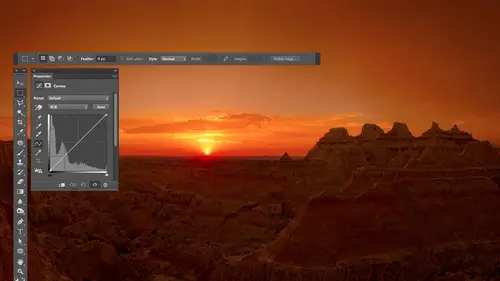
Example Photos with Curves and Adjustments
so I'm just opening some pictures toe. Look at what I did to him. And this is where I've probably been a little bit more careful with my masking because whenever I'm giving a seminar, that screen is if you can see on the video how far away the screen is from my head being precise when the screens that far away and when you're using one of these things is not something that I look forward to doing. So here I'm a little bit more basic with things. When I opened finished images that I did, you know, in in my office. Then usually the masking is a little better because I spent more time on it and I had the screen much closer to me, and I was thinking about it more. So let's take a look at what I might have done on a few images. So with this image, let's see what the original looked like. This is a stitched panorama, and when I was done stitching the panorama, this is what I ended up seeing infighter shop. And here's what the end result looked like after I was done adjusting it. So you see t...
hat right side of the photo felt a bit bright over here, and I wanted to feel more like its surroundings. I think I ended up accomplishing that, and then I wanted your eye to be drawn right here a little bit. And so I ended up adding some contrast in Brighton ing that So you see that that change and some other things. Let's click through the layers to see what the hex in there and what the masks look like. So you can see there is a total of 12345 adjustments there, all curves, adjustments. I can see that from the icon, and I'm just gonna turn on the 1st 1 It's doing the left side of the photograph. Let's click on the layer for it. Double click so we can see the adjustment. And I'm actually gonna move my adjustment so that it doesn't cover up my picture. I'll put it up here so it will be above my layers. All he did was click on the name of the tab that contained it and dragged it up on top of the layers. I think this a little smaller. See if I can arrange this where we can see both layers and that. Okay, so if you look at this particular adjustment, it's got three dots in it, most likely what I did. There is I added contrast to this area I most likely clipped on the hand and drug across this area, the photograph to see where it was And can you see by looking at the curve where it iss see the circle moving around? It's pretty much between the two dots. There, there, you see that? So I made it steeper between the two dots to get a little bit of contrast, and I made sure I moved it down because down would darken. It's a dimmer switch. Down means dark this little dot over here. It was most likely because some area became too dark either overall, and I generically put it not there or in a very specific place where I move my mouse there afterwards. I'm guessing this place right here because G when I moved there, it's exactly where that dot is, and that spot probably got too dark when I was done. So I click there to add a dot and I moved its dimmer switch to get it back to what I thought was appropriate. If I applied that adjustment to the entire picture, it would have looked like this. So I painted in the mask I painted on the mask so that only that part of the photo was affected. The next adjustment is in the lower right of the picture. I know that I look at the mask and that's where Dwight. I turn on that and you see, it's darkening that area. And I think that's because this area here looked a bit brighter than the area over here dirt and I didn't quite like that, and it made my attention be over here when I wanted it somewhere else. So I'm assuming this is gonna be one dot added right here in moved toe whatever height this would be. What's two dots? Darn it. Studio shots. But one dot would be right here If I grab the little hand tool. One of those probably moved to somewhere near the height of Maybe over here. Didn't quite move it as far, and I'm not sure why. I have a second dot I don't know. Maybe I made it a little steeper or something. The next one is going to affect the right and left sides of the photo. It's a single dot, moving it down, which means it's darkening. So that's darkening the edges. Almost like a vignette to say, Keep your attention more towards the middle. Got a couple mawr? This one here is affecting the near the top edge, most likely this area right over in here. I want to draw your attention a little bit there, so I isolated that area and brighten it up a little bit. That's me just brightening by moving the dots up a little bit, putting into that area. Then we have one more that's affecting a good portion of the image. It's brightening as well. It looks like I was concentrated in the shadows because all the dots air down near the shadows and so let's see what it's doing. Just brighten up the image of the whole. And so oftentimes that's what it's like when I'm adjusting a picture, end up with five of them or whatever, but they're usually created in rapid fire succession, and they don't have to take a lot of time. See the darkened corner in the upper left. This is before, after a little bit of detail pulled out at the bottom, the skies a little darker original on this one looked like this. It's quite different. You notice all the telephone lines air out of there, we'll show you how to do that very soon. So here is my retouching on one layer that got rid of all my telephone lines. Talk about how to do that later. We have curves. In this case, I just pick areas that bother me in this image. If you look close at it, you see right here there's some lens flare, that greenish stuff. If I take this color and make it look like that color, I could get rid of that lens flare. Just grab the numbers from right over here and force them into their painted in. There was a little area over here somewhere I didn't like. I think one of these adjustments is doing Yeah, just darkening that area. Here's lens flare removal and right there another lens flare up here. If you can see it, that's the same thing. Grab the numbers from over here where there's no lens, flare and adjust this area to make that become that painted in. What other kind of stuff is in here just overall bright Ning's that's starting in an area in a tiny area under the goose, and I just build up Theis adjustment layers. I'm making the logo or the sign on the building. Stick out. You see it. That's make the curves steeper. Steeper brings out detail and then painted into the sign thistles doing something on the left. It's getting rid of bright highlights on the left. See the bright highlights. It's at a dot on the bride. Highlights. Make it the same brightness of something next to it, which just means that a dot and just hover your mouse to the right, where you don't have a bright highlight just to see how high you need to move it or low, you need to move it and then put it to that height and then painted in. If the color shifted, then instead, I'll have to do the thing where you write down the RTB numbers, but I'm just using the same techniques over and over again, and that's all in doing so. Once you get used to the basic techniques I don't know what that layer is, But once you get used to the basic techniques, it's a matter of thinking about where they really needed in oftentimes with me. I'm doing really small, isolated areas with my adjustments where when I turn these eyeballs on and off, it might be really hard to tell where they're happening. And I have to do the backslash key to see an overlay to say, OK, that's under the eaves of the building. So that's where I need a look when I turn this off and on and I might even need a zoom up to see what is happening there. Add is in contrast, So I get all picky like that and just keep working. Uh huh, Yeah. Is there a way to remove that halo around the building? Yeah, there is. Why don't we do it? Um, this image was processed as an HDR image with earlier HDR software where it was more likely to get halos around the edges of things. So let's go and see if I can get to a point where we halos pretty obvious. I think it just on the base layer. I'm just going to get rid of just some retouching here. So this is the image will work on to simplify things. I'll delete the other layers so we don't get confused by them. If I go to the side menu of the Layers panel, there's a choice called Delete Hidden Layers just thrown away. OK, and now let's see how we might come in here and tackle this kind of glow that's around the edge of the building. Right, So there's a couple things we're gonna need a selection in. The selection is gonna make sure we don't get over spray on the building. So to make the selection, I might use the quick selection tool and just paint across the sky. Try to get the entirety of the blue sky selected. If it selects too much like here, it dipped down on the building. You can hold down certain keys to take away from or add to your selection, or you can click on the various icons that are found up here. Take away would be the minus one plus is the ad. Usually you hold shift, add to something and you hold option, which is ultimate does take away. So if you don't feel like going up here to the icons. So I'm holding on option right now and I'll take away from that building anyway. I would continue to do that until I had a good selection of the sky. I'm not going to spend the time because it's just not fun to watch. But I go through here and add that go there, there and at it. I take away from other areas and make sure it was close to what I needed. For now, we call that good enough. I'm going to save that selection Sunday back later to say this election, You go to the select menu, you to save selection, Uh, and I'll just call it now. I can get rid of that selection because if I have that selection there at the time of making adjustments, it's gonna convert that selection into the mask and it's gonna be adjusting the entire sky. I need that selection later on when I paint with a soft edged brush just to make sure I don't get over spray on the building. But I don't need it right now, so I'll come up here in D Select. Okay, now we need to do our adjustment. I put our adjustment at the top of the layers stack, and I come over here in new curves, and what I'm doing is I'm looking at what part of the image my gonna just you know, where is it most important that I have to really concentrate my adjustment for now? Why don't we deal with this part here in that same adjustment? White work Fine for over here, if it doesn't would have to a separate adjustment for over here because the numbers might not be appropriate. So I'll come up here and I'm gonna put my mouse on the area that I want a match. Get the info palette open. So you think the glow ends by here? I think so. So I'm gonna write down the numbers So I just wrote down that color. In essence, Now we do our curves adjustment layer, which looks like already created. It's right here and in curves. I click on the hand. I move my mouse into the brightest part of the glow that I could get to without hitting the building. So I move my mouse right up in once you say about there, maybe. And there were two keys that I have held that hold down. Don't know if you remember or not, but to get the dots in each curve, it shift in command on a Mac that shift in control on windows. So I haven't held down right now and I'm gonna click. All right, so it just write down the numbers within curves for me. I go to curves and I go to read and for output, I type in what I have written Now 30. Make sure just glance at the curve. Make sure didn't top out or bottom out. You don't want an abrupt, uh, hit. When you get to the top or bottom, go to green and I got 56 and go to blue where I have one of six. Okay, And I didn't see any of those bottom out or top out, so I don't have worry about that now. What we need to do is make sure that change only happens where the glow waas. So what I'm gonna do is invert my mask to make it black so it doesn't apply anywhere at all, and I do that by typing command. I If when you first type command, I doesn't work the reason why it might not work when you first type it is because you had the output field selected. You had just typed in a number and it thinks you're trying to type Where that number is is trying to type command I into the output field, and so you can hit return to, say, except that number. Or you can click on the mask or something else if it doesn't work. When you typed command, I So now it's not applying anywhere at all. The mask is black. So now I'm gonna create I'm going toe, grab my brush, gonna paint with white and I'm gonna get a soft brush It doesn't need to be a big brush because the fade out on that roof edge is pretty quick. It's not like over half of the sky or anything, so I don't have to have a huge brush. But the problem right now is if I come in here and try to paint that in, I'm gonna get over spray onto the building, right, so choose undo. And that's where that selection comes in, I choose load selection. Remember, before we had a selection of the sky and see which one was it? I save selections that are complex in case I ever need him again because I hate remake in any of them. So I have one of the rafters because that was each rafter individually isolated, that kind of stuff. But I think this is when we made, and now with that selection active, that selection will prevent me from getting over spraying the building. So now I can get in here. I find the selection to be distracting, though, because it's not gonna print out with my image. And it's just trying to get my attention so I can type command H That's control agent windows to hide the edges, where you go to the view menu, where you'll find a similar choice. What's whoever was on this computer last the very first time you run photo shop on a Mac and you type command H. It asks you what you want the command to do. Should it hide the extras, which is what Adobe wants it to dio what it has done in photo shop for 20 years or do. You wanted to do it? The operating system thinks it should do, which is hide the application you're running. So whoever used this computer before me said it to hide the applications, so I would have to come up here instead and, uh, say I want to hide my selection. Edge is usually just take command age. Okay, so now I'm gonna paint it in. Here goes. I'll start with my mouse on the building knowing that I have a selection that doesn't allow me. Actually, it paint there, and I'll just slowly work my way out. You notice my brush doesn't even look like it's touching this guy. That's because that circle is not the edge of your brush. That circle is where your brushes halfway done, fading out halfway done. So if you have a soft edged brush, your brush extends beyond that circle. Then I could possibly get a bigger brush, maybe lower my capacity, even get a larger fade out, go a little bit further out. No, but let's see if it's doing it. I'll hide the layer. Is that largely getting rid of our glow? So the process was the same conceptually as sunburn it's take the numbers from one spot for something else to be it. The challenge was, How do you mask it? And that's where I created the mask for the sky so that I could not get over spray on the building. And that way I can have my mouse over here. The selection is still active, and it's not allowing any of the paint to get on the building. And I could just get up close to that edge painted in. But that's very common. If you ever run into people that overuse the clarity slider, especially in front of shops, CS five glowing trees, glowing buildings and somebody gives you one of those images and you work for a magazine, you kind of publish it like, Well, this is how I go in and fix it complex ones. Do they save individual to the file that you selected them in? Yeah, they're stuck in this file. Where they're stored is the channels palette. Okay, so if I come in here and I click on channels, the top channels are what your images made out of. When I say your images made out of red, green and blue, that's the actual until your pictures made out of below that for what's known as Alfa Channels in Alfa channels are saved selections or masks the masks that are on your layers and stuff their equipment to these and that's where they're stored and so similar to sharing, um, masks between documents. Like if you have another picture of this same building and you were in the same spot and everything, but maybe you changed your exposure. Could you take that selection into the other? You could picture if you had a selection. You could just use the selection to a clique within the selection dragon on top of another document. The selection would move as long as you're in a selection tool. Or I think that was you that brought up previously the idea of duplicating a layer of and have it sent to another document. I think you could do that the same thing with a channel I haven't done in ages. Those really make sure it's still possible. So I'm going Teoh, bring this down here and they want to duplicate it. If you hold option when you drag it down, it asks you this question instead of just duplicating it. And right there, I could tell to go to a different document or a new one. So, yeah, you could send him between documents. So these down here, these were saved selections. Just things I didn't want. I didn't want to make that selection again, because that takes time. Yeah, look at that. So, anyway, I hope the idea of making one area match another is useful because it's something that I end up doing so often. It's ridiculous. Here's my mask. And so I find it to be amazingly useful here. I say I got that a little too dark, so I will just paint with Black and Lauren. My capacity of plasticky will mean How much do I want to delete? The late 20%. Just get it off of there. Uh, all right. All right. So that's basically how I think about curse for color. Yeah, um, the more you practice with, the more you play with it, the more comfortable you get. And just like when you adjust curves for tonality, if you make the curve go perfectly flat, we're used to have a variation in color. You're gonna have less of a variation. It won't be no variation, though, because you'd have to make all three of the curves red, green and blue flat to get absolutely no variation. If you make the curve go downhill as you go from left to right, uh, you're gonna get weird shifts in the colors, so usually try to avoid that. Um, you know that So it but it's just general way of thinking, remembering that it might list red, green and blue. But they might as well also list the opposites of sign magenta and yellow. Because you can also shift things towards that Queen's a Couple Questions is awesome. The question waas from love My picks when you made a selection of this guy and saved Is there a way to make an inverse of that selection and save sure just before you save it, go to the select menu, choose inverse or after you save it, click on the channel in the channels palette and took command I for invert and it would make a negative of itself. And that would be the equivalent. So yes, you can. Also, when you load a selection there might be, I can't load a selection of this once. There's none saved. But let me look. Save selection. No, Load it right here is a check box when you load the selection back in. That says invert, an invert would give you the inverse meaning the opposite off what was saved. So if you saved one of the sky, go back and shoes load and turn on that check box, you get everything except for this guy down. Another question from Birth Express. Sometimes when I create mass players, I want to go back after making other adjustments and work more on that mask, and it will paint black instead of masking. How can I prevent this? That made sense to okay. If it ever paints black instead of masking, it means that your mask is not active. So look at the corners of the mask and make sure they have those little kind of bracket shapes around it. If it doesn't click on the mask itself and it will be active, then if you grab your paint brush tool when you paint, it's not gonna put black in your picture. It's gonna put black in the mask, so it probably was that you were mask was not active. Yeah, Cool. Just remember, adjustment layers affect all the layers on underneath them. So if you have a complex, multi layered document than your finest longs, use an adjustment layer and you place those adjustments above it. So here's a multi layered document. If I turn off the layers in the document, here's the original, which is just me shooting up the trunk of a tree with a fish eye lens. Eso the fisheye makes it so you can see the corners here, which are the hill that is near the tree. And I ended up retouching out all that stuff, and then I took the result, duplicated it and flipped it horizontally and made that thing. And I think it looks like a praying mantises head here. So But if I wanted to adjust this stuff, I gotta be careful. I gotta make sure the top layers active when I come in here and apply any kind of adjustment. If the top layer was not where that went. Instead it went below one of these. It would only affect what's underneath it, and we would have some pieces that are not being adjusted. And so we need that to be on top of your image so it affects all those pieces that are underneath
Class Materials
bonus material with purchase
Ratings and Reviews
Jim Pater
I taught Photoshop (version 5) to graphic design students at the college level. I had great fun teaching. This is the perfect course to show others how they might go about teaching a Photoshop course. Congratulations Ben, on your excellent teaching style and methods. I thought I already knew quite a bit about Photoshop but this course made me aware that there's always more that you can learn.
Ron Greathouse
This course is one of the best Creative Live Courses that you have made available to us. I have purchased at least 12 courses and this course is my personal favorite. Ben is an excellent instructor and should be teaching at the university level. He is great!