Free Preview: Camera RAW: Exposure & Contrast
Lesson 1 from: Photoshop for PhotographersBen Willmore
Free Preview: Camera RAW: Exposure & Contrast
Lesson 1 from: Photoshop for PhotographersBen Willmore
Lessons
Day 1
1Free Preview: Camera RAW: Exposure & Contrast
42:43 2Camera RAW Q&A
20:25 3Camera RAW: Color
23:03 4Understanding Histograms
07:57 5Camera RAW: Localized Changes
35:36 6Understanding Saturation Clipping
09:42 7Camera RAW: Noise Reduction & Lens Correction
16:34Curves
44:44 9Curves Q&A
20:46 10Keyboard Shortcuts & Adjustment Layers
24:41 11Review of Curves & Adjustment Layers
16:13 12Hue/Saturation
19:08 13Day 1 Q&A
14:27 14Day 1 Wrap-Up
03:40Day 2
15Day 2 Pre-Show Banter
13:26 16Review of Day 1 Process
38:53 17HDR
33:41 18Advanced Layer and Masking Techniques
29:29 19Using Curves with Color
39:42 20Color Correction
35:04 21Color Correction Q&A
14:30 22Example Photos with Curves and Adjustments
25:09 23BONUS: Printing Tips
03:42 24Retouching
23:27 25Advanced Retouching
19:49 26Directing the Viewer's Eye
16:43 27Day 2 Wrap-Up
01:12Day 3
28Day 3 Pre-Show Banter
10:52 29Fixing Lens Flare
14:36 30Hiding Clouds
15:47 31Color, Hue, and Saturation
08:21 32Essential Keyboard Shortcuts
13:18 33Technical Issues
15:00 34Preparing Images for the Web
18:36 35Exposure Bracketing and Photo Stacking
15:52 36Blending Modes
35:07 37Review and Q&A
05:05 38File Formats
21:12 39Brush Tools
14:34 40Transplanting Clouds
20:39 41Selective Focus
18:00 42Converting to B&W
20:03 43Color Spaces
22:03 44Thanks + Credits
03:56 45Fixing Extreme Problems
20:33 46Sharpening Images
23:41 47Day 3 Wrap-Up
04:59Lesson Info
Free Preview: Camera RAW: Exposure & Contrast
Well, we got three days, and today what I thought we would do is concentrate on adjustments. So that means we're going to start off with things or will adjust the entirety of an image where you don't have to work on small, isolated areas, and then we'll progress into things where we're isolating little areas to fine tune. And but that's the concentration in today's adjustments. When it comes to tomorrow, we'll get into more like retouching and will cover all the retouching tools and, more importantly, how they all work together. And after that, I'll show you how I direct the viewer's eye into a picture where I try to influence exactly where somebody looks first in the image, how they kind of looked through the image and, more importantly, where they don't look or don't spend much time because I don't want them to see any distractions that might be in the image, that kind of thing. Then on the third day, we'll get into more creative things that we can do to our images. If you need to ad...
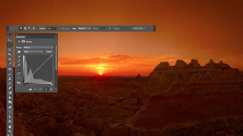
d texture to them or you need to just have them have a unique visual look, we'll get into more of that in the third day. I also used Teoh hopefully cover some of the things that people bring up on the Internet or here live. That might be more requests. I'm flexible when it comes to the things I want to give you in general, whatever you need, Teoh, get things done in photo shop. Now, when I'm going through this, a couple things you should know one, um is there are certain things I'm gonna ignore and those there anything that you don't need an expert to tell you how to use. If there's something that it's something that's either obvious on your own by just glancing at it or if you clicked on it, it would be obvious once you got into it might not cover it. I want to cover what I consider to be the most important things than the things that I use every single day. And that means I'm not gonna go over every single preference that exists. I'll go over whatever preferences actually change. I'm going Teoh, concentrate on the things that I use 80% of my 80% of my images, that kind of thing. I should also mention that any time you see me working in Adobe Bridge, which is what I'll be in when I'm viewing thumbnails of my images, Um, and anytime in camera raw, those two areas of photo shop are things that you could replace with adobe light room. And so, if you own adobe light room and you see me do anything and I mean anything Enbridge or camera raw those air things that you could do in light room and you should do in light room if you have it. Eso. Any time I leave bridge where I leave Adobe camera raw and I'm in photo shop where you see all the pallets around and get to the menus and everything. That's when you need to leave light room and pop into a photo shop. Sometimes there are things that could be done in camera or in light room, but I choose to do in photo shop because they might be more user friendly in some ways, because Cameron Light Room are limited in the way that they can work, because anything you do in either camera or in light room has to be able to be saved in a little text file where it doesn't actually save the pixels that make up your picture, it say, is a description of where all the sliders were moved to within that area. In because of that, it's limited in what it can do. And so sometimes that gets in your way where you have to work around it too much, and it's more convenient to be in the photo shop. So just remember anything I do in bridge or in camera. If you have light room, go for it, do it there. In fact, the math that is behind the adjustments that is in adobe camera raw is the same as the math that is behind light room, so moving the slaughter will do an identical change. Eso What I want to do is just get into Photoshopped. I'm going to start off actually, Enbridge, because we just need to know how to navigate our files but bridges something where it's not critical to know everything that's there. I just want to show you what I'm gonna be using during class, and then we're gonna get into Kamerad because Kameron is where you can get the most quality out of your image. If we ignore camera head all the way into the main part of photo shop, then we're gonna be more limited in what we can do. I always get the most out of my image as much as I can when I'm in camera. So let's take a look. Uh, this is bridge that I have running right now, and it should be set up with default settings. I reset my preferences on both bridge and on photo shop before we got started, and I haven't changed anything in that way. If there's any preference I need to change or anything I like to do, you'll see me do it. And so let's take a look. The first thing I'm gonna do is just set up bridge the way I like it in. That is, I go to the left side where you see a tab called Filter and I'm gonna double click on that. When you double click on it, it will collapse it down. If you need to get to that area again, you could just double click on the word filter again to expand it. This is where you could limit the number of images. Your viewing so that you could only view, Let's say tiff files or on leave you images that you've raided a certain amount, that kind of thing. We're not gonna need to do that right now, so I'm gonna double click on that and hide it on. The right side is an area for metadata and metadata is where you can look at things like the shutter speed to used what lens you shot with, Uh, what was the date you shot it. That kind of stuff were not gonna need to look at that all that often. So I'm gonna double click on that so that I could get this preview area to be larger. I like my preview to be bigger so I can click between my images and then get a better view of it. So I'm gonna click on the vertical line that separates the preview from the thumbnail center over here. We just cooked near that vertical line and just drag it to the left to make that area bigger. Then on the left side is where I navigate my computer and I can navigate in two different ways. One is through favorites, so if they're folders I need to go to all the time. I can save them here in my favorites. If you navigate to a particular folder in one of the men use up here, you will find a choice of saving two favorites. It's right here. Add to favorites. So after you've navigated to the folder that you'd like to access, just go up to this menu, choose had favorites and it would then appear over here War. If you don't want to do it by favorites, you can click on the tab called folders and that's where I'm gonna be. On this is where I can manually navigate my hard drive and I just click on any one of these, uh, folders in over here. It'll showing my thumbnails and, uh, I can click between different folders. At the top will be a bar right across above those thumbnails in that Bartos see the path to the folder you're currently in. So, in order to get to this folder, if I just open my hard drive without using bridge, this is the path and have to take to get there. And if I want to navigate back within that navigation, I just click on any one of the folders that are listed there, and I can go back to different levels on my hard drive if I want to go deeper on my hard drive. That's right. Used the list of folders that's on the left so I can come in here and navigate through things. So this is how I usually have bridge set up. I just have my folders over here so I can navigate him, viewing the images in the middle. And if I click on one of the images, I will see a big previewing of it on the right. And that's how I'm gonna be working to switch between the various images we're gonna use. I'm just gonna be clicking on these various folders. All I have is a folder on my desktop and some sub folders within it. And when I need to move backwards, if this parts visible, I'll just click between the folders. Otherwise, if I need to go back a level I use that little bar above the thumbnails Bridge is installed if you have photo shop installed. So if you haven't used it in the past by chance, as long as you installed Photoshopped Bridge got installed as well. It's in the same folder that photo shop is usually stored in. And if you happen, have Photoshopped running. You can go to the file menu, and there's a choice in they're called Brows and Bridge that would automatically launch it. So if you didn't feel like navigating your hard drive to find it and you know you have Photoshopped running, just go to the file menu browsing Bridge. So this is what we're gonna be using for going through things. I don't want to cover all that much about bridge because bridges not in general, that difficult to learn. It's something where you don't really need an expert to walk you through everything. It's something where I want to concentrate on what is most critical and more difficult to learn. Uh, so the first place I always start with my images is a dialog box that's called Camera. Some people abbreviate that is a CR that stands for adobe camera raw, and so in order to access the raw dialog box. If you have a raw file, meaning you set your camera to shoot instead of shooting with J. Peg, you're shooting and raw format. Then all you need to do is double click on an image within bridge. It'll automatically pop open into camera if, on the other hand, you're not working with raw files. Instead, you're working with JPEG files or TIFF files. Then when you're inbred and you'd click once on your picture because double clicking on it would bypass Kameron, open it all the way into photo shop. Instead, you would go up to the file menu, and you will find a choice called opening camera. And that would force a JPEG file or a tiff file that wouldn't usually automatically be open with camera to open in there. The main limitation is if you have a tiff file and it has any layers in it, it can't work on that. It's got to be a flattened one that doesn't have any layers. So if you ever find a tiff file, it doesn't work. Uh, probably open it up and you'll see that it's not just a picture is a picture with some layers on top of it. So then what I have is a bunch of folders here full of images that I think need help and a lot of these images I've never worked on before because I don't want to just work on stuff that, you know, I know exactly where the sliders need to go to fix them. I just need images that are messed up that I can work with in some of the times. The tools we use won't be able to fix something. And I want to make sure we run into some of that. So you might see how do I deal with it To have to go into Photoshopped and doom or or what? So with a lot of these images, I have no idea what I'm gonna do to him. And that's good, because that's how you are when you open your images, right? Another thing with bridge right now, My previous air really small in the bottom, near the right side. You'll find a slider down here that control so big the thumbnails are. So if I just grab that bring her up, we can see larger thumbnails. So these images here are ones that I thought need improvement. This is in a folder called Under Exposed. If you agree. Okay, we're gonna try to fix all those. Let's hope it works. These air once that I thought were somewhat over exposed in some areas, although a few of these have already been adjusted in camera and I'll have to turn off the adjustment for you to see that. But this one, the sky gets pretty bright. Here's some they're lacking. Contrast I thought we'd work on Here are some that have too much contrast. Then we have some that have color issues and other things, and we're just gonna roll through him and, as we do, learn about all the things that are necessary for doing that. So let's start off working on some under exposed images. And let's just figure out how to think about some of the controls that are critical in camera. So these air raw files these were shot on a canon camera and a canon cameras. Raw file format ends in C are, too. If you have a Nikon, it'll end in any F. That's the file extension. Each camera vendor will have a different file extension on the end. But if you had your camera set to shoot raw, they will have the file extension similar to those now the reason why I end up shooting raw is because your camera can capture thousands and thousands of brightness levels. But if you said it capture J. Peg, which is the default setting on my camera, then it only saves 250 brightness levels in 250 brightness levels is fine for viewing an image on screen or printing it. The American look great if it looked great on the little screen in the back of your camera. But if it didn't look good on the little screen in the back, your camera and you really need to fix it like this one, then a J. Peg file is gonna fall apart very quickly, where there's just only 256 brightness levels where, as a raw file would have thousands upon thousands of brightness levels. There's more brightness levels than we really need in a raw file. And what that allows us to dio is too radical adjustments to it that you couldn't get away with with a J peg. And so that's why I primarily shoot raw. Having said that, I know that you can still apply these adjustments to a JPEG file. It's just don't expect the quality to be as high when you're done and don't expect to move. Be able to move the sliders as far as I dio before the image starts looking terrible. So let's take a look here. We got a bunch of sliders. There's only fueling, mainly need to think about when it comes to under exposed images. When it comes to under exposed images, it's mainly the blacks, the shadows in sometimes the exposure sliders that we have to work with. So let's try to figure out what, how those work and how they relate to this bar chart that's at the top. This bar chart tells me the tonal range that's in my picture, just the brightness range that's in it. And I really wish they would put a little bar at the bottom of it, where they put black in the left, white on the right, and then all the shades in between in between there, like a little Grady Int bar. It would make this bar chart so much easier to understand. If you have that, they're they actually do it in parts of Photoshopped. If I go into photo shop here and I go up two levels. You'll see it. They put it in there. Do you see this bar right here with black and left white on the right and all the different shades in between? Imagine that that bar you could copy it and you put it in camera. Imagine you put it right underneath this bar chart. I so wish it could be there because all this bar chart does. Is it tells you what brightness levels air in your picture. If there's a bar above a particular shade of gray than that shade is in your picture somewhere, if there's not, then that shades not found in your image. And so you just have to imagine there's a bar there with black and left white on the right. And so if that was the case and I looked on the far right here, I would see that there is no white in this picture because there's no bar chart above the area that would be white. I would see that the brightest shade in the entire picture is right about here. If I had that Grady int below, I could look straight down and see exactly how bright it is, but instead I just know it's nowhere near white, then the height of the bars. First off, when I'm talking about the bars, ignore the colors. Just look at the white part. The colors have to do with saturation in color. Right now, I'm just talking about what I'll call tone ality. Tonality is just the brightness of stuff, regardless of what color is. And that's what the white part of this thing is. If you look at this, one of the bars will always go all the way to the top. That's whatever shade in your picture is most prevalent, most common in the picture. It takes up the most space, however you want to say it, but the bar that goes to the top just means that's the stuff. It takes up the most space. So if you look at this particular bar chart, you notice that all the tall stuff is on the left, isn't it? And that means really dark stuff takes up a lot of space. If you'll get the picture, it's pretty obvious, isn't it? In really bright stuff. There either is none of it because there's no bar chart over here or the bars that do start there. They're all pretty short, aren't they? That means that the bright stuff doesn't take up much space. All right, And notice On the far left, the absolute left edge there's a bar that goes up quite high. The absolute left edge is where black iss. So that tells me I have a large area of solid black. Don't stress about this thing. It's like your speedometer in your car. You don't stare at when you're driving. You glance down on occasion and just see if it's helpful, right? Same thing here. So we'll try to get a little bit more comfortable with this as time goes on. So with this image, what I notice he is the tall stuff is on the far left, and that means we have a tremendous amount of dark stuff and there's nothing anywhere close to white. So it looks like I could just take this entire thing and shove it to the right. That means make things brighter, and it might look better any time I see a huge gap on the right in a big spike in the left. What I do is I go for exposure exposure will take that whole thing and move it left to right. So watch what happens when I bring exposure up. You see the bar chart, see it spreading out, moving towards the right. You go in there, get going, okay, and the images looking a little bit different. If I want to see before and after there's a preview check box, I'll turn that off. Here's before here's after, but still that's not looking so hot, is it? We've got a lot more work to do. But if you look at our bar chart, it's starting to spread across, meaning that we do have bright stuff now in Our dark stuff isn't so shoved over next black yet. Yeah, so now the other sliders we have to work with for an under exposed image is the next slaughter I would think about is the one called blacks. The time I use the slaughter, called Blacks, is when I look at the bar chart and I see a spike on the left side. If the very first bar that makes up the bar chart is tall, then I want to use blacks. What blacks does is it works on the absolute darkest part of your picture, however dark that happens to be. If I move the slider towards the right, you'll brighten that if I move it towards the left, will darken it. And so what happens is with a raw file. There's additional highlight and shadow detail, but it doesn't show you to begin with that you have to move these sliders to make show up. So if you have highlights that look like they're blown out solid white, there might still be data in there that could be recovered. Same thing in your shadows. You might have areas look solid black, but there's actually extra data in there. That's not true of the J. Peg file with a J. Peg file. If something in your image looks to be solid white, it is solid white, and there's no more data coming back there. If there's something solid black in your picture, same thing you're stuck with solid black. But with a raw file, there's a little extra leeway in the highlights and shadows where you could bring back detail. So this little bar right here on the far left tells me black takes up in all right amount of space. I want to see if I could get some of that detail back. And so I go to the black slider. I move it towards the right, and I'm looking at the bar chart right now in seeing if I can get that spike to go away and I was able to. So that means that Black doesn't take up much space at all. The little bar chart on the far left is really, really short. It tells me black just takes a little bit of space. That means we should have some detail in the dark part of our picture. That's still relatively dark, though. So now we need to work on a different slider in here. And that slider is going to be the shadows because shadows is going to take things that are a bit brighter than black and brighten them up. So a grab of shadows and I'm just going to start bringing it up, starting to see stuff in there. So now I'm not sure how bright things look on the live feed versus what I'm seeing here on the screen will have to get used to that because I either can adjust it for here, or I can adjust it for your view with these images in general, if I were to view them in my normal laptop screen, there would be a bit brighter. Just say now. So if I'm not able to unify, bring shadows up in, it's still a little bit on the dark side. Know that on a normal laptop normal set up, I would be able to have a little bit more to it, because these images overall look a little darker on the screen. You see your work eso anyway, we're able to get it to this point so far. If I turn preview off, there's before there's after. That's not right. Change, isn't it? I'll show you how to go even further beyond that. Ah, little bit later on. So with understood, under exposed images, there are three sliders that I end up using. This My primary adjustments in those are exposure. Blacks in shadows. Let's work on a different image. I'm just gonna click the done button and go find another one, and we'll do the same thing. But the way I think about which sliders don't need to use. If it's a normal picture, and I just need more shattered detail, which is often the case. I don't under exposed like this on purpose, you know, usually get the exposure alright, usually just to get more shattered. Details. The shadows, slider. It's when you have an extreme case. That's when I might need to go to exposure or blacks. And so it's think through it again. Remember our bar chart up here? If there's a gap on the right in a big spike on the left, that's when I go to exposure, because exposure will move the entire bar chart towards the writer left telling in what direction I move the slider and I'm just trying to get her to spread across most of the with available. That means give me all the brightness levels I can have in a file, not just all dark stuff. But then, if I were to keep going with exposure, eventually certain areas to become too bright like my sky. And so I'm just trying to get the bar chart to in general go all the way across. Once I do that with exposure, then I'm gonna go to other sliders, huh? Then if I look in the left side of the bar chart. If there's still a spike in the left still there, that's when I go for blacks. I'll bring it up and I'll see if I get the spike to go away. You not always gonna notice what's blacks doing to another exposed image visually on the screen. That's why I need a look at the bar chart is just see. Can we get it? So we don't have a big, solid blob of black somewhere. Instead, we just have a little area. All right, then, toe. Actually, visually do it where I'm just looking at the picture. I go to shadows that I could bring it up and get however much out of it. I think I can. There is a way to get even more out of this, but I'm gonna show it to you later on. We have to use some of the tools that are at the top of my screen to do it. So let's look at before and after in this one, a little more usable click done. But it's the same process with all overly under exposed images. Uh, that I do this with this one. Look at it and you notice we don't have a huge gap on the right. We don't have a huge spike in the left, right? That means I'm not gonna use exposure exposure I use if that bar chart, which is known as a hist a gram, seems to be pushed way to one side or way to the other. And I wanted to be more centered or spread out. So also, I look in the left, I don't see a spike. That means I'm not going to use blacks because black already takes up a tiny amount of space. All right, all I'm gonna do here is go to shadows, see if I can get things out of this. I can go toe exposure if I want to go further. And if you see red stuff showing up on the image, that's where it's telling me. I have no detail in the highlights, and I can see that by looking at the bar chart. You see a huge spike on the far right. Really tall. That means white takes up a lot of space, and I'm seeing it right there. That's a little warning. You can turn that warning on and off by clicking on a triangle that's up into the right of the bar chart. Little trying go up here if you click on it and toggle that off, we're back on. But you're saying that you're losing detail here? Uh, and so if it's the highlights, first off, if it's the sun and my picture like noonday sun, that's fine. Did not have detail it, so I'm not always worried about it. But let's say this was a sunset, and I really wanted to get some detail in it. Well, that's when I'm going to be going for exposure and highlights if there's a spike on the right side of history. Graham Spike on the right side. That means we have a large area of solid white, and that's where I'm going to go for the white slider. The white slider works on the absolute brightest part of my image. I bring it up, it brightens that we bring it down, it darkens it. And so I could bring that down and see if I can get that spike on the bar chart to go away. And I can't in this case because your camera can't capture detail in the blatant son, You know, in the middle of the day, you're not gonna see sunspots if I want to. Further dark in the bright part of the picture, I could go for highlights, and that's gonna get things that are near white but not quite white have. So let's look at some images that are over exposed and see how it might be different. I just double clicked on a raw file, So pop me in the camera and here I don't have much in my sky. So if I look at the bar chart, it seems to be shoved just a little bit. To the right is a spike on the right. There's a gap on the left. Any time there's a spike on one side in a gap on the opposite side, I use exposure. Exposure means take that bar chart and shifted left or right, so it seems to be shoved over to one side. I'm gonna breathe at this time. Bring it down to dark and things I don't want to bring it. So far down, a large area of black appears, meaning that a big spikes on the left, but that's the first thing I might think of then, in order to get into my highlights, what I'm gonna do it is if there's a spike on the right, that means large area of solid white. I'm going to work on the whites and I'm gonna bring it down, see if I could get some of that back. If that's not enough, then I'm gonna go to highlights. Highlights works on things a little bit darker than white. See if I could get that back and let's see what we've gotten so far. I'm gonna turn preview off before, after we were getting a bit more in the highlights, right? If this area here is important, whatever detail is there first I have to sliders I could work with for the dark. Partly picture. They are blacks and shadows. The time I used blacks is if I see a spike on the end, meaning we have a huge area of black. We don't here, so I'm not going to use blacks. Instead, I'm gonna your shadows and I can control How much detail do I have in that shadowy area? Now, if you're using an older version of photo shop, if you're using photo shop. CS five, Let's say or earlier, the sliders that are available in camera raw are different. The names are a bit different, and so I should talk about what the equivalents are, if I remember him, and how you have to be a little bit more careful with previous versions. So the exposure slider in previous versions would work on the brightest part of the picture, similar to how whites works here. You know, if there's a spike on the right side, I'd be going to exposure. The one for Shadows would be called Fill light. You can feel like the ones for highlights would be called recovery. They weren't as obvious compared to now, where they've renamed them in. The names are much more obvious. Black and white works on the absolute brightest in darkest shadows, and highlights works on things a little bit darker than why a little bit brighter than black, a little range there. Exposure works on the the whole of the image if the entire images overexposed or under exposed to go for exposure. And so here's a little bit more straightforward. But also the quality of the adjustment is vastly superior than previous versions. In previous versions, there were three sliders that if you moved him up beyond about halfway, you would probably see artifacts in your image. Have you zoomed up 200% view and you look close? You go. What the heck is that? And those sliders were recovery. Fill light in clarity. Those three sliders. If you're working with an older version of photo shop, be careful if you move him up past halfway. I'm not saying never to. I'm just saying, If you do, zoom up to 100% view, scroll around your picture and see if you have any issues. The issues you usually find is with both recovery in fill light. Look for where a dark area touches a very bright area to touch. You know there's a shadow under a car, and then the sun's hitting the pavement next to it. Right where that happens. If you have it up too high, you're going to see a double line on the edge. It'll look like somebody took a pen and traced the edge, but didn't trace it accurately. It's off a little bit, and that's if you have your fill light where your recovery up way too high. When it comes to clarity, look at the edges of things and see if they're glowing. If it looks like a tree is glowing little, here's a light behind it. Almost. Your clarity is too high With photo shop CS six. You can crank these things all over the place, and you don't in general get bad artifacts so you could be much more aggressive with your pictures with photo shop CS six. And I would say that's the biggest reason to upgrade to CS six. Compared to being in CS five is the sliders and camera are vastly superior. Uh, right, this one. If I look at the bar chart, it's not shoved to one side, right? So I'm not gonna use exposure. If I look at it, there's not a spike on the absolute end. I only care about the absolute end, not near the end, and there's no spike on the opposite end. What that means is, I'm not going to use whites or blacks because that's when you need that. Instead, if I need shattered detail, I'm gonna go for shadows. And if I need highlight detail, I'm gonna go for highlights with these sliders in general with the photo shop CS six moving any of the sliders towards the right will brighten moving the left will darken in previous versions of Photoshopped. That wasn't the case. Some sliders. If you move it to the right, it would brighten some sliders That would darken depending on the name of the slider. And so I'm gonna bring down the highlights on this to see if I could get more out of that sky. But then there's another slider in here we haven't talked about yet And that would be contrast. Contrast tells you how big of a difference is there between bright stuff and dark stuff. And if you bring contrast up, there's gonna be a bigger difference. Bright things will get brighter. Dark things will get darker at the same time. If you end up bringing it down, the bright and dark things will become more similar. And so in this case, if I want this area here to be more similar to the sky, I'm gonna bring contrast down. And I could do that. I brought it up. There be a bigger difference between them. Veteran preview often see before and after. So this image, I think, has theon visit problem. Instead of having too much contrast where things were really bright and really dark, it's just doesn't have much contrast it all. If you look at the bar chart, it doesn't go all the way across. There's a gap kind on both sides, just the gap on the sides, much bigger. So I could use exposure if I want to move this entire bar chart left or right, so moving it left always means darkening. Moving it right always means brightening. Ah, or I can work on individual areas so I might bring exposure down a little bit. But in general, if I want to affect the brightest part of the image in the darkest part of the image and there's gaps on the ends, caps on the ends is the key. Then you want to go with the whites and blacks in general. Whites and blacks I use when that bar chart either have spikes on the end or gaps on the ends, spikes or gaps means blacks and whites. All right, The left side is always blacks, the white side. They're the right side of someone always whites so I could come over here and say, I want to take the dark part of the picture I'll move it to the left and said Let's darken it even more And then I could go toe whites and say, Let's take the bright part of the picture and let's brighten it even Mawr, and that's gonna take that bar chart and spread it out across the full range. Now see, we have the full brightness range we could have. But just remember, blacks and whites works on the absolute brightest, absolute darkest areas. And so if you ever look at the bar charts not going all the way across feel free to go into blacks and whites after you've done that, then you can look at the picture and say, Well, what doesn't need in this case? I might want Mawr shadow detail. And if that's the case, I'm gonna take shadows and I'm gonna bring it up. See how much of that shadow detail I want? I can also go to contrast. Contrast controls the difference between dark and bright, so if I want greater difference, I could bring it up but went less of a difference. I could bring it down. The other slider in here we haven't talked about is clarity. Clarity is similar to contrast in that if I bring it up, things will pop more. You'll see a greater difference between bright and dark, but it happens more on a localized basis, like around little details. I think of it is how much texture or we're gonna bring out of the image. If you have a picture of wood grain, how much can you see the actual detail within that wood grain? It's also similar to sharpening, but not quite so. I might want to bring up clarity on this. It's really get it to pop, and let's turn preview often see the difference before, after popping a lot more. So we got all sorts of sliders in here. But there are many times where I can just glance at the bar chart. Tell which one needs to be used. Uh, the ends are what tell me if I need to go to blacks or whites. A spike means lost detail, highlights lost detail in shadows, but want to get it back. Blacks and whites were gonna do it if on the other hand of gaps on the ends. That means don't have white don't have black if I want it, then go to blacks and whites to do it. But if the ends of the hissed a gram there no spikes there, no gaps or the gaps tiny, then instead, I'm gonna be thinking about the other sliders. If the image as a whole looks to brighter too dark, it's exposure. I'll go to to brighten or darken it as a whole. If instead, it's not as a whole. It's the dark part of the image of the bright part of the image that has the issue. That's when I goto highlights and I go to shadows. Uh huh. And then if I want the image to pop a bit, mawr have a little more dramatic look. That's what I'm gonna go to be going to contrast or clarity. Contrast her clarity and we get quite a big difference between them. Sometimes you can end up with too much contrast mean too big of a difference between bright and dark. In this would be one example I can't see. You know, if I was gonna have this this dark, why include this guy. You can't tell what he's doing. What's going on? So first thing to do, glance at my bar chart, see if I need to use blacks on that dark part. I look in the very end. I see a little spike. Remember? I'm looking at the white part of the history. Am not the colored part, you see? Yes, the little one. I mean, if you can see that. But there's a little bit of spike right there. Um, so I could go toe blacks bring it up to darken it until it spike goes away. But that's not always gonna be a big visual difference in here. If I need to do more, I bring up shadows. I can start to see the shadows there. I'd like to bring this further. I could do the images a whole cause. Shadows has already maxed out. If I want to do the image of the whole, I could bring up exposure. And I can even overdue exposure because then we could work on the bright part of the image over our highlight slider and just say, I don't want to slow so much in the highlight something. Bring it down tone it down. Let's see before then after that makes us all right. So in general, when I think about this should probably write it down. Here go our little Ford. That little area where you have the bar chart is kind of my guide as to what's going on in the picture. Remember that below it. I really wish they would put a little bar in there where black was on the left and white was on the right and you had all the shades in between in there that would make it vastly easy to understand. I must want to shake them to say, Why didn't you do that? I mean, it's mind blowing that they didn't. Uh, anyway, that's our little bar chart tells us what we got in our picture. So then you got some little thing in here and that tells us what's in our picture. All it says is how much of this stuff is in our picture. When I'm doing this, I'm looking at the white part of it, not the colored part. White part talks about tonality, which means brightness. The colored to heart talks about color. We haven't talked about color issues. Yet you know it's the image to orange to yellow to something else. Or is it too saturated or not saturated enough? That's when you look at the color part. But we're looking at the white part, and the ends is one area I'm looking at right in here. And if there is a gap or a spike on the end, that's what I'm gonna go for blacks or whites that's works on the absolute ends. You want to see it. I don't mean the general region. Near the end, I mean the absolute last hot spot where the bar chart could show up spikes or gaps. If when I look at this, I see a gap on one side and a spike on the other gap on one side spike on the other in general, meaning that the bar charts jammed over to one side. It's a Ziff. The bar charts going off the edge in all the stuff that goes off the edge turns into a spike like it's piled on top of each other. Then if there's a gap in a spike, then that's what I'm gonna go for. Exposure exposure is going to take the entirety of that thing and move around. Then if I glance up here and looks fine, there's not huge gaps. There's not huge spikes. It's going across already. Then I'm looking just at the image. It's once I get this close to looking okay that I'm gonna start just looking at the images a hole and start overall. Ignoring this. This is just a guide at the beginning, Then if the image as a whole looks to brighter, too dark everywhere, exposure because that controls the whole thing. If, on the other hand, is just the bright area or just the dark area, then that's when I'm gonna go for highlights and shadows. That's what will get me there and then, usually to fine tune the end result. I head for contrast and clarity, make it pop a little bit more or to mellow it out a little bit more. And that's how I think about going in there and adjusting what camera? But it's that bar chart is part of our guide
Class Materials
bonus material with purchase
Ratings and Reviews
Jim Pater
I taught Photoshop (version 5) to graphic design students at the college level. I had great fun teaching. This is the perfect course to show others how they might go about teaching a Photoshop course. Congratulations Ben, on your excellent teaching style and methods. I thought I already knew quite a bit about Photoshop but this course made me aware that there's always more that you can learn.
Ron Greathouse
This course is one of the best Creative Live Courses that you have made available to us. I have purchased at least 12 courses and this course is my personal favorite. Ben is an excellent instructor and should be teaching at the university level. He is great!