Lessons
Day 1
1Free Preview: Camera RAW: Exposure & Contrast
42:43 2Camera RAW Q&A
20:25 3Camera RAW: Color
23:03 4Understanding Histograms
07:57 5Camera RAW: Localized Changes
35:36 6Understanding Saturation Clipping
09:42 7Camera RAW: Noise Reduction & Lens Correction
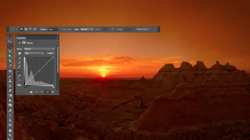
16:34Curves
44:44 9Curves Q&A
20:46 10Keyboard Shortcuts & Adjustment Layers
24:41 11Review of Curves & Adjustment Layers
16:13 12Hue/Saturation
19:08 13Day 1 Q&A
14:27 14Day 1 Wrap-Up
03:40Day 2
15Day 2 Pre-Show Banter
13:26 16Review of Day 1 Process
38:53 17HDR
33:41 18Advanced Layer and Masking Techniques
29:29 19Using Curves with Color
39:42 20Color Correction
35:04 21Color Correction Q&A
14:30 22Example Photos with Curves and Adjustments
25:09 23BONUS: Printing Tips
03:42 24Retouching
23:27 25Advanced Retouching
19:49 26Directing the Viewer's Eye
16:43 27Day 2 Wrap-Up
01:12Day 3
28Day 3 Pre-Show Banter
10:52 29Fixing Lens Flare
14:36 30Hiding Clouds
15:47 31Color, Hue, and Saturation
08:21 32Essential Keyboard Shortcuts
13:18 33Technical Issues
15:00 34Preparing Images for the Web
18:36 35Exposure Bracketing and Photo Stacking
15:52 36Blending Modes
35:07 37Review and Q&A
05:05 38File Formats
21:12 39Brush Tools
14:34 40Transplanting Clouds
20:39 41Selective Focus
18:00 42Converting to B&W
20:03 43Color Spaces
22:03 44Thanks + Credits
03:56 45Fixing Extreme Problems
20:33 46Sharpening Images
23:41 47Day 3 Wrap-Up
04:59Lesson Info
Hue/Saturation
So what I'd like to do next is just move onto a different kind of adjustment and get into that. And I'm actually going to save this document so we can get it. We can work on it, possibly tomorrow. Close that one out. So when something like this comes up a dialog box, I can type the first letter of any one of these buttons. So if you ever see a quick keyboard shortcut pop up when I'm closing a document, I probably hit D for Don't save because I want to preserve a lot of these images to use them later. Um, just so you know, And so the other adjustment I'd like to mention is hue and saturation. And so let's take a look at it. I'm going to use adjustment layers from now on, because that's how I really work my images. I almost never apply adjustments directly, so I will go down here and go to the half black and half white circle, which is where you create your adjustment layers and I'm in accuse hue and saturation. You could describe the colors within an image as a certain hue, and he would...
mean basic color, like red or green or yellow or blue, and then add to that amount of saturation, which is how colorful something is. So a maroon car might be a darker and maybe less colorful version of a red car. You know, that kind of thing. But saturation would determine how colorful something is, and then lightness, which is how brighter dark color is. And those three things put together can define a color in here were able to adjust those three things separately. When you have this little menu in here set to master this one right here, it's gonna affect all the colors in your image equally. And so if you move the lightness slider, you're gonna brighten or darken all of the colors together. And changing the lightness is gonna look terrible if you haven't isolated a color yet, if you're working on the entire image, zero that out saturation could make your entire image more colorful or less colorful. You go all the way to black and white if go to the far left. It's not my preferred way of converting two black and whites. We don't have much control, but you could in with saturation and you have to be careful because you can over saturate areas. Remember, you can get a history Graham to show up if you go to the window menu and choose Sister Graham. And if you ever saw colorful spikes on the very ends of your history, Graham, that means you're getting saturation clipping and you're probably losing some detail, just like we had talked about camera. And then we have Hugh, which is basic color. And if I move this, the basic color of everything in the entire picture will shift and you can get some pretty psychedelic things going on. Well, it's not all that useful win you're working on. The entire image, when it becomes useful, is when you isolate a particular color. There's a couple different ways of doing that, one of which is to choose from this menu. In the menu, we have a total of six colors listed red, green and blue, cyan, magenta and yellow. And if you choose one of those, then that's the only color you would work on. And then you could adjust the basic color, how colorful or how bright, and that's great. But it becomes even more useful when you click on the hand symbol that's next to that menu. When I click on the hand symbol, then I can come on top of my picture and watch what happens when I click on this yellow area here first when I click before I move my mouse. If you look in the human saturation panel, you'll see that the menu that usually says master changed two yellows and if I just click on the picture and dragged the left, were automatically be decreasing the saturation of yellows moving to the right, and we're gonna increase the saturation of yellows within the image. And in order to get that to work, I needed to first click on the hand icon that was in hue and saturation. Then, before I do anything else, I can click over here and click on another color. Let's go to the oranges. Let's move towards the right. They make those more saturated. Then let's go to the blues and make them less saturated. Make them black and white if we can, so you can adjust a bunch of colors very quickly by just clicking on the hand symbol, clicking on what you want and dragging left or right? The only problem is, when doing that, you're only gonna be adjusting the saturation. Uh, if I want to adjust something other than saturation like Hugh, I'm gonna have to hold down a keyboard shortcut. So I'm gonna hold down the command key on a Mac, and I'm gonna click on this yellow area on windows. That would be the control key. And now, when I click on the yellow area and I drag, it's not gonna be changing saturation anymore. It's going to be changing the huer basic color of that area, and I can move it all around wherever I like. So let me do this and more of a practical way. I'll get rid of this adjustment layer by dragging it to the trash. And I will create a new one just to start fresh. If I click the hand icon now, I could move into my picture and let's see, I want my blues to become more colorful. So click and drag to the right and then I don't like the exact shade of blue. So I hold on the command key control on windows and now Aiken, fine. Tune that shade of blue. That could be a blue sky that's looking to scion, and I wanted to be more of a peer blue. Then I can come in here to my oranges, and I could make them more saturated or less the pain and what I think they need. I got on the command key, then in fine tune the exact shade of orange we have in there. And then I can see if I can get into the Reds. I don't know if it's going to separate reds from oranges, though they're so similar, and I confined tune the color as well, and it's a very nice way to very quickly be able to do those things. So I use human saturation all the time to find tune colors. What I've shown you so far is overly simplistic. He doesn't really show you the power that's in there, because right now it's very generically isolating the blues and the reds, the yellows and all that. We'll see if I can find a different image where we might be able to isolate things a little better and just get a little more control. This image I could probably still go with basic adjustments on it. But let's see what happens. My open image. We'll get fancy, even though we might not need to just cause we need to learn how to isolate things. So I'm gonna do a human saturation adjustment layer. I'm in a gravel, a hand tool, and I'm gonna click on whatever color it is. I'd like to adjust. Let's say I'm going for the green grass. It's here, I click. And it thinks the green grass is actually more yellow than it is green because it changed the menu yellows. And sometimes that is the case he issues. You're not used to seeing dark yellows, which is often what Greengrass ends up being. But keep an eye right down here at the bottom of hue and saturation. When I clicked on the picture, it put in these little bars that were in there. Let me see if I can choose undo to get rid of him. Usually there's nothing down there at the bottom by zoom out books. Suppose I need my adjustment. Okay, see, there's bars down here, but there's no like little tick marks and other things in between them. But the moment I grab that hand and click on something. Watch what happens right in there. Now you see what showed out. So what's happening is it's on Lee able to change what is above those bars. Now there are actually two different shades of those bars. Middle section is lighter in color or in tonality, I should say, than the outer that middle section is where it's going to get the full force of my adjustment. Those outer sections is where it's gonna fade out, and so it blends in with the surroundings, and we can control that. You can actually move your mouse in here, and if you click in the middle of the bar that's there, you can move. This is a whole around to put it above or below different colors that are in your image. You can grab one of those and little handles and expand this out to, say, work on a wider range of colors or work on a narrower range of colors. Then you can say fade out across a narrow region or a really wide region, and you confined to, and I want to show you how to kind of use those. So let's see what you can do with them. So the first thing I'm gonna dio is I need to be able to just visually see what part of the image has been isolated because I can't tell right now in order to see that I'm just gonna make a radical change to any one of these sliders and what I'm gonna do for now, it's just bring my saturation all the way down so that the area that's being affected is going black and white. And right now, I don't know about you. I didn't notice any area. Go black and white. So that means this isn't a sitting next to any of the colors within the picture. If I move it around, though, remember that it thought the grasses more yellow than it was green. Moving over far enough. It might start making the green grass black and white. So here's how I really work with this. First, I either click on my picture or I choose from this menu to get those things to show up. Then I slam them together. That way, it's gonna work on the narrowest range that it can. You see they're touching each other, then We have three eye droppers down here, and that's where it gives us all the power. The eyedropper on the left is going to center these bars over whatever I click on. So I'm gonna click on the green grass, watch what happens to these little bars. It's gonna pop over to wherever it thinks that color is. And I click on different areas. Do it until I think green grass is starting to change a little bit. Then we don't have enough of the green grass changing. So I'm gonna grab the eyedropper with the plus sign on it with that eye dropper does is it expands these bars by expanding them. It means work on more colors, wider range. So I grabbed the eyedropper, the plus sign on it, and I click on more green grass any part of the green grass that hasn't turned black and white yet. All right. And I can continue doing that in various areas until all the grass turns black and white in the black white effect is only to show me what part of the image of isolated I don't really want black and grass. After I've done that, where I clicked on it with a plus eyedropper on all the green stuff until all the green grass turns black and white. Then I look at the transition of where that black and white effect ends and where bumps and other things. And I say, Does it look abrupt, or does it look semi natural? If it looks abrupt and I needed to blend in with its surroundings, that's where I'll come in and I'll pull out these end little doodads the fade out region. Grab those, and I'll just pull him out a little bit to say, blend into the surroundings on either side until it looks natural Now. Sometimes it's not able to isolate things precisely because it thinks of the green grass is dark yellow. Well, the top of this Jeep was bright yellow, and so they're the same basic Hugh or basic color, and so it won't be able to separate those two. That's okay. We can paint with Black and the mask afterwards very easily over that part of the Jeep to prevent it from changing. So once I've gotten that isolated, I bring my saturation back to the middle just by typing in zero After I've highlighted that number, and now I could make any change. I want to the grass. I can change the basic hue of the grass. Maybe I wanted more of a pure green, but after I make it more pure green, I find it's too colorful. So I bring down the saturation until it looks appropriate, because maybe I want my grass look a little different. There's an eyeball, I kind of the bottom of your adjustment panel that shows you before and after, and so I can see how it's affecting the image. And then, as with any adjustment layer, if its effect in an area that it shouldn't like the top of the Jeep. I grab my paintbrush tool paint with black black, takes away the adjustment, and I would say, Hey, don't affect this thing and I only have to be careful where I bump into green grass. I can paint up. We're on this stuff. Who cares? There's no green grass in there that I'm trying to adjust so I can get it off of the yellow parts of the Jeep that I can continue to find. Tune it. I can come in here, may make it more colorful. You make it a little bit brighter, whatever. I'm not saying this is improving this particular image. I just needed a picture to play with. But if I turn on and off the eyeball, you can see that I'm isolating the green grass. So let's see. We can try that on a different image. In fact, I think I'm gonna try to find the guys from Russia. Let's see if we can isolate sunburnt skin from normal skin because that could be useful because they're not as sunburnt down on their necks and things. And so I'm gonna open this image, bring out some shadow detail, OK, open and let's do hue and saturation. And then I'm either gonna choose a color from this menu or use that little hand tool to click on my image. Either way doesn't matter. Doesn't matter what color I choose, either, because I'm gonna manually move these around, and that's gonna change. So in fact, right now it says yellows. When I slam these together, it's gonna change to whatever their closest to right now. Wherever I left him anyway, I slam them together just so I could be the most precise. I can only get the range I want instead of generically grabbing all the Reds or something after I've slammed him together is when I go to the three eye droppers, starting with the eyedropper on the left and I click on the basic color I want Click in its centers, those sliders on that color. Then, to see if I've isolated enough, I move one of these sliders a radical amount. I'm just gonna take saturation and bring it all the way down, and I'm looking at the image now saying, Are all all the sun burns areas black and white or not if they're not? I grabbed the eyedropper with plus Sign on, and I click on other sunburnt areas, like right up here on his cheek. I might want to get his ear in other things, and it's expanding the range in between those two little slider bars to say work on a wider and riot wider range. I don't remember if this area here was sunburnt her. If that was normal. If you remember it being somewhere, click on it. If it's normal, un sunburnt skin don't click on because I'm trying to isolate sunburn I should have inspected the image a little bit closer. Then, if I want to get a good transition between that area and its surrounding colors, I'm gonna pull out the outer parts of those slider bars, and I just look at what's the surrounding color? Is it closer to being what's on the right side of this? Which would be yellowish orange is, or is it closer to what's on the left side, which is more of a pinkish orange? I would say it's more of the yellowish orange in the surroundings, so I'm gonna pull out the right side, see if I can get a good transition there. Then I'm gonna bring my saturation back to the middle. But selecting it, typing in zero. And now I have these three choices of what I could dio. I think that the basic color of their skin, which is the hue of their skin, eyes to read. So I'm gonna move it one direction, which makes it worse, and then the other direction, which makes it a little better. All right then I think their skin might have been a little dark, because when you get sunburnt darkens, so I might brighten it up a little bit by bringing up my lightness. And then I can decide I need more color in the skin or less. And let's see what I've done to the skin. I'm just gonna turn off the eyeball before, after you see that we're getting less sunburn. And if it's not a big enough correction, you just kind of move the sliders further. Maybe I need to lighten them, even Mawr making even less colorful and maybe even shift that you a little further, more towards yellow. There, let's see what we're getting. See the big change in their skin. If something changes that shouldn't, then you know you can paint with black, so just grab your paintbrush in. What might change here is the color of sunburn is very similar to the color of lips and sew. Their lips might have gotten less colorful. Imagine I zoomed in and I'm being precise. Come over here and say, Get it off of their lips wherever I can see the lips here, I'm not being precise, so look like lips. That kind of drunk person, you know, eso Anyway, that's how I'd end up doing that so the combination of using curves in hue and saturation. Those two tools are what I use the most of my images. And tomorrow, when we start the day, I'll end up somewhat summarizing what we did today. And afterwards I'll open some complex images where I might have dozens of adjustments in it will go through each one of the adjustments to see exactly what we're doing. Will look at each one of the mass to see exactly what I was isolating, and you'll see how I apply this and much more complex in high end images where it's not me being sloppy painting. It's me being very precise painting, very precise with my adjustments, so you can really see what it's truly capable of once you're comfortable with. But those are the two most popular adjustments for my images. Curves in human saturation
Class Materials
bonus material with purchase
Ratings and Reviews
Jim Pater
I taught Photoshop (version 5) to graphic design students at the college level. I had great fun teaching. This is the perfect course to show others how they might go about teaching a Photoshop course. Congratulations Ben, on your excellent teaching style and methods. I thought I already knew quite a bit about Photoshop but this course made me aware that there's always more that you can learn.
Ron Greathouse
This course is one of the best Creative Live Courses that you have made available to us. I have purchased at least 12 courses and this course is my personal favorite. Ben is an excellent instructor and should be teaching at the university level. He is great!