Lesson Info
10. Keyboard Shortcuts & Adjustment Layers
Lessons
Day 1
1Free Preview: Camera RAW: Exposure & Contrast
42:43 2Camera RAW Q&A
20:25 3Camera RAW: Color
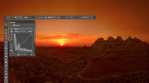
23:03 4Understanding Histograms
07:57 5Camera RAW: Localized Changes
35:36 6Understanding Saturation Clipping
09:42 7Camera RAW: Noise Reduction & Lens Correction
16:34Curves
44:44 9Curves Q&A
20:46 10Keyboard Shortcuts & Adjustment Layers
24:41 11Review of Curves & Adjustment Layers
16:13 12Hue/Saturation
19:08 13Day 1 Q&A
14:27 14Day 1 Wrap-Up
03:40Day 2
15Day 2 Pre-Show Banter
13:26 16Review of Day 1 Process
38:53 17HDR
33:41 18Advanced Layer and Masking Techniques
29:29 19Using Curves with Color
39:42 20Color Correction
35:04 21Color Correction Q&A
14:30 22Example Photos with Curves and Adjustments
25:09 23BONUS: Printing Tips
03:42 24Retouching
23:27 25Advanced Retouching
19:49 26Directing the Viewer's Eye
16:43 27Day 2 Wrap-Up
01:12Day 3
28Day 3 Pre-Show Banter
10:52 29Fixing Lens Flare
14:36 30Hiding Clouds
15:47 31Color, Hue, and Saturation
08:21 32Essential Keyboard Shortcuts
13:18 33Technical Issues
15:00 34Preparing Images for the Web
18:36 35Exposure Bracketing and Photo Stacking
15:52 36Blending Modes
35:07 37Review and Q&A
05:05 38File Formats
21:12 39Brush Tools
14:34 40Transplanting Clouds
20:39 41Selective Focus
18:00 42Converting to B&W
20:03 43Color Spaces
22:03 44Thanks + Credits
03:56 45Fixing Extreme Problems
20:33 46Sharpening Images
23:41 47Day 3 Wrap-Up
04:59Lesson Info
Keyboard Shortcuts & Adjustment Layers
So now we really need to know. To make curves overly useful is adjustment layers because it's with an adjustment layer where you really get the most control. So see if I've done anything to this, get back to its original state. Um, so let's talk about first. I should mention the keyboard shortcut I just used because maybe going What the heck did he dio If you every new multiple steps to your image and you want to get back to the original state of the image, you can usually go to the file menu and choose Revert Revert would be the same is closing the image and saying Don't save changes and then reopening it. But sometimes what I did was like 20 steps long, and it's only the last five that I need to undo. You have a keyboard shortcut you're probably used to because most people screw up pretty often, and that is for undue is command Z controls and windows. So let me do multiple things to this image. I'm just gonna make lines on it or do something dumb. Make it get a larger brush here. Oka...
y, Each one of these paint strokes is considered to be a different event that could be undone if I just typed commands. The all I can do is get rid of the last thing that I did. And if I tape it a second time, it simply re applies. If I want to get more than one undo, I have two choices. And what to dio. I could go to the history palette in the history palette. Usually you can get Teoh groups if I come up to this thing right there that'll pop open the history panel, and this will list what I've done, and I could go back by clicking on the name of any one of these. Go back further and further further, but you can do the exact same thing using your keyboard. So there's no need to have this open unless you just like that. It's open and you like a list of what you've done, so I'll click on its little icon to hide it and in order, do with your keyboard. All you need to do is take the standard undo keyboard Chaka, which is commands Ian A Mac controls and windows, and just add to it. The option can IMac Alton windows, so have to modify our keys. Held down on a Mac. It's option in command on windows that would be Alton control and then type C in. Each time you type it, you go back another step. Okay, if you screw up and you go one or two steps too far going back, then don't add that option key anymore. Instead, add the shift key shift. Command Z will reapply. It's like going down in the history instead up in the history eso option Command Z means go backwards in time shift Command Z means go forward in time. It can only go forward in time if the very last thing you did was undoing things. If you grab the paint, brush and paint on the image now, it forgot those things that, you know, done done. And it just continues on with whatever you do it. It's on a windows and the shift Control Z just in case you're not used to the equivalence. Any time I mention the command can IMac. It's the same as the control came windows. Easy to remember. They both start with the letter C, and the option key is the same as the Elke. So if I ever happen to not mention the equivalent, you could do that. And if you look at the overlay on my screen, uh, this symbol is the command. Can a Mac, they stole it from an Icelandic map. It means unique and interesting feature, like a wayside view or something. And if you're driving through Iceland, you'll see signs with the command key on What's that, Frankie? And it means, Hey, there's something cool to see over here. Then this key that you see, it doesn't actually have that symbol on my keyboard. But it needed to visually come up with an icon for it. That means the option key. So if you ever see with the overlays and your windows user or your Mac user, you're not used to that symbol. That's command key. That's the option key on Windows. This is this is the equipment to control. This is equipment to halt. So if you ever seen pop up with that, all right, So, um, adjustment layers. He is what I'd like to get into. So there are two general ways of applying an adjustment. The first is to go up to the image menu and choose adjustments to get to your adjustment. I rarely do it that way. I would say I do it that way, maybe 5 to 10% of the time. When you apply an adjustment from this menu, it directly affects the pixels that make up your picture, making it so that if you save and close the image, it's in general permanent unless you happen to duplicate your layer. Firstly, left the original underneath, but when you duplicated the layer, you just doubled your file size, you know, in order to do that, so most of time I don't duplicate a layer and then apply it. So when I do this, it affects the image directly. When I save and close, it has been applied permanently. The other thing about this is if you have a complex, multi layered document in, you go to this menu, this will only affect one layer at a time. So if you have 12 layers, you need, um, Albrighton's. You'd have to apply this 12 times one each layer in order to get the change you're looking for. If, on the other hand, to use an adjustment layer an adjustment layer will adjust all the layers that are below it, but none of the layers that are above it. Okay, so, uh, also, with this kind of stuff, if you want to use, like luminosity mode and that kind of stuff, you have to do it immediately after applying the adjustment before you do anything else. If you forget to do it in luminosity mode and then do something else like paint on your picture retouch, you can't go back and say, Oh, I wanted that to be a luminosity with adjustment layers you can, so you'll find that I rarely go up here. The only reason I did to begin with was because we hadn't discussed adjustment layers yet. So now adjustment layers are my preferred way of adjusting the image, and there are many different ways of creating adjustment layer. Then you just need to decide which one you I feel most comfortable with. The first method you could do is you could go up to the layer menu, and there's a choice called new adjustment Layer, and here you have a list. I I would have to say I never use that one, but you could the second way you could do it is on the right side of my screen. Is this little panel called adjustments If you don't have that visible on your screen when you open Photoshopped, you could go up to the window menu and choose adjustments to make it show up. Any panel you see on my screen, it's not on yours. Go to this menu and look for the name of it. It would make it show up in here. We have one icon for each type of adjustment layer we can create, but to me it's a little bit like looking at higher Olympics and that they're not always easy to interpret. I'm like what the heck one is for the human saturation and they're not always obvious. Some of them are. Curbs is pretty obvious in their little grid, with line going across it levels. Looks like a little hissed, a gram, brightness and contrast looks like the sun, but you can mouse over each one, and if you pause, it should give you a tool tip that shows up Tosi what it's for. And if you get used to those, you can click on those. I've just never gotten used all those icons, maybe curves and a few others. But then the old school way of doing it if you used photo shop for dozens of years, is to go to the bottom of your layers panel that the bottom of the layers panel is 1/2 black and half white circle down here. And if you click on that, you will get a list of all the various adjustment layers you can apply, and you can get in there when you do an adjustment layer instead of having your adjustment appear in a dialog box that pops up. It appears in one of these little panels. Just so you know, these things used to be called pallets, and now they change the name to panels. So if you're used to that thinking, why is he calling it that? Adobe changed the term. So go with what they what they call it in photo shop CS six. There'll be a little scrubber bar at the very bottom where you could expand this to get more space or kind of high it. In some ways, in previous versions, you won't be able to really, really resize that also in CS six. I can make it a little bit bigger in the whip or make it smaller, so that could be somewhat nice. And when you're doing an adjustment layer, you choose curves. The hand symbol moved up here, remember? Before it was near the bottom of curves is sitting right there so I can turn that on. So now what I can do is I'm coming to this image and say that I would like to brighten up this radio. I took this picture in Southeast Asia somewhere in literally just walking into my hotel. That stuff was sitting there and, uh, probably still in use. I mean, from the place I was at. So I'm just gonna click on this and move it up. It's like having a dimmer switch, remember? So just click on it, move it up to brighten. But then let's say I don't want that to happen to the entire picture. Well, each time you create an adjustment layer, along with it comes a mask. So if you look in my layers panel, this top layer is the adjustment layer that was created. It was created at the moment that I clicked the black and white circle at the bottom of Kerr of Layers, and I chose the adjustment I wanted Boom! That showed up and it really has two parts. The part right here is the mask. The part over here represents the adjustment, and sometimes you'll find this area here looking different. Right now you're seeing a generic symbol that is half black and half white. But on a lot of images, you might see one of these icons, Europe. Here. It's just if there's not enough space to fit one of those icons because the picture you're working on is more panorama in size, you know, orientation. It will just substitute the generic half black and half white circle. If he's got enough space to use it, it will usually put in a little icons. You can tell it's curves or something else. So if you look, that mask is currently active, and I know that because the corners air highlighted, see the little brackets around the corners. So what that means is if I grab any brush or tool in my tool palette and do something, what I'm really editing when I go on to the image is not the picture because the picture that's underneath is not active. It's not highlight. Instead, when I'm working on is that mask and the way a mask works is whatever part of it is. White allows the adjustment to apply to your picture. But if I grab my paintbrush tool and down here, I switch my foreground color to black. This little double arrow icon will swap those colors Now. If I come in here and I paint with flak, I'm going to remove the adjustment from wherever I paint So I can paint here and it's the same as throwing away that adjustment, but just in that area. So if I paint with black, I can get rid of that. So now if you look at my layers panel and you look close, you can see the little paint in there. See all the black I painted in the little white part, the white parts the only part it can affect. If I turn off the eyeball in this adjustment layer, you'll see the image before and after. There's my little brightening effect. I wasn't overly precise with my painting. I won't be for a while will be very generic about some painting here. Um, so I do that then I can come in and do additional adjustment layers. I can come in here and say I want a new curves and maybe I want to bring out some of the wood grain. So I come in here and say, Where is this? And I'm just looking and curves and you see that circle bouncing around. So I added dot at both ends of wherever it went. And then I say, looking at the wood grain, Would I like to brighten parts of it to get the change to happen or dark in parts? I'm thinking Brighton at the moment, So that means the upper dot move it up so I'll move the upper dot up. I might even move the lower dot down too dark and too, you could do both a little easier to see that wood grain. Once I'm done, I might think, Well, dang, it got more colorful because when I darkened, it changed it so I can change the blending mode. That's the menu found at the top of my layers panel. That usually says normal. I'm gonna change it to luminosity, and now it won't be able to affect the color in Sanofi turned the Sybil off and on. Can you see the wood grain becoming a little bit more exaggerated? But because we're using luminosity mode, we didn't get the nasty color change on, and I just set this menu up here to luminosity when it did it. Now I don't want that to affect the wall because it's getting way too bright or the radio just want it on the dresser. So I grab my paintbrush. I paint with black because black means take away the adjustment and I just paint over whatever I didn't want affected by in. Usually, I would be much more precise than this, but I'm not used to using one of these mouse things, and it's it's kind of like using a bar soap it's not. I like it, though, for seminars, because I honestly like an excuse to be sloppy so I could just teach instead of trying to create an image we're going to frame and hang on the wall. And this is one of my excuses for being a little bit messier. So now I'm gonna trough the eyeball for that layer and let's see what it's done. Here's before. Here's after you see Mawr contrast in the Wood. All right, so then let's say I come up here and I zoom up on the radio and I say it won't. Lee and I wanted to be easier to read that text or something or bring out the texture somewhere else. I don't know. I'm just making it up. As I think of it, I go back to curves and I make another curves adjustment layer. I grabbed a little hand tool, and if I want where contrast in the grill, I might click on the bright part toe, lock it in and then click on the dark part and drag it down. Then I noticed the image becoming more colorful. I don't like that. So I changed this toe luminosity so it doesn't get that color change in. Now I need to paint with black. Now I'm gonna zoom out so I can see the entire image here. If you double click on the hand tool, you'll zoom out to fit in window. Have you, uh, and I grab my paintbrush and I'll just paint everywhere that I don't want it now. Sometimes painting like this over the entire picture is a little bit of a pain in the butt when you want to only a just a small area. So there is a little trick values and that is if I wanted to effect a very small area before painting. In fact, let me undo my painting. You can look at my mask now It's white, just like before I painted. What I'll do is if I wanted to effect a very small area. I will type the following keyboard shortcut command I that's controlling Windows Command. I control. I means invert. In this case, that means invert the mask, give me the opposite of what I currently have. So when I type it, if you watch my top layer when I type command I if you take a look at my layers panel which I know you guys aren't seeing right now But you will in a minute. In my layers panel, that top layer is black. If I typed command, I it turns white it again. It turns black again, just gives the opposite of what was in there. So that way, when it's black completely, it means do not apply anywhere in my picture, and then I can switch over and I'll paint with white to paint the adjustment into my picture. So come in here. The keyboard shortcuts you're seen flash up is me changing the size of my brush, consuming it. But now I'm paying with white and I can paint the adjustment in just where I wanted it. If I get over spray somewhere where I didn't want it, maybe I didn't want it here. I just switched my foreground color to black and I take it away. Now let's see what that is doing. I'll turn off the eyeball for the layer. You see it? Adding extra contrast of that little area was the amount. Now I want a plot, some contrast in the wall So I make another curves adjustment layer and I go over the wall and say Where is it? In my curve? You see the circle jumping around? I'm gonna add a dot on both ends of wherever it goes, and I'm gonna make it steeper in between the two Steeper in between, the two means more contrast, which means make the detail pop up. If I move anything up by Brighton dimmer switch. Move it down a darkened. So I have to look at that and decide what I would like. I think I'm gonna darkened, so I grabbed lower dot moving down. Okay, we're getting some contrast there. I don't like how dark this area is getting, so I can add a dot for that and move it up. It's a lesson that okay, I don't like that the wall is becoming like pinkish orange. Uh, so that's luminosity. Remember, that means don't don't affect the color. Then I'm gonna paint it and where I want it so I can either paint with black on top of all the areas I don't want where I can invert the mask and then paint with white. Where I do want either way depends how big the area is here. It's a toss up, so I'll just grab a brush and I'll paint with black and say, Don't affect this stuff and I'd have to be more careful here. You don't have to just paint. There are other methods you can use, like making selections and then filling those selections with white or black, which is often very useful. We just haven't talked about selections yet, so I'm limiting myself. But now let's see what that adjustment is doing. See how it's doing the contrast there. So I build up a bunch of adjustment layers to work on isolated areas until I'm happy with the entire image in. So I'll do one more. This side here is brighter than the side here. I'd like to be more similar, so let's go to curves in curves. Check this out. I click the hand in that I click right in here to say That's what I want to adjust now. I don't know how far to move it to make it look like over here, But why not just move your mouse over there looking curves? Where is the circle? That's where the dimmer switches for this part of the image. So if I want the other side to look like this side, move it to the exact same height is where that circle is. So over here is where I was adjusting. Over here is where it's a lot darker, and you just see the circles lower when I hover over that part. So I'm just gonna grab this dot Move it straight down to where that Waas Then I'm gonna invert the mask. I don't remember command. I control on windows, so it's not applying anywhere at all. Grab my brush. And if you invert your mask, you need to paint with white. Now I could bring that dark in effect in here, bigger your brushes, the softer the edge becomes. So if you want a soft transition, all paint with black to take away my adjustment and I'll get a huge brush. Huge, massive brush. Bigger the brushes, the more can fade out. Just how much space does it have? If you have a brush the size of your pinky, it has half the with your pinkie to fade out is gonna fit on both edges. If you have one the size of your head, it's got half the width of your head to fade out. You know, bigger brush mean softer edge. So if I take away now, I could get a very soft transition over there. And let's see what this is doing. I'll turn off the adjustment layer, see that side? I'm getting closer to the look of the other side. So what did I do? There is something I'm starting to kind of get into it where I'm like who, you know, start moving. I added. A dock for the area wanted to change. Then I moved my mouse over the area. I wanted to match, but I didn't click because I wasn't trying to lock in that area. Anything else? I just hovered there and I said, How high is the circle for that area I wanted to match. Then I took the dot for the area, wanted to adjust, just moved into the exact same height. Move it straight up or straight. Now, until it's that height, then what I need to do afterwards is mask it, so it only affects that areas, and I've even that up. If you build up a lot of adjustments like this and you want to see before and after, here's a trick. Move your mouse to the bottom eyeball to eyeball for actual picture. Hold down the option key, which is all time windows and click on it that will hide all the other layers so you can see what the image used to look like before your adjustments. Then option click that I bought a second time. It'll turn them all back on. Let me turn off our little keyboard over lay so that you can see it better See what we've done. One last adjustment. This is too bright on the right side. So curves grab little hand and I'll move this over or pull this out. I'm gonna add a doctor right here. Look, And then I'm going to see how far down I need to move it to make it this bright. So do you see where the circle is right now? That's how high I want or low. I want to move it. So I'll go and grab that dot in the second, and I'm just gonna move it straight down. So it's the same highest in circle, so that should make it about same brightness. If I did it right now, I wanted to only affect a small area. So I'm gonna invert my mask with command. I he and I'm gonna paint with white to paint in the adjustment. I'm going to use a massive brush because I need a very soft transition from the area. I'm darkening to the rest of the picture, so I just kind of do that if I got any down there and I can switch over to black, and I think I got some over spray on the fan and the whatever this is. Desk or dresser. Imagine I was precise right there. We'll talk more about selection tools later, which would help us beef precise there. And I'll get it off of that off this off, and then I'll put this back in where it waas used to be docked in there. Okay, Okay. I don't like that part, but when we could fix it, it's just a matter how much time you spend.
Class Materials
bonus material with purchase
Ratings and Reviews
Jim Pater
I taught Photoshop (version 5) to graphic design students at the college level. I had great fun teaching. This is the perfect course to show others how they might go about teaching a Photoshop course. Congratulations Ben, on your excellent teaching style and methods. I thought I already knew quite a bit about Photoshop but this course made me aware that there's always more that you can learn.