Lessons
Day 1
1Free Preview: Camera RAW: Exposure & Contrast
42:43 2Camera RAW Q&A
20:25 3Camera RAW: Color
23:03 4Understanding Histograms
07:57 5Camera RAW: Localized Changes
35:36 6Understanding Saturation Clipping
09:42 7Camera RAW: Noise Reduction & Lens Correction
16:34Curves
44:44 9Curves Q&A
20:46 10Keyboard Shortcuts & Adjustment Layers
24:41 11Review of Curves & Adjustment Layers
16:13 12Hue/Saturation
19:08 13Day 1 Q&A
14:27 14Day 1 Wrap-Up
03:40Day 2
15Day 2 Pre-Show Banter
13:26 16Review of Day 1 Process
38:53 17HDR
33:41 18Advanced Layer and Masking Techniques
29:29 19Using Curves with Color
39:42 20Color Correction
35:04 21Color Correction Q&A
14:30 22Example Photos with Curves and Adjustments
25:09 23BONUS: Printing Tips
03:42 24Retouching
23:27 25Advanced Retouching
19:49 26Directing the Viewer's Eye
16:43 27Day 2 Wrap-Up
01:12Day 3
28Day 3 Pre-Show Banter
10:52 29Fixing Lens Flare
14:36 30Hiding Clouds
15:47 31Color, Hue, and Saturation
08:21 32Essential Keyboard Shortcuts
13:18 33Technical Issues
15:00 34Preparing Images for the Web
18:36 35Exposure Bracketing and Photo Stacking
15:52 36Blending Modes
35:07 37Review and Q&A
05:05 38File Formats
21:12 39Brush Tools
14:34 40Transplanting Clouds
20:39 41Selective Focus
18:00 42Converting to B&W
20:03 43Color Spaces
22:03 44Thanks + Credits
03:56 45Fixing Extreme Problems
20:33 46Sharpening Images
23:41 47Day 3 Wrap-Up
04:59Lesson Info
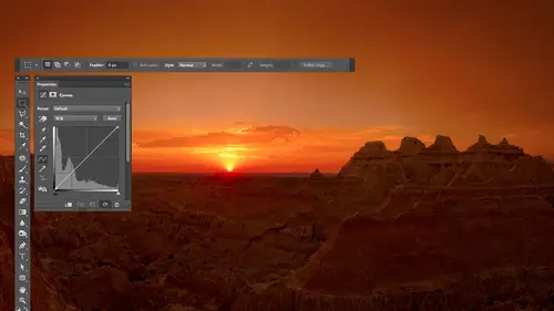
Review of Curves & Adjustment Layers
Well, when we last left, we were working on her image of, ah, radio and a fan and, uh, a couple things I want to mention about it, and then I'll give me a little bit of review before we move on. Eso. One thing I forgot to do with this particular image is I've neglected to change my last adjustments blending mode to luminosity. And so if I look at the image now, uh, the, uh, portion on the right side where I made my last adjustment, uh is one where, uh is too colorful. And that's just because any time you darken an image, it's going to, uh, make the much more colorful. And if I change my blending mode from normal to luminosity mode, uh, then you'll see the difference. So if you first off, this last adjustment is one where you can see it here by me tugging on and off. And if I changed my luminosity right here, that's gonna look much better if I choose. Undo without luminosity, with luminosity. So this is an image. It's rather sensitive to that, because this wall is just a little bit colo...
rful and so is your darken it. You noticed quite a big difference with that happening. Other things I could do to this image they would most likely Dio is I would dark in this area right here, if you can see that. Sorry, I hit the space bar to get a hand icon. It's sometimes easier to see. I'm not used to the little overlay of the keyboard shortcut, but right here I'd probably dark in that all you have to do is add a dot for it and move it to the same height is where for the circle would be with My mouse is up here. That means make it have the same amount of light, and then I'd have painted in. Then I also like doing vignette ing were darkened the edges of a picture to try to keep your interest in the center of the image. Just briefly mentioned a few ways of doing that. If I do a curves adjustment layer and I just darken the image either generically, by clicking anywhere and pulling down where sometimes just grab the highlights the highest part of the curve, and bring it down like this, then what I'll do is afterwards I'll come in here and I'll just grab my paintbrush paint with black and I'll grab a humongous brush because big brush means soft edge and I'll just paint where I want your eye to go. So I want your eye to look at this fan. Look at this radio in to look at this desk and just kind of paint over those areas. And now if I hide that layer, you'll see what it's doing. It's just darkening up the edges of the photo, and sometimes that will be too much. I find the busier my picture is, the more detail there is everywhere, the more I can get away with more radical vignette ing darkening me over the edge. Simpler the images, the more you have like a blue sky kind of simple look, the less I can get away with it before you know I did it. And so what I'll do is after darkening the image. With that, I'll go up to the top of my layers panel. We'll click on the word opacity. I'll drag it all the way down to zero and then slowly bring it up to say, How much can I get away with before I really notice I've done it in. Oftentimes I'm going for subtlety there where, you know, I don't want people who really know him, you know, messing with them. Then remember to show before and after you hold on the option key Alton windows and click on the bottom eyeball. And therefore you could see before handing. See after a big change, then one last thing before I do review is Remember, I mentioned the icon that shows up for a particular adjustment, like this little circle half black and half white. That only shows up. If you're thumbnails that is displaying, are not big enough to have room to show the full icon that would usually be there. Here's one method for getting the Earth thumbnails be bigger if you go into an empty area in your layers panel below all the layers where there's just empty space, you can press the right mouse button and control how large the thumbnails are. So I'm clicking in the empty space below the bottom layer, but above the icons there at the bottom of this little area. Here I right, click, and then if I bring it up to medium or large thumbnails. Then you'll see the actual icons that usually show up in that area. It's only if you have a picture where those thumbnails a rather small that they goes to the generic icon looks like a circle half black and half white. I'm gonna double click on a few of these other panels to collapse them down just so we can see our layers a little better. And that's what we have. So let's review. I took some notes while you guys were break in. Here they are. So in general curves, I think of it. If whenever I added dot on a curve, it's like created a dimmer switch to control a particular area of my image. And if this is a dimmer switch, moving it up is just like a normal dimmer switch. It's gonna brighten things. Moving it down is gonna dark and things, so just literally think of a dimmer switch in your wall. So whenever you grab a dot, you shouldn't be surprised what's gonna happen if you move it up. It's like grabbing a dimmer to do that. Then, if I take what started out as a diagonal line and I take that diagonal line and I make it steeper, more towards vertical, Then I'm increasing contrast in any time you increase contrast, it is going to make it easier see detail in that area. So what I could do is move my mouse onto my image. And if there's any object I want to see more detail on, I hover over it and I kind of go back and forth over it. And I watch for a little circle, jumps in curves. And if that little circle jumps around this little area here, I had a dot to the upper it adopt to the lower. And then to add contrast, I either need move this stock up that would brighten things or move this stock down. It'll depend on the image. What I decide to do. I can also do both. I could move this stock down to darken in this dot up to brighten same time. But whatever it is, if I connect the dots between where I ended up, it needs to be steeper. War towards vertical. As you go vertical, you're increasing contrast. The opposite of that is, if I wanted to make it look like there's less detail. Harder to see the detail in an area. I again go to my image. I click and drag or not. Click just hover in drag over an area. I see a circle jumping around and let's say it happens in here. I had a dot at the ends of both, and I need to make it closer to horizontal. Need to make it flatter to make it harder to see the detail. I can do that one of three ways. If I grab the lower dot and move it up like that, I'm gonna be brightness because it's a dimmer switch. Move it up on your right. If I grab the upper dot and move it down, I'm gonna be darkening where I could do both. I simply glance at my image and I say, for that particular object, Could it look OK if a guy a little brighter? If so, I'm moving things up. Would it look OK if it got a little darker? Have so I'm moving things down and if it's like wow about toss up between it, then I might do both, but you need to make it flatter in order to reduce contrast, then, things to look out for the 1st 1 is making any party or curve go flat when it goes flat, you will have no detail whatsoever in whatever brightness range. That is so that if you had any detail previously, it looked like a flat shade, flat color or shade with no variation. Then if I let the curve, if I look at it and I go from left to right, it should always go up. Is a go left to right? If it ever goes downhill, that's where you're going to get weird colors, weird transitions in just funky stuff. And so it's something where usually you want to completely avoid that unless you're going for a special effect, huh? So that's what I would think of now. I actually did more notes than this. Let's see how this works. Flip it over. All right, then you're working with adjustment layers in with adjustment layers. Here's this. My little diagram of adjustment layer the eyeball controls. If that adjustment is active or not, it's on or off. The next icon over represents what kind of adjustment you have. It's gonna look like a curve or if it looks like a little hissed a gram. It's levels or whatever. There's one icon for each kind of an adjustment, so that went by. Glancing at you can sometimes tell what kind of adjustment it is next to. That is your mask, which determines where that adjustment can affect the picture and in a mask. White allows it to apply to your image. Black prevents it from applying. The little corners being highlighted tells you if that mask is active or not, and you have to be very careful about that. If you're switching between layers, let's say you already have five adjustment layers in there. You're clicking between them to add different things. When you click between layers, you might find that these little corners go away if they go away. Then when you use your paint brush tool, if the information is not going to go in that mask, and that's where you want it. So if you're clicking between layers and already exists, just glance at the mask and make sure it has those corners highlighted to say it's active. And if it doesn't just click right on it and the corners will appear there. So then you know any adjustment or any paint brush tool use will affect the mask. Um, a couple other things to know about in that is, if you want to work on a small area with your adjustment, it's really a pain in the butt to paint with black over everything you don't want to adjust. So what I would suggest you do is if it's a smaller, you want to adjust after you create the adjustment type command I that's control I in windows that will invert your mask and make it black. Black women don't apply anywhere, and then you want to paint with white after that, That's something I get very used to doing. The other thing that I get very used to doing that I don't think I've mentioned yet. If you type the letter X all by itself, the letter X will exchange your foreground and background colors, so if he had black is your foreground color. You hit X, and now you should have white is your foreground color because those were the defaults for those foreground backgrounds. That way, you can just very quickly add to or take away from your mask by switching between black and white. If you find that when you adjust your image, the color becomes too vivid. It's not always the case. Sometimes I like it becoming more vivid. But if you don't like it, you want to set it to luminosity at the top of your layers panel. That's what's going to prevent it from shifting color. Other things was when I'm done, adding a bunch of adjustment layers to an image if I want to see before and after I mean option click, which would be all clicking and windows on the eyeball icon for the one layer that I want to view, which is usually my bottom layer exits when the picture is so, I option Click on that sucker to ah Haider show all the others, um, two things I haven't talked about Keyboard truck. It's that I constantly use. So far, we have only painted when we wanted to work on things here and now if I come in here, what I'd like to do is instead of painting, I want to talk about using selections a bit. So what I could do is with selections, a lot of cool selection tools. Not gonna get into him in too much detail right now, but one of them is called a quick selection tool, and it looks like a paint brush with a little dotted line behind it. In case you can't see it on the video very well. It's the one that my mouse is over right now and that tool. I can click on something click on the image layer, so it has something to look at. Get back to that tool and I can come in here. Grab a brush that's all right. Size. Just click on something and drag. What happens is Photoshopped spreads out from wherever it is. I'm painting and makes my selection larger. It only stops a selection when there's a dramatic change in brightness or color. So if long is I don't get any over spray on the background, I'm gonna sit here and paint over that radio and have it selected for me. It depends on what it is that you're trying to select. As far as how accurate the edge will be here, the bottom edge won't be very accurate because there's a shadow underneath the radio. That shadow is very similar to the reflection of the radio on the dresser that's here. And so that's going to be kind of iffy at the bottom, selecting something like over here, though, where there's a big difference between the two edges, it would probably do pretty good. So let's say I wanted to do something in just that radio. I'm gonna create a new adjustment layer. Now if I have a selection active at the moment I created, it will fill in the mask for me, thinking that it only wants to affect the area that selected so I could make that selection first. And now when I come in here with curves and I say I want don't want to change this area So I click on it to lock it in, and now I want a dark in that radio. I can do it, and I'm not seeing the rest of the image change because I already have the mask filled in with information. And what happened is that selection got converted into the mask moment. I created my adjustment layer. The other thing I could do is if I already have an adjustment layer. I could make a selection. Let's say I select with a quick selection tool, this inner part of the radio like that. And now I don't want the adjustment to effect that well. There are keyboard shortcuts for filling with your foreground color or your background color. And here's what they are on the Mac I type option delete to fill with my foreground color. My foreground color is currently black, so it's equipment to be painting in that area that was selected with black on windows. That would be Ault backspace backspace. Backspace is the Samos delete in alters, the same as options. If it would rather fill that area with my background color instead, then that is command delete that would be controlled backspace and windows in. So I will very frequently make selections and then type those keyboard truckers to fill with my foreground or background colors to paint on. If I want black or white to be put in that area, command D just means de select controlled and Windows, but that is another way of filling in my mask. I'm not always doing it with the paint brush tool, and I just want to mention that, but I didn't actually want that. Top adjustments I just threw it away. All right, so that's kind of the some of the basics of curves. Some of the basics of adjustment layers. Um, we will most likely get into it more detail on other days because there are other things I'd like to mention, like making sure your masks are nice and clean and how to do that. But I don't want to give you too much right now.
Class Materials
bonus material with purchase
Ratings and Reviews
Jim Pater
I taught Photoshop (version 5) to graphic design students at the college level. I had great fun teaching. This is the perfect course to show others how they might go about teaching a Photoshop course. Congratulations Ben, on your excellent teaching style and methods. I thought I already knew quite a bit about Photoshop but this course made me aware that there's always more that you can learn.
Ron Greathouse
This course is one of the best Creative Live Courses that you have made available to us. I have purchased at least 12 courses and this course is my personal favorite. Ben is an excellent instructor and should be teaching at the university level. He is great!