Lessons
Day 1
1Free Preview: Camera RAW: Exposure & Contrast
42:43 2Camera RAW Q&A
20:25 3Camera RAW: Color
23:03 4Understanding Histograms
07:57 5Camera RAW: Localized Changes
35:36 6Understanding Saturation Clipping
09:42 7Camera RAW: Noise Reduction & Lens Correction
16:34Curves
44:44 9Curves Q&A
20:46 10Keyboard Shortcuts & Adjustment Layers
24:41 11Review of Curves & Adjustment Layers
16:13 12Hue/Saturation
19:08 13Day 1 Q&A
14:27 14Day 1 Wrap-Up
03:40Day 2
15Day 2 Pre-Show Banter
13:26 16Review of Day 1 Process
38:53 17HDR
33:41 18Advanced Layer and Masking Techniques
29:29 19Using Curves with Color
39:42 20Color Correction
35:04 21Color Correction Q&A
14:30 22Example Photos with Curves and Adjustments
25:09 23BONUS: Printing Tips
03:42 24Retouching
23:27 25Advanced Retouching
19:49 26Directing the Viewer's Eye
16:43 27Day 2 Wrap-Up
01:12Day 3
28Day 3 Pre-Show Banter
10:52 29Fixing Lens Flare
14:36 30Hiding Clouds
15:47 31Color, Hue, and Saturation
08:21 32Essential Keyboard Shortcuts
13:18 33Technical Issues
15:00 34Preparing Images for the Web
18:36 35Exposure Bracketing and Photo Stacking
15:52 36Blending Modes
35:07 37Review and Q&A
05:05 38File Formats
21:12 39Brush Tools
14:34 40Transplanting Clouds
20:39 41Selective Focus
18:00 42Converting to B&W
20:03 43Color Spaces
22:03 44Thanks + Credits
03:56 45Fixing Extreme Problems
20:33 46Sharpening Images
23:41 47Day 3 Wrap-Up
04:59Lesson Info
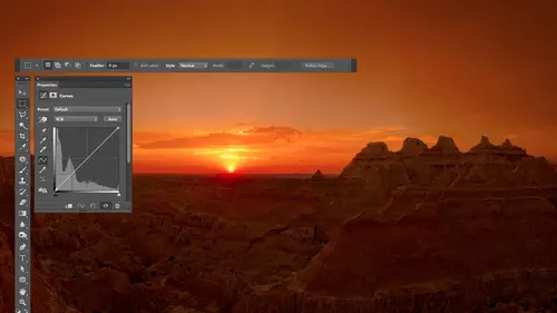
Understanding Histograms
This is just talking about the history, Graham. You know, in the end, I'm looking at the image, but the history Graham just tells me if there are any problems that are large enough that maybe I want to correct them before I even look at the image. And so here are some of the things that could happen. First off these little arrows to show you what I'm looking at in the history, Graham. Just say what's important about it. So if there's ever a gap on this side and there is a spike on the opposite, what that really means is that the images to dark it's under exposed. And when there's a spike in the left side, it's almost a Ziff. You have a history Graham that doesn't have a spike. It's just that part of its hidden. It's going beyond the edge. It's like this. It would be a Ziff. This is the area where the history am could show up, but because you under exposed, it's pushed beyond the edge. And that means something's air darker than black in your picture. In all this stuff that extends beyon...
d the edge of the hissed a gram all this stuff right here, just get stacked on top of each other and becomes a spike. And it's saying there might be extra stuff down there in that. If we somehow shove the history Graham That way, I might feel to get it back. And in general, if there's a gap on one side, that means that the whole history Rams over a bit in exposure is what's gonna move the whole history Graham around. So that just tells me, Hey, it looks like the whole thing is just too far this way. You go that way. Okay, if, on the other hand, it's more of a normal history, Graeme. There's no gap on this side. But there's still a spike on this. Then I don't have to move. The whole hissed a gram because if I do, then this ended. It could go off the end in turn into a spike. You have a lot areas of solid white. It's only if there's gap in Spike that I automatically think of exposure if there's no gap. But there's a spike on one side. That's when I go for if it's on this side, blacks, if it's on this side whites. So the gap in the spike thing is exposure and depends on what direction. Just think of the slider. If you move it to the right, this thing goes to the right, even moving to the left. This thing goes left. So if you glance at it, gap in Spike, you know, move, exposure, whatever way it will go in order to make it so it's not falling off the end and turn into that spike, all right, But if, on the other hand, it's not that the whole thing is shoved one direction or another in general, it's There is just one end as a spike. Then if it's on this side, whites, if it's on that side, blacks. Hopefully that helps you a little bit. So then this if this level is gonna be. But this is a hist, a gram, and just as kind of describe what the sliders do as a whole, um, whites works on the absolute bias party. Your picture, however bright that happens to be. And it's gonna take that and make it brighter or make a darker, brightest part. Blacks works on the darkest part, does the same thing, but if those areas air. Okay, If there where you need them to be, then if you want to work on things that are a little bit darker than the brightest part your picture, it's highlights. If you want to work on the things that are a little bit, I'm sorry. I say brighter, darker than your highlights darker than your whites here. If you want things a little bit brighter than blacks than its shadows you want to go to. And if it's the hissed a gram as a whole, it's jammed too far this way. Jam too far. This way it's exposure Gonna move the whole darn thing. The thing I could add to that would be contrast. Contrast is gonna take the bright stuff and the dark stuff. It's gonna control how wide this gap is. If I increase contrast, this stuff is gonna get brighter. This stuff is going to get darker. So would be a bigger difference between the two. You can do that for images that look dull. They look foggy. They look hazy, contrasts gonna break through the haze. If you lower contrast, it's gonna bring this in and bring this in and it makes the brighter stuff in the darker stuff. More similar. That would be if you have way too much contrast. The shadows are sitting there way too dark. Highlights away. Too bright. You need them to become a little bit more similar. It would be contrast that you deal with that. I don't know how helpful it is, but for some of you, it would be so. That's what's going on in my head when I'm thinking about tonal adjustments with Kamerad. When it comes to color, remember with the history and you look at the white part of the history Graham for tone ality, meaning brightness, and you look at the colored part when it comes to color. I mainly look at the ends and the overall shape, the middle and what shape it ISS is determined by your picture. Take a picture of a dark thing. It's gonna have stall tall stuff near the left. Take a picture of a bright thing. It's gonna have tall stuff near the right. Take a picture of a gray wall. It's gonna be in the middle. It's going very depending on the photo. There's no like right shape for the middle And then keep in mind that when you see me get back highlight detail or shadow detail out of an image, you're not able to do that from a J peg for a tiff. God be a raw file to get that extra detail back. So if there was a spike on one end of the history Graham with Jay Picker Tiff, you're stuck with it. You could move where it ISS, but details not gonna magically appear there. The same is true when it comes to white balance white bounds. We can radically change the colors. Remember that image of the in the winery of all the bottles? How terrible that looked? Well, you can make it look as good as it would be if you had your camera set to the perfect white balance setting in camera. If it's a raw file, if it's a J peg found, you're gonna find you can do much less when you start moving that you move a little bit moving a lot and you'll find that the image just doesn't look very good, be sometimes a dramatic difference. Also, I should mention that with J Peg files, the sliders will be in different positions. For instance, temperature and tent while we started zero because it doesn't know what you shot your your image with. And it just says from where we are right now, I could make it more yellow or more blue. It doesn't say what was my camera set to at the time I took it, Whereas this does when you look at some of the other sliders you find, they just won't quite be as effective. And that's why I shoot with wrong, I would say, 95% of the time. The other 5% is when I need to give somebody else these images immediately afterwards, and they don't know how to deal with raw files, so I might give him some J pegs. My car just filled up and oh my God, look at what's happening in front of me and you must shoot it. I don't have time to delete images often stop fine, Click over to J. Peg and hope the heck I remember. Switch back before I do a big shoot. Also, another thing I should mention is during the break, I talked with ease the creative life folks a bit about my screen, and it does sound like my screen is darker than what you're seeing. Eso If you ever see me over Brighton something, that's why is this screen here, due to the way they captured the video, doesn't quite look the same as a computer monitor would or what you might be seen on the live feed. So if you ever noticed things going way too far when it comes to brightness like, I'm surprised that when I move the shadow slider that it wasn't as effective on some of these images, and it just because my view here is a little darker. So, uh, just good to know that. So you don't think my taste Sarto over brightened everything.
Class Materials
bonus material with purchase
Ratings and Reviews
Jim Pater
I taught Photoshop (version 5) to graphic design students at the college level. I had great fun teaching. This is the perfect course to show others how they might go about teaching a Photoshop course. Congratulations Ben, on your excellent teaching style and methods. I thought I already knew quite a bit about Photoshop but this course made me aware that there's always more that you can learn.