Editing Lens Flares
Lesson 20 from: Adobe Photoshop for Photographers: Beyond the BasicsBen Willmore
Editing Lens Flares
Lesson 20 from: Adobe Photoshop for Photographers: Beyond the BasicsBen Willmore
Lessons
Day 1
1Adobe Bridge: Metadata Panel
22:16 2Adobe Bridge: Keywords and Filter Panel
28:00 3Camera Tips and Essential Concepts
31:58 4Advanced Adobe Camera Raw Part 1
43:27 5Advanced Adobe Camera Raw Part 2
32:37 6Hybrid HDR Techniques
28:39 7HDR Q&A
15:38Difficult Panoramas Part 1
23:16 9Difficult Panoramas Part 2
19:19 10Time Lapse Effect
19:11 11Other Essentials
23:58 12Line Art and Pen Tool
34:10Day 2
13Masking, Selections, and Background Eraser
35:17 14Trees with Background Eraser
20:16 15Furry, Fuzzy, Hairy with Refine Edge
28:10 16Layer Masks
17:49 17Lab Mode to Separate Colors
34:32 18Colorizing and Make Metal More Shiny
19:33 19Partial B&W with Knockout
20:20 20Editing Lens Flares
21:33 21Separating Detail from Color and Linear Light Mode
18:41 22Clone Source Panel Part 1
26:21 23Clone Source Panel Part 2
22:43 24Telephone Lines Through Trees
17:25 25Little Things That Make a Big Difference
35:44Day 3
26Compositing with Simple Masking
34:12 27Aligning Layers and Warping
30:03 28Vanishing Point
21:05 29Masking Smart Objects
17:00 30Antique Color
30:13 31Color Lookup Adjustment and Faux Infrared
15:41 32Nik Silver Efex Pro
32:19 33Perfect Photo Effects Suite
18:34 34Alien Skin Snap Art 4
15:29 35Creating a GIF in Adobe® Photoshop®
18:01 36Camera Calibration and Post Crop Vignette
19:41 37Adjustment Brush on Steriods
34:20Lesson Info
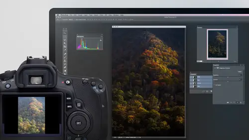
Editing Lens Flares
So let's talk about retouching a bit. First, I'm gonna talk about some color issues that there's a simple solution for, but it's not a obvious one, so it's want to share it with you. Open this image. This was taking it. What's the name of this place? Border. But door, I think, is Thea of it. It's a really cool temple if you look at my benefits, a temple, what whatever they call it. But if you look at these bell shaped things inside, each one is one of these Buddhists, and this is just one that has the top of it missing. But if you were to look inside the little openings in here, you'd see a Buddha's head. It's pretty cool. But when I took this shot with Sun was up here somewhere and it's light hit the front element of my lens, and when that happens, usually get a lens flare. So do you see this colorful area here? That's not really part of this architecture. It's caused by my lens. So let's fix it. Here's how I end up fixing it in my layers panel. I'll create a brand new empty layer, an...
d I'll do that by clicking on the new layer Icon is right here. So now any paint that I apply is gonna only apply up here, and I'm also gonna change the blending mode for that layer. The blending mode is found in this menu right here, and it controls how this layer interacts with what's under it. In normal mode, whatever I put in this layer simply obstructs your view of what's down here. Just like if I put my hand in front of my face and obstructs review of my face. But I'm gonna instead change this menu toe a choice called color. And when I use the choice called color, whatever I put in this layer will only change the color of what's underneath. It will not change. The brightness will change the color of what's underneath but not the brightness. Then I'm gonna grab the paint brush tool and make sure it doesn't have any weird settings in it. Like a opacity is on 100 in normal mode, all that kind of stuff in what I'll do is when you're in the paint brush tool, you can grab a color right out of your picture to paint with, and the way you do it is you hold on the option key, which temporarily gives you an eyedropper. And then you can just click somewhere in your picture. And you've just chosen that particular color to paint with. Now watch what happens when I paint right here. If this layer was not set to color mode, if it was set to normal when you painted, it would look like this. But because I first said it color mode, it's only gonna be able to change the brightness. I'm not sorry about the brightness, the color. It's not gonna be able to change the brightness, so the detail is contained in the brightness. I could go like this. Then I'll sample a different color because this brick is a different color. Grab it paint near the edge. Down here, I see some kind of bluish purple, so I grabbed from just outside of it. Paint there, grab from over here. She's just a hint of greening. Grab from the dark area here, get a smaller brush. So I get it on Lian that really darker area like that. There we go. Now I'll hide this layer so you can see what it used to look like before turning back on so you could see what it looks like afterwards after. And here's what it would have looked like if I was in normal mode. You see how she's solid color sitting there, but in color mode, it can only shift. The color can't change the brightness, but I think that this area right here is still a bit bright from the lens flare. I don't think the actual brick that's there is this bright. So then let's adjust it. I would like to have that areas selected so that when I make an adjustment, it only affects that area. But I don't feel like using a selection tool because most selection tools create hard edged selections. I would rather paint with my brush. So what I'm gonna do is I'm gonna type the letter. Q. Remember quick mask mode. What quick mask mode usually does is if you already have a selection on your screen and you type Q. It will cover up there is that are not selected with red. Type it again and it turns it off. But if you don't have any selection active whatsoever and you type Q, which I just did. It doesn't look like anything happened, but it's still turned on quick mask mode. And now all I need to do is paint with black in. I am, in essence creating a selection where, when I type a letter Q again, it will convert that into a selection. So if you ever wanna paint to make a selection type letter Q to turn on quick mask mode, paint with black and then typed letter Q again, the only problem with that is quick mask mode usually displays that red overlay where things were not selected. And so if I zoom out on this picture, it actually has everything except for that area selected. Can you see that the marching ants are all the way out on the edge of my document as well? That means that everything except for that is selected. But that's not a problem, because all you need to do is go to the select menu when I'm done and choose inverse to get the opposite. So what did I do just then? To get a selection? I'll do it again. I type queue for quick mask. I paint with a soft edged brush. Wherever I want to select, I type queue again to turn off. But the area covered with red is where is not selected, so I need to select in verse to really get that area. Now. I could do an adjustment. I'm gonna come in and do curbs because curves is my favorite adjustment. I'll click on that area and I'll simply drag down four. After I can continue bring it down further, but I might need to Oops, I didn't want to dots. I might need Teoh find, too, in the color afterwards. If I do so, what happens is any time that you darkened something usually make it more colorful at the same time. And so if I already attempted to fix the color that's there now, I'm making it more vivid ism doing that. I might be able to take the layer that contains the paint and just put it on top, and it will mellowed out a little bit because then the darkening is happening first, and then the color change. I could also come back with my brush and choose different colors to put in there then and go back to my adjustment if I want continue to dark in her life. All right, so that's one fixed. Let's look at the same concept on a few other images just so you know, it's not just for when you have lens flare. That's that plate. Now. If you were to look inside one of those bell shaped things, there's little openings in it. And if you were to stick your head in one of those, this is what you see. So that's one of the Buddhas in the bell. I just stuck my camera right in the opening, and it was nice that it was V shaped here. So get out, almost act like a tripod and stabilize my lens and took that shot. But if I look close at it, look at the Buddha's ear. You see some red There, you see some red Here. I see some purplish over here. I don't like that stuff, so let's fix it in layers. I create a new empty layer. I set the menu up here again to the choice called Color. Then I grab my paintbrush tool, and if you want a sample a color from the image to paint with you. Hold on the option key and right here in this dark part of the year, I see a color where I don't see that red stuff in it necessarily, or maybe a little bit further up. I could grab the color there and then just paint where I see that red stuff, and it will instead shift to the color and painting with. But it won't change the brightness. I see a little bit here, so option click nearby, where I don't see that color messing things up. And then I'll just paint over that edge, and over here I see kind of a purplish. I'll sample from an area outside paint in there to get it to look more appropriate. It's not uncommon to see some of that. If you see a lot of it on the edges, you might want to make sure when you open that image with camera that you had the check marks turned on called Remove chromatic aberrations, because if it's really small halo around things, it could probably be fixed automatically with just one check box. But sometimes what is caused by is light coming through an opening, and it's kind of flaring around the edge, and when it does, you sometimes get different colors. So I'm just looking to see if there's any other areas in here that bother me. Okay, there's a little bit of blue right here, so I option. Click outside of the blue on the color it should be, and then paint. I don't like the green. That's their option. Click nearby, Choose a color to paint with. Does that make sense? That color mode changes the color of what you paint over but does not change. The brightness in the brightness is where all the detail is because think about it. A black and white photograph doesn't have less detail than a color photograph, so that means all the brightness information is in the colors in the All the detail, I should say is in the the brightness information. The color doesn't contain all that much usable details, so it's OK to just paint to replace it. Did you have a question? They're ready. Yeah, Contin awareness without do the same, Sagan, content aware, come to new awareness in which, in what context? Because what content aware would dio is if I worked either directly on this layer or above it. I could make a selection like this and then go a little bit bigger than that. Go to the edit menu. And there is Phil, which has the choice of content aware. Not sure if that's what you're referring to, but that's gonna try to completely re touch something out where the detail will look different when I'm done. So do you see how that that might be acceptable in that it looks like this? But what I was doing was something where the detail will remain the same. Just the color will change. So if you don't mind the detail changing, if it's not in critical detail, content aware might possibly work. But if it's something where the detail is important, if there was something else there, it wouldn't look right. Like on the edge of the ear, something if I went in here with a lasso tool on the edge of the year to say, Well, there's red over there before we'll get rid of this fix. And I did content aware it would think you want to get rid of the year. All right, so, yeah, I know your mind Set is like a continent where gets rid of stuff, but it doesn't just get rid of little color problems. One more image. This is an HDR image where when I was done processing the HDR, which was really needed in this case because if you look at what we have, you have the daytime sky out there which would be extremely bright. And then here you've climbed into this area and it's extremely dark. And in order to get both the blue sky showing up and the dark interior, this was multiple exposures. I don't remember how many, but I'm guessing more than three. But when I was done sometimes with HDR, it has a few issues. And let's see, right where that sunlight is streaming down here and hitting the wall. If we zoom up close enough, you see some issues there, right in here. I really like that. So I'm gonna credit the layer again, said it a color, and I'll choose a color just outside of where we have that issue. Maybe let me grab my paintbrush first. You right up here and then with a soft edged brush just painted in in sense were in color mode. All I could do is changing color. It can't change the brightness. And so I could get that everyone so well. I'll change the color and painting with so it's more appropriate for that particular area because it fairies. And sometimes I'll need to choose from the darker area down here. But all it's doing is grabbing color, so it doesn't matter the brightness, it just matters. Would the color be appropriate for that area season? Pinkish weirdness down here anyway, Sometimes that helps what I do. New layer color mode in paint with the paintbrush can be nice Question going back to the of lens flare on the temple. Yep. Um, couldn't you lower the brightness of once you've made the selection with with luminescence? I could have gone up here, and when I had the selection, I'm using in quick mask right there. Q. And then I'll inverse it like this. Uh, could I have just darkened it to mean at this stage right now already where along in there with I could have gone in here Depends what you mean by with luminescent. So you mean painting? Do you mean unjust mint with that name and adjustment. OK, so I could come in here and use something like levels or curves, or even brightness and contrast in dark in this. But when I do is just going to darken whatever colors there. And so when I darken and it still looks like a rainbow of colors but is darker, which wouldn't be a bad first step to get the brightness to be somewhat close. But after that I'm somehow gonna need to get those colors. So look right. So that's when I created a new layer, set it to color mode and then with my paintbrush. I just choose a color from the surrounding area that looks like it would be appropriate for in there. And I still needed to deal with the color issues that I had like that. So I don't know that just darkening it would have been enough because you just have all the colors in there. But that's one of the pieces to fixing that. So that's one concept, which is color mode, and I use it all the time when I see little color fringing that I don't like that. The chromatic aberration check box in camera Raw couldn't fix because it's not just around basic edges. Is there some other reason for it? And I find it to be rather useful. Then let's talk about removing some areas, just moving some details because there's one thing, one concept that I find to be useful. This place was cool. It was a temple, I guess you'd call it that's inside of a cave, the interior of the cave that uses the temple and there's monkeys around. So whenever you show up the monkeys here, you and they know that they often get fed by tourists. So suddenly they'll be like 40 monkeys climbing all over the outside of this cave. And this is the top of the entrance where just below this would be the opening where you walk in and they'll be cruising around, so it's kind of kind of fun. But here I like the shot that I got here with with the monkey that's there. But I don't like the greenery that's right by his head, and I think it's a distraction. I'd like to remove it in the one thing I just want to mention here when it comes to retouching that if I don't cover right now forget to cover is you'll find me commonly using the spot healing brush to remove things. And I use it a lot. But there's one time when it really fails you and thats in this particular situation let me show you why, when I use the spot healing brush, usually you could well, actually let me before I use it there, use it somewhere else. You see this whole usually just click Lecco and it figures out where to copy from. Just fix this thing. So there's a hole here. I'll get rid of it. Just clicking. There's ah, big scrape across here that I might not want So I just paint across it and it figures out where to copy from And it just seems to be somewhat like magic. Ah, here. We gotta flaked away area. Maybe I just paint over it and it will figure out where to copy from. And usually it's doing pretty good for fixing. Thanks, but time it really fails. You is when you try to get rid of something that touches the edge of your document. So let me try to get rid of this all I usually have to do is paint across the whole thing. I'd have to be careful in one spot, and that's right where the monkey is to make sure I never touched the monkey, that maybe I'll go for this little branch to. But here's the problem. Any tool that has the word healing attached usually tries to blend them with its surroundings all the way around the edge. Whatever's outside of the area that you paint on is where it gets its color and its brightness from and when it comes to the spot healing brush. When I let go, watch what happens on the left side. I'm assuming you to mess up. Yeah, do you see that stuff on the edge? And that's because it can't look beyond the edge of the document to pick up some sort of color. So the only information it gets right there is what used to be in the photograph this green, and it's trying to blend in with it. So if you ever need to retouch something out and it's extending over, where touches the edge of your document in general, usually stay away from the spot healing brush. There's another tool that uses a similar technology that spot healing brush appear the top of you see, it's using a technology called Content Aware. Here's an alternative way that usually doesn't much better job when you're working on something that extends over to the edge of your document. With this one, you make a selection instead of painting, and then you go to the edit menu in Choose Phil. Usually, the default setting, if I hadn't used it before, is content aware and you just click OK, it does a much better job when things go over and touch the edge of a document, even though it's using the same general technology that's called content aware. For some reason, it is much better at the edges of documents. So if I had something like this when I'm out shooting and I'm composing my shot, I will sometimes composing away where it's kind of a bad composition just because I have something in the frame that is blatant that I wouldn't want. But I'll definer moving it as long as I remember which tool is best when something touches the edge of the document. So what do you do? You use the selection tool, make a rough selection. You gotta be really careful if it touches something, though, right here touches the tip of something, and that's where it might mess up because it does try to blend them with the edges, and it might try to blend in with that color. That's where it's touch of the tip, but I select it. I choose Phil, do content aware, and it can handle it just fine. Sometimes you need to do it more than once because the transition might not be completely smooth. If that's the case, I might switch to the spot healing brush because because I like the experience of painting instead of making selections. And I could just come across here and say Blend that. And if it still doesn't look smooth, it's usually because you need to have a 16 bit document to do really smooth skies with retouching. And but oftentimes it will look fine with a normal eight bit image. You see there where I can see this little edge if you seem to not be able to get it to look smooth. If it's a raw file, reopen it and open it is a bit image. I don't if you remember in camera raw at the very bottom of the dialogue boxes a line of text, and if you click on that text, you can switch between eight and 16 bit. And in order to get a nice, smooth and result, you often need 16 bit to do it. Although you will find people that will be like militantly tell you that 16 bit never helps. If so, bring him in this room. I'll put them in front of this image, will force them to retouch it. And then I'll do the same thing in 16 bit. And then they will stop saying that because it's it's 16 bit rarely helps. But when it comes to using the healing brush or the content aware fill on skies, it can very much help. So I did mainly wanted to make mention that where if it's something on the edge of the photograph, I end up going to the content aware fill
Class Materials
bonus material with purchase
Ratings and Reviews
Olga
The best investment I've made to improve my PS skills. Mr. Willmore is a skillful lecturer. English is my second language and I appreciate the clarity of his voice and the fact that he repeats several times what he's doing or what he did. It is great for note taking as well as for practicing. Just an Excellent workshop! Thanks Mr. Willmore!
a Creativelive Student
I absolutely love Ben Willmore's teaching style. He is clear and thorough. This class has a wealth of good info so I had to purchase this course. Thanks Ben and Creative Live!!! PS, Don't forget to forward the PDF. I am waiting patiently.
a Creativelive Student
AB FAB- Ben is an excellent teacher. He is very through and "down to earth" in his explanations. All his courses are worth the time and the money to view and purchase them!!! Please keep on teaching on CreativeLive. Thanks, Thanks, and more Thanks. Janet Bozgan 4-24-14