Furry, Fuzzy, Hairy with Refine Edge
Lesson 15 from: Adobe Photoshop for Photographers: Beyond the BasicsBen Willmore
Furry, Fuzzy, Hairy with Refine Edge
Lesson 15 from: Adobe Photoshop for Photographers: Beyond the BasicsBen Willmore
Lessons
Day 1
1Adobe Bridge: Metadata Panel
22:16 2Adobe Bridge: Keywords and Filter Panel
28:00 3Camera Tips and Essential Concepts
31:58 4Advanced Adobe Camera Raw Part 1
43:27 5Advanced Adobe Camera Raw Part 2
32:37 6Hybrid HDR Techniques
28:39 7HDR Q&A
15:38Difficult Panoramas Part 1
23:16 9Difficult Panoramas Part 2
19:19 10Time Lapse Effect
19:11 11Other Essentials
23:58 12Line Art and Pen Tool
34:10Day 2
13Masking, Selections, and Background Eraser
35:17 14Trees with Background Eraser
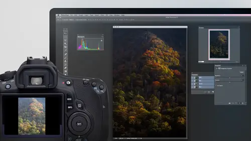
20:16 15Furry, Fuzzy, Hairy with Refine Edge
28:10 16Layer Masks
17:49 17Lab Mode to Separate Colors
34:32 18Colorizing and Make Metal More Shiny
19:33 19Partial B&W with Knockout
20:20 20Editing Lens Flares
21:33 21Separating Detail from Color and Linear Light Mode
18:41 22Clone Source Panel Part 1
26:21 23Clone Source Panel Part 2
22:43 24Telephone Lines Through Trees
17:25 25Little Things That Make a Big Difference
35:44Day 3
26Compositing with Simple Masking
34:12 27Aligning Layers and Warping
30:03 28Vanishing Point
21:05 29Masking Smart Objects
17:00 30Antique Color
30:13 31Color Lookup Adjustment and Faux Infrared
15:41 32Nik Silver Efex Pro
32:19 33Perfect Photo Effects Suite
18:34 34Alien Skin Snap Art 4
15:29 35Creating a GIF in Adobe® Photoshop®
18:01 36Camera Calibration and Post Crop Vignette
19:41 37Adjustment Brush on Steriods
34:20Lesson Info
Furry, Fuzzy, Hairy with Refine Edge
I want to talk about What do I do? If the background razor wouldn't work in this case, the background eraser would be terrible. Look at how similar this background is to the colors in the hair background Racer would just do a terrible job. Also, the background eraser doesn't always do a great job When you have partially transparent things in hair is often partially transparent, where you can see through it a little bit. Has a lot of hints of the background that's there. So let's look at a different technique that we could use. I usually use this technique win. What I have is furry, fuzzier, Harry our feathered And what I end up doing is I use any selection to whatever is convenient to me to make an initial selection because I need to tell Photoshopped. Give it some hint of what area am I trying to keep? Because if I just tell it to get started, it has no ideas. The background important to me is the subject important. Who knows in this case I might use the quick selection tool. I find t...
hat with a quick selection tool, it's usually easier to select whatever simple, and that's not always the subject. So in this case, if you look at this subject, there's a lot of detail in it. In the background is really simple, though, isn't it? Even though what I want to do is select the subject, I'm gonna use the background eraser tool on the are not the backbone eraser tool, the quick selection tool on the background. Just because I think it will do a better job. And then all I'm gonna do is select in verse, which means give me the opposite. So I just got the background selected. I'll go to the select menu and choose inverse, and that means give me the opposite. So I have my subject select compared to having to paint across the subject where there's all this detail in variation where the back and I keep saying the background. A razor with the quick selection tool might stop making the selection, and you might have to paint over and over and over again. Why not? If the background is simpler, simply select it. Choose inverse to get the opposite. Now touch us up just a teeny bit one spot, but it's not gonna be critical. Now I don't think that that selection is gonna be good enough for what we need, because we do have areas on the wings that are partially transparent with the background mixes with the subject in the quick selection tool does not usually do a great job in those areas, but we need a starting point of a selections of photo Shop has a nine idea of what area we wanted keep. Now, here's what I'm gonna do to get it to do a good job around the wings. I'm gonna go to the select menu and I'm gonna choose Refine edge Now refine edges the same command we used earlier when we had a white kind of halo around the tower. It was called Refine Mask then. But what happens is it's called refine mask when you're working in a mask. If, on the other hand, you're working on a selection, which is where it looks like a little dashed line that's moving around, it will be called refined edge. But when you get into it, it looks identical. Now, I use this last night because these are not the default settings the default settings would usually cause it to look like this. So when you first get into Refine Edge, it's going to show you what your image would look like if you use the selection you had, you copied the image and you pasted it on a white background. And so here's what it looks like on white. Then what your job is is while the refine edge dialogue boxes open, move your mouse on top your image, and when you dio, you'll get a brush that you can change the size of the same way you change the size of any brush. In this case, I'm using the square bracket keys, which are standard keyboard shortcut for changing brush size. And what you're supposed to do is paint over any areas where you can see the old background still showing up. So if I look at the left side of the photo, can you see, like in this area right here, there's a little hint. Maybe all zoom up right there. There's a little hint to the old background in here. They're hints of the old background here. There's some sticking to what we have. I'm gonna paint over those areas and by painting over them. I'm giving Photoshopped permission to change. What's there in modify where the edges. So I'm just gonna paint like that. And when I let go, it should re calculate that and hopefully help clean it up. And I'm just gonna do that. Wherever I can see hints of the old background, I'm gonna paint over it like that. And each time I let go, it should recalculate and hopefully do a little better job. I could see a little hint to the background, I think right there. And I'm gonna go to the other side and see if there's areas there that need a little help. Maybe right here. I see a hint of the background throughout here. There, here. All right. I think I hit most of the areas where I can see the background still showing up. Then the next thing I'm supposed to dio is right now, it's probably giving this a little bit of a kind of know what the word would be. A trim. I was going to say hair cover. There's not really hair on us so trim. And what I need to do next is change my preview. The preview defaults to showing the some white I'm gonna show it is an overlay. What it means by an overlay is show me the original background and just put red over the tops of areas where it would not be selected. And so when I choose that, I see the original background, which in this case is is, you know, simple. But what I'm doing is I'm seeing the entirety of the image we started with, and it just has a red overlay where it won't be selected. And usually my job is is to see if any part of these feathers is covered with red. You see, the tip of this one right here, covered a little bit with red and red would indicate an area that's not gonna be selected and therefore would be trimmed away. If I used the selection and I paint over that so it can re calculate it. Any area where I see red covering up like here on that tip, Do you see these two tips? Have a little read on top of them. So I just paint and see if it can recalculate and do a better job, or if I see any of the old background. Uh, this red should pretty much come up and kiss the subject where it looks like it's perfectly integrated with the subject. And if I can also see areas right right here, I can see a little kind of white ish thing where the red doesn't seem to perfectly lineup. That's where I'm gonna paint to see if it can re calculate that and do a better job. Ben. Yeah. Do undoes working here. I believe so. But I think there's a chance he only have one of them. I'd have to test it. Okay, Um, let's I'll choose. Undo. Well, first, let me go to an area like right here where you tell it. I made a change, Okay. And then I'll take command Z. Yep. And then I'll try. Well, first, let me try to two changes one there and one there, and I'll try option command Z like the history. Oh, no. So you know, if one undo okay. Just like the old days. Yeah, old school. So anyway and painting wherever. It doesn't look like the red accurately matches up with the edge. So here. Doesn't that look pretty generic? Where the red is coming. It doesn't look like it really has a soft quality of the edge. Well, I could come over here and just paint across that. I'm giving Photoshopped the opportunity of changing the selection right there, and it'll usually recalculated with much better accuracy. And so anywhere where it doesn't look like it perfectly matches up with that edge I paint. What, Walter? Let's see. Uh, I would have to try to remember. It's in the glop Coast Islands and in the club coast. The most frequently seen bird is actually a blue footed Burbey a booby. And I'm not sure if it is one of those or not. I'm not great at remembering names of trees and birds and things like that. So I wouldn't trust my So do you see right here how the red doesn't seem to match up. So I just come in here and paint now. Usually I'm doing this very quickly. Right now. I'm describing it and trying to get you mentally used to what you look for. It doesn't usually take the amount of time it's taking me right now, and so we'll do this on some member images, and hopefully we'll get a little faster at it. But we're doing is we're just saying, hey, refined the particular areas where I'm painting to try toe, match it up much better. And so here I can see the red doesn't quite get into those. So I paint there, here, the reds not getting in. All right in that red indicates the area that will not be selected. And so it's refining my selection, So it's going to look much better in all of these areas here. Quick question. Why do that? Yeah, What it should be You just tow line the bird and just automatically do it. Or you can, in fact, on this particular one it might work out, But on a lot of the other examples that we have, it wouldn't. But there is a choice of here called Radius in Radius. What it does is it acts as if we painted around the entire edge of the bird with a brush that's this wide in the time that I use that is win. The subject matter that I'm on is consistent in how fuzzy it is. So a lot of pets, like short haired dogs or a lot of guys with their little like, crop top kind of haircuts, you know, kind of thing where it doesn't very a lot. They don't have a lot of fly away here and then tight here. Just bringing up ratings will be enough in on this particular one. It probably would be all right, but I wanted to educate you about exactly what it's thinking about how it's working. So now what I'm going to do is preview this again on White. All I'm gonna do is go to the top of my dialogue box and change the preview from overlay toe on white and we'll see if the edge looks any better than it did before. Now the other thing we could do here it is if I find that the edge still doesn't look right, I could go to decontaminate colors and it can push the color from, or the inside of where the wing is out into the edge where is partially transparent. In this case, at least, if I wanted to put it on white, I don't think it looks bad. If I go over here, I could choose on black and then I might notice more any problem that I'd have on the edge. Can you see the problem with the color on the edge? That's when I might notice it. Turn on decontaminate colors and then bring this up. If you bring decontaminate colors up too high, the edges sometimes look like the detail has been blurred, so you gotta be a little careful with it. And when I'm done, I click OK, if I ever use the decontaminate colors check box. It will always duplicate the layer because it had to shift the colors, and it wants to make sure you have the original still in there. But if I did not turn it on decontaminate colors, it could just do. This is a mask where it will be a mask without duplicating. All right, just in case we need this again, I will save it to my desktop. And now let's try it on something that might be a little bit more challenging. In fact, I brought all sorts images here. Everybody always asks about what I consider to be some ridiculous examples like, Can you show how to remove somebody with blond hair on a yellow background that has detailed, like similar to hair like a fuzzy yellow background or something. And I'm like, Why didn't you just haven't walk onto a different kind of background? You know, when you took the picture or something, it's like, Well, sometimes I know a client asked you to, and you're stuck with whatever the God. But I did bring a picture of somebody with hair that looks very similar in color to background. That has a lot of detail. We're gonna kind of progress to that. So let's see. What else can we do here? Well, let's do a lion now. Lion is somewhat challenging. Why is it challenging? Well, if you look at the colors that air in the lion's mane, they're very similar to what's out here, aren't they? And so for something to be able to isolate that I mean, it's hard for me to visually see the difference sometimes around this, so it might not end up being exactly perfect. I might need to refine it by painting on a mask later on and manually refining things. But let's see if you can help out here, I'm gonna start the same way did before. With a selection, you can use any tool you want to create the original selection. I usually use the quick selection tool because it can help me out. I don't mind if it's select some of the background accidentally because I can come back in a second pass and hold down the option key. Which means take away this'll cases going to select the whole picture about time, times like Thanks. Now I'm gonna hold down the option key and hope that it does a little better. Job option means take away in option is the same as using an icon in the upper left of my screen, where it's got a minus sign. So if you forget the keyboard shortcut, you could go to that icon instead. But they're you know, a lot of people would given up on it the moment they saw it. Select the entire thing, but it is paying attention to both of my paint strokes. The 1st 1 that said Select this in the 2nd 1 that said, Don't select this part in, So this selection should be good enough to start with. Then again, I'm gonna go to the select menu and again I'll choose Refine Edge. It's gonna remember whatever setting I used last, so it puts it on black. It's your reference. If you wanted to show it on white, what I would usually do is if I was gonna take this lion and copy it and put it on a different background. I would have gotten that background into this document. First, I would have put it on the layer that's underneath. And then one of the preview options here is on layers, and what that means is it would instead of showing white out here, it would show whatever the layer is that's underneath would be the new background. In this case. I'm not looking to copy him and putting him on a different background. What I'm looking to do is get a selection so I can adjust him. What I'd like to do is take the background and, like, make it less colorful so that he jumps out. So let's, um, take a look. Well, the first thing I'm supposed to do is move my mouse on top of the image in paint wherever I see hints of the old background, So do you see some areas over in here where I can see parts of the old background, they look more vividly yellow. I'm just gonna paint like that and it's gonna re calculate I am. I'm just looking around the edge for hints of the old background. There might be the tiny spit right there. Otherwise, I think what's currently there is what we want. After I'm done with that, I come over here and I change this to overlay just like we did before. And that shows me the areas that are currently white. Those will be the areas that it thinks it's going to be deleting. Instead, it will show the original picture with a red over light. And now what I'm looking for is any part where the the for extends into the red stuff or where the red stuff doesn't come in and just nicely fit around the first. So I come in here and if I thought the lion hat was overly consistent in how furry it waas, I could just bring up the radius slider and it would do the equivalent to what I'm doing right now. But it would do it an equal amount on this edge. It would be a Ziff I used to brush of a particular width and just traced around perfectly, uh, the original edge that was there. But I find with things like this, it varies too much, and I think it's more helpful to manually paint like I am right now. Wherever there red stuff doesn't match up nicely with what we have is where I'm gonna paint. And this isn't a miracle worker. If the background is identical to the subject, how's it supposed to know? You know what is different, but if there's any kind of difference, I just want to make sure I don't paint with too large of a brush wherever. Um, the background is very similar to the subject. Otherwise, it gets confused about how big of an area that you really want me to work on. And it starts thinking the background looks somewhat like the subject, right? I think it's starting to look up, came around a good portion of this over here. It's a little bit I'll use the term wonky, but I could try there again, and I didn't make a selection out the bottom of ignoring that part. Uh, if I wanted that part, I would have with my original selection I would have had that selected. I think I was zoomed up on the picture enough where? That was outside the frame, so I just didn't notice it. All right, now let's change our preview. I'm gonna just go to the top of the dialogue box and I could say on White, on black or whatever I think would be appropriate again if I was gonna put a new background in here, I would have already gotten the background here on the layer underneath, and it would have chosen on layers. So I choose on white. Now, when I do that on the right side, do you notice down here where there just seems to be some weirdness where they're stuff that doesn't look like hair showing up out in here? That's parts of the background that were very similar to the hair. And here's how I can try to fix it. When I move my mouse on top of this area, I'm gonna hold down the option key. That's all. Tom Windows. It's actually if you hate keyboard shortcuts, it's the Samos. Switching to this setting right here looks like Eraser in what it means is now. Let's take photo shops control over this area. Where in painting right now. Let's take it away so that it doesn't have a decision. What to do there. Instead, we're forcing it to delete those areas. Mm. And if you want to thin out some of the hair, you can come over here and do that on the edge of the hair. If you had, like, this was a human and they had little fly away hairs that just looked a little busy, you might be able to do it. But over here, do you see some that just doesn't look like the hair. So I hold on option. I come in there, see if I can get it to clean it up. Just try not to paint over the hairs when you do that, unless you truly want to thin it out there on Lee pain over areas that looks like it's not part of the subject at all. If there's an area where it looks like the hairs air too transparent, do you see over in here where they just to me, it feels like that's making them disappear, and they really shouldn't should be more full there. You could do the same thing, holding on the option key. But be careful. Instead of just clicking on this. Start in here where the subject is in. Pull out towards there where you just touch it a little bit and you can try to get it to bring areas back. What's really happening here? It's unless you see it. It's hard toe, really get adjust for it, but let me show you what it's really doing. If you want to see where I've painted and where I've painted is where I've given Photoshopped control of what's happening, you could turn on a check box called Show Radius. It's not a very useful view when I turned on, but right there's where I've painted right there is where I'm giving Photoshopped control over what's happening. And then when I come in and I'm holding on that option key and I'm taking away, I'm simply taking away from the area where it has control in. Here's what will be kept out There is what's gonna be thrown away. And so I just got to be careful what side of that I'm painting on when I do this. If you want a more useful view. Turn on the thing called overlay when you're showing the radius because then you can see the rest of the picture. So Photoshopped has control over what's happening where there's no red. The outer red is where it's gonna throw stuff away. The inner red is where it's gonna keep things where there's no red is where it's gonna figure out what to dio. And so what I was doing when I was painting with that option key L down as I was reducing the how big this areas where it has control. And I was saying, You no longer have control over here and I just had to make sure I was on the right side of the red nous. It's kind of weird, but, like right there, if I need that, I'll start from in here. Take it away. Ah, appear I might want a few these areas, but I don't want to get into the areas that are partially transparent up there because that's where it needs to do its magic. So I might need a but most the time. You don't have to view this view where you see it like that, but if it helps some people understand what's going on pretty much it's gonna have control over the edge. Where that gap is to get to that view, I turn on the check box called Show Radius, which will turn off now. And I had this view set to overlay. All right, so now here's where we're at, and the final thing we could do other than refining the mask afterwards is we haven't used decontaminate colors. We can see what happens if we take the color of this and shove it out into those partially transparent areas. Don't know if it will be overly necessary in this one because the background was similar in color to the subject. But we can try it, turn on decontaminate colors and start pushing this up. See if the edge looks any better. Just know if you push it too far, the edge will start looking like it has less detail to it. So here, I'll turn this off and back on. I think it helps up by his ear, uh, in at the top where I no longer see more of the vivid yellow from the background that used to be there, like right here in some over there. Meanwhile, click OK, because I like the end result. Then we can further refine this if needed. What we can do is all option. Click on the mask so you can see its contents. You see our end result You remember before we could grab the paint brush tool in the way we set it up in a special way is we'd set the opacity around 20 and we set the bloody mode to a choice called Hard Mix. I don't actually remember the words hard mix. I just remember it's the last choice in the biggest grouping. Last choice bottom Most choice in the biggest grouping of modes. I honestly don't remember the name unless I'm teaching and I'd gone in Houston a few minutes earlier, but now, in that mode I could come over here and paint with black. Touch up a few of these spots where I can see that Thea thing is extending too far. I can switch over and actually hit the letter X Hitting the letter X is the same is hitting this little symbol here to switch these colors. X does the exact same thing so I could hit acts to swish and paint with white. Whatever. I need a little more show up wherever it doesn't look quite right. All right, I think that's looking okay. I'll option. Click the mask again. Teoh. Get out of it now with default settings, it thinks you want to remove the background. I didn't want to. What I wanted to dio is I wanted to make the background less saturated. Make the subject more saturated so it could jump out from the background. Or maybe I want to use less contrast or even blur the background. Eso you remember. You can command click on a mask to get a selection out of it. Command click. The only thing you're not gonna get my command clicking is if there was any color shifting on the edge from decontaminate colors. That's not gonna be in there cause a selection can't have that. But I could go back to the original layer now, and I have the lion selected so I could come in here and maybe do a few adjustments. I'll do a hue and saturation adjustment layer. I'll bring the saturation up, make the color more colorful. That would be way too much on the background. If I had that active, I can. Anytime you see any mask you can command, click on it, get a selection, so I'll just do that to this mask. So I get selected again. I'll select the opposite or inverse of that. So I get the background. Maybe I do another adjustment layer hue saturation, and I bring the saturation down to say Make it less colorful, just trying to make the Lions stick out a little bit more separate from the background, and I could do all sorts of other adjustments, whatever I want. But the main thing is, we were able to isolate it around the free edge. In this case, I don't know that we needed to be that precise for the kind of adjustment were making, but I just wanted to show you that it can work on things where the background subject are very similar. Make sense. That was great work. Thanks. So and just so you know, if I know that this is my subject and this is gonna be my background, I'll just select both images in bridge and you go to the Tools menu. There's a choice called photo shop, and there's just a choice called load files into photo shop players. If I use that, all that's gonna do a stack the images. So if you watch my layers panel when it's done, some of this out of the way you see it just stacked the images. So if you have a couple images you know you're gonna combine, I just select them. I choose load files in the funder shop players. It stacks them for me, and therefore there's no need to drag and drop between documents or copy and paste. It just does it. In all, I had to do a select those images and it was in bridge. It was under the tools menu. That's where I found it.
Class Materials
bonus material with purchase
Ratings and Reviews
Olga
The best investment I've made to improve my PS skills. Mr. Willmore is a skillful lecturer. English is my second language and I appreciate the clarity of his voice and the fact that he repeats several times what he's doing or what he did. It is great for note taking as well as for practicing. Just an Excellent workshop! Thanks Mr. Willmore!
a Creativelive Student
I absolutely love Ben Willmore's teaching style. He is clear and thorough. This class has a wealth of good info so I had to purchase this course. Thanks Ben and Creative Live!!! PS, Don't forget to forward the PDF. I am waiting patiently.
a Creativelive Student
AB FAB- Ben is an excellent teacher. He is very through and "down to earth" in his explanations. All his courses are worth the time and the money to view and purchase them!!! Please keep on teaching on CreativeLive. Thanks, Thanks, and more Thanks. Janet Bozgan 4-24-14