Nik Silver Efex Pro
Lesson 32 from: Adobe Photoshop for Photographers: Beyond the BasicsBen Willmore
Nik Silver Efex Pro
Lesson 32 from: Adobe Photoshop for Photographers: Beyond the BasicsBen Willmore
Lessons
Day 1
1Adobe Bridge: Metadata Panel
22:16 2Adobe Bridge: Keywords and Filter Panel
28:00 3Camera Tips and Essential Concepts
31:58 4Advanced Adobe Camera Raw Part 1
43:27 5Advanced Adobe Camera Raw Part 2
32:37 6Hybrid HDR Techniques
28:39 7HDR Q&A
15:38Difficult Panoramas Part 1
23:16 9Difficult Panoramas Part 2
19:19 10Time Lapse Effect
19:11 11Other Essentials
23:58 12Line Art and Pen Tool
34:10Day 2
13Masking, Selections, and Background Eraser
35:17 14Trees with Background Eraser
20:16 15Furry, Fuzzy, Hairy with Refine Edge
28:10 16Layer Masks
17:49 17Lab Mode to Separate Colors
34:32 18Colorizing and Make Metal More Shiny
19:33 19Partial B&W with Knockout
20:20 20Editing Lens Flares
21:33 21Separating Detail from Color and Linear Light Mode
18:41 22Clone Source Panel Part 1
26:21 23Clone Source Panel Part 2
22:43 24Telephone Lines Through Trees
17:25 25Little Things That Make a Big Difference
35:44Day 3
26Compositing with Simple Masking
34:12 27Aligning Layers and Warping
30:03 28Vanishing Point
21:05 29Masking Smart Objects
17:00 30Antique Color
30:13 31Color Lookup Adjustment and Faux Infrared
15:41 32Nik Silver Efex Pro
32:19 33Perfect Photo Effects Suite
18:34 34Alien Skin Snap Art 4
15:29 35Creating a GIF in Adobe® Photoshop®
18:01 36Camera Calibration and Post Crop Vignette
19:41 37Adjustment Brush on Steriods
34:20Lesson Info
Nik Silver Efex Pro
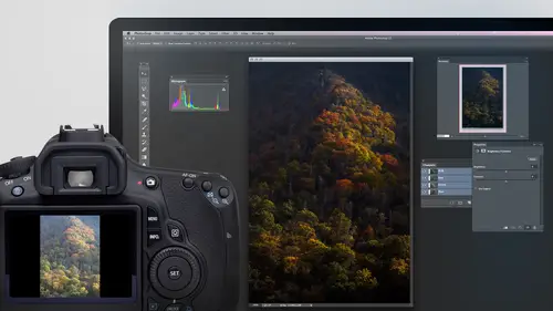
Usually if somebody makes a plug in for photo shop, they're going to concentrate on one particular area where people do something very frequently and they're gonna dive really deep and add. A lot of features were in photo shop. To get the same functionality, you'd have to use everything in Photoshop to do it, and it would be just not a piece, a smooth or fast experience. So I want to share with you some of the plug ins that I use with photo shop just to give you a sampling of what's available. There are a whole bunch of other ones as well, but these air some that I think are worthwhile looking at. So first off, let's talk about committing to black and white. So far in photo shop, you've seen that you could go to the bottom of the Layers panel, click on the Adjustment Layer icon and you can choose black and white. And just look at how feature rich of a feature you get here. All it is is a bunch of sliders, and these sliders control how bright things are. That used to be these colors, an...
d that's pretty much what you get And you also have a tent check box, if you would like to a little bit of color back. Yeah, there is an auto button which will analyse your picture and try to figure out where to put thes. And then finally, you could use a preset. You could load your own presets. You can or apply one that's here, but it's pretty darn basic what you have there. Now let's compare that to what we can do if we instead purchase a plug in for photo shop. Um, this particular plug in first before I apply any of these, I always convert to a smart filter. Smart, I should say, Smart object. Okay, now I'll come down here in. The one we're gonna use is from a company that used to be called Nick Software. But now they're owned by Google. Google purchased them and you can buy ah, whole grouping of plug ins together. Then I believe it costs $149 to get the grouping. We're just going to use one of their plug ins at the moment in. That's one called Silver Effects Pro. So I just launched silver effects pro it pretty much took over my screen, and this is designed strictly for converting to black and white. And let's compare it to what Photoshopped just presented us with a few minutes ago. First on the left side, we have presets in instead of being like in photo shop, where there was a preset menu at the top of the black and white dialog box. But when I tapped on it, all I saw was some names here with presets. We have a visual. It actually takes the picture I'm working on and shows me what it would look like with each one of these presets. Also, these presets are categorized, so I don't have to see them all. If you look in the upper left, I have classic vintage modern, which would only show me a selected segment of these. Right now I have it set to also I see them all. If I see one of these presets that I think looks good on this particular image than all you need to do is click on it. And when I dio it applies it over on the right. So you might want to start off with a preset see if you can find one within this list that makes your image look somewhat close to what you would like. Click on it and you're gonna start there. Now. You can create your own presets as well. You'll see an area down below called custom, and that's where I can have my own. And there's a plus sign there where you can create your own. So that way, if you get a particular look that you like, you can get returned to it very easily. Now, if I don't want to use the presets or I'm done using them, there's an icon just on the right edge of it right here, which would hide that and just get it off my screen. If I tap that same, I kind of again it would show up. And that's nice when you have ah, landscape orientation image because then you have more space for your picture. Then, on the right side of my screen, we have all the settings related to this. In these settings are in different groupings, and with those groupings you can expand and collapse them by clicking on a little arrow or a little triangle to collapse down each one of those areas. And let's take a look at some of what you'll find in there. First off, we have an overall brightness control. Make the entire image brighter or darker. We have a contrast control Atmore contrast. Reduced contrast, and we have a structure control and structure is similar to clarity and camera raw. It means should we emphasize the textures there in the image and just make it look more detailed as we bring it up, you'd have to zoom in on the image quite a bit to be able to notice that. But then, underneath each one of these choices, you'll notice there's actually a triangle there. It gives you the basic setting of brightness. But if that's not enough, if you need to really dial down and get more precise than that, you hit this little triangle and you'll see it expand. Now I have separate brightness controls for my highlights, for my mid tones and for my shadows. So right now my highlights are a little on the bright side. I could take that highlight slider and move it around, see if I want a brighter bring it down, see if I want him darker maybe I want. My shadow is also a little darker, but that's nice. I could either have an overall brightness or I can drill down and see the individual controls air in there for contrast. Similar kind of thing. I could work on whites blacks and add a little softer contrast. Look for structure. There's even more I can say I want to emphasize the detail more so in the highlights orm or so in the shadows, that type of thing. So it really gives you a lot more control than anything we find in photo shop. In fact, in some ways it's a ridiculous amount of control. But what's great about it is it doesn't force all those sliders in front of you because you can simplify just collapsing those little triangles. So you only see the basic brightness control, and only if that's not going to control it the way you like. Do you have to drill down and be able to control it with more precision? Let's look at some of the other choices that are in here, not going to go through everything that's there just takes a lot of time, but we zoom up over here. Some photographers air used to putting in various colored filters in front of their lens when shooting black and white. And it can cause things like blues to get darker in the image to make blue skies change and other areas will. Here you can go into an area called color filter, and if I click on these, you will find it changing image considerably. And if you're used to thinking about shooting film black and white, then you might be familiar with putting various colored filters in front of your lens. Me personally, I didn't shoot a lot of black and white when I was doing film, so at least not when I got to filters. But if you're used to it, you can dial it in there. You can even simulate various film types. Right now, this setting is set to neutral. But if I were to click on it, we have the names of a bunch of different types of film, and so if you're used to shooting on film and you want it to look similar to what you would get with a particular brand of film, you could come in here and use one of these settings, and they've gone through and didn't done quite a few. If you have experimented with that, you don't like it. Just send it to neutral. Intra means you're not going to use any of those below that. We can add grain toe our picture. We can use levels and curves if you want to. And below that, we have something called finishing adjustments and with finishing adjustments. I really like this. There's a choice called Toning Tony is when you want to add color back into your black and white picture. If I were to click on this little menu, we got a whole list of presets. But what I really like about it is if I just mouse over these without clicking, I get a live preview of each one and so I can come down here. And if I just scroll through the list, I can watch my image update and see if I can find exactly what I would end up like He just click on it and it's applied. Of course, there's a triangle next to it, so if I need more detail, I could come down there in and here I can tell it exactly what color I'd be using, how strong it, ISS and the paper huge would be like the bright areas in the in the picture, I believe, would come out all of that stuff. And so if you look at the sheer amount of settings that are here, it's not that you have to use them, although you can start off with just the basic ones in Onley. When you find that the basic level of settings isn't enough for you, do you have to drill down to more granular settings that are there? We also have choices for vignette ing, which is darkening the edges. And again, if I don't like the preset, I can get the little triangle next to it, and I can tell it exactly how dark I want to make it and tell exactly how big the area is supposed to be. And if I click this little icon, I could even click on my picture to say, Where should the center of the vignette ing be? Vignette ing is darkening the edges. Um, burn edges. We could go right out way out on the edges to get the much darker. If you want to, and you can even add borders. So if you want a particular look where it's not a normal straight Chris bej, there's a very limited set of them. But if you've chosen one, of course you can drill down even further control the size. How clean the edges. If you wanted to vary the border mawr because you might want to vary the border if you're gonna apply the exact same bordered eight pictures, you don't want to look exactly the same on each one. If you tell it to vary it, it would look different on each, um and then finally at the bottom, we have a history, Graham, where I can tell if we're using the full brightness range available or not in. So with this, you don't have to use every setting that's there. But if you do want to drill down and really get in a control, you're gonna get a heck of a lot more control here than anything you'd find in a photo shop. Question. Um, how effective would this plug in me with? If the original images black and white, it would be effective when it comes to adding color to it if in yet ing border that kind of stuff also things like contrast. You would be able to change, but it's not gonna be quite as effective in a Sfar Aspinall Brighton and darkened like particular flowers that are in here because before they used to be separate colors and it's able to How would I say it? It's able to pick up on the color values that were in the original and make that part of how it suggesting the image with a black and white. It's gonna limit that somewhat. It's still very effective, especially for toning when you want to add color back in now, usually do this to a layer that's been converted to a smart object when I'm done, if I go to the lower right, just click. OK, take a little while for it to apply. But if you look, it applies just like any filter that you usually apply and Photoshopped in that Here's my layer. Ah, and it says it's a smart filter and there's the name. If I were to double click on this, it can send me back into that particular filter. There's a couple other things that you can do here that are generic to any filter that you apply in this way and that is first, I could double click on the thumbnail here. And of course, I would see the original contents of that smart object if I replaced what's in here by pasting something else in. And then I saved and closed it. This would update, and it would have this black and white effect applied to it. Or I can go over here and click on this mask. This mass controls where this filter can apply. And I could come into here, grab my paintbrush tool. And maybe I wanted one of these flowers to remain in color. If so, paint with black. It is paint in the flower you might want. I'm not being precise here, but what you might want to do is use something like the quick selection tool or anything else, and then just say fill with black, you know, go to the edit menu, choose Phil instead of painting. Cause right now I'm not being precise about the painting. So look so good. Finally, you can also go to the right side. If here's the name of the filter to the right of it. These two, these two symbols, too little sliders. If I double click on that, come on, it will come up and allow me to choose what blending mode is used when it's applied, but more importantly, the opacity setting. So if I don't want to apply it at full strength instead, I wanted a 50% strength or anything like that. I could dial it down right here and now. The black and white effect is not applied at full strength. The only problem is house of a border effect, which is being reduced. But sometimes I like the look of it when I still have a hint of some of the original color coming through. But all those things that I just did when it came to painting on the mask when it came to double clicking on that icon or when it came to actually seen the original image are you are generic to any filter that's been applied to a smart object, not just this particular filter. Now, one thing is, if you're gonna convert to black and white, what I would suggest you do is before you get in there, make sure that you've adjusted your picture already. If it's a color picture, what I would make sure that you dio is only open this one in camera raw. I'll come in and first I'll make sure I've done white balance. You might not think white balance will be important when you have an image that's gonna have no color in it. But white balance is important. You need to make sure the image is color corrected. Which I want to do is when I move these temperature, intense sliders. I'll look at the picture in. What I'm looking for is when the colors separate the best when I could see the biggest difference between one color and another. So if I move this towards the right way over to the right, you see everything's looking yellowish. It's gonna be hard to convert to black and white. Make it look good if it thinks everything is close to yellow. But if I bring this down, there will be some point in here where I noticed the colors separate better, like right there, they seem to separate a lot better than right there where they look very similar. So I'm looking for where they separate the most, come down to 10 to do the same thing of it, one direction, then the other, and find that part where they seem to be the most distinctly different from each other. You might also want to increase the saturation of the colors or a little bit of the vibrance. The more saturated the colors are, the easier it will be to see them to differentiate them. When you're adjusting them, then I'll click done or, in this case, open image, because I want to adjust this. And now if I go into that filter, it's gonna have a better job because it's going to be able to see the individual distinct colors much more clearly. They're not going to be blending in with their surroundings, and so it will be able to more easily give me, Ah, one color, like the yellows brighter than the greens or anything like that. That's just the tip. It's. I just find that often times people ignore white balance, ignore color correction as a whole when doing black and white cause I think it's unimportant. You're never gonna see the colors, but when you actually adjusted the colors become more distinctly separate from each other, and it makes it so. Could do a better job on the black and white. Let's look at a second filter. This filter is also from Nik Software, which is owned by Google. And this is what I use if I find I want to merge multiple exposures that vary in brightness into a HDR image. Well, remember the way we did that? As I selected a series of images and bridge, I went to the tools menu, chose Photoshopped in shows, merge to HDR Pro, so let that run might take a moment for it to combine. These together usually end up processing, seeing HDR images in camera or in light room, which is what you could do when the dialog box comes up here. In a moment, there'll be a check box that will allow me to process this using camera wrong. But on occasion, I don't like the look that I get. I just am not able to get an acceptable image by doing that. And so I want to show you an alternative. So first off here, I got some friends here and they were moving around as I was shooting and so we might have some movement between shot Somebody's arm might be in a different position or anything like that. So in the upper right, I'm gonna turn on a check box called Remove Ghosts. And there they look a little better there. Then when you choose removed ghosts than lower left, one of these exposures is gonna have a green box around it. It considers that to be the master, and it's comparing this one to the others, insane. If anything has moved from the position it was here that is going to try to get rid of any artifacts in what I need to do is just click on the one on the left and look at the image to see if it looks any better than click on the one to the right of that and just discover which one of those looks the best. This one doesn't look very good, cause this guy right here is looking like he's a ghost. Literally, either this setting for that setting, it's up to me to decide which one. Then, if it wanted to process this using camera, I would turn on this check box and When I click the button at the bottom, it would send me into camera raw. Well, let's say I've already done that. I didn't like the look of the end result. Then what I would do is I would have that turned off instead and I just click. OK, What I need to do is make sure this is set to 32 bit right there. That means don't do any processing in here. I click OK, and now is an alternative to using camera raw. We're gonna use the plug in. We just first needed to merge those images together. This is another plug in that comes from Nik software and with the Knicks software plug ins. You get it as a bundle. And I think I wrote down the price Ah, $149 for that price, you get 1234 about six different plug ins. So not just the one I'm showing you now to access that plug in. I'm gonna first, of course, convert this to a smart filter. You don't have to do that, but it's just nice if I ever want to go back and change the settings later, Uh, least they will retain the settings so I can easily get back to it. And once it's done without, I'm just gonna go to the filter menu and go to what's called HDR Effects Pro. All the other filters Air Great out because they wouldn't work on HDR images unless that HDR image has already been processed, which is what we're about to do right now. Well, this should look somewhat familiar because the interface between all the Knick filters is very similar. So on the left side, of course, we have presets, and it's really nice that it calculated the preset from my image so I can scroll through here. And if I see one of these, I might like I can click on it and I'll see it on the main screen. Come down and see some others. You see which one, I think. Ooh, that one's called Structured, and I think it was pretty bad. Some of these you can make your image look rather seal surreal. They have names like here, sinister in others. I don't think they're the best for overly realistic ones, and that's why up here they take their presets and they give them categories And so sure, if I want an artistic look, I confined those. But if I don't want an artistic look, I go over here to either realistic or landscape, and that's probably where I'm gonna find the ones that are gonna be best for this particular image. What I had it said to was all before, and it ended up giving me everything from the most surreal to most Melo. So I would usually start with the preset, Then you confined to in the end result of the preset in the right side. So let me click on a preset. I'm actually gonna choose this one because I think it needs to be fine tuned on the right side is where we confined tune everything. And this is a similar set up to the other, uh, filter that we used in this case. The main change I think it needs is to be less colorful. So there's a slider, and here it's called Saturation. Do you right there? All I'm gonna do is bring it down. And then I think this will be a much more usable image, but I can't find to all sorts of other things, so Let's just take a glance at what some of those settings are. We have tone compression anytime you see the word compression. When it comes to HDR, the higher you bring it. Usually the darker your highlights become, and sometimes your shadows will shift a little bit, too. But often times it's mainly the highlights in this case that are gonna be coming down if it's making too big of a change in your image, you could bring down this thing called method strength, but we have things like this exposure. This is an overall brightness control. But if it's not the whole image, that of a problem with, we also have a control for highlights where I could brighten the highlights for dark in the highlights, dial it in. I could do the same with shadows bright in them or darkening them. However, I'd like we have contrast and then here, blacks and whites. This is if I would look at this history ram at the bottom. If I noticed that the history am did not go all the way across, meaning I'm not using the full brightness range available. If there was a gap on the far left of the history am I could take the black slider that's here, and if I bring it down, the blacks will get darker and darker. Once that hissed, a gram hits the left side. I'll actually have some solid black in the picture, but I might not want to go quite that dark. I can do the same thing for whites. If I see a big gap on the right side of the history Graham, then it means I'm not having my highlights as bright as they could be in here. I could bring the whites up higher and higher, and I'd see that history. I am getting pushed towards the right on the end, and if it ever touches the right, it means I actually have white in my picture where I could bring it down. Structure usually means detail, and so I bring that up. It's going to emphasize the textures that are in the image more. You have to be zoomed up closer to really see the main effective structure, but it's often going to bring out more texture. Then here's our color settings. We have saturation, which is how bright the images. And then here were of white balance. That's for color correction. If the image is to blue, you can push it towards the right to make it more yellow or if it was too yellow to begin with, you can push it towards the left to find tune that we have tents where we can go towards the magenta or a green. And then we have finishing here we can do things just like in the other filter. I showed you like vignette ing to darken the edges. And after I applied, of course, you can hit a little triangle to get more detailed with your settings if you'd like to. But if the preset was enough, then all you have to do is choose from the menu. You could even have a graduated neutral density, which would mean it would darken the top of the image, slowly fade out as it goes down. That would be useful in some instances, but in this case with this archway in there, it wouldn't quite be appropriate. And you also have level in curbs if you need to tweak it. So as you can see with this, you have a whole lot of control. But I find that I do most of my processing for HDR in adobe camera Raw like I showed you earlier in when I don't like it there, I want to have a backup and I have two backups. One is this program which is HDR FX Pro Click. OK, toe apply this. The other one that I use is one from a company called HDR Soft and it's called Photo Matics. But I find that photo Matics It makes it more difficult to get a photographic looking and result in the names of the sliders air Not straightforward there, slightly weirdly named although they've been improving in the last short period of time. But I still wanna have it in case I don't like the end result of either one of the other products. Now, here's something that can happen on occasion when you use any HDR processing as a plug in and Photoshopped on occasion when you click OK, the end result will not look right. So I'm glad that happened because now I can show you how to fix it. There is something weird that Photoshopped does when it merges together in HDR image in plug ins that you end up applying. Can't access this one feature that I need to change to get this toe look right. So let me show you how to get this to look just like it did when I was in the HDR FX Pro. What you need to do is go to the View menu. There's a choice called 32 bit preview options, and you only have to do this if the end result does not match what you saw in the filter itself. Go to the View menu. Choose 32 bit preview options and they'll be two settings. Make sure they're set to zero and one. Then you notice it's not set to zero right now, so I'll type in zero now if you look just like it did when it was in that filter, then any time you use any filter to process an HDR image, you're gonna find your images in a mode called 32 bit in. Most file formats can't save a 32 bit image, so when you're completely done, you want to change it to eight bit for 16. It's a personal choice, which one of those to use if the image is looking pretty darn good at this point. Eight bits fine, but some people stay in 16 bit and feel they get some higher quality. I find it's only a select images that you'll get higher quality by working in 16 bit, so I'm gonna choose eight bit in. This is also when it could screw up. If used 1/3 party filter for doing HDR. Let's see what might happen. It might screw up. It's just saying it's gonna merge my layers. Did it change? It looked a little different. I think so In here it thinks that this image has been processed, yet it has no idea that I did anything with that filter Photo shops to kind of dumb to know. And so it's asking me for studies for processing this picture, and what I need to do is change this pop up menu near the top, words called Method change it to the top most choice, which are the same two settings that we saw a minute ago that we changed. Just make sure it's set to zero and one click OK, and you'll be fine now. This is a normal image you could save. It is J peg a tiff or whatever file format you like, and it works out fine. But I'm glad it messed up on on those two spots so that I could show you how to get past it, because otherwise it's terrible. You sit there and you adjust the image, you get it. Absolutely perfect. You click. OK, and it doesn't look exactly like that. And, uh, you're kind of stock, but it's just a preview option and how you convert it to eat bit. And if you know how to change the settings, you could get the same look, any questions about that particular filter? Okay, question. Um, yes. Um, when you brought it back into photo shop, it was 32 bit. Yes. There are a lot of functions within Photoshopped that can't deal with the 32 bit. That's correct. That's why we convert to eight bit afterwards. Okay, General 32 bit is only for HDR when it comes to photographers in so you. When we merged those images together, the end result was 32 bit. And you can either process that with adobe camera raw, which is what I do most of the time. But when that doesn't look good emergent together again in I'll leave it in 32 bit and I go and use this filter. But when I'm done to get it to be a normal picture, that's when I choose image mode a pit. Once I've done that. Now, all the features air available now normal file formats available. Now you could think I'm done with the HDR stage and I could do anything else I want. Now it's a normal picture. Okay, now, since we were merging those images using photo shop, I actually selected the images. I went up to the tools menu, choose photo shop and then chose merge to HDR Pro. What that means is, since we're not using another program to do the merging, it can understand, uh, certain changes we make in camera raw. So remember when you select these images before you merge them, I usually make a few changes in camera. I select the images I typed command are to get them in raw. I hit the select all button and then under the lens corrections tab. Remember that choice called remove chromatic aberrations? Because chromatic aberrations, which are these little halos that can appear on the edges of things will be exaggerated. When you do HDR, I'd usually turn that on. I would also usually look at the brightest image if I can easily see the shadow detail. If it's look into the dark portion of the image. I wish there was more. I could go under the basic tab in Bring Up My Shadows slider to bring out additional shadow detail in this image. I don't think it's necessary because I can easily see what's in just about all the shadows. And if I bring up the shadows slider than I might also need to do noise reduction because it's in the shadows where the noise is lurking. I also click on the darkest image, and I look at the highlights and say, Can I easily see the detail in the highlights? In this case, I think I can. But in some cases the highlights will end up being too bright in this shot. If that's the case, I bring the highlight slider down, which will darken the highlights. Macon do it here, but I don't think it's necessary. And I do that here in camera. I click done and then I merge them together. So just keep that in mind, because if I don't mention it here, it seems like people assume it's not necessary, even though I showed you that before, when we used the camera raw plug in for processing. I still do it when I use third party processing. The only time I wouldn't do that is if I wasn't emerging these images together using Photoshopped instead. Some other program is taking the raw files themselves, emerging him because those programs that would start from a raw file would not be able to read the camera's settings in use them. It would have just ignored them. Eso That means if I merging together with the standalone version of Photo Matics, for example, any settings I applied in camera would just be completely ignored. So no need Teoh spend the extra time to do that
Class Materials
bonus material with purchase
Ratings and Reviews
Olga
The best investment I've made to improve my PS skills. Mr. Willmore is a skillful lecturer. English is my second language and I appreciate the clarity of his voice and the fact that he repeats several times what he's doing or what he did. It is great for note taking as well as for practicing. Just an Excellent workshop! Thanks Mr. Willmore!
a Creativelive Student
I absolutely love Ben Willmore's teaching style. He is clear and thorough. This class has a wealth of good info so I had to purchase this course. Thanks Ben and Creative Live!!! PS, Don't forget to forward the PDF. I am waiting patiently.
a Creativelive Student
AB FAB- Ben is an excellent teacher. He is very through and "down to earth" in his explanations. All his courses are worth the time and the money to view and purchase them!!! Please keep on teaching on CreativeLive. Thanks, Thanks, and more Thanks. Janet Bozgan 4-24-14