Lessons
Day 1
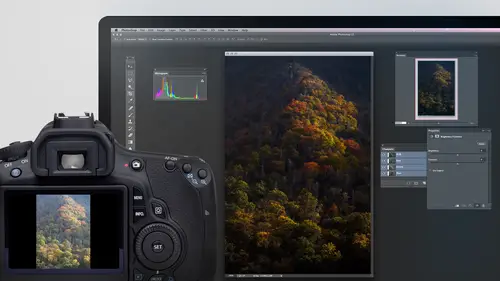
1Adobe Bridge: Metadata Panel
22:16 2Adobe Bridge: Keywords and Filter Panel
28:00 3Camera Tips and Essential Concepts
31:58 4Advanced Adobe Camera Raw Part 1
43:27 5Advanced Adobe Camera Raw Part 2
32:37 6Hybrid HDR Techniques
28:39 7HDR Q&A
15:38Difficult Panoramas Part 1
23:16 9Difficult Panoramas Part 2
19:19 10Time Lapse Effect
19:11 11Other Essentials
23:58 12Line Art and Pen Tool
34:10Day 2
13Masking, Selections, and Background Eraser
35:17 14Trees with Background Eraser
20:16 15Furry, Fuzzy, Hairy with Refine Edge
28:10 16Layer Masks
17:49 17Lab Mode to Separate Colors
34:32 18Colorizing and Make Metal More Shiny
19:33 19Partial B&W with Knockout
20:20 20Editing Lens Flares
21:33 21Separating Detail from Color and Linear Light Mode
18:41 22Clone Source Panel Part 1
26:21 23Clone Source Panel Part 2
22:43 24Telephone Lines Through Trees
17:25 25Little Things That Make a Big Difference
35:44Day 3
26Compositing with Simple Masking
34:12 27Aligning Layers and Warping
30:03 28Vanishing Point
21:05 29Masking Smart Objects
17:00 30Antique Color
30:13 31Color Lookup Adjustment and Faux Infrared
15:41 32Nik Silver Efex Pro
32:19 33Perfect Photo Effects Suite
18:34 34Alien Skin Snap Art 4
15:29 35Creating a GIF in Adobe® Photoshop®
18:01 36Camera Calibration and Post Crop Vignette
19:41 37Adjustment Brush on Steriods
34:20Lesson Info
Vanishing Point
Let's talk about other ideas. Sometimes I end up putting something into an image. In this case, Ah, just grabbed a random image, and I want to make it look as if it's far into the scene. It's far away from the camera and in order to make it look like it's far away from the camera, Usually I need to do something to, uh, give it that feeling. And so let's open another image. To put it on top of what happens is with a lot of pictures. The further something is away from the camera, the more of the atmosphere that's in there distorts what you're seeing. It makes it so. It's lower contrast. Have you ever seen mountains in the distance? That air, you know, hundreds of miles away usually don't have. This much contrast is things that are close to you. And so sometimes I need to do something about that because I want to put an object so it looks like it's far away within my scene. So let's take a look at what we can do. First, I'm gonna remove the background on this and there many different ways...
. I could remove the background in this particular case, my wife, Karen. It's nice enough to create a path for me, and so I have this path. If I click on the path, which was made with pencil, then I could go up to the layer menu and I'll have a choice called Vector Mask. And I could say used the current path, the one that's currently visible on my screen and that is going to use that path toe limit where this shows up. Karen was nice enough to realize that a pen tool is not going to do a great job around things that are furry, fuzzy or Harry. And so then I would come in here and say, Well, I might add layer mask to this layer to dis deal with those parts so you can actually have two different types of masks on a layer. You can have a vector mask, which is made with pencil in that works great with crisp edged object, especially things like cars and things like that. And that's what we have here going around. It gives us a nice clean edge around this whole thing, but then where it's very fuzzy or Harry, it's not going to do a good job because it'll act like you're using a pair of scissors to cut that out. And so I might want to combine my vector mask with something else that has softer edge. So if you look at my layers panel, there's the vector mask attached to my image. Looks a little bit different than a layer mask in that Instead of showing black and white shows this kind of a grayish on the outside in just a black little outline. If I, uh, click on that, I could edit it with the pen tool to find Tune it. But what I'm gonna do is use not only that but also a layer mask. So click here and there's my layer mask so I can paint with a brush on that if I want to hide things or, ah, change it anyway. Normally, change a layer mask. Let's see now if I could get a okay, selection of the hair so I'll just make a basic selection like this to tell Photoshopped what part I wanted to think about. Then I'll come up here to refine edge. Isn't that how he did here? And I'll just use my brush and I'll paint. It looks like it remembered the last setting I used, which was the red overlay setting. Default setting shows it on white, but it will show whatever setting you used last. Hopefully, if I paint like this over all those areas where the hair refer, um doesn't quite look right. It will fix my selection. Ah, okay. And then I can click. OK, and I should end up with a selection that's relatively nice. Uh, I don't want to hide this area. I want to hide the opposite of that. So I'm gonna select inverse to get the opposite. And now we have the area out here selected in my layer mask is active. So if I paint with black, I can hide things. And right now I can hide. Probably need to be careful, though, when I get to the edge of the ear that I don't paint too far because otherwise I would start hiding the ear. Here we go. I'll get rid of my selection with de select. And you see how we can have both the crisp edged area and one part and a soft edged area somewhere else, which is often necessary. Do that one more time just so you get what we were doing. I made a general selection because Photoshopped needs to know the area to work on. So I just selected an area like that. I went to Refine Edge and I painted. Wherever I need that red, which indicates the area that's not selected to more accurately cling to the hair like that, Photoshopped calculated a new selection. Click. OK, so I have that selection and I'm working on a layer mask. And right now, if I were to paint with Black, which hides things only this area selected. And so if I painted that's the only part where I could hide things that's exact opposite of where I want to hide things. So I selected in verse. Now we have all the area out here selected, and that's the only area can change. So now I can grab my brush, and I'm painting here to say hide things, paying with black, and I get that. So now when you look in the layers panel, we have a vector mask doing most of the work, and we have a layer mask hiding a little bit extra, but that's one thing we hadn't had a chance to talk about yet. Which is how do you combine a crisp edged, uh, and a soft one. So I'm gonna leave the little tail in the back and stuff. This is just be doing the same thing over again. All right? Now I'm gonna take this image, and I am going to bring it over to our other file. Gonna find one here. I'll put it in this one. And any time I'm going to scale something, I usually go to the filter menu and convert to Smart Filter first. Therefore, if I decide to scale it more than once, it always calculates the scaling from the original. I'll then type command t to transform. And I'll bring this down in size, and I'm gonna place it back. Here is if it's far away, I'm gonna leave it larger than it would usually be, because if I make it the size, it would really be You barely be able to tell what I'm doing. So just imagine it's the right size for back there is if he's standing on the road far away, if I actually make it small enough. You're not gonna tell what I'm doing now. I need to make it feel like it's further away, because oftentimes the contrast would make it so it doesn't. I feel like it belongs there. So here's two things that I often dio. The first thing is I will usually go into levels or curves in in levels. There are these bottom two controls right here. What they do is they take what used to be black in your picture. And as you drag this in like this, it lightens up what used to be black to this shade of greatest points at when you drag in the opposite side. It takes things that used to be white, and it darkens them down to whatever you point this at. So we can say take what used to be the darkest part of the picture and lighten it up to whatever I want it to be. Whatever used to be the bright part of the picture, you, Congar can it down to whatever you'd like it to be. I want to do that with only one layer in here. And so to accomplish that, I need to click this icon. Remember that one means only a just one layer. Now let's see what I can do. If you look at the little hill or mountain that's behind here, way in the distance. If you compare the blacks that are in there compared to the blackish areas up here, you'll find it's much lighter back there. If I was gonna try to make it look like an object was way back there, I would have to goto levels, grab the lower left slider and start pulling it in. When I do that, watch what happens to the zebra. Do you see that the blacks within it are getting lighter and lighter? You need to bring that in until they're just a slight it was. Whatever else is that deep into your picture. If it's a mountain way in the distance, it might be really light. And if it's something closer up, you won't have to do it quite as much. Right now, I'm looking at this kind of mound that's in the background or that amount here, as if it was gonna be that far away. So maybe somewhere around there in on occasion, you'll also find the highlights. The bright part of the image aren't quite as bright, although that's less common. If you do need to adjust it, then goto levels, and that will be the lower right control. And so if I were to bring that in, the bright parts of this would get less. And when you do that, you probably only need to do a tiny amount because that isn't it's affected quite as much. When things are far away, I'll turn off the eyeball here just so you can see the difference before after. And so that's one of the things I need to consider. But that's not the only thing, because usually when things were further away, they're harder to see fine detail. Also, it's harder to see variation in color. And so what I frequently do is a human saturation adjustment layer where I lower the saturation a little bit because then it will be less colorful. In this case, my subject matter. It's not very colorful to begin with, so wouldn't matter. The second thing that I would do is I would create a brand new empty layer, and I would make sure my foreground and background colors are at their defaults. Let me first show you Why? Because I'm gonna run a filter that is called clouds. And when I run that filter, look at where the colors it uses comes from. You see, the color ended up using it ended up using my foreground and background color. This is a dark green and kind of ah, pinkish. So before I run that filter, I'll choose Undo. I want to reset my foreground and background colors by either pressing letter D for default or by clicking on this icon right here. Now I'm gonna run filter called clouds. I had an empty layer, so that's where it's ah is deposited. And I don't want something that actually looks like clouds. I just wanted to vary in brightness, and I don't want it to be quite as distinct is this? So I'll go to the filter menu, choose blur on a blur. It ah blurred intel. It just varies in brightness and does not anymore look like clouds like that. Then I'm gonna make this so it only shows up where we have information on the layer below in, since the layer below already has the little down pointing arrow, it actually will skip over that layer and look down here. What happens is let me first do it. If I go up to the later menu, I can choose a choice called Create clipping mask. When I do that, watch in my layers panel and you'll find a little down. Pointing arrow appears right there, and that means make this only show up where there's something down there. Well, if you look, the next layer is indented in in the first layer. That's not indented is the one that contains are subject, So this is going to clip it to the first layer. That's not indented, which is where our subject is. So now you can see it. Sitting there doesn't look very good cause you can't see where our subject is. But all I need to do is click on the word opacity at the top of my layers panel and drag it down. Now you bring it up a little bit, and as I do that it's going to make it so It's harder to see the variation in color that's in there and the variation in brightness and oftentimes that's also something necessary. If you're gonna put something far away and you're seeing in this case again, if I actually make this small enough to make it feel like it's far away, it's gonna be so small in the picture. It won't be useful. But I wanted to make sure that you saw the general idea is that you need to consider so you need to reduce contrast, usually reduce saturation and make it so. It's a little bit hard to see the distinct detail, and I often do that with a layer that contains blurry clouds. Uh, and by doing so, I could make it look like something belongs further into the photo in this case that have to make him much smaller and push him of physically, further into the photo. And there any questions about what I was doing there? Why you end up doing it? But this should have similar contrast to what's deep in here way in the back. If that was more prominent and I put it in there, it would look like it's more similar to the background. All right. You ready? Yeah. We got some up here, so I'm gonna start with Christmas 65. What happened to the layer mask? on the zebra once he placed it on the other background. Let me take a look. Oh, what happened is I converted it into a smart object in So it is inside the smart object. What happens is any time you have, um, any time you convert something to a smart object, it will look is if you've flattened that later emerged that layer end. All of the elements that were there at the time he did are inside the smart object in. So in order to access them and change them, what I need to do is double click on this thumbnail image that represents that layer. And when I dio whatever the contents of the smart objects that are well appears a separate document and when I see it there, that's where the mask is. Cool. I could have had it outside of the smart object if I had converted this into a smart object before I added the masks. So that's where they are. We've covered most the general ideas that I wanted. Teoh get by here. And, uh so now I'm just going to show you how I might deal with a bunch of layers that I need to scale and move around. In this particular case, what I have is when I was in Iceland, there's an area where you if you go out there, birds come and swoop down at you and there are so many birds and it's so, uh, it's hard to stand there because they're driving dive, bombing you that this doesn't give you a true sense for what it's like to experience it. Here's what it's like when you're shooting it. You get bird bird bird swooping down in so many of them that it's ridiculous. So I wanted to give a little bit of that sense by adding a few extra birds to this. But it's not that I really need to create that exact composite. It's that I want to show you how to deal with moving a bunch of pieces of relatively rapidly. So I'm gonna open some of these images. I'll go tools, photo shop load files into footer shop players that should stack those images. Then, if I want to mask those, one thing I could Dio is the background on the birds is simpler than the bird itself, so I think it will be faster to select the background and then choose inverse. There is, ah, trick that I sometimes use. If I had a complex background, let's say there's trees and other things in here that I didn't want to deal with. One simple technique you can use is if I come over here and make a selection, just lasso tool. Sometimes I'll come over and do something as simple as choosing the magic wand tool and holding down the key that takes away from things. Think e that takes away from things is the option key Ultima windows. And if you click within the selection on the area where you don't want it selected like the sky, it will usually shrink the last. So if it doesn't do it enough, make sure that in your layers panel that the later you're thinking of is active. If you look right now, the magic wand tool is thinking up here when I'm looking down here. So that's the first reason that didn't work. Uh, there we go. And with the magic wand tool, it has a tolerant setting at the top. That means how much how sensitive is it? How much can it vary from the color you're clicking on and 32 is the default. Sometimes you need to bring it down there. So sometimes making a selection is a simple as make a basic selection of Glass O Toole around something and then use the magic wand, a shrink it. Then I can add a layer mask, and I could go to my next layer. Another technique we could use for selecting the background is quick selection tool. But I don't feel like painting across each part of the bird because there's varies quite a bit. So instead I go around the background. If it gets too much, that's when you're gonna have to go on the bird holding down the option key. But if there was enough contrast, it wouldn't have needed to if it could do it on its first try, which, if this was a object that contrast id more with its background, then I would be able to simply choose inverse to get the opposite. Then I can add my mask. Of course, this one's a little messed up because we cut off his little tail. It's there, but that's fine. I can go to the select menu and choose refine mask. And just like when we had ah, horse or we had, uh, anything else, I'll go up here and choose on layers. Eso If I had any layers underneath, I could see them. And I will just paint to say, do this part separately, and it will refine that Justus if this was the zebra and its little hairs, um, to fix that and I'm not gonna do this to all the layers, I'll just do it to two of them and then I'll drag them over to the other document. Now, what I really want to show is how doe I very quickly deal with more than one layer, selecting them, moving them, transforming them. Ah, well, first off to select layers, if you have distinct areas like these with the move to allow active, all you need to do to change between layers is hold on the command key and click you when you command click control clicking and windows, it's gonna automatically target whatever layers directly underneath your mouse, the top most layer that contains something. And so, if so, I can very quickly switch between these and then if I had a bunch of birds in here, let's say, had 15 or 20 of them in there. If I needed to scale and rotate them very quickly, then what I would do is at the top of my screen. There's a check box is called show transformed Controls. Each time I click on ah, different layer, it's going to automatically show me my transform controls so I could do that. And then I could command click on the next layer and I could do it. Rotate whatever I'd like press return when I'm done than a command, click on another layer and continue, and it makes it much faster when you need to transform. Although I sometimes find that to be annoying that it's always showing up. So remember, if you ever see that on there and you're not not looking for it, it's when you're in the move tool and you're at the top of the screen. It's called show transform controls. Also, when I'm command clicking to select the layers so I could move them around. Just so you know, what that's doing is that is toggle ing something at the top of my screen that is called Auto Select and it's simply trained that on for the length of time that I hold on the command key, if you'd like it to be that way all the time, feel free to turn that on. Then I don't have to hold down any key at all, and I could just click on objects and move them. It automatically targets the layer that top most layer that contains something there, and then when I hold on the command key, it would temporarily turn it off. The command key will simply toggle whatever that's set to. All right, well, I know we didn't make any, like, amazing end results here. Those are ones that I can't show you as far as using stock photography, because I don't often shoot the content that I use. But the concepts we talked about, things like getting both the hard edge and a soft edge on something. Or if you want to put it deep into a scene, how do I get it to the contrast and color looks right? Or how do I change the perspective on things to make it look like it could be appropriate in a completely different image?
Class Materials
bonus material with purchase
Ratings and Reviews
Olga
The best investment I've made to improve my PS skills. Mr. Willmore is a skillful lecturer. English is my second language and I appreciate the clarity of his voice and the fact that he repeats several times what he's doing or what he did. It is great for note taking as well as for practicing. Just an Excellent workshop! Thanks Mr. Willmore!
a Creativelive Student
I absolutely love Ben Willmore's teaching style. He is clear and thorough. This class has a wealth of good info so I had to purchase this course. Thanks Ben and Creative Live!!! PS, Don't forget to forward the PDF. I am waiting patiently.
a Creativelive Student
AB FAB- Ben is an excellent teacher. He is very through and "down to earth" in his explanations. All his courses are worth the time and the money to view and purchase them!!! Please keep on teaching on CreativeLive. Thanks, Thanks, and more Thanks. Janet Bozgan 4-24-14