Photoshop: Work Flow Options
Lesson 8 from: Photoshop for Photographers: The EssentialsBen Willmore
Photoshop: Work Flow Options
Lesson 8 from: Photoshop for Photographers: The EssentialsBen Willmore
Lessons
Day 1
1Adobe Bridge: Basic Navigation
33:58 2Adobe Bridge: Organizing Images
47:54 3Camera Raw: Basic Sliders
18:24 4Camera Raw: Adjusting for Exposure
32:10 5Camera Raw: Adjusting for Contrast and Color
21:45 6Camera Raw: Localized Adjustments
40:44 7Camera Raw: Optimizing an Image
43:52Photoshop: Work Flow Options
33:15 9Photoshop: Resolution
25:55 10Photoshop: Quick Overview
18:41Day 2
11Photoshop: Black and White
17:46 12Photoshop: Focus Bracketing
36:09 13Photoshop: Panorama Stitching
27:17 14Photoshop: Curves
41:40 15Photoshop: Curves Continued
27:58 16Photoshop: Shadows and Highlights
14:52 17Photoshop: Curves for Colors
34:13 18Photoshop: Hue and Saturation
39:43 19Photoshop: Adjustment Layers
37:44 20Photoshop: Adjustment Layers Before and After
38:13Day 3
21Photoshop: Layers
39:27 22Photoshop: Layers - FX and Masks
38:42 23Photoshop: Compositing
31:59 24Camera Raw and Photoshop: Retouching
35:35 25Photoshop: Retouching Continued
31:47 26Photoshop: Content Aware, Selective Focus
23:06 27Photoshop: Textures With Layer Masks
31:08 28Photoshop: Creative Treatments
16:24 29Finishing Techniques and Workflows
31:06 30Finishing Techniques and Workflows Continued
22:40Lesson Info
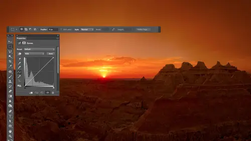
Photoshop: Work Flow Options
well we're going to start off with butter shop with some essential concepts there's some things you just got to know in order to be successful and and be able to think about your image is so I'm just gonna open any old image whenever I have a raw file you know if I double click on it it's going to send me into camera and if I want to get beyond camera then I need to hit the open image but now when I hit the open image but anything I do after that cannot be saved back into the raw file remember raw files are proprietary file formats where we don't want to add anything to them camera rockin do that because it creates a metadata file a little ex mp file that contains our settings but all the stuff we do in photo shop now is independent of that so we're gonna end up with two files your original which is the raw file and then you're photoshopped file now when we working father shop oftentimes I'll end up adding layers which we'll talk about later today we're not gonna get in the layers so m...
uch tomorrow we'll get into adjustment layers and on the third day will get into just layers in general on so get used to him by then but usually my document will be constructed of multiple layers when I have a layered file there are two primary file formats that I use when I save them photoshopped file format which has an extension of p s d on the end or tiff file format which has an extension of tiff and either one of those could be used there is no technical big difference between them as far as choosing one over the other we will talk about what some of the differences are so you might be able to choose between the two but you could use either one so usually we're going to end up with our original raw file along with its ex mp which is what camera did to it and then our photo shop where tiff layered image and so that's what we'll end up with and actually it's three files raw ex mp and then the photo shop I only need that photo shop file if I ended up going beyond camera and doing something in photo shop and now is when our file sizes are going to start heading north they're going to get bigger and bigger because as we add more to our image into constructed out of layers compared to adjusting things we came a raw where that little bitty ex mp file is usually like sixteen k where thirty two k try to find a document somewhere that's that small than any other program it sze crazy how small those files could be but now these files are going to start getting big and so we're gonna have to manage it more and just think about a lot of other details we didn't need to think about in camera but if we go to camera once more there are some settings there are going to control how much information is given to photo shop when you open that picture in so much shit where those settings are double click on a raw file here I'm in camera at the bottom edge of my screen you'll find some blue text that's underlined in those are the settings that will be used when you open the image in the photo shop so this is on the left side which notice your color space we'll talk about that this is how many bits of data it's going to get we'll talk about that then this is the width and height in pixels and the resolution if I click on that I'm going to get a dialog box that appears and these air all the settings that air used at the moment you open the image into photo shop so if you change one of these settings you're changing what you end up with when you get to photo shop for now we're just going to discuss a few of those settings and then will slowly add more maurin focus we go through this session so first down here image sizing if you don't turn on this little checkbox then you're gonna have the native resolution of your camera is what is going to use whatever the width and height in pixels are of what your camera generates is what you're going to get in photo shop now some cameras generate massively huge file especially if you end up having a medium format camera their files are so huge it's sometimes overkill and if you know you're going to use an image for a purpose where you just don't need a huge file it's going to be used on the internet and that's it you could turn on this check box of resized to fit and then you have some choices you could tell it I want to scale it down by a certain percentage like fifty percent of normal size where you can type in a width and height where I can say exactly what is needed either in pixels or inches um and so on but if you turn that off which most of the time I have it turned off so I can work on the full sized image then we could always scale it down later when we're done with it and that's what I usually do I work it full size because I don't know what this image might be used for even if somebody asked for just for the internet you know they might come back a week later and say now he wanted printed brochure and they need a high res picture so you might as well work on the full size image unless you absolutely know it's never going to be used for you know larger purposes so that I wouldn't usually turn on with that ah here we can have it sharpen our image if we want teo or not it's ah it's up to you if you wanted to sharpen it here most the time I end up sharpen an image twice I sharpen an image once to compensate for um what my camera did the image because most cameras have a little filter in front of the sensor which actually softens the image a little bit and it's doing it to prevent what's known as moray patterns if you didn't have this little filter in front of the camera sensor when you photograph something that had a pattern to it like the weave of fabric you could get a weird looking pattern it's the same kind of pattern if you've ever seen it if you take to screen doors put them next to each other and rotate one you get his weird looking things called maria pattern and this little filter in front of this sensor prevents that but in the process it makes for a much softer so remember we actually have some settings for sharpening an in camera he was under the detail tap in the default setting is not zero so your image is already being sharpened it's already compensating for that filter that's in front of your camera sense or trying to get a little bit sharper so here we're already sharpen the image that's fine I will sharpen the image again when I'm completely done with the image and that is when I'm usually compensating for my output device if I'm going to print in the newspaper it's gonna look much softer than it did on screen so I'm gonna sharpen it to tryto compensate for that kind of printing and I'd use different sharpening depending on what kind of putting will use and so we might have time to talk about that more on the third day the very last session of the entire three days is kind of a start to finish thing and part of that will be some finishing techniques which part of that could be sharpening but we're sharpen it once here and when we click on that workflow settings which is that study at the bottom of your screen and camera you could sharpen it again so this would mean let sam completely done here in camera I'm gonna open and photoshopped I'm just going to make a composite of multiple pictures that shows them in a grid or something well I could say right now go ahead and sharpen them and sharpen them for just on screen use or if I was going to use glossy or matte paper in do I like to aggressively sharpen my images or just do it normally most of time a normal but that's not usually needed because we're going to end up sharpening ours at the very end of the process and so you don't need it here down here we have open and photo shop is smart objects you remember when I had the button that said open image and I held that shift and it said open object open in a special way well if I wanted to always do that then turned that on in the button that usually says open image at the bottom of your screen and camera will always say open object instead and so if you like to work that way it's a personal choice uh you could turn that on so when we're in here there are generally three pieces that we need to define one is the resolution which we're going to talk about here I usually use the default of my camera says default right there but then we have to choose a color space and how many bits what the heck does that junk mean well let's find out first off our color space color spaces have names like s rgb adobe rgb pro photo rgb in that type of stuff and it's um really technical stuff but in general behind the scenes your pictures made out of three colors red green and blue you've heard of probably being an rgb mode before that's red green blue and that color space defines what color of red green and blue are you using are they really vivid red green blue where are they mellow red green and blue and so when I changed the setting called the color space what I'm really doing is defining what's the most colorful colors I can have in this document usually it's these choices in here you'll end up using in fact the most common I mentioned her srg be adobe rgb and pro photo those are the three you'll find people using and s r g b is the most limited srg b is going to not allow you to have as vivid of colors as the other choices it'll still look fine it'll still every photo you've almost seen on the internet I'd say ninety eight point six percent of all photos we've seen on the internet have been s rgb meaning if you've seen them and they've look colorful you can get those vivid colors and s r g b but what happens is your printer if you happen to own one it's on your desk it khun most likely reproduce colors that are more vivid then what an s rgb image could contain so srg b is mainly used here's what I would use if the only thing you ever do with your pictures is show them on the internet in send them out to be printed and possibly print in the newspaper s rgb would be the most ideal setting for you because the internet on a lot of browsers makes an assumption about your picture and if the assumption isn't true the colors don't look right the assumption it makes is that your image is set to s rgb so that's not a bad thing for the internet newspaper really limits the how vivid the colors khun b you've never picked up a newspaper and gone whoa look at this color compared to picking up a book where something health with higher quality paper and so ass rgb is fine for newspaper use because you can't have really vivid colors anyway there and when you send out have your images printed most of the service bureaus that do that they require your image to be an astra gb just because that's the way their equipment is set up in there like that so if I do it just for the internet I send out my images to be printed and I might put him in the newspaper I don't have my own printer on my desk or if I do I only use it to preview what's going to be printed somewhere else that surgeon be if on the other hand you have a printer on your desk it's a high quality printer like for me ivan epson what is it called a are three thousand or something like that I don't know the exact model number but it has incident that can reproduce colors that are more vivid than s rgb would allow me to have so therefore I could move up the next step up from that as faras be able to get more vivid colors is adobe rgb and so if I owned my own printer sitting on my desk and that's my primary output is that printer on my desk I might move up to adobe rgb and make it my standard setting to use all the time then if I get really good at it and I really want to push my printer to its absolute limit so I can get the most vivid colors it is absolutely capable of I might consider venturing into pro photo but I would not casually go there if you don't know what pro photo means don't use it it's easy to mess things up when you're in pro photo because you could make colors that are so colorful that your eye isn't capable of perceiving how comfortable it is that kind of thing and so it's on ly for ultimate professionals that really need to get the utmost out of their equipment you might think you want to but unless you want to become a mega nerd I mean mega mega nerd you don't want to you want good looking at images and it's it's everybody else that wants to get overly technical that might head there okay so srg b is the default for a lot of things and it's fine don't be concerned if you haven't srg bm it's your images will look fine but if you own your own printer you probably want to go to adobe rgb you can end up with a little bit more colorful things now the only time you're going to notice this is if you have a really colorful stuff in your picture if all you have is blue sky and green grass and brown dirt you ain't going to notice this setting if you have flowers though flowers can be quite vivid and if you like to push those flowers to his vivid as they could possibly become then you might notice here so let me see if I can show you something here just take me a moment watch the history graham do you remember when we were making an image more colorful how we could tell if we were starting to lose detail because we got a colorful spike on the end well this setting right here determines how colorful we can make things and if we try to push something beyond that that's when we get the spike it says hey you're trying to push this to become more colorful than you can make in that color space so if I set this toe srg be the history graham is in this particular image that has a spike on the left if I work with a larger color space many ones that allows me to have more colorful colors there's a chance that that spike will either go away or gets smaller because this color space can contain things that are more colorful so see if it works watch the history it changed a little bit but it's still got a huge spike let's then change to pro photo who spike went away meaning whatever we're trying to do to make it much more colorful pro photo khun represent that without losing the detail in it uh so there you can see that it it wouldn't have lost the detail does that mean my printer could print it does that mean I could see it on my screen does that mean my eyes could even see it not necessarily so just because of spike went away doesn't mean that you've solved all your issues and you're you're perfect all it means is when you move from s r g b to adobe you could have more vivid colors when you move from adobe to pro photo you can have mohr vivid colors which means you're going to get those spikes less often I am going to use dobie rgb here and I'll click okay I would suggest most people that don't have the situation of internet send out your prince in printing a newspaper those people should be ass rgb but other people should consider adobe rgb it's a pretty good setting in its relatively safe it's relative difficulty to screwed up where's pro photos easy to screw up if you don't know what you're doing all right uh if you want to see it visually I'm sure you think I have a file take me a moment find it though all right gamma plots all right this represents all the colors your eyes they're capable of scene at least the most vivid ones you can't actually show that on the screen because your eyes are capable of seeing a more vivid green than this screen could ever reproduce but this represents the most vivid green you could get most vivid blue most vivid red and so on even though the technology were using cannot display anywhere near what we're truly representing with us then here are some working spaces here is s rgb many we would make our pictures out of this color fred that color green in this color blue it just whatever is contained within this triangle that connects those three dots is the range of colors we can have now looking at this that looks extremely limited but remember my screen can't show you how vivid of a green your eyes were capable of scene imagine the most vivid green you've ever seen it might have been a neon sign it might have been a fluorescent green sign or some other thing that was you know ridiculous you've never seen it on screen well this so this doesn't really represent visibly what you'd get but just compared to the most that you could see okay then this would be adobe to see it's a bit bigger you can create more vivid greens more vivid blues that type of stuff and this is pro photo massive it has colors you cannot see with your eye and it way out here but it's trying to get closer and closer to encompassing all the colors should be able to see with your eyes now the problem with that is your output devices cannot reproduce most of that stuff in fact if you look at a computer screen you will find in the brochures like online for computer screens that they'll brag that they khun display ninety eight percent of adobe rgb if you've ever heard of that you see it in some of the higher end monitors it means we can actually display most of the colors that are in there but we can't display any of the ones out here usually so even though you khun represent those colors in your picture doesn't mean you seem on your screen doesn't mean your printer could print that kind of stuff I only have old information in here because to create these I need expensive piece of software that I don't own and so I only khun go and you use that software on occasion but I can show some old printers thes air quite old printers though here is a printer on glossy paper do you see that shape that represents the colors it could reproduce so what this means is if you had uh s rgb which is a small triangle your picture could only contain colors that are inside that triangle but your printer could print things much more vivid because they could go beyond it if that makes sense because you're not used to looking at these but if you went to adobe rgb though you'd be much closer to the shape of your printer you'd be able to use mohr of that range of your printer but if you wanted to use this range to see the part that's outside of the second triangle in the part that's out here where you could go even further than adobe rgb you'd have to pop up to that thing called pro photo but you're on ly going to notice that if you have pictures that have extremely vivid colors like this one here if I take that and max out how colorful that could be if I'm in essere gb is gonna limit me found on adobe rgb I could go a little further and if I was in pro photo I could push it as far as my printer would be capable of okay so for most people adobe rgb is a pretty darn good choice and for some people s rgb is fine but don't sweat over it you don't think oh my god I got on s r g b m a truck delivering to a client or somebody else I've limited unless it contains flowers that are pushed the most vivid vividness it's capable of you would never notice what's attached to that because that's when it matters the most vivid colors so for me most of time adobe rgb find especially fine give him out to anybody else I don't occasionally I dabble in in pro photo that's touches me and I rarely use s rgb uh the only time he's s rgb is what I'm going to give it to somebody else they're going to use it for the internet and I'll show you a way of doing that it's just called safer web whenever you say for web and photoshopping automatically converts yes rgb so it's good for the internet so all right that's your color space it's s rgb dobie rgb or pro photo and each time you bump up you can have more vivid colors not critical unless you have extremely vivid colors in your picture most people don't have colors that air that vivid you khun tell if you're hitting it by being in camera when you see colorful spikes on the end of the history if you never see color spikes on the end it would never matter when the colored spikes air there if he went to a larger color space they might be reduced or eliminated and it means you got more detail in those saturated areas technical thing we don't love it but nice to know about yeah question would also depend on your printer it would mean if you end up using matte paper and you you have a cheaper inkjet printer let's say that doesn't have as many colors of ink in it it might be more limited but still most printers even inexpensive ones can print a wider range than s rgb so adobe rgb is a pretty good choice for if you on your own printer in pro photo if you really want to push it to the limits but pro photo it's easy to push it too far and run it run into issues also adjustments become les what's the word for it less granular it's harder to make slight adjustments as you get into bigger spaces but uh yeah what does seem like a because I know that's an option in photoshopped seem like a stands for science magenta yellow and black and it's for printing out our printing press if you're putting on a desktop printer wouldn't usually need it because well anytime you print with science magenta yellow and black ink somewhere your picture is being converted to seem like a with an ink jet printer is happening in the printer driver so you send it to normal rgb image it deals with that stuff it's when you're going to send something to be printed on a printing press it's in the newspapers and a magazine it's whatever someone sometime before it hits the printing company has to convert it if you're sending your image to a magazine though they can handle that they know they're printing set up us the photographer designer probably don't know what paper they're printing on who they're printing with so they'll usually handle that but if you're actually bringing your stuff to a printing company yourself you either need to tell them that hey I'm going to be giving you rgb images can you guys handle that or you need to convert to see m y k but only for printing press all right so we had our color space next in there go backto a raw file in there are settings there's a color space dobie rgb is not bad over here bit depth this means how much information are we going to give photo shop are we going to give it all the information our camera captured or are we gonna limit the amount of information to make it be less data so our computer runs faster our files are smaller the choices you have are eight or sixteen bits eight bits means two hundred and fifty six brightness levels but that means it's between black and white you have so many shades in between the two if you count them all up with eight bits you have two hundred fifty six brightness levels that's good enough to make the picture look on screen it's good enough for most images for printing a few extreme images you would need more to make it continue to look smooth and skies and things but overall that's not bad any j peg file you've ever had in your life time has been a bit if I go to sixteen bit file size is going to double and instead of having two hundred fifty six brightness levels we're gonna have us many as my camera captured which it depends on your camera the newer the camera usually the more it captures but it's going to be thousands upon thousands of brightness levels if you find that your image does not look good right here in camera if this image needed a lot of adjustment if I'm going to pull out all the detail in this one's bottom area here if I'm going to pull out all the detail under her hat and everything and I'm not doing it here in camera I'm doing in photo shop if I need to make radical changes to my picture that's when this would help but if the image looks pretty darn good right here then you wouldn't notice the difference but your file size would be twice as big and when you add layers it would be geometrically bigger it gets huge so for most folks eight bits is fine if you optimize the image in camera and you're a pretty good job of it so that what you're doing in photo shop is little tweaks it's not massive changes it's when you need massive changes that you might want sixteen what might it look like if you run into issues well here's an example the middle images what I started with I didn't adjust it in camera anything you doing camera works with all the data that came with your camera if you've a raw file instead I brought it into photo shop and decide hey I'm going to adjust it there instead why would I do that uh I do it on camera because that's where it works with all the data and I brightened it so much that you could see what was in this image so the end result are on the outside and one of them is a bit the other is sixteen if you look at this particular view of it you probably can't tell the difference but you can tell the difference if I click on it in zoom in so if I click on the image on the left to zoom up to one hundred percent view and just to make it easier for you to see l's name up a little further than that can you tell that this image looks like it's it almost looks kind of noisy in there it's actually what's known as post arisen ation it's where they're supposed to be a smooth transition from one color to the next but instead of having a smooth transition there's an abrupt one where you can see two colors touching each other that looked distinctly different than each other where is usually two colors that touch each other looks so similar that it's a smooth transition now let me show you the difference on the right side because this was the eighth pit version over here I don't see that unless it's where the rocks actually changed from like purple tow this but like in here that looks smooth to me in most of these areas it looks relatively smooth where is on this one it looks like the whole thing is just full of spec please junk well that's the poster ization where it no longer it can make a smooth transition from one shade to the next it's the same thing as me doing this I'm just going to make a little demo file here it's supposed to look like this smooth but instead this starts to happen can you see what you might call banding it's just happening where it's not happening with straight lines instead they're shaped differently because of the image in it's because we didn't have enough brightness levels in our picture and we expanded what we had we made an extreme adjustment and we made it obvious that we didn't have enough brightness level and so the time you really need to use sixteen bit is if you're going to make a radical change outside of camera you know doing photo shop be good to be sixteen bitch the other time that I would consider doing it would be if I'm going to stitch a panorama because sometimes you end up with some issues with panoramas see if I can show you it's not going to be every panorama so what I would do is stitch your panorama first then inspect it to see if you had any issues and only if you have the issues would I read do it using sixteen bits because otherwise all your panorama is going to take longer to stitch and your file size is going to be bigger and all that stuff in your might not been any difference so just stitch your panorama and if you notice this problem just go back and redo it with that setting set to sixteen okay so here goes this is a sixteen bit panorama it should look relatively smooth across everything it could use a little adjustment and stuff but uh it's this now here it was the same panorama stitched with only eight bits of data and if you can see it I see it right in here there are some lines they might be hard to see so I'm gonna exaggerate him okay can you see these kind of vertical lines that kind of wavy kind of things I'll turn off the eight bit so you can see the sixteen but you see how it was smooth and then with eight bits it's not smooth and it's usually when you're going to have a panorama with a y two spent expanse of sky and just stitch it with eight bits of data and then inspect your sky see if you can see these little odd transitions and if you do go back to camera clicking that little line in texas the bottom change it from eight bit to sixteen in then go stitcher panorama again and then your end result will look smooth then go back to camera and change it back to eight because it's a sticky setting it's a setting that means for all the images from now on what should I use since you already done stitch stitching your panorama you could go back to camera with any picture click in that line of text of the bottom and say from now on I'm going to use eight until I run into this problem again and uh then what's interesting about it is when you're done stitching your panorama for most images you can do this you could bring it down to eight bits afterwards because the time it was useful tohave it was when it was doing the stitching in blending the things once that's complete if you flatten the image which means you combine the layers so you no longer have them is individual layers all that stuff's already done with and if you do this it'll usually still looks smooth it's just the process of doing the blending where it needed it and so now if I turn this back on you can see this was a sixteen bit version I'll turn the eight back on where's exaggerated but you see the sixteen is still pretty darn smooth so in therefore your file size we're good on behalf file size when you convert to a pit all right so now we had when we're in camera and it clicked in that line of text we had our color space adobe rgb it's what we use for most things over here eight bits the time that you change it is if you're going to do absolutely radical changes in photoshopped don't know why you'd do him there not in camera because camera uses all that data um and this is just how much is given to photoshopped work with or we're going to stitch a panorama and I ran into an issue then I'll bump it up okay now let's talk about resolution we need to know what number to type in here when you open an image in photo shop you can go to the image menu and she's image size and there'll be a number typed in for resolution and you'll find that most images I think it'll be two hundred forty and all that is is it's grabbing whatever numbers typed in right here and you can change it and then all the images you open from then on we'll have that number it's not a number your camera gave it's a number that you put into photoshopped or you happen to be using the default so let's look at that number called resolution let's try to figure out what does it mean and what setting do we need
Class Materials
bonus material with purchase
Ratings and Reviews
a Creativelive Student
Very authoritative and informative class. He commands PS and shares what he knows in concise and precise methods. It was too much for me to keep up with. I am not a techno guy and I decided early on that buying this course, and his next one, was what I needed to do. I watched the whole course and tagged a few areas to review. OK, a LOT of areas to review. Great job and I am looking forward to part 2 in April. Thanks for presenting these courses as you do. I a guy who sure wouldn't gamble on an unknown course, so previewing it is the way to go!! Good luck in your venture. I am looking forward to more great classes from other great photographers. Keep up the great work!!
a Creativelive Student
This is one of the best courses I've taken on any topic, not just PS or photography. Ben is a fantastic instructor. He introduces a new concept and then reinforces it with great examples and with well done repetition of key points along the way. Really really impressive. He does a super job of finding analogies to explain the concepts that underpin key parts of PS (e.g. comparing curves to a series of dimmer switches) and also teaching tons of super useful keyboard shortcuts in the midst of showing larger processes. Excellent.
a Creativelive Student
Hi. I would just like to thank Ben and Karen for the amazing course they have put together. I am pretty new to PS, but I feel like after following and playing again and again the videos I am in a completely different level. I am enjoying a lot more my photography. Great, great course.