Dark & Moody Fine Art Post-Processing
Lesson 60 from: Portrait Photography FundamentalsScott Robert Lim
Dark & Moody Fine Art Post-Processing
Lesson 60 from: Portrait Photography FundamentalsScott Robert Lim
Lesson Info
60. Dark & Moody Fine Art Post-Processing
Lessons
Class Introduction
04:10 25 Shots That WOW
14:08 3Four Fundamentals of Photography
08:05 4Create a Visual Impact with Composition
07:04 5Importance of Foreground and Background
08:30 6Create Depth in Landscape Images
18:09 7Photos Don't Always Follow the Rules
02:11 8Composition Practice Exercise
10:41Composition Critique of Student Images
05:28 10Keys to Posing
05:37 11Shoot: Classic Elegance Female Pose
14:46 12Shoot: Modern Female Pose
09:04 13Shoot: Rollover Female Pose
08:10 14Female Hands & Arms Poses Overview
19:52 15Shoot: Hands and Arms Poses for Female
08:58 16Seven Posing Guidelines
04:18 17Headshots Poses with Male Model
14:59 18Shoot: Headshot for Male Model
06:45 19Shoot: Sitting Poses for Male Model
10:03 20Shoot: Leaning Poses for Male Model
06:43 21Shoot: Standing Poses for Male Model
03:32 22Keys to Couples Posing
10:31 23Shoot: Couples Posing
06:17 24Couples Transitional Posing Overview
14:28 25Shoot: Transitional Posing
15:25 26Keys to Group Posing
07:12 27Accordion Technique with Groups
07:46 28Shoot: Accordion Technique
04:11 29Shoot: Best Buds Pose
04:54 30Shoot: Talk with Your Hands Pose
02:33 31Shoot: Lock Arms and Hold Hands Pose
04:34 32Run at the Camera and Dance in Your Seat Poses
04:13 33Shoot: Pod Method Pose
17:58 34Posing Critique of Student Images
09:32 35Introduction to Lighting
05:38 36Soft vs Hard Light
17:10 37Difficult Lighting Situations
05:52 38Bright Light Techniques
18:16 39Overcast Light Techniques
10:34 40Low Light Techniques
10:27 41Lighting Techniques Q&A
14:58 42Drama Queen Lighting
06:26 43Laundry Basket Lighting
09:44 44Make it Rain Lighting
03:48 45Smart Phone Painting with Light
07:53 46Mini LED Bokeh Lighting
08:22 47Choose the Right Lighting System
13:30 48Hybrid Flash System
06:42 49Innovative Accessories
05:35 50Gear Overview
06:19 51Theatrical Post-Processing
06:07 52Ten Keys to Post-Processing
08:37 53Essential Skills to Post-Processing
08:25 54Headshot Post-Processing
24:53 55Bright Light Post-Processing
09:45 56Flat Light Post-Processing
14:46 57Low Light Post-Processing
08:24 58Introduction to Fine Art Post-Processing
09:06 59Light & Airy Fine Art Post-Processing
27:34 60Dark & Moody Fine Art Post-Processing
13:36 61Post-Processing Critique of Student Images
36:56Lesson Info
Dark & Moody Fine Art Post-Processing
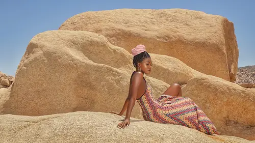
Let's get onto something easier here, okay? And just really quick here, so what we can do is I really liked this image and the problem was is that that white area was really bothering me, right? And these little light areas and I'm like, "Man, am I gonna have to create paths for all these and whatever and darken that down and everything and how am I gonna do that," right? And so once, you know, I learned about using dark or color then I'm able to go in there and paint that and make it darker without effecting any of the other areas and so then so that's why I could get this, see this rich tone here? I just filled that in there with that tone, added some contrast and then added some texture on top of it to give you that fine art image with it, okay? So and remember what I said about paintings, right? Paintings had it's tone all over. All those landscape pictures, there's tone. You kinda just have to have solid tone across everything to really make it work. Okay, so let's just go in ther...
e. And open PhotoShop. Okay and so what I'm gonna do here, right? Is I will select the color, that's the color that I really wanna mess with, right? Or I can, let's select this blue up here, okay? So I like that blue but I want it a little bit darker. Right so I can just go in and select the tone that's around that same family right there, right? And now I can say that's in my foreground, I get my paintbrush and then I say, "Mode, darker color." And so when I go in there and I paint it, I can take my flow down just in case it's too much. And it won't get on the other images. It might get on the hand but what I'll do is I'll go in and I'll paint this and then see all the spots where it's bright, the highlight is bright? I can pull those down with that color too and so you're kind of eliminating the highlights and reducing the tone of the highlights and not keeping those hotspots in there. And so you can go across your image and add those, just those little highlights are gonna cause a little bit of distraction but you still want the highlight there. Right? You just wanna make sure that you wanna reduce the contrast of it, you don't wanna eliminate it but you wanna reduce the contrast of it and someone said, "Well, why don't you just go and take another layer, select that color and just take the whole thing and make it darker color and paint in all the highlights at the same time," but it doesn't look the same because it looks very, kind of, mechanical whereas if you're actually painting them in, some areas are a little bit darker than other areas and it has more of a natural feel to it like it's hand-painted and it just has a better look to it and so I'm just taking all these highlights, fooling around, and painting them, just bringing that down. Giving that more information there. You can really go in and get you something. And it's a subtle, like I said, you know, post processing can be just a million different steps that you can do. You can make things a little bit faster by just getting a higher brush here. You can select different tones but I'm just raining down just ever so slightly. It's funny it's because even though you don't think it matters, your eye picks up those things immediately in your subconscious. Alright, okay so I got rid of the highlights there and then I can just now do goal. Go to "spot darkening", right cause now there's some information, information there where I can just kind of tone these things out and so what I'm doing is deepening the highlights in the shadows in there. Just creating that little bit of contrast in there. I could have painted that one right in there and just creating that nice contrast in there. So there is a highlight there but I'm making it smaller by just making it darker right in there. So you just go in and you just really massage it and you play with the highlights and shadows and darken it and then you're gonna get a nice contrasty image or a dark tones more like a dark key type of feel to it. Alright. Coming in and I want all this dark here. Painting it down. Alright, there. I even paint on the dress a little bit especially where those shadows are to bring out the contrast there, kay? Perfect. Okay, so that's just a general making it darker. I would actually go in and I would actually select, and you can even get this tone even darker but let's see if we can do that, bring that into light room and adjust that darker even more so. Let's flatten that out and so oh, okay, well I like that. It is darker in those areas, right? But you can even go even more of it. Adjust that down more. Just gonna copy a layer and just paint that in and begin to use darker color a larger swatch this time. Get it down more, let's just change the flow so it's a little bit faster, just get it down even more but you know the process, you do it to your, you're kind of like your own feel. What you feel is good but I'm just telling you the process of how to do it but see how I eliminated the highlight or I reduced the contrast of the highlight by giving it information there so now when you have that that's kind of like a fine art painting, it's like you've got information everywhere, right? And it's just a solid tone, there's no whites there and then you can really get it down, okay? Alright. So let's bring it into light room and let's contour it a little bit more with the contrast with the curves and see what we can do, okay? So we started it out with that, see the brightness there? And then we're bringing it down there, okay? And so, see how the tone is? It's less distracting there, kay? Yeah, I'll just mess around with it some more. I mean you could go on in and make that a little bit darker if you want but you get what I'm talking about. We can try to bring down some of the highlights. You can do this. Let's see what we can do here, so we can make it even darker there, moodier. The shadows there, okay. And you can try to make it a lower key if you want to, right so I can bring it down like that, okay? And I can take this and I can just pop the subject a little bit with the exposure and bring it up a little bit there, little bit there, right? It's okay if that fades down there darker and so see these dark areas here? Oh, just hit it a little bit here and there. Just to open that up, okay? And then, now from that there you can just kind of bring that into alien skin and add that texture or you can do that manually instead, it's the same way but it's a little bit, just a little bit easier to do it there and you can also give it, mess around with your presets here so you can, I forgot which one I used but it was art tonality so see how these presets give it different feels to it, right? And so it's a really easy way to kind of create a color matching pallet and have it repeatable with the same imagery and it's pretty much endless with how many things they've got here. So cinema, right that's even way darker. Now let's say you kind of like that, right? The power of this is that you can change the opacity of it of how much you want that effect to go, alright? So you might like that and go, "Okay, I like it but I like it right there," okay? And then you can add another layer on top of that and then add another effect and the list goes on and on and on and on but I just wanted to show you a little bit about using those presets. Okay, so now we're gonna bring it in and then we're gonna add some texture to it and so and then we'll be done with it. So now they have these, where's it at? It's not my lighting effects, sunflare. Oh, sorry, it's under texture, duh. Texture, here. Alright now they have all these desk type of things that you can add to it and so, right? So let's pick out something here. Dust. And you can layer this too and give it more dimension if you want but I'm trying to pick something where I can see something so let's see that. Do we actually see that dust coming through? Okay, let's just add a layer there and see what's going on here and add that dust in there. Extra so we can see what's going on and I'm not sure why that dust's not flying through there. The screen should be, should be screen cause it's making it brighter. Oh, okay. That's why. Okay, so I wanna add that, okay but then I want it subtracted away from the subject a bit, just on her face really, okay and then I can just add another one and then I can go through. Add some more and then basically that's it. Let's do another texture. Let's say you're adding the same one, okay? You could add the same texture to that, where did that go? Let's add the dust to it. Add something there and then you can flip the direction to it wherever you want, there's the opacity that you can flip it around the other side, see how you can create a different pattern there and then you can add that and save it and then that's how you get the texture with it, right? So, I think that's generally how you do it. It's not exactly like what it is but I told you the process on my thinking on it and that's how you create something that's like that. I really like adding the texture at the end, I'll probably lower the opacity but that texture kind of gives it ties everything together but it gives it just a little bit of that fine art feel.
Class Materials
Bonus Materials with Purchase
Ratings and Reviews
Vitor Rademaker
This course is amazing! Scott is extremely straightforward. He goes directly to practical problems, tips and etc. He explains every thing very clearly, and he is also very funny and charismatic, making you laugh as you learn. He shows that you don't need a lot of expensive gear to make very nice pictures. So I have saved some money as well, cause I was about to buy some gear that I wouldn't need right now. It is for sure one of the best photography courses I have ever attended to! I highly recommend! Thanks a lot Scott! You are the best!
user-9994d2
I have purchased a number of classes, this being one of them. The quality of the information was good and the level at which Scott spoke was appropriate for me. Having a course sylibus would add greatly to the value, which usually is not part of the programs I've purchased including this one, unless I've missed it. I believe the speaker should be required to provide one. After watching the videos, much of material can be recaptured by seeing it in writing. I would like to hear back from Creativelive their thoughts. In sum, good topic, good speaker, good technical audio and video quality by Creativelive
user-b48fe5
Another fantastic class with Scott Robert Lim! The combination of his knowledge, willingness to share, passion & entertaining personality makes him a top choice for photography education. Learning not only the "what", but the "why" & "how" can transform one's entire approach towards MAKING pictures. A constant inspiration to get better & better through practice.
Student Work
Related Classes
Portrait Photography