Post-Processing Critique of Student Images
Lesson 61 from: Portrait Photography FundamentalsScott Robert Lim
Post-Processing Critique of Student Images
Lesson 61 from: Portrait Photography FundamentalsScott Robert Lim
Lesson Info
61. Post-Processing Critique of Student Images
Lessons
Class Introduction
04:10 25 Shots That WOW
14:08 3Four Fundamentals of Photography
08:05 4Create a Visual Impact with Composition
07:04 5Importance of Foreground and Background
08:30 6Create Depth in Landscape Images
18:09 7Photos Don't Always Follow the Rules
02:11 8Composition Practice Exercise
10:41Composition Critique of Student Images
05:28 10Keys to Posing
05:37 11Shoot: Classic Elegance Female Pose
14:46 12Shoot: Modern Female Pose
09:04 13Shoot: Rollover Female Pose
08:10 14Female Hands & Arms Poses Overview
19:52 15Shoot: Hands and Arms Poses for Female
08:58 16Seven Posing Guidelines
04:18 17Headshots Poses with Male Model
14:59 18Shoot: Headshot for Male Model
06:45 19Shoot: Sitting Poses for Male Model
10:03 20Shoot: Leaning Poses for Male Model
06:43 21Shoot: Standing Poses for Male Model
03:32 22Keys to Couples Posing
10:31 23Shoot: Couples Posing
06:17 24Couples Transitional Posing Overview
14:28 25Shoot: Transitional Posing
15:25 26Keys to Group Posing
07:12 27Accordion Technique with Groups
07:46 28Shoot: Accordion Technique
04:11 29Shoot: Best Buds Pose
04:54 30Shoot: Talk with Your Hands Pose
02:33 31Shoot: Lock Arms and Hold Hands Pose
04:34 32Run at the Camera and Dance in Your Seat Poses
04:13 33Shoot: Pod Method Pose
17:58 34Posing Critique of Student Images
09:32 35Introduction to Lighting
05:38 36Soft vs Hard Light
17:10 37Difficult Lighting Situations
05:52 38Bright Light Techniques
18:16 39Overcast Light Techniques
10:34 40Low Light Techniques
10:27 41Lighting Techniques Q&A
14:58 42Drama Queen Lighting
06:26 43Laundry Basket Lighting
09:44 44Make it Rain Lighting
03:48 45Smart Phone Painting with Light
07:53 46Mini LED Bokeh Lighting
08:22 47Choose the Right Lighting System
13:30 48Hybrid Flash System
06:42 49Innovative Accessories
05:35 50Gear Overview
06:19 51Theatrical Post-Processing
06:07 52Ten Keys to Post-Processing
08:37 53Essential Skills to Post-Processing
08:25 54Headshot Post-Processing
24:53 55Bright Light Post-Processing
09:45 56Flat Light Post-Processing
14:46 57Low Light Post-Processing
08:24 58Introduction to Fine Art Post-Processing
09:06 59Light & Airy Fine Art Post-Processing
27:34 60Dark & Moody Fine Art Post-Processing
13:36 61Post-Processing Critique of Student Images
36:56Lesson Info
Post-Processing Critique of Student Images
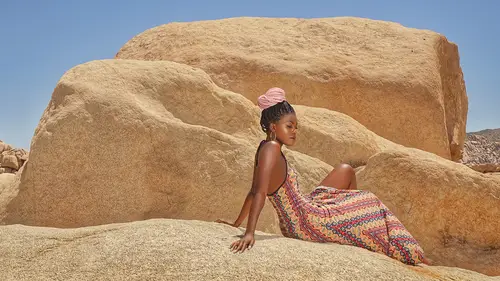
What we're gonna do now is we're gonna take some of the images and look at them, and I'm gonna talk about from the post-processing aspect how we can make them a little bit better. Okay, and let's bring up some of these images that you brought up, right, and so, let's take a look at 'em and see what we can do with them, you know, and mess around with them, have some fun. Okay, so we have this image here and she's got a great expression on her face. She's doing a little rollover and things like that. This image is good. I think actually ... If the lighting was ... Included shadows on this image, we could do a lot more with it because it's all evenly toned and it's evenly exposed, there's no, you just see it and there's not a lot of drama involved with it, and so that's why, you know, personally, for me, it's hard for me to edit as, an image like that because I got no highlight and shadow that I can go to here, right? But, we can kinda fake that, right? And so, we can say, "Oh, let's give...
it a little bit more of a dimension "and let's give it a little bit more pizzazz to it "and then, see what we can do." Okay, so first of all, there's a little bit of a, you know, hot spot, there, and so, with some skin smoothing, we can go in and just quickly edit that. Alright, so, so just edit that into Photoshop, and so, that's one thing that's gonna draw your attention away is just that little hotspot there. So, if a person, you know, let's say their skin is just a tad oily or something. It's very, very easy to get this. So, we'll just go in and smooth that skin right down there, right. So, see how you have to adjust that according to the pixel size of the image? And so, it's gonna change no matter what, and so, I just go to 'til, until that's kind of gone. Alright, and then you go to that. Actually, the grain, this is a really, really low. So, I'm at the lowest point here. So, we can just, that's the very lowest I could do on the grain, and so, I just go through. I just, even just that little bit, doing that helps it, smooths it out, okay. Every little bit helps and counts and just give it a smooth image there, right, and that's good, just to smoothen that out, right there, like that, and so, if I, you know, working with this generally, I would try to, try to create some kind of light contrast in there to give it a extra pop. I know it's a studio shot, but, you know, let's pretend we're trying to give it like a fine art feel to it. So, let's say that, right, move that in. I mean, another type of thing, what you could do, is if you do turn it into a painting, you could exaggerate the colors on it and change the hue and the background, and do all that kind of stuff, but what, when the person is looking at the camera, then, I tend not to do that because it's a portrait at that point, and so, when you exaggerate the colors and they're looking at the camera, it's supposed to be a portrait, to me it doesn't jive well, but if we had it, now, like if you took this image, you looked off to the side, hit the lighting right there, and you had some shadows, then you can go crazy with it 'cause you have a lot of options at that point, and then, you can even turn it into fine art picture, even if you use the same background. You can make it look painterly, you could take it into paint or whatever and do that, but, in general, you don't have that. So, let's just quickly see what we could do to create some different lighting effects, and let's just quickly bring it into Alien Skin and see, see what we can do with it, and then, you know, if not, that's cool, but let's just try to see what kind of effect. We can see, you can even throw in something like this and then add a little bit of mystery to it if you wanted to, but let's just take one of my effects, which is more of a global effect, and see, you can go, kinda go crazy with this, but even jut something like that, I think helps, right? Even if you want, you didn't wanna go too crazy with it and just, let's look at down, or maybe even something like that, just to soften it up, right, and you can take out those areas there. I think that would be great, and so, let's say even if you just added a little bit of that, changed the lighting direction over there. Let's see, what's that? Let's keep that there, and I'm just gonna quickly paint out that area in the face because then that's gonna add that sharpness in, and so, I'm gonna say, "Give me less of effect there", right? And, and with that, and so, even with just a little tiny thing like that, I think just adds just ... A little bit to it and hey, I just, a little style to it, okay. So, I think that's cool there. Alright, so, let's move onto another image. Let's move onto this image here and I love the emotion here, okay? But what I don't like is the nice houses that are being built behind there, okay? And so, first of all, I would use my cropping to kind of isolate that ... And maybe, I would just focus on him because I just love that emotion. The other stuff in the image, to me, kinda gets away, and then, one trick that I do when I see, have an image that has a lot of emotion in it, I want to amplify that emotion, and so, from a post-processing point of view, when I see emotion, if I get rid of the color, then that way, you can focus more on the emotion. So, simply, (chuckles) okay, this is not my laptop, so I would have my presets on post, on color, but let's just do it simply through here. So, we have your black and white here, and now, what you can do, is you can change these tones of the color to get the effect that you want on the black and white, right, and so, this is complete control. I'm just hitting the saturation button, and so, you hit the black and white and these color tones and now, you can select certain elements to come out the way you want it. I'm just showing you how to control it, I'm not saying this is the best way. I'm just saying that you can control your black and white this way, okay. So, I think just doing a simple thing like this. I should've create, let's do this. Create a virtual copy of this, and then reset it, okay. So, I just think going from that, right? Going even down to, isn't that much more powerful? Just that right there because that's really what we're talking about. All that other stuff is distraction. Bang, just give me that right there, okay, and then, with some added contouring in there, right, you can maybe, let's do that. Let's see if what we could do. Let's just see what kinda detail we can get out of this, right, and see what's there. Let's do our little trick here, where we maximize the highlights and the shadows, and see what we got, but I think, you know, okay, so that's really good detail in there, right? And so, you make it sharp, right, and you add some shadows, and then (claps), you got a good picture right there. You really do. That other stuff was just distracting to it, even the color, but I think that's a big difference just the way you crop it, okay? Let's go into the next image. Alright, I like how you're using the leading lines there, using, I love using longer lenses for portraits. I think that's great, and so, again, I think with the cropping thing. Let's see what we can do with that. I just feel like they're the main image here and ... Because I'm not sure, I don't think any lighting was used here because this bright spot here is brighter than them and so, that's the problem. If you squint, you're seeing this white dress here and you're seeing this over here, but you, that's the focus right there, and so, that's where the impact is missing. It needs to be right in that area right there. So, first of all, how 'bout we just eliminate some of that area down there so you're kinda just focused on that area, and I'm not sure how much of that you actually need in there to do that now I think, just, doesn't that look better just like that? Just cropping it just like that? Because what is the central point? That right there, so let's get to the, let's just get to it right there, okay? And so, now we can kind of do that same old routine where we're maximizing the dynamic range with it. We see, so you can see where it's blowing out real fast, right there by the tree, right. That's the point where there's detail still and ... That's the point right there, where there's darks in there. So, that gives it a little bit more oomf right off the bat, just that little oomf there, okay? I'm not sure if it's sharp there. It sorta is, it's a tack blurry. I mean, we can go in and add a little clarity there, right, and then, let's see what we can do with the, let's bring all the highlights down. See that bright? I need to lower that as much as possible because of those tree area there. There ... Dark is there, right? Okay, give it some pop right there. Okay, and that's really starting stick out and then, let's just, for kicks, see what we could do with these leaves just if it might look interesting if we change the color of it. So, it's the hue ... Down. Maybe we make that a little bit darker with the green. Okay, a lot of times I do that, I take the green and I actually make it darker, just so it's a little bit less distracting with that and bring out some of the variation of the tone there, okay, and then, here, darken that down a bit there. Maybe, we can change the birch there or something like that, okay. So, now we're getting some rich detail in there. The only problem is that we have a hot spot there that we have to fill in and so, let's go into Photoshop there and we can go in, quickly, there, and so, what I do is I select the brightest area with tone. So, if I go in here, right, and I say, "Okay, that's the bright part there." There's tone right there. So, what happens if I make that bright part that tone there? So, let's duplicate this first, so I don't work on the original layer and let's hit this tone right there and now, I have that in the foreground, right? If I take my brush and I say, "Darker Color", it's just gonna fill that, those bright spots in and only those bright spots where that is, and now I got information in there, see that? 'Cause when I go over here, it's darker, so it's not gonna affect that, but it's only gonna put in the, that foreground color where it's darker, okay, and so, now, I'm adding information where there isn't. I do that a lot, I shoot in jpeg (laughs), but if I happen to do this, it's fine, and so, now you're reducing these hot spots there, okay, and now that attention could be more on them there, here, right, and then, now I'm gonna just pop this in. I'm gonna flatten that. Now, I'm gonna just take this, I wanna make them a tad brighter there. So, where's my spot lighten here? So, I'm creating another layer and calling it a screen, and then, I'm just creating a layer mask, and then I'm gonna paint in where I want it brighter. So, I'll take a global brush here and I just wanna brighten in that area there where they are, just a little bit. Okay, and then, I wanna take down where that dress is, down there. Just a little bit, okay. Now, I've got hotspots here and there. I'm gonna do that in Lightroom. See down here, it's bright, too bright, it's brighter than them, I'm gonna take that down, but because there wasn't, I don't think there was any extra light going on there, it's really hard to make that brighter than the highlights there, but you can edit it a little bit, okay, and so, let's save that. Let's flatten that and save that, and then, let's just do the one small little ... Let's do just go back and, see how I use them back and forth all the time? Some things are better than others and that's why, when I use Lightroom, it's better for, so let's see that grass on the bottom. Let's just eliminate, get that lower. See how they come out immediately. I'm trying my best to just make them the brightest spot, okay, and just, and so, I'm gonna push it and see what I can come up with there ... And just ... Make it ... Come out. Now, I guess you could say you could vignette it, but I like the control that I get here. Oh, shoot. Delete, it goes wacky like that. Let's just start all over. Okay ... So I'm just, but you get, understand the concept, right? You're making them pop out by darkening everything and so, let's look at ... That's the tiff, okay so let's look at what it was actually before. So, I'm gonna create another one, create virtual copy, and I'm gonna reset everything with that. Okay, so that's kinda before, right? And then ... That's after, okay. So, that's before, that's Lightroom, and then, that's the final image with Photoshop and Lightroom, but they pop out a bit more, okay, and it's just massaging it and doing what you can with it, right? That looks like pretty good image there. Okay, now let's go into this one, which I love, it's a great photo, and let's start off with the crop here and I just think you can tight it up and let them sing, and I'm not sure if I wanna even go with that, but the tighter you crop in, the more that subject's gonna sit. Actually, let's do this. Let's create a virtual copy first and then, we can go back to that, okay. So, here's what we're working with now. Now, what did I say? Detail in the darks, right, and detail in the brights, and so, if we can get some detail, I don't know, I don't think, if we could get some detail in that darks, I think we've got something going, but let's see what we can do. So, I'm gonna bring all the highlights down, all the shadows up. Well, there's some there and then, just, my only worry is is where that highlight is on the dress. Yep, see that, that's kinda coming out. There's a little bit of highlight there, so I'll leave that in and let's do the darks and see what we got, if I can bring that out at all and see what kind of dynamic range is, eh. Okay, so I'm gonna reset that, and I'm just gonna mess around with the shadows and see what we've got. Got a little bit there, alright, but, you know, you're kinda, at that point, kinda ruining the silhouette effect there, too. So, you might just have to do some global adjustments on that, instead of whole thing. So, what I can do is now that I did that, I got tilted back there. Guess what, the sky is a little bit too bright, so I'm just gonna take my exposure gradient tool, give it, set it to exposure, and then, just pull it down a bit, just so I can get back some of that. This might not be the perfect situation, but, you know, I can't spend all day there doing local adjustments on it, but you get the idea of bringing those lights out. Let's take it into ... Ooh, I got an idea. Ooh, I gotta an idea. So, let's take it into Photoshop and see what more we can pull out of it and then, I'm gonna give it a little bit of my special sauce and see what happens. Okay, so here, we're gonna spot lighten this and see, you know, I have no idea how much detail is there, what we can get, but I'm gonna give it the college try. So, let me open up this brush and make it a little bit larger. Just knowing what brush size to select and use, that's probably takes a year just to figure that out. I got some there, I got some coming back. Come on, baby, let's go. You gotta kinda talk to it too. That helps with your post-processing. (woman laughing) (laughs) Wow, okay. So, see that detail I'm getting back? I got a little bit back there, right? We're kind in the game, it's coming back. Okay so, let's flatten that out and then, before I give the special sauce, what do I wanna do? Maybe I'll do that a little bit later. Okay, so ... Oh, shoot. Okay, so what I'm gonna do, I'm not gonna change things on you. I'm gonna just, what I really wanna do is I wanna change those greens and make it a tad darker before I do this. So, I could do that later So, let's do this. Let's give it the special sauce, and so, what this does is I'm in the highlights, I'm toning it, ooh. Okay, you guys probably may not even like that, but I love it because it just makes things a little bit different and it's kind of like my signature style of how I do my highlighting here. Okay so, let me pull this down, and so, now I can adjust. So, what did that do? Okay, again, I'm taking a layer of yellow, now, you can choose any yellow that I want, I just happened to choose that yellow. So, I chose that yellow, right and say, "Make all the highlights that color." Then, I chose a color of blue and I said, "Make all the shadow areas that color." So, you make a layer, and you turn the dark one, and you select Screen as the mode, and then, you say, "Multiply ... "On this ... "Layer right here", and now, you can go in, and you can adjust how much of that secret sauce that you want. It's up to you to do it, but, see that toning? That toning is what you see in paintings and landscape photos. It's just an overall signature tone, but you're using complimentary colors so they work together, right? And ... That looks pretty cool. I feel like I'm just talking to myself, but I'm not, you guys are there. (laughter) Okay, good, and so, okay, here's some more secret sauce. So, to make it fine art and make everything blend together, I like putting ... And I love it because they're not looking at the camera. You can do a lot, I mean you can see, you could even just take that, around here, and do a shot, if you really wanted too. That looks cool too, right? Okay, and so ... Let's go with some grain here, right, and just, if you happen to blow this photo up, no matter how large it is, if you got a little grain in there, it looks believable, okay, and so, I add a little bit of grain here and I'm just gonna back down, okay, that's zero opacity, and I'm just gonna throw in a little bit of grain just in case they blow this photo up, then it's just got a smoothing effect to everything, the grain. It gives it a film, film feel too, and I just, overall, it's pretty cool, and so, I always do that when I have a lot of tone in there, and I'm trying to blend things together. Two things that blend your picture together is that special sauce blue, blue shadows and warm highlights, and then, also the grain. So, those two things really help when it just doesn't feel like the elements are blending together. That really helps blend things together. So, let's flatten that, right, okay, and then, save it, and then, let's do ... A compare and contrast. I think I actually cropped this a little. Did I crop that already like that? I think I cropped it down a little bit more. Alright, okay, so we got that. We ended up with, and we got that, what we started with, okay. It's different, hey, but, it's just adding some things. I mean, we can go in later, I think, too, and just further refine how much of that that you want, the shadows and the darkness and whatever. You want it more of a glowing feel there, right. That's why I love finishing off with the curves, 'cause it gives you that pop or contrast. If you want, if you want a little bit more contrast, you can pop it off, then you can kind of do that, but you get full control of that, okay. So, there ... There, okay. Alright, great. So, let's, moving on. Okay, we've got this image here and it seems to be a bit dark over here and light over here, and so, I think you gotta even that out a bit, where this brightness over here on this side, you wanna, don't distract from her. So, if you just take this and you just quickly pull that down, doesn't that make it better right off the bat? Just a simple little thing like that? Okay, so that just adds something to it, and you can kind of do this too, and darken that down a bit here, and then, now I'm gonna fade this dress because the dress is pointed kinda where that light is and so, you're, it's kinda taking away from the face, right? So, if I just ... Pull it down, see that? And kind of, ooh, I just put a snoot on that lighting, right there. Alright, there's my snoot right there, and you can just kind of focus it in on her there because, really, so you gotta, when you look at the pictures, you gotta say, "Hey, what's the main focal point of this picture?" It's this face right here, look how beautiful she looks. Let me amplify that. Let me take everything down there, so she's right there, okay, and then ... Even, why do we even need that other area over there? Right, if we're just talking about her face there, why do we even need it? That looks better and then we can adjust that even more to create that drama right there and that looks good. Now, I'll do the exact opposite on the other side 'cause you see how dark that area is, over on this left-hand side here? So, I'm gonna take my same gradient tool and I'm gonna, instead of underexposing it, overexpose it, and then, I'm gonna see if there's any information there and just give me something there. Is there anything? Come on, what, maybe there's something that we don't wanna see. Yeah, there is, that's why. That's why that person did that. So, but, what you could do on top of that is kind of add a texture overlaying that to give it a fine art feel to it. So, let's see. Let's see a before-and-after light. So you can go back and forth on that. You see that, right? And so, it just adds more focus down to her. Okay, now though, the reason why that, it's not feeling as dramatic as you want to because there's no shadow on her. If she had some side light right in there, I think that would be really great. I don't know if we can make that up and add it, but we're gonna give it the college try and see what we can do, but let's pretend it's side light and see what we've got, and so, now, if I take my spot darken here, right, and I use a darker brush here, ooh, look what we're getting. You know, every image is a surprise. It's just like a box of, what do they call it, Cracker Jack? You just don't know (laughs). You just work with it, have fun with it, experiment. You know, just have fun, man, Okay, does that look a little better? I think so, right? See that, bringing it down? Ooh, yeah. With me on that? Okay, and then, I'm gonna take some areas here, open that up, just to give a little detail there. Right, ooh, I'm not sure if I wanna open that part up, but let's see, maybe not. I'll erase that area there. Okay, and so now, I'm just doing the same things that I talked about where I'm putting, oops, sorry ... Wrong way. Wait, what was that on, light? Let's take that out. Okay, so let me darken it again. So, again, I'm darkening the image. There's a billion ways to darken it, but ... That little pillow, we've got some shadow here, so I can kind of go with that, and I think something like that, around there. No, you can take it and you can change the opacity just to, to see what you wanna do with that, and I think we got something there, and then, ooh, okay, let's see what we got now. We got, what we can do is create a ... Shoot, this not my computer, so I haven't set up that, a brown tone. So, let's do this. Here's how you can make it sepia, because I kind of feel like it's a vintage picture. So, what happens if we kind of made it a sepia tone? So, what I'm gonna do is pick a sepia tone, okay. So, let's pick something that's brownish There, I'm taking a guess. Right there, that's brown, that looks brown to me. Okay, and then, I'm gonna fill that, I'm gonna fill that foreground with that brown, okay, and then, now, I have a layer mask it over hiding it, but I'm gonna open it up and I'm gonna put the brown over the whole thing. Okay (claps), so that, that's the brown over there, 'cause it's in Multiply, but if I turn this mode to Color, it turns everything in that picture that brown that I just selected with those tones, okay. So, now I can tween it. I can go, "Well, do I want it vintage, "or do I want it color, or do I want it in between?" This is the magic of Photoshop. You can select how much brown you want in there just to give it your feel to it, to create a vintage feel to it. Okay, I think if I had a little bit more time, this is, I see a lot of green in there. I'm not sure why that's happening, but I would get rid of that, but I would definitely kind of do a tweener type of thing with it and edit it, but, you know,'cause it has, sort of has a vintage feel too, and so, that's kinda, or, it looks good that way too. So, anyways, let's just go with that right there and flatten it. Alright, and save it, and let's see what we got here. Okay, so, we kinda ended with there and then, started with that, okay. So, we started with that and came up with that. Again, you can also mess with this black and white. You could turn it all the way black and white. I think this lends itself to more of a sepia feel to it, and you can mess with that, alright, good? Alright, let's end with this last image here, and I really like her profile right here, and I love the styling with that, and I'm just wondering, you know, so this area over here is not that great to me because of the posing there. I, well, maybe if we can just dump that part. Not dump it, I mean, crop it out (laughs). Alright, and I'm just wondering what we can get if we just, 'cause that face is beautiful, that's what I'm thinking. I go, I got, I got something, but I'm not quite sure. What do we got? Okay, maybe just that. Okay, because, let's just do this. Create virtual copy. Alright so... To me, when I look at it, bam! It's all about that profile and that styling there, and so, just cropping it off, maybe something in there, or making it square. I think just this example is maybe just with a crop, you can really just amplify whatever that you got going there with it. Okay, so I think in that particular picture, I think just the cropping makes it all good there, how's that? Scott, I'd love to just bring it all back around. Yeah, let's do that! And we can just kinda talk about what we learned in the class and what your final words of wisdom are for everyone. (laughs) Well, you know, I think it's just what I've been basically kind of preaching the whole time is really, you got to have really all four facets together before you really gonna start singin' with your imagery and getting to the place where you wanna be, and if you're at that point where you feel like man, I just can't get past certain levels, it's usually because one of those areas, you're just not clicking through with, and so, there's a couple things. One, is you gotta be honest with yourself and say, "What do I hate doing?" Oh, I don't know, maybe it's post-processing or maybe it's lighting, and go in there and tackle it, and do it! And then, you'll find that once you start becoming a complete player, per se, you're gonna start to love your imagery because you're bringing it to new levels, and then, once you start mastering all four, you still do the same process. You go, "Okay, you know what, I wanna learn this "a little bit better", and then, you start incorporating that or you know, let's say, you go to a different workshop and you see something that they're doing and it's easy for you to incorporate other styles into your work because you're well-rounded in lighting, and posing and composition, and so, you can take that new skill and make it your own, and that's really what you need to do is make your photography your own, but if you don't have the four fundamental things down, you can't make it your own, 'cause you're just struggling to get it to look okay, right, and so, you're struggling with the limitation of that one area that's holding you back. It's handcuffing you, and so, I just wanna attest to like, my whole personal experiences. Once I feel I got a handle on four of those things, you know, I just felt like you're, you become unstoppable, right? And you, there's this joy when you go out and shoot because you can add different combinations of lighting, different combinations of posing and come up with a new, entirely new idea, but if, you know, it's kinda like playing the piano, right? If you only know four notes, there's a limited amount of songs that you could do with four notes, but if you can use the whole 88 keys, wow. You can create a symphony, and so, if you've only got one or two of those four elements down, that's like playing the piano with four notes. What can you do with that? But once you start mastering all of those four, man, you've got that whole keyboard you can do, and you can start creating songs, and letting your, your song come out at that point, and that's what I really love doing is like, giving tools to people to let them really bring out their vision and that's what I have a passion for, and so, I hope you guys have taken something away from this, and you know, love to hear from you. You can reach me on Facebook, Scott Robert Lin. Scott Robert Lin, you'll find me somewhere, and I'd love to hear from you and see where you're going with your journey, and, you know, how this class has helped you in a small way to where you wanna go.
Class Materials
Bonus Materials with Purchase
Ratings and Reviews
Vitor Rademaker
This course is amazing! Scott is extremely straightforward. He goes directly to practical problems, tips and etc. He explains every thing very clearly, and he is also very funny and charismatic, making you laugh as you learn. He shows that you don't need a lot of expensive gear to make very nice pictures. So I have saved some money as well, cause I was about to buy some gear that I wouldn't need right now. It is for sure one of the best photography courses I have ever attended to! I highly recommend! Thanks a lot Scott! You are the best!
user-9994d2
I have purchased a number of classes, this being one of them. The quality of the information was good and the level at which Scott spoke was appropriate for me. Having a course sylibus would add greatly to the value, which usually is not part of the programs I've purchased including this one, unless I've missed it. I believe the speaker should be required to provide one. After watching the videos, much of material can be recaptured by seeing it in writing. I would like to hear back from Creativelive their thoughts. In sum, good topic, good speaker, good technical audio and video quality by Creativelive
user-b48fe5
Another fantastic class with Scott Robert Lim! The combination of his knowledge, willingness to share, passion & entertaining personality makes him a top choice for photography education. Learning not only the "what", but the "why" & "how" can transform one's entire approach towards MAKING pictures. A constant inspiration to get better & better through practice.
Student Work
Related Classes
Portrait Photography