Lesson Info
6. Blend Modes and Adjustment Layers
Lessons
Lesson Info
Blend Modes and Adjustment Layers
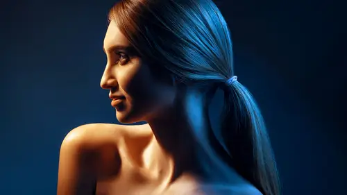
I like to even out colors, and do some color work sometimes. So, for example on this image, I'll do the same thing, I'll click on the folder, and call this color work. Now, as I mentioned, we're doing a lot of things, and sometimes I don't cover everything that you can do, because I want to make sure you have tools that can be applicable to everything. But if there's anything you wanna to re-visit, or see more extensively, I have a lot more content that you can look at to see, a lot more tools. But I think you don't really need all of them, as long as you can get to where you're going with the most basic tools. So, when it comes a color work itself, one of the things that I like to do is I always like to ensure that there is consistency across the skin. I feel like the quickest way to do that, for minor issues, is if I set a blank layer, and I set this to the color blend mode, I can easily fix some color issues that have happened during the process. And the way to do that is simple, I ...
click on my brush tool again, and, I have my option key, which is sampling, just like the healing brush I'm able to sample. So, I'm gonna sample say an unusual color right under the eye, so I'm gonna be fixing some colors here that were contaminated. You might not be able to see it here, but usually on the screen you are able to see a lot more colors. So, let's say I sample here, and the same thing I'm going to be using quite a low-flow. And when I start brushing, it'll end up replacing the color of what I've selected, over any colors that were contaminated. So, for example if I have an area like this, where it's a completely different color cast, and I start brushing, what happens, is I'm able to replace the color, with what I've selected. And the only reason this works, is because I'm in the color blend mode. If I'm in the normal blend mode, it's just going to smear colors around. You see? So, it's just taking kind of like the properties of that color and pushing in there. It's really neat. and there's obviously other tools like color balancing, gradient map and curves, but you know, you can go on forever. Right? But that's a tool that I use quite often, use the color blend mode, or the hue blend mode. But usually, the color usually fix a lot of the problems. The same thing goes for any areas that might be too saturated with one color, like over here on top of the mouth, on my screen it's little bit more saturated. So, the same thing else. It's like the color which is quite similar that I wanted to be and kind of start brushing. And what that does is it kind of just places it, and if I don't like it, I can undo, erase and pick another one. So, it makes it really easy to do that. Okay. So, I'll do the same thing kind of across, some of these other areas. And that's the kind of workflow that I would continue progress. If there are any areas that are too saturated, I would simply go in and the use the hue saturation. I'll decrease saturation, I'll use the black mask again, and then you can brush over any areas that are oversaturated. And the other great thing about hue saturation, is that has like red yellow green, so, if there's a color that's too red, go into the red channel, and you could move the hue around, so, you can see it changes, the color of the red to whatever you want. There's an influence of a certain red, yellow you can switch things up. So, hue saturation and the blend mode set to color on a blank layer is typically what I like to do. When it comes to color toning, I would say that in my work I like to do skin work, and my girlfriend Bella Kotak, she is like final photographer. She loves a lot of extravagant color work. So, she has a lot of actions she uses because she has the website is fineartctions.com and there she kind of takes all the fineart work that she's done in galleries and repackages her layer stack to be actions you can apply different color tones. They are very cinematic and extravagant, and they're all adjustable. So, sometimes what I like to do is, if I don't have necessarily, I wouldn't say time, but if I want different options in what to do, I will you know, look at her layer stack, for her color work that she's done, and you know usually run them, and then see how they interpret the image. and then tweak it based on that. So seeing other people's color work sometimes gives me different ideas on what direction to go in. And I also mention this because we're giving one of her action collections away to everybody. So that way, you know, everybody who's watching the same part of the course, they have one of my favorite collections that she's done, and you can play with them and adjust them, and give me a lot of ideas. And to study, how people are color toning, cause you can see the layer stacks. So, we've basically included all the adjustment layers, so you can go in, and you know see what what they've done. In terms of, how did they get that tone? How did they get that tone? And study. I think it's a best and cheapest way to learn, how someone color tones his thing, then do it. And the other cool part is that, if I decide that let's say I like something you know, at a lower percentage, maybe I like this, but not as intently, I can change my (mumbles) of this theory, of this folder here. And then just run another one for example. And then what I like to do is kind of combine different things. So, for example this one's a lot cooler, and it cools up everything, and gives a different feel altogether. And I can combine them with tweaking, for my own personal taste. So, I can make formulas of different pallets. But usually color work, aside from that, I like to leave to the photographer. Sometimes they'll say, you know what, let's use this reference, and then I'll try to adjust it that way. But for the most part, I tried not to do a lot of color work, and I like to leave that to the photographer, because you know their artistic interpretation's hard to match what they're seeing in their mind. So skin work is usually my jam. But aside from that aside from these three steps, you know getting to where you wanna be, is really critical because from here what happens is when you look at this from web perspective or in a print perspective, right? Like we are looking at this at a size that you would imagine on the web or even a lot more, or on a print, right? Like an 8 x 10, or whatever. This is where you kinda wanna be when it comes to having her portrait be as realistic as possible, but very clean. And we've done this all, under an hour with talking. So, it's like 20 minutes of work, we're able to get there, so is very possible.
Class Materials
Bonus Materials with Purchase
Ratings and Reviews
Elizabeth Mesley
This is a really wonderful class. Clear instruction - the only thing is that I wish there was a bit better explanation about liquefying and what the purpose of using that tool is. However, wonderful class overall!
Paloma Aviles
He is fantastic, the best online teacher you can have. You learn a lot from him, he made easy photoshop. I recommend his course 100%.
Anastasia Roschina-Kulakova
Retouching is my favourite part of the art process, and here I found really nice and helpful tips for an easier workflow! Thank you!
Student Work
Related Classes
Portrait Photography