Lessons
Lesson Info
Color
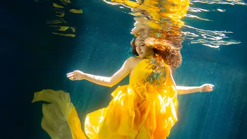
Okay, so the first thing that I wanna talk about is color. All right, so let me just bring this up. And, so you, when you're photographing underwater, and you're taking an image underwater, we have to think about the way light reacts. And so, you lose lots of the red wavelength colors a lot faster than the blue, or the cool- the warmer wavelength colors than the cooler ones. And the reason for that is because, like I said, water is 800 times denser than air, so it's much harder for the colors of light to move through. And so what I mean, what I... I'm trying to describe this, but, the warmer wavelength colors, so you can see up here we have, I think it's nanometers. So they vibrate at a different amount of nanometers per second, and so when that's being said, you can see how little water red penetrates into. So you immediately, as soon as you go underwater, you're gonna lose your reds, and your oranges, basic- or, you know, I'm sorry. Reds is here. This is infrared. So, reds and orange...
s as well. So, that's a big deal when it comes to skin, all right? When we are dealing with models underwater, there's gonna be a lot of recolorization of skin. Especially the deeper you get. So, for me personally, my sweet spot is to be photographing in less than three feet of water. And sometimes that's hard, because you have to kind of crouch yourself down to actually get under the water, and then once you're done shooting, you can just sit up, but you're still in the water. So, the less water for me personally, that I could be shooting in, the better. The problem with that is that if you are anywhere with sand, you have issues with, especially if your model's in a mermaid tail, that mermaid tail's just gonna kick up all the sand, and then you have all of these specs of sand that are just ruining your image. So, we'll get to that later, but the first thing that I wanna kind of focus on, and spend the mot time on, is this problem. So, I like to think of it as your warmer wavelengths with the faster, with the faster nanometers, so they get tired faster. And so once they hit the water, they're gonna immediately just fall apart. But anything that has more blue in it, is gonna be a much slower wavelength, and because of that, it's going to have the energy to penetrate deeper into the water. So the deeper you go in the water, the less reds and yellows you're going to have, and the more greens, and blues, and purples you're gonna end up with. So, that's just a little bit about that. Does that make sense to everybody? The faster ones get tired faster, or the faster wavelengths get tired faster. Okay, I should never have been a physics teacher, so. Yeah, so that's my best explanation as to why some colors penetrate deeper into the water than others. So let's talk about the fix, all right? We are going to bring up our image here, and let's bring this into our develop module. And so the first thing that we wanna do is get a good type of overall color balance from the image. So, we'll just bring this a little bit warmer, and as you can see, it's not so much the blue, it's not so much the blue yellow temperature that needs a lot of fixing. This image is exceptionally green. It has to do with the water, wherever you're photographing. Some water's gonna be more blue, some water's gonna be more green, and you're just going to have to, you know, colorize it appropriately. So for this, we're really gonna just totally take that tint, and really bump that tint up to something that is starting to look more realistic. So off the bat, that's a pretty good, that's a pretty good start, right? What do you guys think? You think that looks pretty good? Yes. Okay. So, our next thing is just to play a little bit with the exposure. So we'll just bring up our exposure just slightly. And add some contrast. You guys think we need some contrast over there? I think so. All right, so let's add contrast. All right, looking better. So one of my favorite sliders for underwater images is going to be your Black clipping slider. I use this a lot. I use this a lot with Clarity and Dehaze. Dehaze is gonna become your new best friend, as soon as you start shooting underwater. But for this, we're really gonna try and bring back the depth in this image, by really clipping those blacks, so that immediately it just cuts through the haze of the photo, and we can continue to move on. All right, let's add some clarity, like I was talking about. So, the cool thing about clarity, is that it's going to take, it's gonna divide your image up into, into segments. So it's gonna have your brighter tones. It's gonna have your mid gray tones, and then it's gonna have your darker tones. And so what Clarity specifically does, is it looks at those tones that surround 50% gray. So basically, take this image and pretend, just hypothetically in your brain, that it's black and white. It's going to take your 50% gray tone, your medium gray tone in your image, and it's gonna look at the surrounding values in that area, and then what it's going to do, is it's going to increase the contrast within those mid-tones of the image. So that's where this clarity comes in, and then Dehaze works a little bit differently, but we're gonna add Dehaze. All right. So. If we are looking to look at our before and our after, we can hit our backslash key. The reason why you're seeing this lens distortion is because I've already hit the, the lens distortion over here. So, let's go back. Let's see our before and our after. I think that's starting to look pretty good. What do you guys think? Here's our before. I have a virtual copy. Yeah? Okay. So that's dealing with overall color, right? So we're doing the color of the entire image. Well, I like to take it a little bit further. I always love to push the envelope when it comes to color specifically, and retouching, so what I really like to do, is use my HSL panel over here, pretty extensively when dealing with underwater photography, and that's because I know that there's this color contamination, where all of the colors end up looking more blue, or more green than they should. So if that's the case, I should be able to take each one of those colors, and basically nudge them in the opposite direction, bringing back the warmer value of that specific color. So, that's why I really love using this Hue, these hue sliders over here, because it literally breaks down your image into reds, oranges, yellows, greens, aquas, blues, purples, and magentas, and it lets you modify them specifically. Not only does it let you modify the hue of those specific colors, meaning, you know, if the color is cooler or warmer, but it also allows you to deal specifically with the saturation, and the brightness darkness of a specific color. So if I wanted the water to be super bright, you could just modify the aquas and the blues, and that's gonna completely change your image, right? And the one thing I would recommend doing, is whenever you're trying to deal with a color, go ahead and use your little, the little spot right here, that's on the tool, because you may think you're looking at green, but it very well could be aqua, that it falls within, that that color actually falls within, so you may... Like when I look at this, it looks like it could be green, this color. Everybody's eye is different, so by using this thing, you're not gonna have that guessing issue. All right, so lets tweak the hue. So I, so we'll just take our reds, and we're gonna make our reds just a little bit closer to orange. We're gonna take our oranges, and make them a little closer to green, to yellow. And we're gonna take our yellows, and make them a little closer to orange, because I don't want green contamination in on my yellows. Now my greens, I'm gonna really bump those closer to yellow. And my aquas, I'm gonna make the aquas a lot closer to blue, because I want that water to look more blue. And if you're not sure where a color is, and you're not sure exactly what to do with it, this is my trick. I just take it, and immediately pull it all the way, to see, what am I dealing with here, you know? And then I can make up my mind as to where exactly I wanna go with it. Aqua, 76 I think is a good one. So almost all the way for the aquas. The blues, I'm gonna keep pretty much where they are, because you can see how that water really falls mostly, 90%, within the aqua spectrum, and it's not technically really in the blue spectrum here. Let's add some warmth to the purples. See some of them are much more extreme than others, so I'm pulling the purple, and I'm polarizing it to both sides, and I don't really see anything. I don't really see any- oh, you know where I see it? Right here. Right there, look at that. Okay? So it's in there. And the magentas. So the magentas is basically the fabric, right? But so, let's just take a step back here and talk about the powerful ways we were just able to modify the image, just by using the Hue, and by using no masking whatsoever. That's a big deal, right? That's a power user, that's almost a power user tip. We were able to really modify each specific color, by just using the sliders, and that be it. So, do you guys think, do you guys think you would save time using these specific sliders? Yeah. I think so. All right, there's a couple different tweaks to the saturation and the luminance that I wanna do, but that's basically just making the water look a little bit cleaner. So, I'm just gonna add saturation to the water here. And then darken the water just a bit. Now for me, I'm not sure what your monitor looks like, but for me I think that this all needs to be brightened, just a little bit. That looks better. So, before. After. Before, after. So, what we're doing is we're basically thinking about each specific color, and we're breaking it down, and we're isolating it specifically so that it doesn't have any other- so we don't have to worry about any of the other issues, of other colors. And then we're basically modifying that specific color, to get something that we like. And so that's really where the power of this, the HSL panel, really lives. Lastly, what we're going to do, because one of my ultimate, I don't know, I don't know if it's a tip, or a trick, or what, but I love adding brighter, whiter sand along the bottom, and brighter, whiter sand along the top. And maybe that's because I'm in the process of just photographing in really shallow water. So you can see here that she could easily stand in the water. So if anything goes wrong, I'm just like, okay, stand up, and let's take a breather. If anything happens where she is, for example, caught up in the fabric, it actually, in this image specifically, her head's even out of the water, so we're not even dealing with any issue of danger, specifically in this image. So, what I'm gonna do is I'm gonna add a graduated filter to the top, and to the bottom, to make that sand just look a little bit more, less blue, more, I don't know, a little bit warmer. And we're going to add some warmer temperature. And tint. And let's brighten up the top and bottom as well. So now that I have everything set, I'm gonna hold down my Shift key, which is going to make my graduated filter parallel to the image. And then I can pull that in. And then just pull that off, just a little bit, so that we have one from the top, and we have one from the bottom. Okay. And I think that that is it for this image. So, we've added our gradiated filters, brightening up the top and the bottom. So there is our before, and here is our after. So, this is the first image that we were talking about in our color section. Are there any questions, are there any questions out there about color specifically. I'm gonna talk a little bit more about color, but then we'll move on. No? Cool, all right. So, what I'm doing in this class, is I'm going to, for the most part, for almost every section, I'm gonna talk about how to fix it in Lightroom, but then I'm also gonna talk about how to fix it in Photoshop as well. So, we're gonna move on to the Photoshop section of this segment. All right. Let me switch over. Because as we all know, there are a thousand ways to do everything. There's, and especially in Photoshop, and Lightroom, there are different ways to do different things. So, for this image specifically, I have originally just brightened up certain areas of the mermaid here. So this is straight out of Lightroom, okay? And so I've brightened that up, just using a few curves adjustments, and stuff like that. And doing some dodge and burn, just to brighten it up. But what I wanna talk about is our color balance adjustment layer, and the reason why I think it's really, really powerful when dealing with color is it's similar to what we were just talking about with the hue, saturation, and luminance. The fact that you have all of those sliders, which are going to modify specific things in the colors. So for each color in the spectrum, you can deal with warm or cool value, you can deal with how much saturation is in that color, but you can also deal with the luminance in that specific color. That's why it's so powerful, and that's why I wanna talk about, why in Lightroom, I wanted to talk about the hue, saturation, and luminance, the HSL panel. Now, in Photoshop, a similar equivalent is your, is two things. Your selective color adjustment, but also your color balance, and the reason why I like talking about the color balance, is because you have the option to split the color balance between the shadows, the mid-tones, and the highlights. So, for this image specifically, you can see that the highlights, for the most part, in general, the highlights and the mid-tones are pretty spot-on. I was able to get them pretty spot-on in Photoshop. I have a problem with the dark tones over here. Can you guys see how there's blue, almost creeping into the darkest tones over here? Can you guys see that blue? Okay, so that's what I wanna get rid of. So what we can do is we can come over here, and from mid-tones, we can choose Shadows from our color balance adjustment layer, and we can modify just the shadows, all right? So we're gonna add red to just the shadows. We're going to add magenta to just the shadows. And then we are going to add yellow to just the shadows. I like doing anything that you don't have to mask. I'm a pretty lazy masker. You always wanna make sure that Preserve luminosity is turned on. So, let's zoom in here. If I turn on and off, can you guys see how immediately the color is kind of coming back to reality? To that, to more of a real... I don't know, more in the realm of real, and it's... And now when I turn it off, immediately I can see this blue haze over everything, and then I turn it on and I'm like oh my gosh, once it's on, it looks so much better. But, I would never have known that if I didn't play around with it. All right, let's look one more time. Before and after, yeah. Definitely like that. It looks much better. Okay. So, similar to our color balance, so, again, I didn't modify any of the mid-tones. I didn't modify any of the highlights, because I don't think that there is a problem with any of those. It's just those shadow areas. So, the other thing that I really, really wanna talk about is the selective color adjustment. And the reason for that, is because just like the hue, saturation, and luminance in Lightroom, the HSL panel, you have the option to independently modify each color within your image. So reds, yellows, greens, cyans, blues, magentas, whites, neutrals, and blacks. I don't, personally I don't deal with the whites, neutrals, and blacks. I just deal with the colors. So, has anybody played around with the selective color? Okay. Great. All right, so for the reds, again, like I was doing in the, in Lightroom, if I don't necessarily know what it's gonna modify, or what it's gonna change, what I'll do is I'll take that slider, and I'll just totally pull it all the way to both sides, and I can see, okay, so even though I thought that those starfish were orange, they're falling in the reds, okay? So, let's make those a little bit bet- a little bit more red, and take the cyan out of the reds, okay? Now with the magenta, again it's gonna be the same area, but we're just gonna add a little bit of magenta to the image, to those reds, and then we're gonna add a lot of yellow to the reds. Let's make sure we're on, I think we wanna be on Absolute, but I'm not positive, don't quote me on that just yet. So right off the bat, are you guys seeing an improvement in color? So obviously you've got orange, you've got orange starfish top, and you've got blue water. If you put orange and blue on top of one another, they're complementary colors, which means they're basically gonna cancel each other out, so what we're doing is we're trying to work against that. We're trying to work against the fact that the blue seeps into every color, and makes every single color more dingy. But we're doing it to each specific color. We're not doing it to the overall image, because each specific color needs to be, is its own unique item. It's its own flower, and it needs to have the special treatment that we give it, right? So let's move on. We're gonna move onto yellows. So for the yellows, and pretty much for almost every color, I'm gonna be taking out quite a fair bit of cyan, because, you know, that's just what we're, what our objective is. So you can see that the yellows are definitely now coming into the tail. And, let's add some magenta to the yellows. And let's add some yellow to the yellows. Okay. And we'll move onto greens. So, I think the green's gonna be a lot of the tail, right? Yeah. It was a guess, but you never know, sometimes. So, -20 on the cyan. From the greens, we are going to actually subtract some magenta, and then we're gonna add yellow to that tail. And now, we get into the cyans and blues, and that's when we're gonna be dealing with most of the water, right? Yeah, look at that. If I take all the cyan out of the cyans, all that water color just disappears. All right, let's add some magenta. So as I add or subtract magenta, that water goes from green, all the way to almost purple. Isn't that cool? Have I touched a mask yet? No. Okay, just wanted to point that out. Okay. All right, let's go onto the blues, we are almost done. We're gonna add cyan to the blues. We're going to subtract magenta from the blues. And we're going to add a little bit of yellow to the blues. Okay, magenta is our last one. Okay. Let's see. Okay so it's just basically her, right there in her skin. Right there in her nose and mouth. You guys see it? You want me to zoom in? So, again, remember when I was talking about the skin color, and its unique problems that you're going to have issues with in underwater? This is what I'm talking about here. Okay. All right, so, what on earth did we just do? So if we turn our layer on and off, you can see how we were able to just cut through the overall blue aqua of the image, and we were able to really bring back the native colors of what that mermaid looked like, and what the water should look like, without doing any specific masking. We just modified specific colors, and that's the real excitement behind selective color, and also color balance as well. So, that concludes the color section. Do I have any questions on color, you know, out there, before we move onto contrast, and al of that other good stuff?
Ratings and Reviews
JennMercille
This class is SO COOL! I don't shoot underwater photography, but now I want to try. I especially appreciate that in addition to walking through the editing process, Kristina explained the how and why of each step in a way that can be applied in so many other creative and editing situations. Awesome class!
a Creativelive Student
Really great class! I would also like to see a class on underwater photography.
Simona Grigorescu
Usefull tips. I would like to see also from Kristina a class about underwater photography. :)