Lessons
Class Introduction
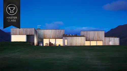
07:51 2Step One: Getting The Clients
06:54 3Step Two: Convincing Clients To Hire You
05:30 4Step Three: Successfully Bidding On Jobs
10:48 5Step Four When Shooting
15:58 6On Shoot Day
06:30 7After The Shoot
05:05 8When Things Go Wrong
06:40Portfolio Pictures
07:11 10Image Composition Overview
13:37 11Gear Used To Create Images
12:36 12Edit Lighting In Photoshop
10:15 13Clone Out Problems In Photoshop
06:18 14Fix Moire Effect In Photoshop
03:37 15Finishing Touches In Photoshop
03:05 16Contrast And Clarity In Lightroom
01:25 17Q & A
17:37Lesson Info
Edit Lighting In Photoshop
To Photoshop, let me know when we are going in Photoshop. All right, so I just loaded up the shot here, and here is the completely ambient exposure that I showed you at the beginning of the slide, slideshow. And so I've loaded it into Photoshop, and I look at it, and again, I look at the problem spots, and um, I can zoom in and show you, you know, we have these fire extinguishers and this horn there and this light that I don't like. We've got these bars that have to come out. They look like a nightmare to Photoshop out, but I can show you a really easy technique for taking care of those. Is not content aware, those of you. Um, and you know, just stuff like this that has to come out. In addition to that, I have all that lighting I want to add. So, and I gotta fix this pattern on this grate here. So I'll show you how to do that. And these are pretty common problems that come up whenever I'm doing a architectural or interiors photo shoot. So, the first thing I wanna do, just like when I s...
howed you in the slide is I wanna find out, you know, I wanna kind of explore the lighting options and find out what kind of look is it that I like here so, I will load into Photoshop all of the different um, you know, all of my different experiments with those, flipping the breakers on and off, turning the light levels, and I'll kind of settle on a look. And this is totally up to you. These are all bracketed exposures. They're bracketed with flash, they're bracketed with the breakers on, in one spot, they're bracketed with them off, lights on, lights off. And just all kinds of stuff. I put them all together and I find out the look I wanna go for. And I kind of wanted something moody and dramatic, so what I settled on was the first thing I saw that annoyed me was down in here, this was very dark, and as I said earlier, the eye likes to go to bright things, and in order to pull the eye towards a composition, I generally find, generally, not in every case, that having the brightest object in the rear of the frame will kind of help the eye to navigate through. And it just very naturally follows pathways back to find that bright object. So what I settled on doing was pulling a frame where I let these lights in the back sit on for much longer than the lights overhead or in the front. And so here's that exposure. So I'm just using a general mask and I brush in and out those lights. I mean, all the layers are aligned again 'cause I'm on a very sturdy tripod. And you know, I can brush it in and out just using Photoshop's brush tool. I can show you, there's our mask, and I can switch it around, take out. Put it back in. And I'll remove the mask so you can see again. And then, the next thing that I did was I felt like again, this chandelier or medallion up here was way too blown out and I kind of wanted to tame it. So I used a darker frame on top of this to bring back some of that highlight detail up in this medallion. And what I did was very similar to before. I used a mask, and here you can see the mask. I just brushed it in, brushed it out, accordingly, and I'll show you exactly what happened as I go too far with it. So if I, I'm sloppy with the mask, and you know, it bleeds all over the place. And so I really wanted to pay attention and be careful and just keep it in using a big soft brush within the medallion. And you can see how that detail comes back. Like there it was before. Just a little bit too blown out, and I'm just brushing it back in. And it comes back into view. And I'm looking at this, and I know my client, he was on my case about this. He was like I need to see that medallion. That thing was a nightmare to install. It's like the centerpiece. So I'm like, let's go a little bit darker and make it so you can see even more detail and keep it still believable. So I went down one more level on that, and you can see just how dark that actually is. And then here's one little thing, like I love to get down to the nitty gritty. I wanna see detail in all the lights. And these sconces were incredibly bright compared to everything else. So what I ended up doing was turning on a very dark exposure here, putting it on top of all the other layers, and then I went in and I kept only these details in the lights, so when I turn that on again, all you're left with is you see the detail in the fixtures and you see the architecture of the lights and I mean, look how much brighter it is without that and that took like three or four stops worth of bracketing to get that to the right spot. And without that, you don't see that. It's a small touch and when you blow these pictures up, you know, you're gonna wanna see everything. And so I've kind of settled on my look. It's kind of dramatic. It's dark up front, bright in the rear. The eye kinda goes through, and a lot of people might say okay, I'm done, I'm done with this photo. But not me, you know me. I love post, I love wringing everything out of it. So now what I start doing is adding that lighting that I showed you earlier. So I'll show you these exposures with me. Here I am over on the left hand side. And I will reset this back to a totally normal frame in Photoshop so here I am, you can see me down here in the corner, and I'm just blasting some light very gently, very gently, across these seats just to bring out a little texture and depth. And in order to take this and make it um, and remove myself from it, the method for that. I will delete this layer mask. I will change the blend mode to lighten, and that only leaves the lit part down here with what lighten does is removes everything in that frame that is not brighter than what you had before. So as you can see all we're left with is the flash head, some light down here, and I'm gonna add a mask to that and what I'm gonna do is I'm gonna make my brush nice and big and soft. It's all I ever do is big, fat brushes. And I'm just gonna brush myself out, brush out the extra, and leave the light only where I want it. And so that's how we get just that tiny bit of texture down there, and there's some bleed up here. I'll brush it out. And then I'll move on to the next layer. And it's the same thing. I'll undo that so you can see and change the blend mode to normal. So here I am, looking like a goober, holding my light up, um, and you can see the texture in the seats that wasn't there before and it's the shadows and the highlights that are what create depth and texture and interest. And so that is a big part of my work. So again, it's the same method. I'll show you a different technique that's a bit easier. I will delete this layer mask. And I'm going to first alt click on the add layer mask button down here, and that will create a new, a layer mask filled with black, and so that basically hides everything. And all I'm gonna do now is just brush in where I want that light. So here, that texture's coming in already. You can see it, if I turn this off, it's kinda flat, right? As soon as you add that, these chairs kind of have this watery feeling to them. And then I change the blend mode to lighten, so that again, it's even more subtle, but all you're left with is the brighter part and I can turn that on and off. Super subtle, but it really adds a lot. And you can see the colors really come to life too. And so I did that all over and I tried to keep it somewhat believable. I didn't go too bright on it. Sometimes you can you know, really overdo it and it looks totally fake, but I just wanted to lift them a little bit. Add some color and texture as I keep jarning on about texture. And then I did the same thing with the hot lighting, and here's what it ended up looking like. So this is all light painted hot light. I'm just walking up and down, waving it back and forth over a five, six, seven, eight second exposure. Up and down the aisles. Trying to make it look like the track lighting in the theatre. And again, I will show you that technique. And I'm gonna drill this into your head. I will just turn this layer on and reset it and go to delete this layer mask. And there I am with my dorky socks on. Alt click add layer mask, change the blend mode to lighten, select my brush, white foreground color to reveal, and paint in that hot light. And I do this for every layer, being careful not to show myself in there. Every layer, and eventually, you know, after 10 or 15 layers, we have this added light that wasn't there before, and you can see how that, you know, it's kind of a very small, almost subconscious addition, but without it, I feel like the picture lacks depth and this is kind of like my big technique, and it's just adding, adding depth and texture and lighting to kind of guide the eye to where I want it, and create interest where there really wasn't any before. So now after you know, we've got these great lines leading us further into the composition. We can see the carpet. You can see the pattern. It brings out some color that wasn't there before. And again, it makes it look like this track lighting that works in the theatre. And you know, that's the big, big technique that I use for almost all my work is light painted, all these light painted pieces that come together in Photoshop. And if I turn, I'll put those both in one folder, so that you can see, and I'll turn off all the lights and turn them on all again. And so it's very subtle, but I just finds that adds a little bit of life.
Class Materials
bonus material with purchase
Ratings and Reviews
a Creativelive Student
Mike Kelley is fabulous, so many aspects of his work would make for great classes! I hope Creative Live brings Mike back for many more classes. He's a great communicator with lots of info presented in his class with understandable instructions. . . not that you'll leave the class being able to recreate his amazing images! Although he is very generous in the knowledge he shares on his great techniques. Only issue was not being able to hear/view most of the class as the "live feed" kept cutting out, which was so frustrating. So, I'm purchasing the video. Hope to see Mike in more courses! Excellent!
Victor Zubakin
Firstly this course should be renamed to just Architectural Photography. There's very little information here about shooting real estate photography. Mike Kelley is more of a fine art architecture photographer and the techniques he shows are not really relevant for real estate photography. Kelley's well-known for his blue hour shots and with these he often sets his camera up for a few hours and documents the changing light to later blend into one image. His work is very Photoshop intensive and each photo could require a few hours post-processing in PS. Real estate photography generally requires a complete house to be shot in less than an hour and delivered to the realtor in 24-48hrs. The course is more of interest to those wanting to shoot high-end architecture or interior design projects. Kelley gives some great tips on the business side - how to do marketing, attracting new clientele, how to maintain a healthy relationship with your clients, what to do when things go wrong. Kelley also discusses what gear he uses including the very useful tilt-shift lenses, geared head on his tripod for fine control, shooting tethered, and also some of the lighting he uses. The course features a photoshoot that Kelley did of a historic theatre, and he discusses the techniques he used to capture the images as well as how he processed them in Photoshop. The course was enjoyable & informative, and Mike Kelley is an engaging & fun presenter, with a laid-back style.
a Creativelive Student
Enjoyed this class. Took it to learn more about architectural photography because I know little to nothing about that area of photography. I feel Mike gave a solid introduction in the how-to's of getting into this business, offered some good outside sources, gave good supporting personal stories. Would have liked to lean more about balancing light color and to be referred to some outside sources on learning more about that. Overall, I feel this was a solid intro to architectural photography.