Lesson Info
4. How to use Black and White Visual Aids
Lessons
Lesson Info
How to use Black and White Visual Aids
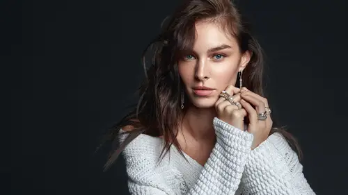
I'm going to delete these peace to not cause confusion and move it where my other let's call it what so way are back to basics. Basically, I'm going to turn this off. So here is the problem. Whenever you want to dodge and burn, Dajun burning is concerned with brightening and darkening certain areas of the image, either locally or globally. And now that means that we don't really have to care about color, right? The color, it's just there. Teoh, you know, to be like your problem, basically. So that's why I have the luminescence. I'm being fancy here. It's just almost like just black and white so that I can see it better. You know, I can see I don't have to care about colors. I don't have to care about anything else. Just the tone is just to brighten or darken the tones that there's just so much better now. Here is the trick. With this, the way food shop works, I'm going to demonstrated once again I'm just closing it, so I'm not going to cause any confusion. I'm going to work on top of t...
hese groups, but it's all the same. So this is how Photoshopped works. I'm going to bring, you know, just to make it black and white. I'm going to have, like, a de saturated layer. So you say this is black and white, right? The problem with this is that this is actually not correct, black and white. The problem with this is this is not perceptual, black and white. This is like an unknown expert, that software engineering, food shop. But I'm going to show you the difference, and you will see What's that? What I mean is a problem. So let's just turn this off and let me create that many methods to do a proper the saturation. Let's do it with a solid color on I create a solid color, which is just a solid color. And what I do I ever picked like black A white doesn't matter. That's quite I'm just going to grab the blending boy mode and just switch it to color. Now it's black and white. Right now, I'm going to show you the difference by clicking. You know the visibility on and off on the human situation layer because you can't turn black and white into black and white. So you have already turned your image into black and white, and you put another black and white. It's going to be the same black and white, you know, like he had never, never had that other black and white before. So if it's going to show any difference, that means that something is interesting. Oh, wow, right? I hope you can see this on the monitor. Just noticed the lips. They're So if I turn on the 1st 1 that de saturated kind and just to show you if I turn yourself, it's just the same. So then you see the lips are very, very Bryce, While whenever I look at anyone, I don't see bright lips, lips are not bright. I think lips are more like this, right? I think that's closer to perception. So that's why if you're creating anything that's that's you, you want to use for, like, perceptual purposes, like a black and white visual aid layer. Then try to use this this method, like a solid color black or white color blending mode, and it's going to give you a mawr accurate representation of what you can see. Two demonstrated further. I'm going to show you another image and then come back to this too confused the hell out to everyone. But first, here is the thing. This is a cafs glass, right? So why not do the stain thing with cups? I'm going to show you how to do that. So I'm just to not cause any confusion. Delete color onto you and saturation. So now again, Back to basics and I'm going to once again curves adjustment layer on. I'm going to change the blending mode. Let's say color and I'm going to either bring this up like this, right, or I'm going to get that down. It's, you know, black and white. But the great thing is that I'm going to have this up here. Okay? The great thing is, is that now if I go back and create a solid color, let's see again what? I'm going to shoot with black suits the same so that you will see that it's the same color. Now I'm clicking the visibility and it's the same right, So apparently curves de saturating with curves on de saturating with a solid color on color blend mode works wonderful. I mean works the same. While hue and saturation adjustment layers on and black and white adjustment layers. They work differently, not based on perception. This is more perception based, and this is how again I'm going to prove it to you because, you know, it's very hard to think about how lips would look in black and white because in real life we don't really look at them. So I have another image that I have here. It's just a color will. We are going to use it later. For other purposes, you can see you can differentiate obviously the colors. It's just easy. However, We see different colors, like with difference, you know? Wait. So what I would say is that most of the times, like blue, looks a bit darker right then yellow. So that's just apply the usual things to this. What if I just descend? Trade the whole image? What happened? What happened to that blue? I mean, we have the blue and look at the blue and the yellow, you see right. It should be like a very, you know, a gradual thing, but it's not. It's just like a bumpy road, so this is not good. Then what if I just grab a card layer on top of that and just said it on my color. Let's take that. Oh, wow. So yeah, this is I think this is closer to what we imagined that the black and white should do. I know that this was a very long segment, but I think this is an overlooked thing. So just keep in mind because you have to leave accurate when you are doing your retouching or anything like that, right? Cool. Now what we are going to be doing is that we are going to touch this image. And now Oh, yeah, Just to show you that I'm a horrible person in my black and white adjustment stuff, I have an actual black and white layer, which I always switch to the method I just showed you. I just haven't updated the action, so just Yeah, I don't know if that's good or bad. Probably very bad. Let's just do that now. So we learned what we need to do is just we need to create a carves. Bring that up. This is what happens and then collar, right? I know it's not showing up because the group is not going to put on the best. This is as you can see, the darkened mayor. You will see why. So this is the same as before. I put all the time like a darkened A. It depends on if I work in like someone who's in shadows are dark skinned. Then I need to, like, back off a bit with this darkening layer with capacity. But other than that, I work like this because you notice problems you know easily, easier than without the darkness. Just consider this. This is like I can't really see it. And now I can see all those. There are those spots. I don't know why they are there. They were not there when I photographed the person. That's, you know, the two D image that you can look at. So So what we are going to look out is just to, you know, these are no secrets. So this is just a Mick tone grabbing and then pulling it down. Now what? That means we're going to jump into that. So many people know about calves, they know how to use it. So if you're one of those people, just we're going to talk about some basic stuff and then we are going to gradually build up to some or hopefully advance stuff. But it's still the same because, you know, it's just the same technique. Okay, once again, closing this down. Not too cool, causing confusion on the curves. Okay, so getting down to the basics, we have this line here and we have this how we just, like, dropped down list Which says rgb because this is the curves that shows you the red, green and blue channels because, you know, a, um, image. But this is, you know, from something else. But you create an image on the computer by having like, almost like those conclusions. Layers like this is like the red translucent lee and the blue and the green. And combining that because this is, like, you know, additive process. Like the RGB you get like, you get certain college night and if you have a maximum read Maxim Green maximum blew. It all adds up toe white because this is RGB. That's what about that in a color class, not here. But this is just what we have. And then you can give between those on, since it's all the same by definition, is like what you do with it, how you manipulate it. We're going to talk about RGB, and when we are going to do any anything that is concerned with these things, like thes channels, then we're going to go into those okay, now back so hard to be. Now we have a very handsome thing here, which is like actually a hand on. This is a useful tool, and now it's going to be useful because we are going to pinpoint certain areas in the image, right? So as you can see, I'm as I'm dragging it across the image. You have that little circle that's going up and down on that line. That means that that certain point, for example, here where I stopped is represented on this curve on this line there, right there. So if I were to select that point and pull it up and down, it's going to influence that's area and from that area outwards, right? That's that's the action. That's the tricky part. Two. If I go down, it's the darker parts, So what we can say is like we have this grid on the Internet intersections could be regarded as we have. The first thing is black. The 2nd 1 and I'm going to click on it. The shadows. The 3rd 1 which is the middle, is the mid tones on. Then we have highlights here, right? So and yeah, and white. I'm sorry about Sorry, White. Ah, yeah. So these are the things you can basically manipulate if you're in cuffs. However, since this is not stupid levels, we can do so many stuff. With this, we can create a point here or here and just, you know, create whatever you want to create with this. This is beautiful. This is what I do anyway, So you have the control over your image, which you can use in curves. So that's the beautiful part of Kurt's On the same thing. Just to mention applies these channels, I can go through with the hand and it's going to show him Well, yeah, on the rational, this is like a highlight on the right. From let's say, on the blue General, this is like a shadow, and this is like almost like a mitt 10. I like to think right so you can just map your your image this way. Now, if you're asking what those other there were icons are you're out of luck. Okay, let's talk about this. You're not out of luck. Thes are just You can basically just tell photo shop where different passed on your image are like, Let's see, this first pick is like As you can see, it says, like sample in image to set black point you can set at this point let's go back to RGB to be very core principle. So this black point you can set with this one it's going to influence all the other channels to. So it's going to try to create a pure black in in the sense that it's not going to be like just darkened is black so you can see it like black and white would be black. But it is going to be like in color also like a very neutral black tone. The same goes for like the MIT turns, which, if I say that these are the midterms is trying to make that skin tone to be like neutral gray, which just, you know, this is what it does. This is not something that you usually do most of the times. You don't used these tools because you take care of white balance issues in like a camera or we take Carib it like one set. We have like the colored checker things, and then you can. You don't have to use these. Sometimes they are very useful. But most of the time it's stretching the image so you don't want pixels to go like all over the place. And then also, you know, the white. If I see that this is why that it's trying to be this point like, you know, the wife on. It's just, you know, I'm just saying, you know all the time because I think it's so evident and so many people know about this because even if you start playing with first shop curves is just something that you start playing with and thes clickable things are very like playful stuff here, so that's what you can do if you really want to. I'm just going to give you a tip like a trick. Everyone loves tricks that's creating you another one, just to I don't know if it's more confusing or less confusing creating anyone, So if you really want to find your mitt, Turn on your image. What you can do is that you would basically use this tool, right? You don't know which part is really in the gray area. Like if I were to go with the hand I this I don't know that there was This is something like a gray area, but this is not what we need. So what we do is that you can do and this is just again a trick with these curves things I'm going to create another solid color layer. Onda, get a 50% gray. You can create this from let's create and you can create this from edit Onda feel just no on this layer, you have to have, like a that What I do is I'm just going Teoh, grab this and put this on difference. I know strange, but bear with me now there is a certain thing called threshold, which is this thing. You see. It's a black image now, but if I put it here and I start going this way, the first things that are popping up are going to be those, uh, gray tones. So what I can do, right now is I can grab a color picker and it has the ability to point to a location and it's going to stay. It is going to stay there. If I hold down my shift key, then I'm just going to click here. So I know where these things are. I don't need this panel right now. It's that I'm just going to delete all of that. Or yet let's actually delete them because they are just again help players. Let's do curves go into this, and this is where I would click and you see this is not that accurate. It's it's somewhat accurate. It makes the background look like you're neutral, gray kind of thing. This is just again, just a trick.
Ratings and Reviews
JIll C.
Viktor describes his method of organizing his Photoshop Layers for all the typical edits that he will apply to an edited portrait. He also clearly demonstrates the power of Curves Layers to make tiny, but useful edits to an image. This is definitely a class I will have to watch over and over to be able to take in all the subtleties of his process. On the sample image, each of the individual edits are hardly noticeable, but the cumulative effect is a dramatic improvement in what appeared to be a very good image to begin with. Mostly what I learned about high-end Retouching is that I have a lot to learn!
Mitch
Loved the class. Viktor teaches the why behind retouching techniques and encourages students to think about the image before applying techniques. One of the best online classes I've taken in a while.