Lessons
Day 1
1Essential Retouching Techniques
55:08 2Intro Q&A
25:31 3Portrait Retouching
1:10:38 4Body Shaping: Liquify
25:37 5Beauty Retouching
1:04:41 6Shoot: Portrait, Beauty, and Avant Garde
41:29Day 2
Workflow and Lightroom
24:15 8Beauty Image Retouch Review
40:08 9Portrait Recap and Frequency Separation
15:40 10Frequency Separation Q&A
25:21 11Blend Modes
11:32 12Creative Techniques: Color
14:40 13Miscellaneous Creative Techniques
08:13 14Faux HDR Look
12:53 15Avant Garde Retouch
23:25 16Displacement Maps
35:10 17Audience Image Retouching
17:14 18Special Shoot: Halloween
24:59Day 3
19Compositing Basics
45:55 20Compositing Examples
26:01 21Creative Skin Effects
21:12 22Additional Creative Techniques
22:21 23Retouching Dark Skin and Q&A
17:13 24Common Problems
29:12 25Perfect Mask Plug-in
13:37 26Audience Image Retouching
18:46 27Sharpener Pro and Color Efex Plug-ins
30:41 28Cinemagraphs
37:32Lesson Info
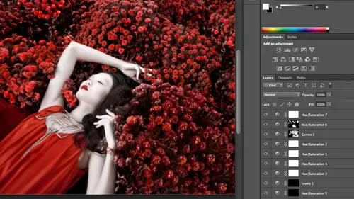
Faux HDR Look
Okay, so I'm going to grab a photo on we're going to basically show this is very, very, very popular for a couple of years with my portrait clients, particularly men, because basically the guys felt like they were getting left out because they weren't doing, you know, it's funky hair and make up stuff for a cz many props, and so a lot of them really liked this kind of grungy, hdr look each year it could be a cool thing, or it can be a swear word because people can take it way too far, and it can look really cheesy to put it blatantly so it's a taste level, depending on what you're comfortable with, but I want to show you how to make this look a little bit more painterly, and I've also done this recently for two album covers, this same exact field for rappers, so taking off to start with a raw image and two fake hdr to kind of emulate the feel of it hdr has is let's say you take three frames, one pretty telling the shadows, one for detail in the highlights and then one kind of in the mi...
ddle, and so when you combine them together, you have detail all the way through your frame, so there's a lot more detail, it's a lot greater and has a much bigger tonal range. Okay so to fake that with a single file this is assuming you don't have any plug ins and or any other special tools what you need to do is say okay well I need more detail in the shadows and more detail on the highlights okay, here is a difference between c s five and csx in c s five and older um for raw what you would do at this point is you would pump up your fill light and your recovery dragged them all the way to the right well in c s six how we've created it or what they've done for update is basically taking a page from the book of how tone curves work and they say okay instead of just doing fill light to fill in shadows and recover to bring back detail in highlights we have a bar for adjusting highlights and shadows and whites and blacks so it's just given you more control over how you change the tones intervention it's much better but it's a little more complicated all right so what you want to do and you can watch by sliding them it's the same thing you see on the left it's black over here that means those items will probably get darker that way and if you drive it to the right or get later so if I go like this I can watch my highlights I can bring back in by dragging it's the left the shadows will I want more detail in the shadows, I can drag that to the right, and then my whites, they want to bring back in, and I want to pump up my blacks a little bit, and so look what it does, basically, tio my history, ma'am, it squishes it because I brought in all the detail in the highlights and shadows, so there isn't really a black point, and there really isn't a white point. You'll see the same thing if you guys at home, drag up, fill light in recovery will be the same field. So looking here, I do want a black point in a white point, so I went to introduce that with contrast and exposure, and I could do the same thing. If anyone's played with tone curve, you can play with it over there. What I need to lighten up my image a little bit, and I could mess with contrast in black point, just to bring it back to looking a little bit more like a normal photograph in the history room. So I said earlier in teaching that you increase the contrast and increases saturation. So if you look at this photo, no, the color's kind of messed up, but when we zoom in, we've got a lot more detail, and it looks a little more painterly, almost like a painting so mean, back off of my highlights just a little bit. All right, so the next thing I have to do is fix the color and you could go in with your targeted adjustment brush and you could kind of pull out red, but a lot of times I'm doing this kind of fohr look, I like to just pull out vibrance, and when you back it off, it looks almost kind of silvery and painter like, and so this is where we are so far and again, it's already looking, ah lot more cartoonish on ideally it's in a good way, and you don't push it too far. The next thing about aged era that we talked about is has a lot of detail, and so we talked about clarity when you increase clarity it's increasing contrast in the mid tones, so if I increased clarity here, I'm starting to pull out a lot of detail and give my image a pop that it didn't have that kind of flattened out and squish the history room. The seem to be careful of cia six has a better algorithm for clarity if you drag clarity all the way to the right with older versions of photo shop, you will start getting some paling around the edges. And you get some artifact ng so it's just something to be mindful of but you could still pump it up to twenty five or thirty without any problem it's going to zoom back and just show you this look right here is totally achieved justin camera raw and it's not going to be right obviously for every photo but it was very common for people in bands and for guys that wanted something a little funkier so it'll lighten up lighten up just a tiny bit more a little bit okay and I'm going to open that image up all right? So the next element if you want to make it look kind of grungy is to do crunch textures and grunge patterns so one way you could do this is you could go down online deviant art has some weaken look them up is to download brushes, unique brushes and there's some that looked like cracked walls and there's some that look like dirt and there's a little bit everything graffiti whatever it may be you could add textures that way, but what we're going to do is actually take a texture and overlay it and uh this is a very blatant example of here's adding a texture to a background but I am textures to my photos all the time so maybe take a texture that looks like watercolor paper and it makes the photo look more like a painting or maybe I add a texture would like just a little bit of grunge and a little bit of detail so that it makes the picture look a little older I do this a lot in fashion editorials where I overlay kind of old film green or like an old actual photograph had been tourney or something like that with textures on it overlay and it makes it look like that so you could get textures anywhere um these what you want to consider for your textures is you want to be shooting parallel to your surface like straight on because if you're shooting at an angle part of it being focused and part of it won't be um these are all pictures taken in the new york city subways so if you ever come to new york just take your camera job on a subway and go to brooklyn you'll get more textures and you know let's do it and you can use them forever um I do have these textures on my site which is stored at lindsay out there photography dot com I have some textures and pre sets there but if you don't want to go the paid route you could take it with your own camera or you can also find some textures online um and there's tons of textures it's funny because I noticed when I look at some people's photos I could tell them where they got the texture from because there's certain ones that when you search texture photo shop it comes up in google images and people uses all the time this is one of them but people in dv and are a lot of them dvr is a social network for artist so the photographer's illustrators there's painters there's a little bit of everything and several people have created textures that they say go ahead anybody you can use them I want you to go make art with my texture I made him I don't need to keep him so this is one of those and so I'm going to use this just for the example of where you can get a free texture and how it can work for you some to click and drag it into photo shop and so I have those two things side by side and when I used my move tool and click and drag this texture on top of the other photo now this is the reason you want to take your own textures if you grab texas online often they're small so if you're shooting let's say a five day mark two and you're shooting really really large files chances are you're not going to find a texture that large online unless you purchase it so it's usually better for you do it yourself that being said um sometimes with textures usually you never want to do this I have my transform controls on usually you never want to do this and stretch your photo because it pick slates and it distorts textures. You can get away with it a little bit, to be honest because it ends up looking more like film grain and it's it's a texture so it's not supposed to look pure. So it's it's kind of hard to say, how far can you go? But you can get away with a little bit more, then hit, enter and it applies might transform, and then I can flip through my blend modes. And this is how I add textures. If you look at my website, if you go to my portfolio, I have this editorial, which was called crusader and it was it looks like, um, kind of joan of arc isha girl kind of dressed in more medieval looking metal pieces. But then it has pictures of, um, old religious texts in the background. So the bible and then, you know, books from monasteries. And this is how it was done the same thing. Instead of having a texture on a wall or texture like your grunge texture, I used words and so you could think of the same thing. Maybe you have a picture of a couple of any overlay it with soft, you know. Words of a love letter I in my previous class their creative live robin one of my attendees took a picture of me a portrait and so I use that technique to put kind of an old letter overtop of my portrait to kind of demonstrate retouching for her so something you consider it's on my facebook page somewhere so we try our usual overlay soft light or hard like any of them are fine and then you can just back off of what's the face and so let's just say I like hard light I can add my lair mask I consume in grab my paintbrush and whatever rapacity I want I can paint it off of the face but does it go in? I do this more carefully if anybody has any nick software products will be talking about this tomorrow, but if you have the vase a or sharpener pro in these different tools there's something called structure and structure is kind of like clarity on steroids like the souped up clarity and it really helps you pull a ton of information out of the mid tones and makes the photo really, really gritty. I'll use it all the time for photos like this all apply some structure and it'll make it that much grittier but that's when we're doing tomorrow going to do some cool plug ins so you get the idea I had painted off of his face but let's say that I have a photo where I wanted to really look old, not just grungy, but look much older. You could also go ahead and take a brush that looked like looked like a crack on a wall or a lot of people, what they'll do and there's a ton of different tutorials out there online is we'll take different pieces of parchment and paint it with lemon juice and different things, and then bake it and so they'll have tauron and curled edges, and you can add that to your photo. But another thing, if you just wanted to look a little older, is if you go to your half moon cookie or just met layers, you grab few saturation and color eyes. If you make this say something kind of orangish red and you back off of your opacity, you've kind of warmed it up and made it look a little bit older. So it's a mixture there's not going to be a formula, but, ah, lot of people, if you wanna have come in arts and crafts day, you can make a lot of your own textures, photograph them, photographed them, put them high resolution and then use them later on. There are also companies that sell them, and then some of these plugin softwares. Actually come with textures. You khun ad again. I generally stay away from this so that's kind of the foe. Hdr look and let me just open up the original so you guys can see I dragged these two months going drag. We set aside, um it's pretty drastic difference and you don't need to go that far, but you can use elements from that. So any questions on that before I jump into some porcelain skin I have a question from remember person who was with us in new york last week, everyone. She actually assist me sometimes just three times. Yeah, so I didn't yeah, that's. Awesome. Okay, when you create textures, what size to make it? And is it always a j pick? Um, a texture, always j pegs, and it just tried to make it as big as possible to try to match the target image, which means if I can have four thousand pixels on alongside that's, awesome and that's the issues you plenty.
Class Materials
bonus material
Ratings and Reviews
Sean
Fantastic Photoshop course. I knew Lindsay was great at Photography, Lighting, Posing and Public Speaking, but I am really blown away by her mad (great) skills at Photoshop. Lindsay really is a fantastic teacher. She turns what might be a more or less dry topic into a fun and entertaining topic. Thank you Lindsay and thank you CreativeLIve. You have a real superstar with Lindsay Adler.
a Creativelive Student
This is a great workshop for photographers wanting to learn and hone in on their retouching skills. As a photoshop user and photographer of 10 yrs I have been able to take away some further techniques to help better my skills and more or less tailor them. I would suggest you have some adv beginner knowledge of photoshop because I don't think some of the techniques you will be able to keep up with unless you buy it. There are two things that I wish she did better in her teaching and that is to teach new users to label all their layers and what they are as you are working. As you can see Lindsay ends up with 20 layers and unless your the one doing the editing you will have know idea what is what when you have to go back to it. So its best to teach this in the beginning so people get into the habit of organization early. Also I wish she used a Wacom. It really does cut your editing time in half and you have more solid movements in precisely selecting areas of a photo. From a photographer to other photographers. Use a wacom. You can start with a basic baboo for $89 and when the apple wireless mouse cost $69. Time is money, and a wacom truely save time! I used to use a mouse and my trackpad and once I switched I was like OMG what was I thinking before! So I wish she just emphasized that point more. Overall I think it was $99 well spent.
Christian G.
Not only is Lindsay very knowledgeable and a very good teacher but I REALLY TRULY appreciate her no-BS, straight-forward style.. No time wasted on long tangents talking about herself (or what have you), on cute remarks or on off-the-mark humor. She has showed us many great techniques, has presented to us various creative/different ideas AND she has also really been able to explain "how she thinks of a solution", how there is a bit of trial and error, "even" at her level.. All in a all, a truly excellent course and worth every penny!! Thank you Lindsay and thank you to the CreativeLive team for a great course!!