Live Edit 2: Replacing the Sky
Lesson 3 from: Retouching for Exterior Architectural PhotographyMike Kelley
Live Edit 2: Replacing the Sky
Lesson 3 from: Retouching for Exterior Architectural PhotographyMike Kelley
Lesson Info
3. Live Edit 2: Replacing the Sky
Lessons
Lesson Info
Live Edit 2: Replacing the Sky
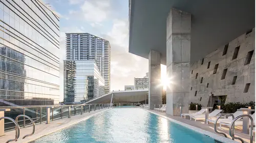
Photograph number two. We are still in New York City. This time, we're shooting the Cooper Union building, which is a really, really cool piece of architecture. In this image, I'm gonna show you guys, again, not only how I do those temporally expanded composites, but how I also add drama and replace the sky to give the shot a bit more, we'll call it zing. A bit more interest, a bit more life, a bit more drama. As you can see, I have this really flat sky here. There's people walking in front of the camera. All kinds of action everywhere. So what I wanna do here is really bring this to life by adding people, but in the right spot, adding cars in the right spot. The sun is kind of flickering in and out of the clouds. The building building becomes flat and then dramatic again and then flat again. So I'm gonna take, you know, all of these shots that I took over, say, a 20-minute or so period. We've got buses and people. I'm gonna find the best elements out of all these photos and composite ...
them together to make my final, finished picture. So I've already gone ahead and sort of selected the shots that I wanna use. So I'm gonna turn on my filter rating here in Lightroom. And here's my sky that we're going to end up adding. I keep a sky library of like hundreds of skies from different places all over the world. I think this sky was in Santa Monica, California. There's like a little park you can walk along next to the ocean. And I've gone down there on many, many occasions to get cool sunset skies. And I'm gonna drop this in in this photo, which has really great light, but a really, really flat, dull sky. So I'm gonna try to make this a bit more interesting. There's the final picture, you shouldn't have seen that, but we're gonna get there. So just like the last shot, what I'm going to do is find my base exposure, upon which I will build everything off of. And in this case, I think, it's very subtle, but I can see it pretty well at this point. The light is changing between every shot, right? And we've got this great, golden light, which adds a lot of drama and three-dimensionality. Like, if you flip between this shot and this shot, you can see how the building sort of, it feels a lot heavier, it's a lot more dramatic when the sun hits it that certain way. So I'm gonna grab this as the base and build everything on that. So I'll use this for my base layer. And then I'm gonna bring some people in from different photos. And just like the last shot, I need to edit all of these shots before I go into post-production. So this, to me, I look at this histogram, a lot brighter. I think this is like a stop underexposed, so I'll add one stop of exposure, here in Lightroom. That was a good guess. Now all of my exposure values are matched and it'll make my life in Photoshop a lot easier when I go to composite. So I'm going to shift-click and select all of my exposures. And I'm also going to add my sky that I will drop in after the fact. So I'll right-click, edit in, open as layers in Photoshop. Okay, here's our stack. Obviously, this is a different photo entirely, so it didn't align correctly, but that's fine. I'm gonna go ahead and turn off all my layers by clicking on these eyeballs. And just like in the last shot, I'm gonna find my base layer. And that was this one right here with that cool light on the building. I'll double-click, rename that Base, drag it to the bottom, take a minute, go through, and kinda find something about each picture that I can maybe pull out. So this looks like romantic couple on the left. It might be a little, like, cliche, but we'll see. This one, what do I like about this? This has some nice light. So in this shot, I'm not only blending in people and cars, but the different, the light as it changes and flickers through the clouds. You know what I mean? And I'll blend different light, different lighting effects together. So this one is guy in front, no cars on the left. And I'm gonna write, my base exposure has this big mail truck in the front, I might take that out using a frame like this. And this one also has maybe people in the crosswalk. All right, so here's my base exposure. What do I like about this? Well, I think the light looks great. I think the sky is super dull and flat. I'm gonna have to take care of that. But I'm gonna just start building up the base, the people, I'm not worry about the sky just yet. But firstly, I wanna make sure that my scene is clean and clear and has some nice life happening. So let's see, first thing I wanna do is take care of that big truck. So I will use this frame. I'm gonna alt-click, add a black layer mask, and I'm going to brush out that mail truck. I think that's kind of distracting. And I wasn't perfect with my exposure matching. And you can see here, there's a bit of a brightness issue from what I masked in. So I'm gonna click my add adjustment layer button, select curves, I'm gonna alt-click between my curves layer and the last mask that I made. And it's gonna make this little clipping mask, right? It'll clip that curves layer to the layer below and only affect that layer when I make these adjustments. So if I didn't do my clipping mask, right, and I did this curves layer, it would affect everything. But if I clip it to the layer below by holding alt and clicking between, it only affects that layer that I just made. And you can see, I've sort of evened out the exposure there between those two layers. So now everything should composite together much more seamlessly. All right, and I, that's looking good. There's this over here on the curb. I wanna see if I can find a better, there we go, that's nice. So that has good light, but also cleans up the sidewalk. I don't like this situation over here on the right, when there's someone cut in half by the edge of the frame. So I'm gonna clean that up. Alt-click, take a brush, remove those people on the sidewalk, put them down a little bit further. And make sure I'm getting in there. That guy can stay. Looks like there's a bus or something. I'll fix that in a little bit. That's all right, it's in shadow, it doesn't really bother me. Over here we have some people in the crosswalk. Yeah, I really like that. It'll add some life here. Add a black layer mask, soft brush, white to reveal. Yeah, that looks like a happy New York day, people out in the sun. I'm gonna keep this guy out for now. Again, I have the same issue with those exposure levels being slightly different between frames. So like I just did, I'm gonna add a curves adjustment layer. Alt-click to clip it to the layer below, so it only affects those pixels. And adjust the lighting until it matches seamlessly. That looks pretty good. You can see, without it, it's too bright. But with it, it fits right in. Okay, do I want these people on the left? Let's see what that looks like, I don't know. It might be too stuffed, but we'll see. Kinda jaywalking. This I can get rid of. 15 minutes left. Cool. And you can see, something moved my camera there. (humming) There it is. So this looks like it might not be worth it, but let's see what we can do. All right, we'll just mask him in there. And again, the sun was kind of flickering through here. All right, so I don't know if I like that, but we'll see when I'm a little further along with the edit. Okay, so now, I wanna kind of punch this up a little bit. The sky's almost pure white. I'm gonna do a sky replacement. I want this very cool sky in this frame. I love the cloud action here. What's nice about this sky is that the direction of light matches the direction of the light in my original photo. So it's just a matter of, basically, lining this up on the horizon and blending everything together seamlessly. It's very important that this direction of light in the photo matches the direction of light in your sky. So when you're compositing, keep that in mind. So, first think I'm gonna do is make sure the horizon of my sky matches the horizon of my original shot. And in order to do that, I might have to stretch this a little bit and make it bigger. So something like, I don't know, maybe right there looks pretty good. And let's make sure my horizon is somewhat aligned. That ought to do it. So my horizons are both matched, the direction of light is matched. Now I need to make a mask of the sky. So what I'm gonna do is, I'm gonna go into the channels palette and I'm gonna find a color channel here, maybe it's the red channel, this is all the red information in the photograph, visualized as a black-and-white mask, or the green channel here, or the blue, and one of these is going to create a mask. I'm gonna use the blacks and the whites in each of these channels to make a mask, which I can then use to add my sky into the photo. So the more blacks and the more whites that I have, the better, because that will be easier for me to make my final mask. So it looks like my blue channel here, if I use that blue color information in this black and white channel to make my sky mask, that would be the best. So I'm going to duplicate that blue channel and I'm going to, I'll rename this Sky mask. I'm gonna hit command, M to add a curves adjustment to that channel. And I'm just going to bring the blacks down and the whites up. Again, white reveals and black hides. Everywhere that's white the sky will be filled in. And everywhere it's black, my additional sky will be hidden. So the better of a job I can do separating those colors and making it black and white, the easier my sky replacement will be. Now, if I go too far, things start to look a little, like, crunchy, and I don't really want that. You can see it up in here. So I might have to do some manual masking in addition. That's okay. I think that this looks pretty good. And how do my trees look? Yeah, those are looking fine. All right, I have nice, crisp edges on this mask. It should match up pretty nicely. Like I said, I'm gonna have to do some manual masking to make sure my sky doesn't go over this building here. So I'm gonna hit okay. And before I even go back, I'm just gonna grab my pen tool and I'm gonna very quickly sort of come in and here's another reason to use the pen tool for refining all these masks, come in and sort of make sure that the entirety of the building is either black or white so when I add my new sky in, everything makes good sense. I actually think I can take that right across here, up, down. There's like a very fine mesh at the top of the building. I wanna keep that intact. And I'm gonna come like down here and avoid that sky through the mesh. Something like this and that. And, obviously, I don't want any of the building itself to be affected by this mask, so I'll just go around and down. And that's all behind the mesh. I'll go up here. This is the neighboring building. Come down. I might need to go back out and refine this in my actual working document. But for now, we can see how it looks. All right, and I'll come down with the pen tool. I can just be quick and dirty down here. And connect back up at the top. I'm gonna hit command, enter, to turn that into a selection and take my brush, brushes work just fine on your channels, as well, and I'm gonna paint that all black. And what that's gonna do is, again, hide the sky over that portion of the scene. So I'll hit command, D, to deselect, turn everything back on, go back to my layers, turn the sky on, let's see, going to select that mask by hitting command, command and clicking it. I get those marching ants. I'm going to go ahead and click add layer mask. And boom, there's my sky. Now, it's not perfect, right? It's a little funky-looking. Now, the reason for that is, the brightness of the sky doesn't match the brightness of my scene. So in order to fix this, I'm gonna make my, I'm gonna make a group here. I'm gonna call it Sky replacement. I'm going to drag that into there, just so I can keep better track of what's going on. As I get more and more layers involved, things get more complicated. So I'll rename this foreground. And I'm going to not only adjust the brightness of the sky, again, curves adjustment layer, add a clipping mask, put that in, now it's starting to feel a bit more natural, right? Here it was too dark, it felt really fake. But this feels a bit more natural. And I can also adjust the opacity of the sky itself. So if I take the opacity from down to like 80 or something, that feels very natural, right? So there's our sky replacement. Now, if I zoom in here, it's not perfect. Like, my pen tooling was a little rough. And I can clean that up. I'll go right in here and follow that edge down. Kind of a funky building. That's better. And I can just make that a selection, take my brush on that sky mask, and I can paint it out. And the beauty of using that channel mask is that we retain that really sort of translucent feel in the upper mesh of the building. If I tried to do that manually, it would be a total, total nightmare. And I think I can do a little, I'm gonna kind of come in here and make that even a little more opaque on that screen, to sell it a little better. So, and I'm just painting it out with a mask at 30% opacity so that everything blends sort of seamlessly together. Right? Now, if I turn this on and off, I'm working quickly and on a tiny screen, so it might not be totally perfect to you guys at home, but that looks pretty natural to me, okay? Now, the thing that's kinda bugging me about this is it still feels pretty, like, flat, a little bit lifeless to me. So I'm going to add, one of my favorite tricks here is to create a luminosity mask to sort of bump up the contrast in the mids. So I'm gonna go over to my channels palette again. And instead of using a, you know, red, green, or blue channel, I'm just gonna make a mask based on the luminosity of the scene overall. So I'm gonna hit command and click on the RGB channel. That's gonna bring up this mask based on the brighter parts and the darker parts. So basically, think of it this way, the blackest parts of the image, the darkest parts, will be black. They'll be like 0% opacity. The brightest parts will be white, 100%, and it's gonna build a mask based on that. So I'll go ahead and click create new channel from, yeah, save selection as channel. And here it is down here. And I'm going to go ahead and I just wanna select the midtones, because it does feel a little bit flat, and I wanna punch up some of that light. If I, so what I wanna do is create this, okay, there we go. All right, so I select, I'm sorry. (making frustrated noise) Command, click, to activate the mask again, but I wanna subtract it and I only wanna focus on the midtones. So I'm gonna hit command, alt. And that little minus sign will come up. That will subtract the mask from itself. And I'm going to click again. Oop. Subtract the mask from itself. Aah. Here we go. All right, now I'm gonna get this warning. No pixels are more than 50% selected. The selection edges will not be visible. Okay. So there's still a selection there but what's going to happen is, I get this very sort of midtone-only mask. And I gonna command, click that, okay. I'm gonna go back, turn everything on. And back to my layers, I'm going to add a curves adjustment. Now, keep in mind, that selection is still active we just don't see it because it's so faint. Right, I'm gonna get this curves layer. I'm only affecting the midtones here. I can start adding contrast to the mids and really making this thing pop. And what happens is, the sunlight really starts to light up that facade. And again, I don't wanna go nuts with this, but I do feel like it's a little bit flat and I want that nice, golden light sort of poking through. When you see these really flat, gray tones in here, this otherwise flat picture starts to come to life a bit. And that's just us, very gentle sort of midtones adjustment. All right? Now, I wanna make this feel a little more golden, a little more afternoon-y. My sky totally didn't perfectly match the scene, so I'm gonna sell it even a little more. I'm gonna command, D, deselect everything. In order to tie this all together and make the sky replacement totally believable, I'm going to add a solid color adjustment layer. And because that orange afternoon light is kind of, you know, golden, I'm gonna select a warm orange here. And this looks a little bit goofy now, right? But I'm gonna set the opacity to, say, 10%. And you can see, it adds this orange wash over everything. If I change the blend mode to color, it only affects the color in the images. And it starts to tie together that sunset, which is, admittedly, a little bit later than the shot I took, but it makes it a little more believable. You get this sort of bluish daylight and we turn it into this golden, late afternoon light. So what happens is, we've added some drama, we've replaced our sky. At this point, I can even come in and decouple the sky in the mask and I can find sort of the best spot for that sky and I can add as much drama as I want. Like, if I want some more of those interesting clouds up there, I can add that in. Or something like that, that looks pretty cool. And I can brush out that sky down at the bottom, where we're getting some of that ocean still showing up. And what we have now are these slightly more dramatic clouds and a pretty perfect sky replacement because we used that channel mask. So the last thing I'm gonna do here, we've added some nice midtones contrast, we've tied together the colors of the scene to make it nice and believable. I'm gonna go ahead and command, alt, shift, E to flatten everything to a new layer. And again, I wanna make sure everything's nice and straight, so I'm going to drag over my ruler lines into the middle and onto the edges, to make sure the edges of these buildings are nice and straight because the building itself, kinda tricky to tell what's up and what's totally straight. So I will, yeah, you can see that's kind of canted in. I'm gonna drag this over. Make sure it's nice and vertical. Gonna come over here on the right-hand side. Did a pretty good job over there. And get that nice and straight and lined up so that everything feels like it's nice and upright without leaning. Now, for this picture, something that I often do but haven't showed you guys yet is that I will finish the edits in Lightroom, especially if I've done some tricky compositing in Photoshop. So I'll go ahead and save this. And come back to Lightroom. And what happens is, as soon as I save it, all right, here's our final shot. I'm gonna do my crop in Lightroom. I'll probably crop this to something like a four by five. That feels pretty nice. And because I did all of this compositing, I'll do my final global adjustments like contrast and stuff in Lightroom. That way it even, it sells the illusion even more because once I, again, I washed that orange color over everything, I want everything to have the same contrast. I have two different photos, shot at two different locations at two different times. I wanted make it really believable. So I'll finish this photo in Lightroom so that everything has the same final global adjustments on them. That way, like I said, it feels totally natural and the idea here is to make this feel as realistic as possible and not fake in any way. So I'm gonna, I like to add a little vignette here for some drama. Pull down the highlight priority here. Again, sort of sell that dramatic sky. Whereas before... There, I think that's about done. How does that look? That looks pretty good to me. Now, if I show you that and compare that to the original, right, I'll just use the same crop. Lightroom doesn't wanna cooperate. So I'm thinking about there. I think we've made that a bit more dramatic, a bit more interesting compared to the original, with its flat, dull sky. And we've added some life, some people, got rid of some distracting elements. That's generally how I approach a lot of my exterior photos. I love to add the sky for drama, add some people for scale and relatability, and do some quick color toning and contrast to get everything on the same page. So that's kind of how I'll tie together one of those composites that have, they feature people, they feature sky replacements, different color washes, that sort of thing, to get to the final image.
Ratings and Reviews
user 4a6ee8
I think this is a good course to gain a better understanding of how to shoot on-location more efficiently, while learning a few tips and tricks in post-processing to make your image shine. I would have liked to see the edits of the photos be more of a portfolio hero shot rather than a photo in a series of photographs that are delivered to a client. I found that my best learning tool from this course came from how to properly replace a sky without doing damage to the original photograph.
Christian A
A quick course that flows well. Not overly indepth but provides some good tips and some things to think about and be aware of. Good class for anybody who is looking to improve or brush up on their architecture photography. The purists will likely hate it but for the digital artist this will be useful.
Roy Bisschops
It's a nice and clear course, with good explanations from Mike. But at the same time it's aimed at photographers starting in the field of architectural photography. I expected a tutorial with some more challenging situations, but instead it contains two photos dealing with masking out unwanted objects and replacing a sky. So if you're starting out, go ahead and buy the course. If you've got experience with photoshop masks and replacing a sky, don't bother.
Student Work
Related Classes
Architectural & Real Estate Photography