Retouching: Beauty
Lesson 37 from: Skin 101: Lighting, Retouching and Understanding SkinLindsay Adler
Retouching: Beauty
Lesson 37 from: Skin 101: Lighting, Retouching and Understanding SkinLindsay Adler
Lesson Info
37. Retouching: Beauty
Lessons
Day 1
1Skin Essentials: White Balance
30:57 2Shoot: Setting White Balance Demo
10:13 3Skin Essentials: Mixed Lighting, Color Contamination
41:10 4Camera Settings: Files
20:48 5Camera Settings: Color Spaces
42:51 6Color Management
19:03 7Exposure
16:14Shoot: Quality of Light
25:03 9Direction of Light
27:48 10Makeup: Basics
28:46 11Shoot: Contouring
27:27 12Retouching
19:12Day 2
13Shoot: Oily Skin
18:07 14Shoot: Wrinkled Skin
23:55 15Shoot: Blotchy or Blemished Skin
26:58 16Skin Challenges: Pale and Dark
16:31 17Shoot: Dark Skin
17:57 18Dark Skin Q&A
22:09 19Shoot: Pale Skin and Multiple Skin Tones
38:48 20Shoot: Dark Skin in Sunlight
21:56 21Shoot: Mixed Tones and Pale Skin in Sunlight
15:55 22Skin Challenges: Dark Skin Outside
23:45 23Skin Challenges: Multiple Skin Tones Outside
16:08 24Shoot: Male Fitness
33:59 25Shoot: Female Beauty
25:48Day 3
26Retouching: Workspace Setup
28:11 27Retouching Skin: Removing Redness
29:24 28Retouching Skin: Basic Tools
25:21 29Retouching Skin: Frequency Separation
37:45 30Retouching: Contouring
15:20 31Retouching Contouring Wrinkles
14:45 32Retouching Skin: Oily and Freckles
16:42 33Retouching: Mixed Lighting
16:07 34Retouching: Color Casts
22:38 35Retouching: Color Correction
26:52 36Retouching: Shaping the Face
37:04 37Retouching: Beauty
36:14Lesson Info
Retouching: Beauty
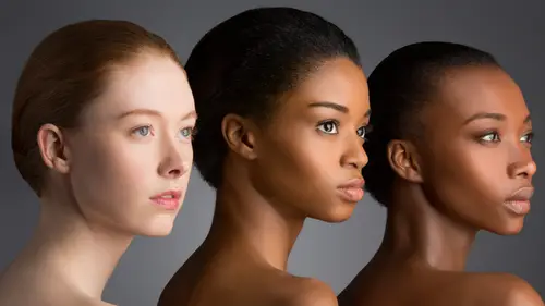
I shot this at incorrect white balance for a reason because I wanted tohave really really low key kind of cooler tones and I wanted that orchid pop so I wanted to be almost not monochromatic but I wanted it won her to recede in the frame and then it be all about perfect skin so here's a little bit of the problem that I ran into let's take a look at her skin I'm gonna just analyze the things that I would need to fix all right so first of all I want to maybe clean up her eyebrow I would want to even know all of this texture here I want more even highlight on her nose might want to tone that down a little bit I definitely want to have cleaner highlight here this area is a disaster so this is like this is where a lot of the work is I don't want this is what we're talking about your shaping the light for a darker toned person you're shaping with highlights so here I think I want to try to give a little bit more highlight because I'm losing her jaw you know jawline and that's that's one of t...
he things I just listed as beautiful so we need to do that smooth skin even skin and then you know a little bit on her hands a little bit too much texture for me and I would try to just give nice creamy even smooth highlights everywhere so I'm just going to go all right that's so hopefully don't get super bored I'm gonna talk through I'm just going like retouched what I would do and I'm doing this on the track pad so this is when you can be impressed with me people didn't notice that there is she really editing with the trackpad right now right now okay all right so I am what I might start with to make my life a little bit easier is if I can get rid of any really big blemishes someone a zoom in to see if there's anything that would have both texture and tone and I can get rid of and we'll see how that goes anything major and we'll make sure that it's not super obvious retouch be over here and I usually this is not frequency separation this is just right now getting rid of the big stuff because infrequency separation if it has color and tone and texture that I've got to retouch it out of multiple layers and I don't want oh don't have that problem so anything that is super defined and this is just more I know it's going to be kind of a mess down here all right so I'm happy with that I'm going to merge down and start with my frequency separation it's going to go to my actions I'm gonna run sixteen bit frequency separation and let's take a look here at her cheeks and this is maybe maybe we're here is a skin tone that I'm going to look at the skin texture I'm gonna look at so she does have large reports there and I want to look and this is when it's perfectly and focus start to blur kind of around there and this is what I'm thinking is if I blur too much then a lot of that bad texture and some of the bad color will be sucked up into the top texture layer and that's going to make it a little bit harder for me to retouch but if I don't blur enough at this stage then I'm not going to have enough texture and so when I say without her skin it's going going to look super fake so I'm gonna go with something around around two point five and when I finished two point seven when I finished hitting okay I can check and see if I did a good job here by looking and seeing what kind of texture I have so do I have all the skin texture that I want I've got some good skin texture but I can't quite tell someone added top on a top levels adjustment layer and see if I have enough texture I think it's a little sparse in here I think they're just not quite as much as I'd like so we'll take a look and I want to see is that because there isn't much texture and there's not because it was a little bit more of a narrowed up the fields there is not as much texture there as the rest of her face it might be okay but if I don't like the amount of texture that I have I can run the frequency separation again and blur more blurring more will suck up more texture for me to work with so I know that when I smooth things out and I add the texture back in that it will look realistic instead of over smoothed so maybe I'll just go up to three three one run it again and I'm gonna have just a little bit more texture to work with okay so where might I start it is easier to contour with those those layers that I had before for you of curves it is significantly easier to do that with a lighter skinned person with someone who has a darker skin tone when I lighten it up it's not going to give me a highlight if I didn't start with a highlight it just kind of lightens up that area it doesn't create a highlight which is why with darker skin people you shape with highlights if you don't create them they're not there where is with someone who's really really pale I can kind of fake some shadows and post much more difficult to do that with a darker skinned person but I can use frequency separation to actually shape those highlights all right so I am going to grab my clone stamp and I can actually give myself more highlights and extend them more by cloning the highlight areas so I could do that so let's see I'm just going to click and dragging around a little bit lower rapacity and not one of the reasons you see the texture over here is not because of the texture layer actually it's because of the depth created by the light and what I mean by that is there shading their highlights and shadows so if I even that out and I fill those in you don't see the texture as much the skin texture will still be in that top layer but it won't look a deep so that's why I can come over here and was goingto even this out a little bit so I don't see all that texture all I'm doing is I'm sampling an area right next to the texture and sampling and pacing cutting and pasting using the clothes damp so four highlight areas the reason I'm using the clone stamp on lytton is because all I want to do is fill in shadow areas I don't wanna I don't wanna copy over texture that exists so I could come down here and try to start evening things out so I'm just going to start cloning and trying to smooth it out and I don't want to go to too far and I know I want to kind of even this out in the end I don't want to have a lot of texture so I am shaping her face here and I'm going to give myself by cloning a nice perfectly smooth highlight that goes all the way from the top of her cheek all the way down towards her chin this is just going to be super even so what I'm doing now is I'm cloning that even highlight and if I wanted to go higher I just extend the highlights I wanted to reach over here more I extend it that way so I'm gonna take a look I was going to kind of smooth this in just a little bit and I can also even this out so cloning on light and in the light areas fills in those shadows and I can also clone a highlight down her nose if I want to give it a little bit of definition same thing here khun even that out so that a little bit to work on but not too bad but let's come over here I really want to see her jaw line but it disappeared because I didn't control the quality of the shadows I didn't add enough of a highlight in this image it was lit with zeppelin the westcott zeppelin I was telling you guys about it was off to the right of the frame andi I had a white reflector slightly behind into the left hand side of the frame so that's what this is lit with all right so I want to give myself a little bit more of a jaw line to work with so we don't do that here and all I'm doing is I'm cloning on light and I'm going to fake that highlight and I'm pulling the skin tones this way and seeking that highlight and let's see uh even up around here even out those highlights k and so the highlight would be a little bit more pronounced closer toward the light source would be and it would kind of uh fade out this way so that's what I'm doing smoothing things out let's add a little bit more highlight this way and have it fade right so maybe something like that when I think it's a little bit teo a little bit too defined so it's not really a problem I can always just go ahead and erase it or mask it out I'll raise it for a second I want to see a little bit too much so maybe I want it like there I like that amount yeah that looks more natural okay cool the next thing is I don't want this highlight to extend over too far so I can grab my clone stamp a normal and I start shaping the chief this way okay maybe a little bit higher capacity so when a shape I'm trying to smooth out some of these texture areas that looks fine and I'm going to smooth out some of the texture on her forehead the reason I'm on normal is I'm just trying to even things out I'm not trying to darken them down or lighting them up trying to get more even so I'm cloning on normal clicking around okay not too bad there on her nose some of this is a little bit uneven and I think that I'll just have to retouch that out on the highlights because I think yep I can see like a lot of that is not in the low there this is when that highland turned off so even if I go ahead and I smooth out that low they're perfectly here and make it so that there's not much depth I turned that hyler back on it's still all there because it's on the highlighter so I know I've got to go back and do that uh this bothers me a little kind of smooth that out all right so looking good looking a lot better let's see where we've gotten in that period of time and I wantto make this a little bit of a sharper partly look so it actually kind of shaped her face using the highlights and shadows I can't do it with contouring like I would with someone whose pale so I've got to do it here and I'm making those choices but I would also do that for her clavicles and for her fingers as well I would come over here and clone on lightened on top of her clavicles to make them more defined and smooth everything out so what's the difference just with that you know I've made it a little bit more of a smooth skin tone brighter highlight it's clone that over and close everything down and I smoked this up okay works great and then maybe just make this a little bit smoother okay so most of that looks pretty good to me I am looking in the shadows here and that needs a little bit of help I can smooth it out by hand but I think I might d'oh I might duplicate the layer and try some image gnomic portraiture I wanna even that out so I'm going to go to filter image nomine portraiture and even that out and so I'm going to select that skin tone this kind of blotchy nous here and let's see if it helped what I need to do I'm going to switch over and just hold the foreign after to see this is before and this is after kind of evening it out for myself a little bit so I don't have to do all that retouching blends everything together I'm gonna hit okay but I don't want to apply to the whole face I wanted just to apply to that shadow area so I can use a mask by holding all option and just apply it here in that shadow area and anywhere else that looks like it really really needs it could also apply to the shoulders and try to even that all out ah place that I would definitely use portraiture for sure is going to be on her fingers because that would be a massive amount of retouching time to really try to go in and smooth them out so we're going to see if portraiture can run just on the fingers when zoom in real close to the fingers must select that tonal area and I'm just going to try to smooth it out a little bit and I could see before and after pretty good let's go a little bit further slut evens it out I'll hit okay but I just had to pump that way up so if it applied to everything would be too strong so I used my mask again and just smooth it out on the fingers okay so now that looks a little bit better so let's see kind of how far we've gotten and so this is where you have to make a decision of how realistic do you want to be or not like I can go further and I can smooth things out but already this is way beyond what I would do for a portrait because this is a perfect highlight so probably not the direction that I would go it is going to be huge beauty campaign or something to that effect I would go ahead and go into the high lair and start getting rid of all those little undesirable textures and so that's what we were doing we were looking at this layer you can go in here and figure out what textures you don't like and then cloned them out or do spot healing to get rid of them and see if there's any other textures that are undesirable anything major it's not anything too bad the biggest area that I don't like is over here so I could try on clone stamp and see if I can make it a little bit more subtle and let's try cloning itjust a little and I can leave ah the bottom layers on too if I want to see what it's doing try to flatten it out maybe okay um if there's a place that looks too smooth air doesn't look riel and by the way I don't know if you can see this at home but there's all these little textures that you would if it was a super high end campaign they would have to go and you have to go into each pore on dh so what I would do at this point will start contouring a little more making a brighter darker and doing a little bit of liquefy think here's a little bright and light darkened it down but I'm able to get a pretty good beauty retouch from like a pretty rough skin very quickly and that's kind of like the things that I'm looking for all right so let me grab this girl cassettes what I was going teo kind of do the differences between the light and darkened because the light lighter skin tones in the darker skin tones she's got a lot of undesirable texture and mismatched skin tone and so how could I kind of get that tow where it's needing to be someone to open that up in photo shop all right so for her let's kind of running through the same ideas you can see the thought process let's analyze what needs to be fixed okay so here's the beaut retouching versus the portrait retouching shadows under her eyes need to go I need to really work on that texture especially all the big blemishes that even out her lips a little bit I need more sparkle and a little bit more light to her eyes this has to be improved this the sharp line of makeup especially around the nose and so we're going to take a look at like tweaking that in that color also I've got a match her chest to the rest of her body and probably the extensive it I might want to add a little bit more contouring but not on her nose that already has plenty s oh maybe just a tiny bit on her cheeks so I will start off and tried to get rid of the big problem areas I'm using the patch tool to select them okay click around what else is sizable something like that um I'm going to be more careful um when I'm using frequency separation in the next stuff going to be more careful because as I start to clone and start to shape I could totally change the shape of her face I want to make sure you can kind of visualize what you would not want to do so you can watch out for it and all I'm going to include a lot of these files you contrite yourself like a lot of what we're talking about right now a lot of these images that I just retouched you'll be able to download so you could make sure that you've got it worked out and I've really got to even out all of this texture and all that texture on her nose so let's do some frequency separation and let's look at her cheek and she's got a lot of texture going on here all right so looking at her cheek blur blur blur around there I lose skin texture that's probably good maybe two point oh two point two so let's try that and I can see if I like it if I turn off those two layers and just look at what I sucked up and I actually just wanted to take one second and show you if you if you took too much what it would look like if I am by blur to like hear what that letter looks like that top text earlier has a lot of her skin tone in it and so when I tried to start evening this out I can't on the color and totally because it's protected up on that texture layer so that's what it will look like if you go too far I start to see too much texture and I start to see color and so you can see that color here and in her eyes and in her skin there's some of that red so that's if you've done that and you can see that much texture then you you went too far and you're blur and you've got to bring it back so for me I like like uh two point two ish all right so where I would start is I would start trying to even out these areas so first I'll show you what it looks like if you mess up like what this is what I see most commonly done wrong with frequency separation the most common mistake and how it ruined skin is this retouched retouch retouch smooth and everything else within everything out smoothing everything out and if you look because I extended the highlight way way down I change the shape of her face so just because something's darker doesn't mean that it needs to go lighter like you still need to keep the overall shapes and so what I would really do it would be something like this is I'm keeping an eye on where this highlighted so this highlights around here and I don't want to go to crisp anytime it's too defined it's really really obvious that you re touched it so I'm going to try to keep it a little more subtle fill in those shadows and textures and as I get close to a line like this you know where have that greedy and I decrease my capacity I decreased the amount that I'm retouching so you don't see the line quite as much and what I'll do is instead of extending the highlight down I'll pick a similar tone and just extend that in the line so it kind of smooth it out that's home smoothing instead of trying to smooth outward from the highlight I'm smoothing the line of everything that should have the same texture and tone right sonam smoothing out over here and uh evening out on her chin let's see filling in under her eye how much of that can I feel it okay good if I sucked up too much texture I wouldn't be able to fill that in hardly at all and again I don't want to go too far so let's I'm going to clone nice even lined all right so let's take a look at how the shape of the cheek and the contours of the cheek of improved as well as the textures so kind of evening everything out but all the texture is still there andi I would need to go into the nose so let's just we touched on the nose all cloning right now I'm cloning on lytton and I'm filling in all the wrinkles here the cloning moving around all right looks good okay all right so I think that's a good place to go so let's look for any other an evenness so places that I see isn't even if you can't tell words and even add a a layer of levels above and increase the contrast and you can kind of edit that way you can kind of see where there's unevenness because it will emphasize it more so they call them like checker layers or verification layers and it helps you see what you need to fix also before I print things I take a look at a couple different monitors as well or before I send them out to the web because sometimes they'll be a mistake that you made that's not visible which is why these check layers are really really good because it's letting you see maybe a mistake that you didn't quite see on the monitor you're working on especially one of the considerations you have for working on a monitor is that you change your brightness a lot and so you might have had it turned down or turned up and not have seen a really bad retouch you might not have noticed it until somebody is looking at it on a computer with a different brightness all right so now I'm cloning on normal even in this all out okay and I think that looks pretty good with the skin over here this unevenness would be a perfect candidate for image gnomic portraiture or whatever plug and you have any plugging you have for smoothing would be great when even out my highlight so let's take a look how we did with her skin turn off that levels let's look before and after gave her the levels and on lee thing I don't like right there is that little highlight otherwise I think it's pretty good all right so now that I've gotten the skin under control um if I did not like all this texture I would go on to the high lair and I would start and this is just have the higher laurent hi lair on I would start with levels and just tryto reduce some of that texture and she's got a lot of it so I could do a little bit of cloning or it could go into the poor level which is what professional re touches do they go into the pixel level and instead of just like backing off and kind of feeling things and well actually individual pore by pore get rid of whatever the problem is we are just going to like produce some of the texture just a little bit all right so for time's sake what I'm going to dio is finish up the color and take a look at some contrast of here's where we got her face I would not go that far with a uh like a non model so I mean how would you do like hair highlights in order do you shape the same way like so when I'm doing highlights in the hair what sometimes what I'll do here it will add a curves layer out of curves layer and I'll go for um strong contrast and I'll try to pop up some highlights highlights that khun get here maybe I'll go for like a regular just more contrast here to medium contrast rights let's drag up some highlights in the hair ah a little bit more maybe about their okay I'm going to change the blend moto luminosity so that it is not changing the color and I'm going to hit command I in order tio in order to fill that with black and now I can paint with white and I'm going to focus more on the highlight areas and you could do that a little bit more subtle it's like a kind of paint highlights on that way and give a little bit more contrast to the hair which will make it look shiny er but the dodge and burn technique that we used before is another good ones let me just show you what this looks like uh let's get the hair looking all spiffy alright cica looks so when add like in a little bit more pop too that I can also go ahead and bring up the white point let's do like a little a little brighter so right here in the very top right hand side of my curves adjustment layer right up here is the white point if I bring this white point over I'm going to start to pop the highlights a little bit more so take a look at her hair here the highlights are getting a little popular the shadows are getting a little bit darker giving her more death first of the original picture we started with it didn't have much texture that action that I had before for the dodge and burn on soft light if you go ahead and paint later on all these highlights maybe with a soft brush at like fifteen to twenty percent you just keep going over the highlight areas only and then paint black on the shadow areas it makes it look shiny er as well thing like this and I could switch to black so thea actual shape of the hair will look a little bit more to find it's exact same thing as you're doing with contouring on the face let me see that before and after should watch the hair on these two years before years after to get a lot of pop in the hair um okay so let's talk about these things color casts or these this messed up makeup and that's why I want to end with this is well it's like even if you start with a pretty model it doesn't mean that their skin doesn't need a lot of retouching it doesn't mean you're not gonna have to do something with the makeup so one thing that I could dio is it could trying this was my lineup of color contamination with the color problem I could try making a selection of that skin tone and so when I hold a select color range when I hold the shift he adds to my selection have clicked on those areas of skin but I don't really want all of that and I could modify it by how I play with range so if you look at range right now it's going from where I selected and it reaches out to the edge of the frame finding anything of similar tone to add to this election but I'm just worried about her face so I can actually limit the range to just around her nose and maybe a little bit on her cheeks but it's going to make it a lot easier for me to make that selection and not have to worry about it contaminating I've changed the range of how far that's reaching so now it's just going to be getting the center of her face yes I can click and make sure I've got all that discoloration something around there and I mean I think it even go a little bit further honestly maybe around they're perfect and fuzziness is how far it's reaching into other skin tones if I drive the fuzziness really far so left it is on ly the color that I selected and nothing else whereas if I drag it to the right it starts reaching out into similar tones which is going to give me it's going to give me a more natural look instead of being so crisp so let's say that that is that is a major problem color if I hit okay that is now my selection and if there's anything I don't want like maybe I don't think it's that yellow under her nose I can hold the lasso tool with the minus and unsolicited that part so that is a lot of the discoloration and so my tool of choice would definitely be selective color and so I would go ahead and try to figure out that's a neutral and so what color is it you could drag the saturation to try to figure it out you could use your little color sampler to try to figure out what color it is or you can also just kind of drag things around and see which direction is the right way which one's going more in the correct direction not see I think I need a little bit more sayin no more magenta so let's see where we're going for going the right direction it's my preview here uh let's move the silver and sees before and after okay we're doing ok but I still think there's too much yellow maybe something around that end yeah so more sayin it's a little bit too yellow so maybe a little bit more of that sayin there so let's take a look at the foreign after so it's getting better I think that looks good but maybe a little bit too much color correction but the thing that's probably distracting me a little bit too crisp um I also might add a little bit more pink ok so something like that but I still got to deal with her chest and I showed you before that I could make a bunch of different changes to try to figure out what color this needs to be and I've already figured out from trial and error that's just a little bit too sayin so I go back and you could also do color balance or selective color and take a look and say okay we said is too saying let's add a little bit of ren in a little bit of yellow and you can make your color your color selections however you want but you're just making sure you clean it up so let's clean up around the edges um for her chest I would definitely use portraiture to help myself out save me some time for her hair here I would try to do a color range selection see color range and I try to select her hair there is that and I would click around like that and change a little bit of the fuzziness so that I could paint off that color effects that I just did off of the hair so I could open up that selection for example go back to the top selective color and then paint black and so I could bring back you know what that hair's supposed to actually be like and I always do like a little bit of blending in the corners all right lastly what I would do is try to add more dimension to her face what a lot of people do when they're trying to add contrast in shape is that they got a levels or their history graham and they just increase contrast overall but the problem is it's representing the whole image and maybe I don't not really paying attention to that I need to pay attention just to her face so I when I do levels adjustments I do a ton of them a lot of curves and a lot of a lot of levels adjustments but just on the areas I need to pay attention to so let's just fix the contrast on her face my end beauty images have like ten or fifteen curves adjustments close your curves of justice for the cheeks for the top of the cheeks the bottom of the cheeks I'll do one for the contrast of the face overall separate like we did separate for the hair and the clavicle so let's finish up with this contrast so when I just zoomed into her face need a little bit more contrast there so watch it's gonna pop and have a little bit more dimension and I would also uh run that contours and I'm going to play with the contour action that is color neutral oh color neutral I'm going to run that and just give a final final shape to her face and when I come to turn these after a quick let's run micro the neutral again okay so I can go ahead to the highlights and paint light where I wanted to be brighter and have higher cheekbones low opacity soft brush and so you can see that this is I could probably finish this up and maybe another five ten minutes to get to where I wanted to be and this would be probably the last two images I showed you are about the most intensive or most intense or most destructive mean most work that I'm doing to the skin I don't usually need to go any further than that okay let's take a look at these okay shape in her face just a little bit more there underneath her lips and I could add a couple more highlights but let's just take a look at my before and after so far I fix that a little bit more so here we go last one so something like that I am hoping but that was interesting versus super duper duper boring like kier what my mind would be thinking as I'm working through the skin I do have this recorded a re touch of this recorded my blawg but I'm not talking so if you wanted to like watching in and see what I was doing I do label it and I'm telling you what I'm doing at that point
Class Materials
bonus material with purchase
Ratings and Reviews
Aliah Husain
Lindsay is an INCREDIBLE photographer and teacher, and also seems like a wonderful person! This class is great for beginners and more advanced photographers, as well. She goes into tons of detail on all the technical stuff like lighting and editing, and it is fascinating to see her interact with and shoot her models, work with her equipment, and photoshop like a pro. Huge amounts of information for what you pay for. If you are looking to improve your skills in photographing and retouching people, purchase this class!!
Kirsi Todd
Lindsay is probably my favourite instructor (and that is saying a lot, as there are many incredible instructors). She is so clear in her teaching and she also seems like such a nice and humble person despite her incredible success. This course is one of the best courses I have ever seen. Thank you Lindsay and Creative Live!
Andrew Lederman
Great course. Lindsay Adler is one of the best instructors for any creative live classes that I have seen. Simple and easy to understand, clear workflow, very friendly and non condescending like some other instructors. Could you put a link (maybe I just didn't see it) to where to download the actions used in this tutorial?
Student Work
Related Classes
Portrait Photography