Lessons
Day 1
1Calibrating Your System for Accurate Results
40:07 2Shoot Prep: Workflow & Lighting Setup
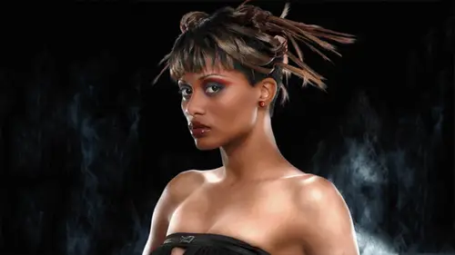
17:07 3Shoot: High Key Beauty Portrait
19:13 4Shoot: Hollywood Glamour
17:54 5Student Shoot: Colleen
13:48 6Student Shoot: Andrea
12:27 7Image Review and Q&A
15:46Skin Tone and Black & White Points
27:01 9Image Selection
25:20 10Global Color Correction
21:02 11Retouching Basics
46:12 12Advanced Skin Smoothing Technique
46:36Day 2
13Luminosity vs. Color
14:44 14Shoot: Low Key Dramatic
28:43 15Student Shoot: Ian
11:54 16Student Shoot: Michael
11:20 17Student Shoot: Colleen
03:41 18Shoot: Beauty Light
12:57 19Luminosity Blending in Photoshop
16:07 20Applying Luminosity
12:19 21Color Correction in Lightroom
23:57 22Detailed Retouching
23:55 23Color Space Discussion
19:16 24Darkening and Lightening Skin
21:10 25Spot Treatment
12:20 26Sharpening
29:57 27Compositing
54:51Day 3
28Introduction to Shooting Movement
11:41 29Shoot: Dancer Leaping
10:52 30Students Shooting
44:15 31Shoot: Dancing
14:59 32Student Shoot: Ian and Colleen
08:57 33Shoot: Dancer Portrait
15:49 34Dancer Session Q&A
11:30 35Figure Retouching
10:52 36Liquify Filter
10:16 37Masking and Edges
13:22 38Importing a Background
16:47 39Color Change and Motion Blur
24:45 40Enhancing Color
17:59 41Removing Tattoos and Adding Effects
21:30 42Lee's Photoshop History
21:56 43Final Portrait Edit
19:03Lesson Info
Applying Luminosity
Let's, uh, let's flatten this and moving back over to my color image. I'm going to turn off the black and white conversion zoom out here. Okay, so now I've got a black and white version in a color version what's gonna happen if I take this black and white version and drag it on top of the color version. So I'm gonna do my hold down the shift key, and he was moved to drag it up to my original color version till it comes forward and I'm going to drag it down and let go the mouse. Suze, I'm over the image, but go to shift key. Now I have black and white on top of the color, and this is what happens when you change the apply moment from normal toe luminosity. So here my color version, my straight color version, the new black and white version applied to the color versions. I'm using the luminosity, the lights and darks from this layer, my black and white layer, and I'm applying that the lights and darks and keeping the color from the underlying layer, and I've got a really unique color ver...
sion that would be impossible achieved using curves on went through this whole exercise here because this idea of taking the black and white gray scale channels and applying it to the color image is going to be very useful when we start working with bernard are dark skin model against a black background so I wanted to kind of get this out of the way first so now before I you know I blaze ahead here I'm sure their questions so let's let's take these questions great to look at it at something that's an object of flour kind of somehow easier to conceptualize before going tio skin where you're just kind of freaked out so thank you for doing that and definitely people were were following along but maybe we could just go back to the very beginning before they started paying more attention with regard to how you started out getting those channels separated out okay yeah let's let's do that uh so I'm I'll go ahead and actually I just close these out and wait just just closed their grayscale ones okay? So um starting up let's let's just do that over again make it easy so I have my color image uh I'm going to duplicate it so I've got two copies so there's my copy and we're concerned about the grayscale uh channel structure of this color and so I've got three grayscale channels that are contributing to the full color image while I'm in the channels panel here I can go to my little options flyaway menu here and there is this option split channels, so when I split the channels, my color document is tauron apart into three separate grayscale document, so I've got a blue document, a green document and a red document, and so now, if I want to combine them back together again, I could reassemble the channels back into color image, but in this case, I'm going for a black and white version, so I'm just gonna drag these separate documents on top of each other to create a layer stack that will have all three layers in it. So he's, my move tool, I'm going to start with a green channel, hold down the shift and dragged up to the read tab. The red document comes forward, I moved down that gold, my mouse, while I'm holding the shift key down, and it drops right on top. So so now, he's, seeing that, I only see one channel because the grayscale document, I'm interested in the layers, so I'm going to go to the layers panel, and I see the two layers I've got the green on top of, and I'm going to go ahead and double click this and name it read just so we're not confused, so I've got the green on top of the red, so the way I combined these is I I used the dark and apply mode, so only taking the darker parts of the green and applying it to the red. Then I made a layer mask and hid the darker green center so I could get the lighter green center of the flour from the underlying layer. Ok, then we took that blue channel document and inverted it, so I'm just doing command ida inverted, drag it again, holding down the shift key, drag it on top of that red document and drop it. And so now that's lined up and we're going to go from normal to multiply. So I'm darkening the sky but a layer mask in there using the greatest tool dragging black to white, holding down the shift key so it stays perpendicular and I've got that graduated filter effect. I'll flatten and so it's all together into one layer, because I'm gonna drag that now on top of the color image. Ok, so clicking inside the image hold down the shift key, dragging up now to the color tab, my original image and dropping that black and white version on top of the color now the only thing I need to do is change the apply mode from normal to luminosity and there you have it right that was thank you for doing that. Ok, quick question from dorian does separating the channel's increase the file size at all? Well, no, actually it just breaks apart into three grayscale document. So, uh, grayscale document is one third the size of a color certainly an rgb document, so yeah, no, I'm actually just I'm kind of destroying the image breaking apart into its black and white components. So I've got three separate grayscale documents here that when I dragged the layers on top of each other, the sum of the layers kind of gets me back to the same size on disk as the original color document. So so another question from katie photo twenty two about that last step how do you know what to expect when you apply the channel mix black and white as a luminosity level over that original color image? How do you know what to expect? Well, um what you expect is to get a color version of this black and white um so I mean, you know, this is something you have to kind of work with get a feel for it but it's very, very powerful way of changing the tonal structure of the color image because the color image is and I chose especially here that my intention was to show you something that was exceptionally colorful you know? It's it's really primary you know, yellow green and blue it's very very colorful and we tend to be sort of seduced by color and really colorful things look, you know, they always looked great and uh but my point earlier on today when we're talking about how luminosity trump's color in terms of importance it is really true that the lights and darks the structure of lights and darks is actually much more important than the actual color values in the image they really want to nail the the kind of light and dark structure of the image first or um if you think of it in terms of black and white sometimes that can give you a real powerful way of manipulating color so in this case trying for a good black and white version something that is really kind of ansel adams you know, I've got a lot of contrast in here I've got really really sense of rich tonal structure I'm not confused by what's happening with color right? And then I want just playfully I'm applying it to the color image to see what's what what's going to happen it's ok to be surprised because you know sometimes you do something like this and it doesn't work now you know, I kind of like this, and I'm not I'm not even that bothered by the yellow flowers sort of going toe white here, it's sort of making it look a little more I don't know kind of it's a little edgy or a little stranger looking, and in this case, I thought that kind of yellow flowers sort of boring, you know, it's right there centered in the frame, you know, kind of obvious, and this takes it to another level into kind of makes it seem more surreal. Um, their various things I could do tio modify this further, and if I didn't like the fact that it's going toe white here, I can show you kind of unusual trick where that changes completely when I convert this image into l a b so if I go from image mode to l a, b and now photo shop always says, you know, gives you this little notice, changing modes can affect the appearance of layers. Do you want to flatten the image before you do the mod change? If I flattened the image, it's going to look exactly the same as as it does now, but if I don't flat, I get the color of the pedals comes back. And this is very much the same kind of thing that happened yesterday when we were knocking the highlights down I went into l a b and I painted with color over the white highlights and suddenly they they took on the color of the skin that's exactly what's happening here, the layer structure is saying to photo shop, I want that bright contrast e pedal structure and I want those real bright white petals, but I also want the fully saturated yellow cone and photo shop is kind of going okay, you can't really have it both ways, but here you go and it's compromising and in this case, that compromise puts a nice yellow color back into the pedals, and I still get the nice kind of dark of surreal sky. So how do you know all this stuff? How can you anticipate all this? Sometimes you can anticipate it, but the more you start playing around with luminosity blending, the more you're going to get a feel for it and it's extremely powerful, and we're going to see how that plays out with bernard next, so but I just want to make sure everybody's understanding so we're cool with all this stuff so let's kind of look, I'm going to look at all the pictures and sort of pull out a couple of images to work with, and we'll see what happens
Class Materials
Bonus Materials with Purchase
Ratings and Reviews
Luis
Skin tones correction and portraits editing are new to me. This course provides a set of tools for me to improve my portraiture work. Lee doesn't just show you how things are done, but also the reasons for the corrections. The delivery is a bit dry because the topic is quite technical. You can have a break between lessons, if it becomes too overbearing for you. I highly recommend to take this course, if you are planning to do portraits, head shots, or even senior pictures.