Lessons
Day 1
1Calibrating Your System for Accurate Results
40:07 2Shoot Prep: Workflow & Lighting Setup
17:07 3Shoot: High Key Beauty Portrait
19:13 4Shoot: Hollywood Glamour
17:54 5Student Shoot: Colleen
13:48 6Student Shoot: Andrea
12:27 7Image Review and Q&A
15:46Skin Tone and Black & White Points
27:01 9Image Selection
25:20 10Global Color Correction
21:02 11Retouching Basics
46:12 12Advanced Skin Smoothing Technique
46:36Day 2
13Luminosity vs. Color
14:44 14Shoot: Low Key Dramatic
28:43 15Student Shoot: Ian
11:54 16Student Shoot: Michael
11:20 17Student Shoot: Colleen
03:41 18Shoot: Beauty Light
12:57 19Luminosity Blending in Photoshop
16:07 20Applying Luminosity
12:19 21Color Correction in Lightroom
23:57 22Detailed Retouching
23:55 23Color Space Discussion
19:16 24Darkening and Lightening Skin
21:10 25Spot Treatment
12:20 26Sharpening
29:57 27Compositing
54:51Day 3
28Introduction to Shooting Movement
11:41 29Shoot: Dancer Leaping
10:52 30Students Shooting
44:15 31Shoot: Dancing
14:59 32Student Shoot: Ian and Colleen
08:57 33Shoot: Dancer Portrait
15:49 34Dancer Session Q&A
11:30 35Figure Retouching
10:52 36Liquify Filter
10:16 37Masking and Edges
13:22 38Importing a Background
16:47 39Color Change and Motion Blur
24:45 40Enhancing Color
17:59 41Removing Tattoos and Adding Effects
21:30 42Lee's Photoshop History
21:56 43Final Portrait Edit
19:03Lesson Info
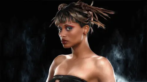
Color Space Discussion
Any other questions? Oh, in the audience? Yeah, way. Do have an audience. Ok, go ahead during the break. But I mean no more. What color space do you work in? You know, s rgb or wmd? Uh, you know, I had I actually haven't checked here. Uh, what color space I'm in? Um, let's see, uh, usually let's. See, I'm going I'm going down here. This little area in the window at the bottom is the information display and by default it showing me my documents sizes. But but I can go in here and check my document profile. So I'm actually in pro photo rgb, which is horrible to be in. And apparently the last instructor had this light room export set up to export into pro photo are you be so you know, I would say a big no, no don't ever go into pro photo rgb this's like danger territory because a lot of the a lot of the color in this workspace is invisible to humans and it's it's ah, you can get into trouble as you make small moves. Big change has happened and, uh, saturation things can happen in a nasty ...
way I think we've been lucky with this particular image. That that hasn't happened I actually work in srg so I'm going to go ahead and change this I'm going to convert back down into uh dio convert to profile here so I'm going to go and convert into my favorite workspace which I'm going to actually have to change this too so my destination space here is going to be a surgeon so why am I you know we've all been told don't ever use satanic rgb or stupid are you know anything rgb has gotten a bad rap that sergeant has gotten a bad rap and it's just not true it's plenty colorful enough for most photography now I've had to flatten that to get into um sorry to be so I'm not going back out um I have standardized on s r g b because I work and deliver files in the real world okay? I'm not theoretically working on I'm not concerned that I want more color in this image in fact, this picture of this human being as regular skin tone he's not a martian so you've got a regular skin tone and all of the colors in this photograph are very well represented in s rgb in pro photo rgb this represents a very small slice of that color space and the mathematics that are being pushed around these rgb numbers they're being pushed around in photoshopped to achieve everything that we're doing all the adjustments they now have toe represent a much bigger color space, so I actually have fewer numbers to work with to effect these colors as they reside inside of that gigantic co spate of pro photo. Okay, I would rather have all the numbers that I having my disposal, I want all of them to be able to have an effect on the colors in my image. Um, I'm really not concerned with super saturated colors that are invisible to humans. Uh, and certainly what I would prefers to be able to see all the colors I'm editing on the monitor and even the very high end monitors. The best they can do is show you ninety eight percent of adobe argue they're not even close to showing you the amount of color that you have in pro phone charging so much better, easier transitions from one color space to the other. If if you're working with a more constrained color space, the srg be color space is already bigger color gamut overall, then seemed like a there a few colors and seeing like a that are outside of that surge, but overall that the volume of the color space and this s r j b is already big enough that you can go in to see him like a and not see you know a loss or you know a huge change in the way the color appearance uh when you're doing the math to get from pro photo where all these numbers are kind out there defining extra colors that you can't see and you go to convert into a cm like a it's a much bigger move and there's more chance for error and how it's converted so uh I think for a while photographers have been sold on this idea of larger color space more color and we think yeah I know I want more color but those colors are not in this image those colors are not in most photographic images you know their people always argue oh I can give you an example of a color that's outside of srg color space and my my response is I don't care I only care about the color in this picture not you know some theoretical color or you know and it's going back to my original uh statement about how important luminosity iss and color it's nice to have it but it's not the primary thing in the photograph the primary thing is are the lights and darks so uh you know when we get all obsessed about some representing some super saturated color you got to remember that the picture really is made up of lights and darks more than it is a color so we get too obsessed with capturing super saturated colors and it's much easier to deal with more constrained color space and fewer problems when you hand off the file two other people who have then have to do something with it and if you going to be putting things on the internet you've got to be dealing with that certainly be anyway so you know, I've just standard on it standardized on that across the board and it's much easier yeah, I worked with a lot of service burrows so my take on using the adobe rgb color spaces largely influenced by that and I'm not doing a whole lot of delivery that is for web specific I'm not understanding why it seems that the majority and that the industry standard is adobe rgb in and I would be concerned about handing off files to a potential client or to a vendor that were knocked down two s rgb because it might I mean if they don't understand where you're coming from it's new to me but what you're saying well actually if they don't understand color management at all, you're better off giving them srg uh there should be no issue we should be able to hand these files in any color space we want hand them off to a client and you know it's all good that's what color management's for their supposed to pick up the tag of the file no I could hand off this file in profile rgb and it should convert just fine so it's not really an issue the issue comes with people that aren't color imagine savvy or have some unusual and for whatever reason it tends to be offset with our rivers that are kind of dinosaurs in this respect they will they often have some assumption about the incoming files like they always assume something and they always put some correction curve on it or you know something like that is these air work flows that people have have involved because of a lot of misunderstanding of what color maginnes um so that being said the vast majority of devices including cameras out there are actually set up to represent colors and s sergeant so all of your consumer point shoot cameras that are shooting j pegs they're actually delivering srg be color images whether you change the setting in the camera adobe rgb or not it's just that change in the setting is just tagging a different profile onto it but the camera itself the color space of the cameras is much closer srg and printers any kind of digital printer out there the actual color space that it's set up for rendering is closer to srg be all of those epps and printers even the high end ones if you turn off color management and you use the ups and driver it's assuming whatever comes into it is srg, you know? So sometimes people go well, I do. I do much better with my apps and printer if I don't use color manning and photoshopped, I just used the ups and driver, you know, it makes their images look for colorful because it's assuming srg, be numbers and you're delivering adobe rgb numbers and it makes the image look more colorful. So that sort of design strategy across the board with, with most, um, output and and input I mean cameras are considered an input is they they consider everything else rgb, and it really is it's standard as rgb and most of your mom and pops taking picture their grandkids don't know the first thing about color in the shooting. J pigs I just wantto email if I'll get it up on the net and haven't looked good, so from the cameraman fractures perspective, they're not going to do anything else because the vast majority of their users that's what they're going to be doing. So what that means is if someone is likely to make a mistake, you're going to be better off if you give them an s rgb file because their mistake will not likely make that look horrible, okay? If you give them anything else and they make a mistake, there's a much greater chance that they'll mess really mess it up and when, you know, I just found that issues where, where? Get something printed or your hand off a file and somebody does to it, and it really wax out the color that's a color management issue that's where some horrible mistake has been made. We're seeing a lot less of that now, but it's just it's mind boggling to me that after so many years of actually having reasonable color, imagine in place, we still have problems with people messing up files, so I just kind of gave up. Um, for a long time, I standardized on adobe rgb because it seemed to be the politically correct color space and, you know, so nobody thought ill of you if you used adobe rgb except a few kind of high end gurus who claimed that nobody's professional ist they're shooting pro photo and the only thing professional and pro photo is that pro part of the name? Okay, so, um I I avoided like the plague and on my set up a home, my default workspaces, srg so I've gotten used to, like, not even thinking about it, I I must apologize, I did not check the set up here so it's been it's set up to do his pro photos of default which is really dad yeah I don't know what pro photo is sick you to cook background of where that came from pro photo is well it's been included in in adobe is one of the standard works basis for awhile now um and so so when we do say uh is the's menus falling off the screen here when we go and do a convert to profile and the profile choices you get you always have you had pro photo here for a while, okay he's a sort of what adobe considers this standard rgb color spaces uh and now basically the only ones anybody you know serious really uses anymore is adobe, rg or srg be and occasional wack owes use pro photo are you going people furiously typing away the chat rooms right now sacrilege anyway apple are to be these air all kind of historical apple rgb was kind of the color space the general color space of the old apple monitors like way back in the day the first apple color monitors that was sort of a color match uh was the color space of um the first I would say the first kind of professional color monitors and it has a gam of one point eight uh back in the day sort of internally apple computers had a gamma of one point eight and that was for the laser writers so when you sent files to tow a laser writer printer they wouldn't print too dark they would you know so the first color you know professional color monitors are served tryingto minnick the kind of internal color space that that apple was using so their monitors where this color match rgb was the one point eight gamma d fifty you know kind of color space since no monitors are made with this general characteristic anymore we can pretty much ignore that all the other color spaces of pro photo adobe argue b and es rgb are all in the kind of two point two gamma the gamma curve that's giving us the overall darkness in contrast of the image so so these three really the only ones there used adobe pro photon srg be pretty much uh s rgb is just the more constrained color space pro photo rgb was a color space developed by kodak and the intention of kodak was developed mathematical digital color space that emulated the color gamut of active chrome film so ector cone transparencies can have quite vivid color and some of the colors are really you know not representa ble in seeing like a it all their way off the chart and the thought codex thought was well we should have a color space a digital color space that represents our flagship product our film product and well we we all know what happened to kodak ok and I kind of expect this relic of kodak science to also go away so um this is not a particularly well crafted coast base ok has there's all kinds of strange she has a strange shape and it's got way more color gamut certain colors and others is very very messy but they it was easy to make make it that shape in order to encompass the actor chrome call again so long little really I think we should have you come back for a color management it's such a big topic it's usually I get started on the color managers people run screaming from the room low it's frightening but it's so important so thank you it's important but we don't have to be way don't get crazy you know so andrea lee you're my recommendation srg yeah you know it's going to be a nice comfortable easy we can see all of srg beyond our monitors no problem you can see exactly what you're getting so it's easy for for photoshopped actually render the image to the screen and srg than it is to do it in pro photo arguably so you know um okay, I'm kind of stuck here let's see uh any any other questions I'm gonna move into something different here I'm gonna I think we can live long all right let's move on I'm gonna right now before I go any further, I'm going to convert this back toe, srg, because that's going to be much more comfortable. Okay, uh, and I'm I'll change my settings in in light room here. Um, ok, actually, I'll just make sure that I convert that lead to believe those kinds of things alone. Uh, my color settings and photo shop, so just give me a second here. I'll feel much better about this. Well, my color settings air said this is the sort of default for a photo shop in north american general purpose. Uh, the one thing I would do is just change this teo north american pre press and then change it back from adobe our tribute s this these things are important, you know, preserving better profiles and ask when opening I was like, make sure those air checked and that's by default that's those settings that that happened when you're in your pre press defaults but srg b I'm good. Okay, um, before we go back and do another picture of bernard, I was thinking that we should also look at because these were we've been using luminosity, blending two light dark skin, but it also can be used to darken skin is too light.
Class Materials
Bonus Materials with Purchase
Ratings and Reviews
Luis
Skin tones correction and portraits editing are new to me. This course provides a set of tools for me to improve my portraiture work. Lee doesn't just show you how things are done, but also the reasons for the corrections. The delivery is a bit dry because the topic is quite technical. You can have a break between lessons, if it becomes too overbearing for you. I highly recommend to take this course, if you are planning to do portraits, head shots, or even senior pictures.