Lessons
Day 1
1Calibrating Your System for Accurate Results
40:07 2Shoot Prep: Workflow & Lighting Setup
17:07 3Shoot: High Key Beauty Portrait
19:13 4Shoot: Hollywood Glamour
17:54 5Student Shoot: Colleen
13:48 6Student Shoot: Andrea
12:27 7Image Review and Q&A
15:46Skin Tone and Black & White Points
27:01 9Image Selection
25:20 10Global Color Correction
21:02 11Retouching Basics
46:12 12Advanced Skin Smoothing Technique
46:36Day 2
13Luminosity vs. Color
14:44 14Shoot: Low Key Dramatic
28:43 15Student Shoot: Ian
11:54 16Student Shoot: Michael
11:20 17Student Shoot: Colleen
03:41 18Shoot: Beauty Light
12:57 19Luminosity Blending in Photoshop
16:07 20Applying Luminosity
12:19 21Color Correction in Lightroom
23:57 22Detailed Retouching
23:55 23Color Space Discussion
19:16 24Darkening and Lightening Skin
21:10 25Spot Treatment
12:20 26Sharpening
29:57 27Compositing
54:51Day 3
28Introduction to Shooting Movement
11:41 29Shoot: Dancer Leaping
10:52 30Students Shooting
44:15 31Shoot: Dancing
14:59 32Student Shoot: Ian and Colleen
08:57 33Shoot: Dancer Portrait
15:49 34Dancer Session Q&A
11:30 35Figure Retouching
10:52 36Liquify Filter
10:16 37Masking and Edges
13:22 38Importing a Background
16:47 39Color Change and Motion Blur
24:45 40Enhancing Color
17:59 41Removing Tattoos and Adding Effects
21:30 42Lee's Photoshop History
21:56 43Final Portrait Edit
19:03Lesson Info
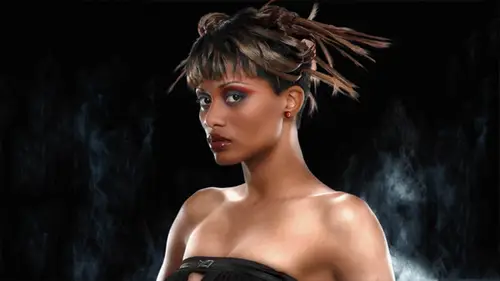
Spot Treatment
So again, we did this before we know how to do this. Uh, I'm just going toe throw another adjustment on there a little brighter and ignoring what happens the skin because I know I'm just gonna paint it into the eyes. I'm just kind of making a nice, brighter thing here will invert that and paint that in another thing that that you can do here, um, involves that that little catch light way had the big uh, soft umbrella light source you can see it here right in the eye and it's it's not quite bright enough, so I'd like to brighten it up and I'm going to do that with a with a we'll do that with an overlay layer I'm just making a transparent overlay layer changing the moto overlay and I'm gonna paint into that with white now overlay has a corresponding effect if I paint with a color that's lighter than medium gray it's going to make the underlying layers lighter, but where the underlying layer approaches black, it starts to ramp off so I can't paint brightness outside of this little highlig...
ht in here. You know, uh, you know, I think I'll start with about thirty percent opacity, and I could just sort of click over this and not worry about whether I'm painting into the black part or not. I'm just kind of pinging the highlight a little bit you wantto kind of back out and make sure you're not overdoing it, but see that that little bit really puts the sparkle into the eyes and also this this lightning just just like you, you know, just a little bit don't really don't want to overdo it now I'm looking, uh, I think for whatever reason, his skin tone is a little saturated here. Uh, so easiest thing would be, and I think actually, these things just to using overall his saturation, so we'll put a few saturation and, uh, since there's, no other significant color and then the jacket just use the master and just de saturated just a little bit just I'm just kind of trying to get a fix for that. That science percentage, usually in darker skin, we want the science percentage a little higher uh, and when it gets too low, the skin color gets like to saturate he's gardi, this monitor is really horrible thean studio monitor so you know, what I'm looking at isn't nearly as bad as that. But it is still a little kind of what I call salmon skinned kind of look where it just gets this a little slightly too saturated. Look in it. So I'm just gonna back off the saturation a little bit there. Just checked that my numbers. Sorry. Put that on way. Go. Yeah, ok. So again, kind of looking at the numbers now, uh, on the on the info panel up here, you can see and seeing my cave are we started off at sixteen. Fifty eight. Fifty eight. So where I said, for an ideal skin color, you know, the scion should be about one third to one quarter on darker skins can actually be higher than one third and be okay, but in this case, you know, sixteen, you know, they're split the spread from sixteen to sixty eight it's just it's too low, it really needs to come up a little bit that's what's giving the appearance of this over saturation in the skin. So we've gone from sixteen to nineteen in the scion without changing the other channels too much. Um and they have come down actually little bit magenta have come down from fifty eight to fifty six and sixty eight to sixty four, so they're both now getting a little closer to scion and that's giving me that uh, de saturation enough that I feel comfortable with the color and then just a final lets you know what I mean. I just was looking at this and I think if I paint in my blue channel adjustment to their was bright ning this jacket, uh, if I come in here and paint over that hair light, I should get yeah, that's brightened up that hair like to write a question. I haven't seen you do any sharpening. Do you sharpen images? Way haven't talked about that, okay? And we will way, will. I was I was trying debating whether to do that tomorrow, our way, probably like we're going to have time to do that today, so I'm going. I'm going to cover that after the break, which we are rapidly approaching here. So let me just do my final little tweaks here, which is the curve put my curve in here to set my black point again. I don't have a reliable white point in this image, um, and I'm sure he'd be happy about that, you know? Ok, keep those white points out, you know? Uh, ok, you think you're going to give me that much time? Uh, all right. Um so let's let's find her darkest point do the threshold adjustment again. Alright. Darkest shadowed. Looks like it's gonna be down here. Um and you know, again these air you can let things fall below your black point threshold if you don't care if you see anything in there and it may not be important to you that you read anything in this black jacket when that would be a certain strategy, just let it all go to black. But if I if I do want to get some sense of tonal shape in these deep shadows, I just want to set my darkest tone to be the point at which it will print black and not darker. So just placed that point there will throw away hoops let's see where's our threshold adjustment threshold adjustments down there. Interesting don't throw that away and see I've got that way down there now after all these moves and this is the thing you know, when you're doing these luminosity blends, it can really throw your white points and black points out that's why I saved the curve for my final tweak for the end now I've been working sort of visually and with the channel structure and not doing too much with the numbers except just for the skin color so now I'm gonna have to bring that black point up to get any chance have seen any sort of folds in the cloth down here get any sense of three dimensionality to that object back down there in the shadows so one one one it's sze very neutral which is a good thing that makes it easy so just elevate the bottom point there make it bring it up to fifteen and we're good to go okay, so, uh questions I mean, we have so many people that are asking for examples of different things right? You want to dive into some of those well let's get a sense of sample or you have a question has a question. Well this also play ana let's say I only got a j peg wright got toe he's a role on camera will supply on anything yeah, in fact you know this this picture of nathan was ajay pegged you know? So the end anything with separate channels you khun always look for those channels and trying to take advantage of the of the different channel structure um so yes it's not just about, you know, having raw files to work with changes like for this one for this shoot I can see that the the adjustments here making could be applied toe many images that air in this siri's are you just making notes of the changes that you've made or you copying? What elements are you copying over tio to the rest of the images in this serious when you're editing like this um you know what? This is an interesting point I'm what I'm really doing here is really financing things uh if I'm just looking for client approvals to pick the shot that they're going to use, I would rough things in just using light room and send them a whole bunch of files I make usually for my clients that I do is I make web galleries that they can select from and then they'll select their picks you know, three or four or whatever I mean, if this was for an album cover there'd be some consensus they would pick I go ok, we like this one and this one they're not going to pick one hundred you know, uh, but I'm going to have one hundred pictures to send them, you know, to show so that they can pick what their favorites are um and I'll sometimes like, oh oh, I will pre select things and I'll show them what my select sar sometimes that helps them make up their mind sometimes I feel like when I share my selects with a client they picked, they go out of their way to pick something else and it's, usually the worst one. So, you know, you can never win. But, yeah, I wouldn't do all this stuff for every single image, because it does, you know, it does take some, uh, financing, and but, you know, having having these things in layers like I do here, after I've elevated the black point, I'm looking at it. I kind of look back at this, and, you know, looking at this, I feel like I've made him to light. So I would just, you know, dial back that that layer in which I use that red channel luminosity boosted his skin tone, right. So having those layers is is really useful. Um, but it's, too much to do this for every single image and, you know, yeah, I wouldn't do it.
Class Materials
Bonus Materials with Purchase
Ratings and Reviews
Luis
Skin tones correction and portraits editing are new to me. This course provides a set of tools for me to improve my portraiture work. Lee doesn't just show you how things are done, but also the reasons for the corrections. The delivery is a bit dry because the topic is quite technical. You can have a break between lessons, if it becomes too overbearing for you. I highly recommend to take this course, if you are planning to do portraits, head shots, or even senior pictures.