Lessons
Primer and Intro Must Watch
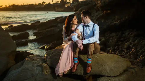
35:14 290 Second Advanced Edit On Signature Color Image
05:24 3Soft Skin Color
07:15 490 Second Advanced Edit On Soft SkinColor
04:27 5Vivid Color
11:28 6Black Crush
08:40 7Vivid Black Crush
07:55 8Glam Ciolor
05:562 Minute Advanced Edit On Glam Color
06:21 10HDR Natural Color
07:12 11HDR Vivid Color
08:17 12Soft Pastel Color
07:57 13Signature Soft B&W
09:18 14Vivid B&W
09:53 15Clack Crush B&W
08:45 16Vivid Crush B&W
07:43 17Glam B&W
08:07 18HDR B& W
08:14 19Fuj i400h
09:41 20Fuji 400h Plus HDR Fade
11:45 21Fuji 400h Plus Rich Tones
06:03 22Fuji 400h Plus Rich Matte
06:25 23Kodak Portra 800
10:09 24Kodak Portra 800 HDR Fade
07:55 25Kodak Porta 800 Rich Tones
07:21 26Kodak Portra 800 Rich Matte
07:20 27Illford HP5 Black Crush
10:12 28Illford HP5 Lifted Matte
07:41 29Ilford HP5 Deep Black Matte
09:01Lesson Info
Soft Pastel Color
in this 12th mixology, we're gonna be creating the soft pastel color preset within the lightning processes numbers in 2015 which is gonna take your original raw file from this to this. And the cool part is, we're gonna create that present in under 10 seconds, and I'm gonna apply it to a series of images that work very well with this pastel color look. So let's jump in. We're gonna get started now, This first image that you see here, this is a gorgeous image that was actually shot by Paul Von Ritter is the only image that wasn't shot by Linenger's a photography or by myself. And I saw this image from Paul, and I was like, that fits so perfectly well in this pastel look. And so I asked him if we could use it for the tutorial, and he was so kind and greatest to allow us to, So be sure to check out more of his work. Fantastic guy. Good friend. Amazing photographer. All right, so what we're gonna do here is what you'll see is here is the reset image. I'm gonna go ahead and select all of our...
images. Actually, press control shift our command shift artist to reset everything out. Here is the original raw file. This was shot on a Nikon. Now, when you're going for this past a look, there's certain types of scenes that worked very well for it. For example, well, I really think the best scenes for this look, our nature scenes there scenes with a lot of green in them, backlit or they have beautiful sunlight kind of coming in. They have nice highlights and nice blacks And there these types of very natural vibes that will create a really great looking pastel image. So I selected kind of some different images in this kind of a grouping that worked very well with his effect. So let's go ahead. We're going to start from the top. Now, let's put 10 seconds on our clock and again, this has already saved out. But I want to show you guys the steps to create this preset by using the FSB framework. We're also gonna cover a little bit of the advanced customization system three a. C s framework and show you kind of the new color toning effects that it's kind of one of things that I'm most excited about with the new version is our new filmic and pastel color tones. So let's go ahead and get started. We're gonna go and first before we create any preset. I'm just gonna just in my exposure. So I'm gonna bring an exposure quite a bit higher and usually with pastel looks, we're going for a more neutral kind of white belt. So I'm just gonna dial that down a little bit and just roughly to a good area, you know, so you can at least test and see the colors when you're carrying that preset. Okay, let's start the clock. We're gonna choose the foundation. We're going to start with this pastel, which is gonna die on our pastel colors and some basic settings here. And really, the only thing I want to switch is just under bass tones. I want a little more highlight recovery from my version of this and a little bit more softening those three clicks and we're done with my version of the soft pastel colored. This was saved out right here under 11 I soft pastel colors again. If you want to save it out, click plus your dislike check all de select white balance exposure, graduated radio and all the lens corrections except for chromatic aberration. It's important once again that we select calibration because calibration is used to get to this final look. We are tweaking camera calibration a bit. Okay, So again, you'd say this under the folder you'd like We've gone over this several times. So again, if you don't or if you're confused, just go back to any of the other videos or just simply posit and you can dial in the right settings for the preset click and name and save it out. Now, at this point, this is basically where we would get to if we just click this preset and all we have to do now is just dial in. The temperature and white balance are sorry. Temperature and exposure to kind of suit our needs. And so right here we get to a really nice for me. At least I get to a really nice I like to expose these really brightened. It looks absolutely gorgeous. So here's that before and here's the after of this image as a beautiful pastel Look. Now, this pastel is basically for those you that wanna have pastel colors without necessarily going to the filmic looks over here in the LGB color film or in the foundational films over there. Okay, so has a really beautiful kind of modern pastel feel to it. All right, let's go ahead and move on to the next image. And we're gonna use that preset once again soft pastel color, which has already created and all we're gonna do is just dialing the exposure again. I like to go really bright on this. And that's why I have a little bit of extra highlight recovery dialed in, and I'm gonna go. They're up to their I love that. Look, this is that light and airy, you know, kind of orange County. Look, that is so synonymous with our publications out here. All right. Looks great. Right there. I'm gonna do is dial in a little more greens. This one was shot on a canon. So generally the can you're gonna add a little bit more greens into it, General, with like a Nikon, you might add a little more pinks into it. A little more magenta. So here's that before, and that after that soft pastel color looks fantastic. Usually these kind of images. I love to have some of those hard highlights from the sun some deep shadows because it really does a lot to kind of pull off this very natural and whimsical look to the image. So I feel like it works very well with this particular style. That's why shoot a lot of these two have hard highlights in them. All right, So, again, soft, pastel color and all we gotta do from there is tweak. Remember that in general, I shoot everything to be very warm. And so when I'm going pastel, you generally want to shoot things to be a little bit cooler. So or we just cool it down in post. It just depends on what you prefer. Okay, so right about there, I'm gonna leave that exposure up nice and bright and get a little more again. Look more greens into this one right there. It looks great. Okay, so here we go before and after I love that has this beautiful, clean look. And if we look at the that, what highlights are actually being blown, there's very little those really hard highlights from the sun. That's the only thing is being blown. Everything else is just nice and bright in the shot. So that's kind of how that preset works and how we typically would use it. Now let's really quickly just go over what settings are actually creating this overall look. So for those that just want to know what's going on right now is we're dropping down the highlights and the whites with that highly recovery while keeping and preserving shadows and blacks and overall contrast, I do drop mid tone clarity a little bit just to give it a little softer look. We have a standard s curve that's boosting our contrast. And this is really where the magic is happening in the H S l and also in the camera calibration. So NHS l were doing a lot of work here to basically pump up certain colors were dropping a lot of the greens, but boosting green. Luminous. We're doing a lot of things to kind of fade out and drop the color tones to create that more pastel Look in the color toning in that a Giselle panel. Okay, so the main things is we're keeping red hue. Actually, we're pushing red hues up a little bit. We're dropping the Hughes on the awkward and the blues to get it to more of a green kind of a Hugh. We're raising the saturation of our reds, oranges and yellows, and that's to preserve skin tone saturation. Want have rich skin tones while dropping away the greens and the blues and everything to kind of have that more kind of faded and vintage past Outlook Okay with luminess were pumping luminous up for skin tones and the oranges for yellows all the way through to greens and purples and blues we're pumping that up to because we want to kind of brighten it and have that more soft and faded look to it. So that's what it's doing there and in the camera calibration were tweaking our red, green and blue primaries just a have a subtle shift in the overall color toning. So in total, we get this beautiful kind of pastel color shift, and it looks really great over these kind of natural, bright images in these different kinds of scenes. Again for us, were typically using this soft passed a look for these Mornay tree scenes scenes that are backlit that have beautiful highlights and shadow and have very natural kind of vibe to them that lend themselves very well to this very Brighton ery type of a look. All right, so that's it for this video. We'll see you all in the next one.
Class Materials
Presets
Ratings and Reviews
Gonzalo Blasco
Cool presets, but the course is a little slow...
Taras Onyshchuk
The importing by copying and pasting the presets into the directory doesn't work for me in Lightroom Classic.
a Creativelive Student
Pye and his website courses newsletters and teaching style and education are 2 nd to none! I have his presets and some courses Brilliant stuff !