Lessons
Class Introduction: The Whys And Whats Of Social Media
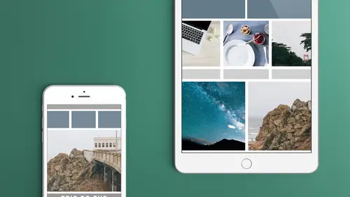
11:37 2Samples Of Social Media Graphics In Action
20:33 3Sizes And Formats To Consider
12:39 4Obtaining Creating The Images Youll Use
22:45 5Learn To Use Collage Apps
34:15 6Adobe Spark Post Socialc Media Project
09:16 7Intro To Adobe Spark Post
25:50 8Adobe Spark Post Export Options
06:54Lesson Info
Sizes And Formats To Consider
Where do we get the sizes, and how do we know what to do? Well, I have a cheat sheet that everybody should have, I believe, and we're gonna open that actually. So again, we've got different sizes. We've got sizes for the profiles and the banners, which are the big things that go across the top, and some of the profile pictures. And then we've got individual posts. And again, the terminology is different on every platform. I'm just calling them profiles and posts. I don't care what the individual term names are called. (laughing) Alright, so we're gonna look at that. So we're just gonna look at some of the sizes. We're not gonna go over all of them, but on Instagram, your profile picture as well as your posts, tend to be square, so 110 by 110 for the profile picture. The thing is, you can always have it bigger. It's going to size it down as needed. Like I said, it may crop them as well, but it's gonna size it as we need to, so I wouldn't worry about that. If you have a 400 by 400, don't...
worry about it. It's gonna work fine. Just know that if you have a tall image, like if you've got your headshot, that's always the hard part for me. Maybe it's because my hair is tall, I don't know. I always feel like I can't crop it the way I want it to crop, so if you do it ahead of time, it's better than waiting 'til you're trying to upload it to the platform, and having it crop it for you. Your profile picture on Twitter is 400 by 400, and your banner image is 1500 by five, so it's kind of a long image. Again, Twitter's one of those that I don't go to individual pages very often. I don't go and check out the person's individual page, but you can, obviously, and you want to have something for them to look at. And then the weird thing is on mobile, when you zoom in, it zooms in that background picture. I don't know if you know, if you've ever used Twitter, where the mobile apps, if you drag it down, the background image actually grows. So again, trying to decide what is going to be the focus is difficult. I think for Twitter, I try to use something that, everything in the picture looks good, you know? There's not me in that individual picture, I think for the background, because I have the profile picture that sits right on top of it. The background picture, I think, is just a mountain picture. So no matter how that zooms in, or how it crops, it's not a big deal. Facebook, there's a lotta different options on Facebook. I put the profile picture that's there, that's the square image that goes there, the cover image, like "the happiness is a warm puppy" image that we just had, that's 851 by 315. And again, don't worry about the sizes. These are all in pixels, obviously, 'cause a lot of the apps, like I said, have that built in. You don't need to know the image size. But when we talk about the self-creating apps, like Adobe Spark Post and the Collage, those are based on the platforms themselves. It just says Instagram, Facebook, things like that. Some of the Collage apps, the one I'm gonna show specifically, just has the ratio, so it has four to three or whatever, so you're gonna have to actually look at some of these, and I didn't have a listing of these that say what the ratio is. Obviously, 180 by 180 is square, so it might say one to one, it might say square, so find the one with the right ratio, so that it crops it efficiently for you. So the cover image, we've got the LinkedIn, the career image, I believe that's the one that goes across the top. LinkedIn has so many different images, and it depends what view you're in, and if you're following or connected to that person. I, sadly, don't use LinkedIn as much as I probably should, I have a really good profile up there, 'cause it's great, it helps your Google rankings really well, so I like it for that, I don't go there very often, so I don't even know which one that is. I'm not even sure if I have a career image across there. I have my headshot, that's all I know of that's there. But that's obviously a large banner, it's a pretty wide banner. Pinterest, your profile picture is square. YouTube. We're gonna come back to YouTube in just a second, 'cause I have the template for that. And also, these are officially off the websites of each of the individual platforms. Know that this can change, and they do change all the time. There are also a lot of sites that actually have Photoshop templates for you to download, so just do a Google search on that. That's what I usually do, but I usually make sure that it's current, so it usually says, on the template, what the pixel size is. I tend to make sure you can use the cheat sheet here, for now, but who knows? Maybe next week, they'll change again. I always go to the actual Facebook and see what it says, and make sure that the template that I'm using, to set that up, actually reflects the right size as well. So keep that in mind. So then, for individual posts, Instagram's 1080, so it's pretty hi-res. They do a really good job of keeping it. How many people love how much Facebook dumbs down your images? Right, it just gets really low resolution. That's so frustrating to me when I've got a great photo that I've taken, and I put it on there, and it's really low-res. And it does that, it automatically does that, so you can put a large photo, you can put 1200 by 630, you can put one that's twice that size, it's still going to dumb it down. It's just they have so many photos, so they've just gotta, you know, it's just to keep their bandwidth moving. But Instagram's really good at keeping that, so I tend to put higher than that sometimes, as well, but again, square. Now you can actually choose not to have it square. You used to be able to do that, actually, you couldn't do that with videos before, now you can do it with videos. You can even do it with images. So if you have a wide image, that you shot, and you're using elsewhere, and you want the entire thing shown, you can actually size that down now in Instagram. You'll get the white bars at the top and bottom when you do that. But you can do that now, everything does not have to be square. Because with Instagram, you don't have a way, it's either, if it's square, it just chops off the side. You don't have a way to move that around and crop it. So, I tend to, again, either make it square before I put it into Instagram or just try and keep everything centered, that's something else to keep in mind, and let Instagram chop it, or, I can pinch it down now. Pinterest is a little different because it can be tall, I think there is a maximum size but you tell it 736 wide and then it's as tall as it needs to be, because Pinterest will automatically line them up in columns as needed, so you know, sometimes you've seen the Pinterest ones that have a really long comic or something like that that's in there, or a ton of memes all the way down, because it's not really infinite, I just don't know what the maximum is for that. And the YouTube, you've got the thumbnail, so, I put 1920 by 1080 and 1280 by 720, those are both the same 16:9 scale, those are widescreen. You're better off doing the 1080, that's higher resolution, I don't think doing it any higher will gain you anything, I'm pretty sure they scale it down to 1080. So, again, that's just the 16:9, so if you've made a YouTube video, you've made a video and you've done it in 1080, you can just take a screenshot, that will be the right proportion as well. The other thing is, you can set up things, we're gonna look at, in a later lesson, we're gonna look at using other tools like Keynote, Apple Keynote to create these and you can have that, so I have all my graphics for my YouTube videos in there, and that's where I do my thumbnails as well, so I create that out of there and have that ready to go. So again, looks like my video, it's got the same branding, I know it's the right size because it's already the size of my video, but I didn't have to do a silly screenshot, because you know, you're trying to do a screenshot, and it's a little blurry because you're trying to grab that frame, so for me, I actually take still photos and plop them in there. And, I've got on the cheat sheet, the hand-out here, I've got the actual links where I grab this information from to make sure that it's current. And again, it's not all of them, I try to put the most popular ones that we use on here, and I'm gonna look at this, I'm gonna open this in Preview really quickly. And I can zoom in a little bit better so we can see it. There we go. So, you'll notice it says TV 2560 by 1440, so what this is, this whole gray background here, that is what it'll look like on things like Apple TV, or Google Chromecast, or any of the other TV ones. So if you're looking at it on a TV, that channel art, that's what they call this is, channel art, so the header that you use for your YouTube channel is in a big square almost, it's in a large rectangle, you know, but it's a little more proportionally almost square. And so you've got that big image. But, then you've got this, you've got your desktop max, which is this whole entire area here, you've got the tablet and then you've got the desktop minimum and mobile. So, basically, this is where I put all my information inside here, but that's 1546 by 423. So, what YouTube does though, is uses one image to fit all those different platforms, so how do you do that? Well, if you put all the good stuff right in the middle, what do you put back here, ya know? (laughing) So, that's always the hard thing. So, for me, I did one for a show I'm starting, but, I don't want to show it, it's in progress, so I basically have a picture of me and my co-host sitting here and I put a background, that we just have, just a pattern background, a demask background that we use in the background, but then I thought "wow, if I saw that on my Apple TV, that's all I see is the demask background and our two faces sitting here, so what I did, is I put up above here, I put the name of the show and a little tagline down below and it sits right against it, so on desktop and mobile, it gets cut off and all you see is that banner and then if you see it on the Apple TV, you've got the rest of the text that's on there, and again, I had to find one image that fit, and I actually grabbed CreativeLive's YouTube banner here, because the other thing you gotta think of and remember, is there's also a profile picture that sits on top here, so again, don't put anything, even though you've got this, this is off the desktop, so we're using probably the desktop max, and because I did a screenshot the pixel sizes won't be exactly right, I just screenshotted it, but we'll come back to that, I can see that there's an image there, and what do I see on the Apple TV? Well, it depends, do they just put color background? I don't have the actual image so I don't know. But, you can take something like this, where you've got a photo and maybe is a photo- you see the whole guy that's there, but you make sure that the image that you want to show on desktop is in that center that's there. So again, that's one of those that's really difficult, because they have one image that fits all, but that actually happens on a lot of different platforms is that you have an image and it resizes depending on whether it's a responsive design, so they're looking at it on mobile or tablet, are they looking at it wide or tall, and it changes as needed, so, I think a lot of it, for me, I think put the good stuff right in the middle, don't worry, make sure there's stuff that fills up the rest of it, whether it's an image or something like that, but it's not the important stuff, and then, part of it, is just let it go. (laughing) Because, sometimes, you just can't control, there's so many devices, we don't even have a way to keep track of who's looking at what on what device. So, that's something that in the back of your mind, know that, don't craft it so well for one device or one platform, because you need to be flexible with that as well. Does that make sense to everybody? Everybody following along and getting some good information? Any questions so far? Either from here in the studio or online, yes? I actually have a couple questions from online, one is, you may be getting to this, you let me know, but in regards to Facebook, one of our online students was wondering what your thoughts were in regards to the new profile picture for Facebook that has animation, allows you to sort of move around in it, and if there's anything you should consider... Hm, animation? when utilizing that? I haven't actually played with that at all, my feeling for a lot of the animation stuff right now is it's very, I don't want to say gimmicky, but I feel like it's "hey, look at me, look at me, I'm moving now, my text is now moving." (laughing) We're gonna look at some animation in some of the applications we're gonna look at and I don't think they're all that great right now because I do think it's just sort of a- you're gonna tone them out after a while like all the Facebook ads and every other ad, you're just gonna learn not to look at that. And again, the profile, how often do you actually go to the profile? Now, it might, I don't know if it animates the profile if it shows up in your feed, I'm not sure yet, I haven't seen anybody using it yet, but my feeling is that it's just a little gimmicky right now but use it and play with it, and you'll find people like it, if you find it sets you apart from the crowd, then I say go for it.
Class Materials
Bonus Materials with Purchase
Ratings and Reviews
Chuleenan Svetvilas
I learned about some great free apps that make it easy to create images for social media. You can make some great images with text really quickly after taking this class. I actually made a little animated image during class and posted it Instagram. I also learned about some good places to go for free images. Erica's very personable and fun, which made it an enjoyable class. The apps are easy to use and you can start making images right away. There isn't a steep learning curve.
Rebecca Chapman
WOW this course is jam-packed with information on so many apps - not just Adobe Spark Post. I love how easy Erica makes everything plus she's very funny and has an approachable style. Thanks CL for another great class!
Jose Velazquez
I really liked how informative and helpful the class was, even do Ive worked with some of the programs used in class I feel like There was so many new things I learned. Thanks to Erica and the whole crew for such an awesome experience