Lessons
Day 1
1Course Overview
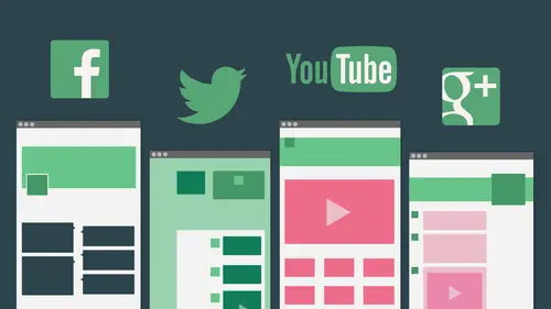
12:00 2What is the Best Social Media For you? Part 1
22:59 3What is the Best Social Media for you? Part 2
17:20 4How to Create Social Influence
28:53 5Facebook® Profiles
27:30 6Facebook® Profiles Part 2
16:19 7Professional vs. Personal
22:20Facebook® Pages and Groups
39:57 9Facebook® Pages and Groups Part 2
28:22 10Platform Templates
14:44 11Twitter® Template
27:07 12Twitter® Tools and Tips
27:03 13General Q&A
07:16Day 2
14Claim your Domain
23:48 15Being Consistant Across Sites
18:20 16Google Plus and Bios
36:10 17Cyber Famous vs. Internet Famous
11:58 18Guest Speaker Roberto Ruz
37:48 19YouTube®
23:29 20Guest Speaker Kare Anderson
32:13 21Managing your Social Media Sites
17:56 22Target your Posts
27:51 23Tools to Manage Social Media
41:16 24Your Cyber Reputation
38:19Lesson Info
Twitter® Template
Let's just look at some stats, cause I know a lot of people are a little hesitant t to use Twitter, but 255 million active users. This is from Twitter itself. 500 million tweets are sent every day. 78% of Twitter active users are on mobile. So if you're thinking that that mobile designed for your Twitter profile doesn't matter so much, think again. This is a hugely mobile audience. Twitter is very much real time, very much in the moment, very much reporting from the field breaking news. CNN updates sports headlines very quick, real time. So mobile is especially important on Twitter. 75% of Twitter accounts, 77% are outside the U. S. Another thing to think about with Twitter, and it may be part of why, as us creative professionals, you're not thinking about Twitter as much as some people do. It's very active throughout the world. 35 plus languages on Twitter are traveling. If you are thinking about working in other countries, find out if Twitter is active in those countries again. In my...
experience, Facebook tends to be the most possible positive, the most popular everywhere, and that just speaks to its 1,000,000, users. But Twitter is hugely popular in a number of parts of the world, and different parts of the world tend to favor different social sites. So before you travel or before you try to market to a new market area geographically, it could be helpful to find out what are the most important sites there. So we're still bracing ourselves for this new Facebook page design. We may get a sneak preview in the next 24 hours, but your new Web profile is here on Twitter. That has definitely rolled out. And in addition to the big design changes, you also have the option now to pin a tweet to the top of your profile. So the way his the way Twitter has worked historically, every time you tweet, it pushes everything else down the page. Now you can have one tweet that stays at the top all the time, and all your other stuff goes down below that. And that's kind of an interesting evolution in that Ah, lot of us use Twitter before a conference or something, we might tweet 10 times. Quotes from the conference tips from the conference, but we might want a general tweet of the top that says what conference were in and what's going on. So this ability now to pin a tweet to your profile, I think it's pretty cool. It's pretty straightforward to use at the bottom of any tweet. You'll see these little icons that allow you to retweet share favorite trash and then dot, dot, dot and under dot, dot dot you'll find pinned your profile. Note that you can on li pin your own tweets. If you share somebody else's tweet on your page, you can't pin their tweet to the top of your page. You can. You can create a new tweet based on that. But I shared creativelive, and then I was gonna pin their tweet and it wasn't an option. You have to have tweeted it yourself in order to pin it. But now, at the top of my Twitter profile, that creative live tweet is always available. So if we go over here even if I had tweeted more recently, U N. C. But, uh, there we go, this tweet will be at the top. This pinned tweet will be up here at the top, even if other things get added down below. And then you can change that if you decide later, you wanted to be a different tweet. Whatever tweet you pin replaces the one that was pinned, you could only have one pin tweet at a time. But that is a very new addition to Twitter that was not possible before. The biggest change is how this header area is used on how it looks and I want, Um, this is how my Twitter profile used to look and a lot of people would have, ah, kind of a cover image, a profile image and then a background image behind it. And then they logged in one day and it said, Take a look at your new design. Some people still have their old designs and haven't switched over. I will definitely warn you before you switch over. You should get yourself ready to redesign your page because I have yet to see anybody's page go from the old design to the new one and not look stretched and pixelated on because the first thing it does is take this cover image and stretch it all the way across the top of your page, and unless you uploaded an obscenely large cover image, it's still not gonna work right. It's gonna crop differently. Everything's different, so don't change the design until you're ready to create a new design. Like I said, the biggest challenge of this new Twitter design is that the photos aircraft in position really differently on mobile and desktop displays. I was using KPCC as an example when she first redesigned this That looks beautiful. She put up a nice high resolution image and replaced the old design. It looked fantastic, but then, if you looked at it not only on the IPad and mobile, but this is also the profile summary. Facebook, Facebook Twitter has a number of kind of use, even on a desktop computer. Many people will only ever see this cover area of your profile unless they click through all the way to your profile. Most people will Onley see this cover Erin. So I would say of all the images and all the elements of a Twitter profile, the most important one is how your profile looks when it's displayed like this in that small, you know, through preview space. The profile summary space, and that's pretty close to how it looks on most mobile devices. So again they change this design because that obviously wasn't quite working to something that's just a beautiful open image. If you go with an option like this on Twitter, you really can't go wrong. If you have one nice, big, beautiful image that looks OK, cropped in all different ways and overlap to different places, that's gonna work on everything. So photographers, creatives a nice, clean, beautiful image at the top of Twitter. You're done. You can go home for the day. That's a perfectly fine option. But I would still say, Does this say something about you know, this says Southern California, right? This speaks to Southern California. Um, I still miss that, but they still have them on their Facebook profile. So here's what we've come up with for this Twitter design template and again, thinking about what we're trying to show is how these profile images are different on different devices and that this area here in red is really the only what I would call safe spot. That's the only part that's going to be visible everywhere. So if you've got words over here, or you've got words that are going to get cut off if they're over here, You're definitely gonna problem if you have words across the top middle that are gonna get overlapped when that profile image moves from down here in the bottom, left toe up here in the top center, you also have a problem. I'm gonna show you an example of a Twitter profile that was designed around those limitations. But I just want you to ponder for a moment. This is why Twitter is probably the most challenging of the designs right now in social media. Don't worry. They may change it next week. So this is, Ah, site that was designed for a consultant Who, um, trying to think how to introduce this. Laurie Rough is a social media consultant, author, speaker, And this site was actually designed by at Andrew. Um, and I'll show Andrews profiles in a minute, but Andrew actually helped me come up with some of these templates. Like I said, he and I are both kind of geeks and designing this stuff, and this is something he came up with, and I want to give him total credit for so what he thought was, Well, wait a minute on desktop that profile images down here at the bottom left, and there's nothing up here. So let's just make kind of a second image be part of the background. And then when we get to the other layouts and that profile image moves up to the center, it will just cover up the one that's there. It's a pretty clever idea, actually, and it wouldn't have to be another photograph. It could be just a little iconic image. It could be just a little whatever, but something that is there and then not missed when it's covered up. It's kind of the best example I've seen so far of how to handle that now. That said, he and I were testing it some more, and you know, the photo was kind of poke him out on one and slipping out over the top. It's a little tricky to get the positioning so that that profile image covers it completely on all the different devices, because the profile image size changes on different devices. So again, going back to that template looking like kind of this money mess, it's really about trying to help you visualize. Here's the safe prior to the screen. If you want text, this is the only place you can have. It is right here, and you really can't have anything in the middle here because it's gonna get overlapped. So let's just look at these again on the desktop. This is one background image. All this text and these images up here are just saved. And Photoshopped is one image, and this is the second image. The profile image. This is just a little different layout on the desktop to show you that the bottom and top get cropped off a swell. See how the top and bottom are getting cropped off differently here. This is that profile summary, and this is really what most people on Twitter are going to see if use hoot suite. This is what you see. If you're just glancing at people's profiles and you're going through Twitter, most of us on Lee ever see the profile summary of other people. Unless you click on Lori's name and go all the way through to her page, you'll never see that bigger image. So this really is, I think, the most important of the layouts and notice that not only has the profile photo moved from that bottom left up to this middle area, but all this text comes in here that's not there on desktop. So all of us who want to put tax down at the bottom of these nice, big, beautiful images will not gonna text over text as soon as it's in that smaller layout. So definitely a complicated design challenge if you want to do very much so really, this little area to the left, to the right and just below here. Those are the Onley places you can get away with putting any kind of text in the background image in the main image at the top of your Twitter profile. Thanks to Lorien Andrew, both for letting me share these. I think again he did a pretty clever job of figuring out how to make that work, and I think this one kind of shows the contrast here of what's going on. So again, remember, this picture up here is really just part of the background, and it's still there. It's just getting covered up now, as this profile images moves and shrinks in this layout right? All the same Social media site. Radically different layouts on different platforms. Thanks for updating your design. Twitter. I would not be at all surprised of Twitter changes their design again soon. They're getting all kinds of pushback on this, and it's really kind of unfortunate that anybody who put any time into creating a Twitter background and a Twitter profile image and I have to even show a couple of old examples that I thought were so good because they were so brilliant. Anybody who put all that time into that had toe start over again. They're really not usable the way they were before. You have to re optimize the images, you have to re upload the images. It's it's a real start over with your design redesign. Um, and now Facebook wants to follow suit. We'll see how much pushback they get. Here's another example of how those sometimes show up. You see, if you're just doing search results, you get an even smaller little profile preview, and it's just her name, the at symbol and whether I'm following her or not. But notice how this kind of abstract image just works perfectly in any layout, right? She's a food blogger. That kind of fits. So are you telling your story? Do you have one big, beautiful image that helps me know something about you? You write about food, you know about food. This certainly says that to me. But no matter how this images cropped or where her profile photo falls over it, it's still gonna be an interesting image to look at. And I'm not gonna have a problem. And that zooming in on something that has lots of detail or an abstract image seems to lend itself particularly well to this. This is another one. Hey, Michele, I hope you're out there. I know you were thinking about watching this, and it's been fun trading tweets with you this week. This is where the other things about Twitter it's Twitter lends itself more to meeting new people in some ways than Facebook, because that's even easier to kind of connect with people on Twitter. So if you're trying to build a network of new connections, that could be a very powerful way to do it. She does a lot of arts and crafts and handiwork, and this kind of an image that shows off something you've made. If you're a maker like you Shantel, I'm guessing there lots of images you could come up with that would show the beauty of your work. Demonstrate that. But again, you could crop any part of this and you could overlap any part. This and it would still work. Giga own is, ah, media site. And this very abstract background just works perfectly at any size. Right? So no matter how we see this, this is always gonna look cool. No matter where their logo is in relation to that background image, it's always gonna look cool. So abstracts photos, um, collections of photos that have some repetition, definitely your safest choice when it comes to Twitter designs back to my wonderful friends Shelly's yard and I love her Facebook profile, and it looks pretty good at first on Twitter. But like I said, this is what happens when that profile photo overlaps in the text comes up over it. And I love Shelly, but I'm gonna have to spend some time helping her fix that. Right? Uh, it just you don't want that. My own design. I played around a little bit. I wanted multiple images to tell my story. And the first time that I started playing around with Twitter, I stuck one big mentioned little and two on the side, figuring the sides would get cropped off and that would be no big deal. And then I got this when I went. Oh, yeah, that doesn't really work, right? My head over my head on a different body just doesn't quite work. So trial and error, it's how we figure out how to do these templates like, Oh, yeah, no. Tested on different devices. So then I split it out a little bit and I said, Well, okay, if I lost this side, I would just lose this one. If I lost this side, I would just lose part of it. And in the middle, I would still have these two images with a space up here that the profile photo could be down here or could be up here. So it's a montage image that still helps tell my story. I work in love with this wonderful person and we travel and we speak and, you know, I'm trying to tell this story, but this works whether the profile photo is in the top center or in the bottom left. And if you are on a desktop, then you get kind of a bonus. You see a little more of that one image, you see an extra image you wouldn't have otherwise seen, so you can get more creative. You could certainly create a montage. Just be thoughtful about where those cutoffs are gonna be and how that's gonna affect the layout. My friend Julio Julio Fernandez, another one of my friends from Miami many years ago, he now runs his own social media consulting firm, Social Julio High. Julio, if you're out there, I know you're very interested in this topic, and I think this is awesome. I love the way his arms come out just really invitingly. I love this sort of way that the photo Reef reinforces it, and I can almost live with that. It's a little odd, but it's kind of funny, and it just fits their well enough. And it's the same photo in the same image that yeah, it kind of makes me laugh ago. All right, that that almost works. So sometimes you can find a way to put your head over your head and e. I don't know where to go with that line, but I think that works pretty well. This is an older design, but I just had into a shadow. You can still have background images. They just don't show up in most places anymore. So most of us are switching to a fairly generic background. But Shawn did a really nice job of creating a background that worked at different sizes, so noticed that even when this gets smaller, you still see just enough of this blawg tweet surf. Answer Facebook that it kind of works in the larger version. And in the smaller version, you still have to think about that. If you want a background image behind all this, you're just not going to see it in most of the layouts in Twitter anymore, again doing a shot at somebody I really admire. Erica Barker was calling on one of my creative live classes. Fantastic photographer, very talented, also a professor, and what she did with this Twitter design, the old design, I just thought was brilliant. So she had. This is a cropped peace out of this bigger picture that only appeared there, and it stands alone by itself. If you don't see the rest of it, just that I is kind of cool. But if you see the background than that works very well, and this also illustrates a tip that it's so hard to part with. You, like figure out the best design tips for the old layout and then they change everything on you. My best design chip from the old Twitter layout was to center the background image. You could align it to the left, align it to the right or center it. And because that center area moves depending on what's going on, the only way to keep a background image consistently relative to an image in your cover area was to center the background. So it stayed. So as it moved, both images move together, and she did that really brilliantly. So whether it was up close, whether it was on a small screen or a big screen, it always looked right, and a lot of people just left, aligned their background images, and then when the other thing moved, it just looked terrible, and it would overlap in very unpredictable ways on different sides screens. So if you're still thinking about trying to figure out of a background image, and you can still have one, then centering that back around images, the right trick. She's pretty much gotten rid of it and gone to this. But this is a great design. And look at this. What's gonna happen when that profile picture is up here? It's gonna look great, right? So another way to think about how to kind of have both of those layouts work, nice design and interesting how she's repeated the same image on either side of it. Just got a great design. I Hi, Erica. She just moved to New York. Can you tell when you are customizing a background or uploading a background? This is I just wanted to see background position, left, center or right. It's how you set that, and I'll show you in a second where you find that in the settings cause there's one place where you change the cover image one place where you change the cover image and then you actually have to go into settings and over to design. To find this, there are a bunch of pre made background images you can get from Twitter they're kind of included. But Twitter now actually has a link to this cult thing called the 1,000,000. And if you go to the 1,000, it has all these backgrounds that you can create. I don't know a lot about them, but Twitter now links to them. So they clearly have a connection on a partnership. But it just makes it easy to create all different kinds of background images. So what some? So red. Scorpio says high red scarf E ho. Thanks. So glad. Yeah. She and I had a lot of fun training treats this week. Thanks for sharing that. So the big profile challenges on Twitter are the automatic cropping, Um, and the challenge of this profile photo that's gonna move. But the other thing that you might not realize is that it's gonna be really small in the bottom left and really small in the top. But if you click on that image, it will blow up to whatever size you uploaded. So here you see, my friend Khari on Twitter has a profile image that's about this big. You can see what I'm doing there on the screen. Now that's a little dark to see there. But when you click on it because I uploaded a much larger image, it comes up bigger. And that actually seems to work pretty well. If you want people to be able to get a bigger image when they click on your profile, you can upload a much larger image than fits in that little box. I went up to about 500 by 500 it still worked. So before I switch over to Twitter tools, let's just look at some of these things in Twitter so you can see them. So here, if you just want to edit, um, your this is what I mean by the profile picture coming up bigger. So if I click on it here, you see how it comes up larger. If I had uploaded an image that size, then it would open that size. If you upload a bigger one, it just comes up a little bigger, which is kind of nice. This button here, which is the obvious place to edit your profile, is, and you can easily change the header and easily change the profile photo here. So that's that's all good and easy. Um, save your changes when you're done, definitely don't switch to the new layout till you're ready to change those two images because both of them will end up blown out. The size of both of them is different. If you want to get to the background, you noticed this is another one of these little gear shift things. If you haven't figured out in the world of social media, something that looks like, um, gear shifts the right word what I want to say, What a comment to gear, not gearshift. Just gear. Something that looks like a gear is probably access to tools. And if I go down here, you'll see at it profile. And once I get into edit profile over here on the left, you'll see design. Once I get into design, you'll see that the background image is still an option. You can still have a background image and change a background image, and there are, like I said, a couple of interface views of this where it shows up. But very few notice yet another way that that cover images displayed, though with the profile here in this little layout. And that's another view that you see sometimes on Twitter. So depending on how Twitter is being viewed, if you're using 1/3 party tool to view it, all these things can have an impact on how you see your Twitter page again. There's a safe change. This button. Make sure you do that when you change the background beer, where you can change the background color and you can change the theme color. The theme color is going to affect the color of the text, so this text here will be impacted by the theme color. If I go back and change that hopes to yeah, design. So if I made that theme color red, you'll see a radical difference. When I say this, go back to my profile. That's what I save it. Oh, come on, make a liar out of me because the other editing pages so easy to get to. Sometimes people miss this design option. Scroll down. Let me see if I could do that again and actually get it to stay that way. Pick a red color Don. That's what I missed. Now that it's red. When I say the changes and go back, you'll see. That's what the theme color changes So if you wanna have that color change, you can. It also changes the color of links within your sight. So it's not gonna change everything on your theme just the color of those links. And if you had done that before and not realize it and then you go in and change things and it doesn't fit. Twitter has never been the easiest site to design for, but they have definitely added some challenges. So I'm just gonna go back toe blue in general, unless you have a pretty good reason. Blue is a good color for links on the Internet because that's the default color most browsers show links in. So unless you have a strong reason to make your link something, something other than some shade of blue blue is probably your best choice for that. Okay, that was kind of fast through all that. How you doing? Why haven't lost anybody? Haven't? No. And we have Ah, Kabul one. Really good question. I we hear this all the time. I think in social media courses. And the question is, I would love to know what the best times to post on Facebook, Twitter and other social media is day of the week, times a day. What's your advice? It's a really great question. It does come up in all the social media classes I've ever seen or taken or given. And the answer is depends. Of course, everyone still I'm up late. I posted one in the morning and I think, Oh, shoot. I should wait till 10 o'clock tomorrow And then I remember I have friends on the other side of the world and this is a way to reach out to them. Um, Guy Kawasaki, who I really admire, is just social media innovator and over over user publicly tells people he posts four times a day. Everything he posts, he posts four times a day and equal increments over 24 hours on. Some people find that a little spammy. If they're following for 12 hours straight, they're going to get him twice. But I think he's found a very effective way to have a very global audience and to reach them over and over. And as long as you're transparent about that and you let people know about that, I think that could be very effective. I think for myself, I'm a move to a twice a day schedule, just cause that feels better to me. But But it's something I've been struggling with. The best social media experts will tell you that it depends on your audience, and you should do some testing. So one thing you might do is this week. Try or maybe for a month. You get a better test every Monday at 10 every Tuesday at noon, Everyone's day at three every Thursday at five, right, And then you have to deal with the fact that different days have different responses to some, people are very busy on Monday morning. Some people leave early on Fridays. Some people don't want to work anymore on Friday afternoon, and it's a great time to post. So it depends, too, on your audience. Are they on the East Coast or the West Coast? Are they more likely to be checking during office hours or not? Are you posting about something work related or play related? So if I'm posting pictures of my family, the weekend might be a great time to share them with my family. If I'm posting really good tips for you in your business Tuesday morning, might be the best time to post but business hours in general. And you're if most of your people are in a time zone. Business hours tend to do best. And I I think it's because I'm not the only one who uses social media to procrastinate. Although I'm telling if you really want the ultimate procrastination challenge, write a book about social media. It's really hard to finish that book.
Class Materials
bonus material with purchase
Ratings and Reviews
Insoyum
I picked up some great tips about the different social media platforms. I found some of the social media templates a bit confusing to use, but the course was useful overall.
LOAF
amazing course