Typography in SquareSpace
Lesson 15 from: Squarespace 101: Build a Site that Shows off Your WorkYvonne Perez Emerson
Typography in SquareSpace
Lesson 15 from: Squarespace 101: Build a Site that Shows off Your WorkYvonne Perez Emerson
Lessons
Class Introduction
08:14 2Add Settings Tab and Basic Info in SquareSpace
07:41 3Create a new page in SquareSpace
06:07 4Make a Page with a Slideshow in SquareSpace
14:35 5Add a Rule on a SquareSpace Page
08:07 6Edit SquareSpace Gallery Layouts
05:18 7Arrange Text on the SquareSpace Page
06:47 8Questions on Setting Up SquareSpace Pages
08:23Make Your Portfolio Better with Descriptions
05:48 10Add About Page in SquareSpace
09:59 11Add Blog Pages
10:42 12Connect Social Media Accounts to SquareSpace
05:07 13Additional SquareSpace Site Tools
02:20 14Designing in Style Editor in SquareSpace
09:05 15Typography in SquareSpace
12:23 16Announcement Bar in SquareSpace
03:25 17Add Social Media Feeds to SquareSpace Pages
13:58 18Cover Pages in SquareSpace
15:05Lesson Info
Typography in SquareSpace
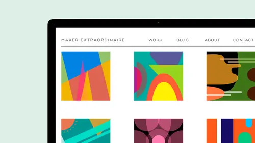
typography is a big thing. Here's this is a pretty bold font, and I don't want something lighter and modern for this site. So in the typography I've chose well, let me show you about typography for so this is what it comes up with right away. But if you click on it, this is what this site is using that to use future, and it uses proximate. But it also has is awesome categorized typography to. So here's some san serif, which doesn't have a little feet and gives you all of this fun. And then there's some serif ones slab, Sarah, display script, monotype and even mawr. And plus, you can add some adobe type kid, or that is, until we take it. And then they also have Google fonts. So a lot a fonts, and it could be overwhelming. Don't want to mix too many fonts in your design. Want to keep it simple and legible on a design note. Decorative fonts can be what they are decorative and trendy. So try to be, you know, again, this is a portfolio site. It's about displaying your work and making or wor...
k the hero, So try not to add too much extra fluff in there because I think it distracts from your work. I have it in there. So I'm gonna m change this, uh, mont and I'm going to go to Brandon Grotesque honey name. And my style is going to be then instead of regular and it's at 46 points. It's good. Um, I want to keep it at upper case because I like that. And I don't want any decoration, but you can add some in there and you can add letter spacing as well. And then the site subtitle is the same thing. Um, so now I put it in there. It's in there, which is so great. Um, and my subtitle I want it to be regular. It is, But I want it to be 14 points, so it stands out a little bit more. My navigation. I want it to be regular. I don't want it to be, um, as Bigas, my tagline. So I'm gonna keep it at 13. I like that. It's upper case, and it's all caps, and you can see if I was to add some spacing in there. What happens? I'm just gonna keep it at one. Okay, so we look down here. This hasn't changed yet because it's not up here, which is really weird, because it should be. It's down below. So we'll go, uh, So site with we're gonna get into the values and the with This is set at 900 pixels. I like a site to be at least at 10. 24. So I'm gonna set that at 10. 24. Um, you can even go larger nowadays, Um, with coming here, do it with the way our retina strains and everything are. You know, a long time ago you had to have your sights really narrow to fit on the browsers and everything, but that's all changed. You know what? There's a lot of one page sites now that it's OK. Just grow up and down. You can go past the fold because people are used to that content. So I'm gonna leave all of this the same. But one thing that I am going to dio is I'm gonna change. You can see they change color. I like these big. So I'm gonna make this bigger. I think I had it at, like, 33. Nice of big This is who I am. This is arrive at like it, um you can also play with. So the index go backward. Go lay out is left. We want the page. Bono's the way that they are next, some title. So I'm gonna make this the index thumb title. That's the title of the images within the index. I'm gonna change that color to match the site color. I'm not going to change the background of it. Um, you can change the titles. So this is gonna be Brandon, because I want it to match month go. And then I want that to be 12 points, and I want my, um, it to be capitalized and nothing for that. So I want them. I already made them capital because they're type have been. But if I didn't and I capitalized him, they would automatically. But you can see that it changed the color right there. Right away. Um, so on my padding, so sidebar. This is where you can change the width of your sidebar on your blog's. Um I already I like the 300 pixels, so I'm leaving at 300 pixels. Um, and then the thumb Now um, patting You can change. It's at 3% but you can change all of the hover over the picture of the color of it. All that can happen in here it's jumping around. Okay, so say this. Go back out a design. Come appear. See? So change it a little bit. Um, as you roll over, you see that the hover color is a different color. Um, this is a different Let's go in and look at one of these. This did not get changed, so we'll go in. But the body copy did get changed. So we'll look at that. Look at some of the other side's. This gets really bold. Some. I'll probably want to go back into those pages and style it a little bit more. Um, because it might have been on bold when I was in when I put the text in there. But you can see let's go to that meat makes hurt. Another thing that I'd want to do is the other that didn't get changed. I want to go in and change the color of this to match my site. So go back into the style editor and then we can add, um, setting for that. Okay, So once what? The one thing is which nice as I'm on this page and I fight scroll over it. You can see that it selects just that within the style editor. So that's pretty handy. Heading one wasn't changed, so I wanted to be Brandon, and, um, I want it to be 28 points. Big elect. Dig in some instances and all caps, No time. So it looks like this might be bold in their thing. Someone can show all can kind of double click on things. Um, heading color, body text. I like the proximate body copy. So I left that there. And then here's your buttons so you can see the little blue outline that happens when you scroll over on the button. And I like that. It's solid. I want the button corner. You can change. It could change it around it if you want. You could keep it square. It could make it outlined. Um, maybe I but I'm gonna make it solid, and my button color is going to be saying is I think I'll do the same here. Same as the site. Show all and save um, in this as well. You, um have a square spades weaken. Disable that if you don't disable it. It's also in the footer. And I'm gonna show you where you can put that in. You can add it in, um and see it pops up, but we're gonna disable it. You might sometimes want to be in there depending on what what you're doing. You're blogging a lot. And you want squarespace, Teoh, maybe feature you or something like that, you would probably keep it in there. Um, this is where you do custom see assess. If you know about it for that as well. Let's go back to pages and let's see what we did. Eso Here I am at my about page, which I now call me and make, and it's set up where it's got a photo. It's got a form, it has a map. Everything is in there. But this type is filling heavy. Still, there's a couple of things you could do. You could click on the left side to get into the page. Or you can just girl over the page with your mouths and hit edit and that I'll help you get into the page to, um and I'm just gonna go in here and go. What's happening here? It's heading one, Um, but it's not on bold. That's good. It's a little bold to me, so maybe I wouldn't want to change that in the settings later. Um, like I said, maybe you don't have all these fonts on your your computer, so you don't know. But if you were in their first before you put any content down, go into the style letter and start going. Okay, I really like this font with this Pont. These are my colors. Then take that information and put it in a form so that you have it in there. Later on. Say you're doing something for another client or something like that. That's a document that you can have for your style sheet to your style guide
Class Materials
Bonus with Purchase
Ratings and Reviews
user-8b437f
I have watched other Squarespace webinars that haven't given me the confidence to tackle building my digital portfolio like this one has. Yvonne is easy to understand and provides just what a designer needs to know to get started. This course was exactly what I needed to get me going!