Student Hot Seat: Marketing Materials Critique
Lesson 11 from: Start and Grow Your Photography BusinessKevin Kubota
Student Hot Seat: Marketing Materials Critique
Lesson 11 from: Start and Grow Your Photography BusinessKevin Kubota
Lesson Info
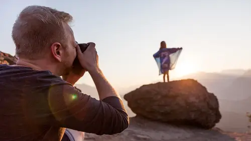
11. Student Hot Seat: Marketing Materials Critique
Lessons
Class Introduction
14:59 2How to Evaluate the Condition of your Photography Business
10:01 3How to Build the Foundation for your Photography Business
30:05 4How to Rapidly Grow Your Photography Business
19:41 5Legal Essentials for your Photography Business
32:08 6Effective Work Habits for Successful Photographers
29:34 7Best Practices for Tracking your Time
14:38 8How to use Keywords to Define your Brand
16:01The Importance of Defining your Brand Identity.
12:37 10How to Leverage Design to Communicate your Brand.
10:37 11Student Hot Seat: Marketing Materials Critique
37:52 12Marketing your Photography Business Online Part 1
19:47 13Marketing Your Photography Business Online Part 2
35:06 14Marketing your Photography Business in the Real World
13:51 15Understanding Cost of Goods and Calculating your Overhead
18:45 16How to Price your Services and Build Packages that Sell
31:37 17KUMU Studio Management Software Pricing Demo
14:48 18Student Hot Seat: Critique on Pricing
12:39 19Ten Key Steps to Selling without Selling Part 1
24:16 2010 Key Steps to Selling without Selling Part 2
18:49 21Student Hot Seat: Mock Sales Presentation
23:48 22Creating & Nurturing Customer Loyalty
23:54 23How to Encourage Repeat Business
11:15 24How to Develop a Sustainable Business
19:32 25Final Q&A
14:11 26The Importance of your Professional Network
20:05 27How to Stay Inspired and Realize Long Term Growth
16:32Lesson Info
Student Hot Seat: Marketing Materials Critique
We're gonna put somebody in the hot seat, for a review of marketing materials and, let's see, who wants to volunteer? Anybody, anybody, anybody? Oh, right in the front row. Here we go, we have a volunteer. My name is Yanina Gotsulsky. That's her name. (audience laughs) And where are you from? That's a loaded question. Let's see, I was born in the Soviet Union. I grew up in Canada, lived many years in Los Angeles and now I'm here in San Francisco. Good, and so, real quick, what's your photography background, as far as just taking the pictures? I've been a photographer for over three decades. You started when you were three as well. Yeah, that's it, exactly. Amazing. Yes, absolutely. In Russia they give out cameras when people are born. Yeah, I got my first camera as a teenager and I've never not had an SLR since then. But I've decided to actually make money from it very recently. Okay, so how recently is that? A year ago. Okay, so a year ago, she's committed. And...
now we've got some of her marketing materials. And she had actually, a lot of stuff and when she was telling me earlier ... Okay wait, I just gave away the fact that I just met this stranger. Yeah, no, I'm just kidding. She told me earlier that she had just started and really just, even just a few months ago, barely started getting these marketing materials together, right? Yeah, two months ago, it dawned on me that actually I need marketing. That if I just sit around my apartment, people are not gonna come to me. I really tried that. You tried the neon sign in the window? Yeah, it doesn't work in San Francisco. I tried Facebook flashing, but it didn't work without marketing. So I started, literally from scratch. What is it? I think having been born in a communist country, the idea of being a capitalist somehow rubbed me the wrong way psychologically. So I finally came to terms to, you have to market. You have to do something to tell people what you do, how you do it. Exactly. So that was two months ago that I started doing this. Okay, so I think she's done a great job for only ... I mean if you looked at her stuff, you guys haven't seen it, maybe some of you have. For really just starting to really focus on this in the last two months, this is pretty awesome. So she's got some beautiful presentation folders here, that are ... This is what? You deliver your images to the clients in? If they only want to purchase separate prints or my gift to my clients. I don't sell anything smaller than an eight by 12, but I do offer gift prints. You know, as a thank you, as you know, Christmas gifts to really good clients. I will print them different sizes. Like I will do and eight by 10 or a five by seven, but I don't sell them. Okay, alright. And that's something good to think about. We'll talk about pricing and selling tomorrow. But I think that's a very valid method too, is to focus on the larger, more important sized prints, and maybe not so much ... The other ones can be add-ons, gift prints, like you said, rather than a product in itself, so that's definitely a strategy. You do quite a variety, it looks like mostly kind of a business head shot, business portrait branding photos? Yeah, I mean basically I'll shoot anything people pay me for, but my passion is ... What about shoes, will you photograph my shoes? Yeah, that's one thing I don't do, really. No? No. Deal's off. Or food. I was gonna pay a lot of money for that. Dang, okay, I'll do it, I'll do it. Portraiture, I love portraits. So business portraits, what I call personal branding is what I have access to, through my real job. But it's not terribly interesting for me. I do make it interesting, I try to upsell people like hey we have some extra time, why don't we do a couple of fun shots. And then present them with more than they ask for, but yeah portraiture, any kind of portraits really. And so let me just ask you quickly, we haven't done a keyword exercise on you, which I think would be interesting to do. And it would, just for you guys out there in the world or anybody here, if you're doing the keyword exercise, what she said that's interesting is that she does a lot of this business portraiture, she's very good at it, it's beautiful work here. It may not be what she's truly passionate about, maybe she wants to evolve it into something else more in-depth portraiture. Tell me, what would be your ideal photography job? My ideal would be, I love photographing women, women my age. I think women past the age of start to become self conscious and the more we age, the more we wanna focus on our children, our loved ones, our pets, anything but us. And what I love, what I get the biggest joy from, is when I photograph a woman, no matter what age she is, and she looks at the photos and she starts crying and she says I didn't know I was this beautiful. And of course, women come with men and they come with children, so everyone around that woman, but what gives me joy is women, photographing them. So could you see yourself making that your specialty? I would love for that to be my specialty, but I have to say that I really love photographing men as well. The problem is if a woman, tell me if I'm wrong, if a woman can be convinced to come in and do a vanity session, I don't call them a vanity session, but I can convince them, you know, this is my before and after, look at this, I can do this for you. Just trust me, trust me for a couple of hours. A man usually will say, "I don't need that." You know, or, "I'm only here because "my wife dragged me in here." Then they will say, "Oh, wow, I look great, "can I use this for my business website?" So I don't see the vanity market in male portraiture, maybe I'm wrong, but women can be brought in. It would be a different market, but that would be one of those things where you focus on the women and they will bring along their hubbies, their family sometimes, boyfriend. And they might take the pictures home and then the boyfriend says, "God, I need a business portrait, "I'm gonna call her because she "did such a great job with you." Right, and I do get that. Right, so I'm just leading to the point of, that might be something you start to think about. How could you start to focus more on that women's beauty portrait that you really wanna do. Which you've obviously captured here beautifully. So are these your actual business cards that you use? So this is, a year ago when I decided I better start making money at it, this is what I came up with, were these business cards and that little postcard, before I had the logo designed. So would this be, kind of the main thing that people get, like if they were to find you. Say you're talking to somebody on the street and we're in the elevator, I'm a woman, imagine I'm a middle-aged woman and I need a portrait. Oh, you do pictures? Yes, I would hook them up with my website immediately. How am I gonna remember your website? My floor is coming, what am I gonna do? Here's my business card. Where is your business card? Usually in my bag, right there. Okay, which one are you gonna give me? It depends how much I like you. Either or. I gotta go. Here you go, please take it. No, no, no I gotta go, I'm late. May I please, please have your email, I'll send you some fabulous information about how to pictures. So that's you know. Because all I get from women is, "Oh gosh, no you don't wanna take my picture, "I'm so not photogenic, I don't wanna do this." So I have to tell them, no, no, no, no, it's my job to make you photogenic. So that might be, just hearing that, putting myself in a woman's shoes, I think that's a great point. So how could you almost answer that question before they ask it? You're saying that like it's pretty common, people think that. I've never had, well I've only had one woman in the past 30 some odd years, not tell me that. Okay, so how could that be part of your marketing, part of your brand, part of your message, that you answer that question even before they ask it? Looking at this stuff is beautiful, nothing wrong with it, but I look at this and I go, you only photograph beautiful people. You ever get that? I used to get that too. People would say, "Well you only photograph models, "of course your stuff is beautiful." I'm like, none of my wedding stuff is models, none of my portraits are of models. So how do we convince people that these are real people that you've made to look beautiful? Before and afters? Maybe, before and afters might be effective. Before and afters would be very effective. Some people don't wanna have their before picture up. I'm having a hard time convincing people to do that, because I've seen other photographers use the before and afters as a very effective tool. But the people who come in to be photographed by me, they say, "Oh, no, no, no, no, no, no, no. "I just came in without makeup, "you told me to come in without makeup on." And the answer to that is, you don't need everybody's before and after. You need three or four. That's it, you have that on your website, maybe even on a card and maybe somewhere on your card you address that in your verbiage here, what you just said, that you may not think you look this way, this beautiful, but I'll amaze you, let me show you how I can turn you into something you never thought. So that would be something that I would try to incorporate into my messaging right away. Um, I don't know if we got a close up on these things. These are the cards here. So where does this one come in? Uh, so this is a gift card. I was watching another CreativeLive show and ... Good tips on that show. If I wasn't here I'd be there. And one of the ways that was suggested that you approach starting to build your client base is approach businesses. Businesses who cater to the same clients and offer for them to give away your gift certificates after a certain amount of dollars spent or however. So I had these done. Okay. That's a great idea for gift certificates. Cross marketing I guess. I gotta say, you're kind of marketing to business portraits, business people, higher end clientele. I gotta say, the first thing I'm noticing here, is there's a typo. Of course there is. Instead of disclaimer, it says dislaimer. Which is almost a funny typo. Good thing I only printed 25 of those. (laughs) I mean that that really jumped out to me and as a professional, I look at things like that, I look at attention to detail. If there's a typo like that on a piece you printed, I'm gonna not really trust that everything I expect, is gonna be delivered the way I expect it. Okay? Knowing you, I won't make a big deal because I know you're a good photographer. I know you're a great person, so it's different, but I already have a relationship. But if this is all I got, I might look at this for business portraits and that may not kill my decision, but it is gonna make me second guess you. Okay. Alright, so that's something really important guys, and I think I had it on the slide. Typos, it's kind of like my pet peeve, if I see typos on a website, people didn't even proofread their own website, what kind of attention are they gonna pay to me in my photo session and what they deliver to me, if they can't even get their portfolio site straight. Really have other people help you, you go over it several times, double check it. But the idea of this card is beautiful. Let's talk about where's your logo? There it is on her shoulder. It's a tattoo. Yep, it's a tattoo on her shoulder. Okay, so I didn't even see it on this particular one, we'll go back to that. We'll talk about her logo in a minute. But when at first I had to look really hard to find the logo because it's hidden like a tattoo on her shoulder, so whether that was intentional to make it subtle or whether it just happened to fit there, I don't know. Both. Okay, maybe both. But I would make sure that that logo is strong and there's a strong brand message for you, for Yanina, first of all. So let's go back to something that has your logo on it. What is this piece used for? So this is something in my real job, I have access to the corporate world, to a lot of lawyers, real estate agents and this is something I don't advertise this price list on my website, but this is, I will hand it out in a law office, I will hand it out in a real estate office. This is to have a photo session where I go in and I have like 10 people there, you know 20, 30 minute shoots and then just for the whole office. Like mini-sessions? Yeah, just the really boring white background. Nice and clean, that's needed. But you know, the law offices, they don't have a lot of variety in what they allow. Okay. So I think this is really great how you've put a nice variety of images. You guys can kind of see, she's done a nice job, she obviously has very high quality images in there. This is kind of a unique thing, you were talking about, it's not like your all-in-one branding piece. Let's talk about your logo, how do you feel about it? Did you design it yourself or did you have somebody? I did not, I had somebody design it. I played around with a camera logo, with the aperture, a lot. And a friend of mine who is a graphic designer, she had portraits done, so we did a swap. Okay. And she came out with several different ... She was the one who sat there for a month explaining what branding is to me, because I had no concept, like I don't understand. And basically, I wanted something relatively simple, because my name is complicated enough. And the spelling of my name is extremely complicated. I, personally, check the spelling of my name every time I write it, because I'm not trusting myself to do it correctly, so as you see, I don't even put my full name onto my website because nobody is ever gonna get it. So yeah, I just wanted the first letters, I wanted very clean, very simple. Okay. Can you all see? So what do you guys think? This is an open ... She said whatever you guys wanna tell me and I've got some thoughts on it, but I'm curious, like what do you guys feel from just her logo? Anything, go ahead, whatever you got. I was wondering, if I type YG.com, does it go to you? It's not YG photo stories. YG photo stories is your website. So I could see why she abandoned the name part and it's true, a lot of times, foreign spelling names are not easy for people to find or to repeat. If you tell them in an elevator, go to Yanina Gotsulsky. You will find, I actually have Yanina.ca because I'm Canadian, and it goes to my mothership of a website, I'm also a writer so it has my writing, my novels on it, and my photography. But just for photography it's Ygphotos. Which I think is fine because that's easy enough to remember. It's like YG. You always think of a website name, like if you were to tell somebody in an elevator and you didn't have time to write it down, you didn't have time to whip out a card, is there a chance they could remember it, even a minute later to put it into their phone or to write it when they got to their office or whatever. Or is it something so obscure that nobody is ever going to remember that, unless it's written down. You know, that's good. Mine is Kevin Kubota is obviously not an easiest one either, so I'm kind of an anomaly of that, because I have KevinKubota.com, but I also start with kkphotodesign.com, which is what I started with. So I have, actually, several over the years that all lead to the same place now as I've evolved it. But fortunately my name, I never really had to redo it because by the time I was already doing it, it was already working. I don't know why, my name was already out there. You can use your name, it's just a little harder. Yes? From a distance, I see V, not Y. The G is clear. You see V, okay. Oh, interesting. I think I see a little thin line going down, but the V is more pronounced. So what do you feel? I think the font is really nice, I like it, it's feminine. Feminine? If you were to give yourself three keywords for your work. Since we haven't seen all of your work. Elegant would probably be my first one. Timeless. Classic or classy, something like that. Elegant, timeless, classy. Those are good words. I think those are similar to my list. So does this say to you elegant, timeless, classy? The logo? It does, I mean it works. I would love to see something a little more unique, in a way, a little more design. It really does work and it's designed well for a logo thing and I can see a lot of like, fashion brands, you know YSL, it's very similar to that. Yes, exactly, my favorite perfume. Well, see there ya go, that's why she made it. Think of my perfume when you design my logo. So in that sense it works and that's kind of her target market. It's kind of a high end designer portrait kind of a feel. So I can't say this doesn't work. You know, I think it works pretty well. Do you guys agree for the most part? I like to feel a unique design of something that has an impact on me, but I wouldn't put a whole lot of money into changing it, in other words. Okay, yeah? Can I just share one thing? Just looking at it from this angle over here, when you're holding it like that, the image, as well as the logo, really makes the brand come together. I think just the logo by itself, that would be, for me, where the question would come in. So I think it speaks together really nicely. I don't know if it would stand alone. It couldn't stand alone? I always have the letters, the font used ... She created the font for the YG and the other font is some font used by Gucci, I don't ... So it's always YG as an image and then Yanina Gotsulsky photo stories actually spelled out. Whether it's on my watermark or wherever, so it's ... So you're referring to having her photograph. Yeah, it looks very editorial, very polished, beautiful. Works well with the logo together. Yeah, it really melts nicely together and speaks for itself, visually. First of all, your image looks great, it's really nice. Because your last name, you said it's a little bit challenging. So is my first name. (laughs) It's Yanina right? It's Yanina yes, but people ask me wow what is that? That's great right there, Yanina. I mean there's a lot of famous photographers that go by one name, designers. We don't even say his name anymore, we just say YSL. I go by Kevin. (audience laughs) And even the way that your particular photo of you in that, is kind of got this VY shape to it, that if you were to maybe just go with your name and make that Y the most elegant, timeless, classic Y that you can come up with. There is a famous Russian photographer who just goes by Yanina and when I tried to, many years ago, to just get Yanina.com, apparently it's owned by a stripper in Brazil and I've been trying to for the past 20 years. I've considered that, but I'm not the only Yanina photographer, I'm the only Yanina Gotsulsky in the United States, actually in the world. I think there are only two Gotsulsky's in the United States. To interject, I don't think he's necessarily saying change your website and everything to just Yanina, but maybe just your logo and the brand. You could still keep photo stories, could be Yanina YG photo stories. But maybe that's something to just ... Is that kind of what you were saying, just focus on the Yanina part? Yeah, no, not at all say Yanina.com, but like if we, so I always know you as like, I know what your last name is, it's difficult, but I just know you as Yanina. So I always just see Yanina, Yanina all the time. Okay. Are you guys, wedding photographers, you've heard of Yervant. Yes. Wedding photographers out here, Yervant, that's what he goes, his last name is very hard to pronounce. I thought that was his last name. No, that's his first name, his last name Zanzany, I don't wanna butcher it. I'm sorry Yervant, I hope you're not watching. But it's a challenging last name, but he just goes by Yervant, and everybody knows him, Yervant, Yervant, Yervant. That's it, you know. Speaking of websites, do you wanna take a peek at the website? We do have Yanina's website right? Yes. Okay, so speaking of logos, there we have some good feedback on that. I do like that idea and I think maybe that Y could be turned into a beautiful shape. That would give it more of the artsy feel that I'd like to have. You know, like a nice symbol that still is a Y, but it's very, very bold and singular, just that Y. And I like even the neckline, even a portrait with a nice V-neck, that somehow you work into the design, you create a portrait of you with a V-neck, that kind of works with that Y. And that becomes like your boom, your brand image that goes out everywhere. And why not, if you're a designer, put your face onto it, you know. I mean get you out there. Faces change, I'm a gemini, I'll change the color of my hair, you know. That's alright, just gives you more work to do later on. Okay, so here's her website, boys and girls. When you first go to the site, it's nice and clean, it goes right into a immediate slide show of images. There is no sound or music, which is just fine. And what do we feel? Are we guided? Do we know exactly ... What are photo stories? So my first thought, if I just came to the website, is what is a photo story? Are you doing business portraits? I want a business portrait. Or I'm a woman and I'm looking for a beauty portrait of me. Is it an actual story, do I want a story? I'm not sure if I want a story. The black, I'm not sure I'm, it does always frames images beautifully, just being black is nice and clean, it doesn't mess with the colors and imagery. It works, there's kind of a trend away from black background sites, has been for a few years, just because it's almost too depressing, you know. So whether there would be another way you could present this and still stay within your message. Okay, so next we're gonna go ... I do like that your logo stands out here. It's a little different, now it's in a circle. Probably because it won't work on black and white unless you reversed them out. So there's a little inconsistency as how you present your logo. Whereas the other ones we looked at it was just by itself in white, with your name over here, in a totally different font. Whereas, on the website, it's totally different again and that's part of consistency in branding. That logo should be absolutely the same. Maybe you reverse it if it's on black versus white, but the font shouldn't be different, it shouldn't be laid out differently. There's not reason you can't do it the same. That was a template and to be quite honest, now that I'm looking at it, I have no idea how to get rid of that slide show. So I put it on whenever I set up that website and to this day, I can't figure out how I put it in and how do i get it off because a lot of these images I don't use for anything anymore. So I'm probably gonna have to hire a designer to undo the work that I did on the website. That could be true, yep. So that's something to consider, is keeping it updated and fresh. And that's something that I also wanna talk about in another section, but the idea of, especially when you're starting out, is to only put your best work and you don't wanna have too much stuff. Because it's better to have 10 images that are your best than to have 10 images of your best, diluted with 10 other images that you're not really stoked about, you know. Because then the overall impression becomes inconsistency. And I'm not saying that because I haven't looked at all your stuff, but even just the slideshow, like that one of the kid we just saw, does not fit any of the other stuff. You know, it's like a fun, playful kid image, the lighting is not ideal, you know. It's a super cute image, maybe great on a kids' website, but totally different than that all of a sudden, right. So we got, kind of, mixed messages going on here. What does she really specialize in and is her quality consistent is my first feeling on that. Is it like, well she can do some really great, but maybe not. Am I gonna be in the good or the bad side when I get my pictures taken? You know, not that the other one is bad, I'm not saying that. Alright, so home takes me right back there, so that's another thing with websites is why have buttons that don't do anything on the main page. Art prints. This is her art gallery. Beautiful art, fine art stuff in here. Nothing wrong with having that, I think it's great. I like, some people don't like when it's just filled with images on the page, but to me it's like imagery is powerful, especially an art gallery. It gives me a good feeling for her artistic sensibility. I'm not sure, if that's not your primary focus, whether that should be the second most important button in this whole thing. You know, cause that's kind of like, that would be the first place I'd look because that's the second most prominent button next to home. The next button should be what's most important, what you want people to go to and buy should be under that second most prominent button. So maybe moving this here into other artist work or something or my passion work or whatever you wanted to call it, or even art prints, but just moving it down the line. Then there's galleries. So we click on galleries, we get her three separate galleries. Very cute kitty by the way, cat portrait. And then we can click into each one individually, it looks like. And I think this is beautiful and for the most part, very consistent. There might be a couple of images in there that are not quite in the same feel as some of the other ones. For example, this young guy's portrait right here, not a bad portrait at all, but these are all very Hollywood glamour, you know almost Horel looking on some of these right here. Really great stuff and then you have this outdoor senior young kid. It's kind of odd, you know, it doesn't support your brand message really, as much as it might be nice, you wanna include some senior photos in there. But it's kind of like you gotta show what you really wanna sell the most. And for you, now that I know, it's the beauty pictures of the women, right? Is your primary. And the good looking men too, yeah. Well and good looking men are always nice to have in there. So there'd be nothing wrong with having those guys in there, but this guy, honestly, shouldn't be in there. And there are a couple others like that as well. Let's go back to art prints. Woops sorry, galleries, personal branding. Okay, more businessy kind of oriented here, it seems like. Yes, in San Francisco, I come from, a lot of my friends are writers. There's a huge writing community here and so I obviously do author portraits, artist portraits, which will be different than let's say a CEO of an oil company, which is also in there. Okay, so that's great for that. Just one little small thing again, we're nitpicking, because she really has a pretty good presence for being as short as she's been in this working on the branding and stuff. But things like this, where this ends on this page and this may change if you resize the page, is it dynamic? I think it does, yes, I think it is. Okay, that might change things now that ... Alright, so it is dynamic, so it doesn't really matter. My point was gonna be making sure the presentation looks consistent, like you were missing a few images in the bottom, why is that, did you just run out of stuff to show? But it's dynamic, it resizes, that makes sense. Alright, let's look at your about page. This is where, thank you, she's got a beautiful smiling picture of herself. This is super important, boys and girls. You're a photographer. How many photographers I go to their sites and they have no picture of themselves? You're trying to sell everybody on taking beautiful pictures and the value of beautiful pictures for everything in your life. You know, for your Facebook page and you have no picture of yourself on your page. Why not put yourself, put your family, put the picture of your dog, that's fine, but don't make the dog the focus of the picture, it's you. If you love your dog, put your dog in there, I don't care, but get a nice, approachable picture of you. I love her picture, super cute. And it's the only picture I have where I'm actually smiling. The only picture she has. Where I'm smiling. And I love that, I'm glad you picked that because that captures your personality, it's true to your style and it makes me want to know you. And that's so important you guys. So many people overlook this. They think I'm not important or whatever, or I don't take good picture. Well sorry, that's what you're trying to sell, you have to prove it. You can't, you gotta walk the walk, you can't just talk the talk. So please, have a nice, approachable picture of yourself on your about page. I will not hire any photographer if they don't put a picture of themselves on their website. Not that I've hired a whole lot of photographers, but I have. But I wouldn't. I love that she's got some quotes right here, that's great. Has some testimonials from clients. And then she has a little bit about her and I did read this over earlier. I think you could work that a little bit, you can make it a little more personal, a little more emotional, a little more passionate. A lot of people do the same thing, they say I got my first camera when I was and that's great, it tells me that you've been doing this a long time. But it's kind of one of those things, like so what. I don't really care, I wanna know what you're passionate about. Why are you a photographer? How are we gonna connect? You know, tell me something about you that's gonna make me fall in love with you. Not that you got a camera when you were 15, that's not gonna make me feel anything special about this relationship. It's a relationship we're working on right. And this is hard because I like to write, I'm a pretty good writer, but I struggle with trying to write an artist statement for myself. And it's hard for you guys, I'm sure too. But it's also really important because if you can connect with people and make them like you in one paragraph, man, that's why they're gonna call you and go, Yanina, I'm ready to book. Just tell me a little bit about your pricing and how this works, whatever. I love your website, I've seen everything, just give me a little more and we got a deal, right. Rather than I need to come into the studio, I need to meet you, I need to see if I really connect, because they already got that, or they should get that from here already. So can you guys read that there? At home you can, you guys in the audience can you read this? I bought my first SRH 15, my manual focus Minolta XGM. Who cares? I mean. I love that thing. I know, but nobody else does. Right, okay, yeah, makes sense. And it sparked a lifelong love affair with the art and science of photography. So that's great, I mean, basically you're trying to say I started when I was young and I've always loved photography. But I don't think you need to put the Minolta XGM and all that kind of stuff. There's another more passionate way you can say that. When asked what I like to shoot, I quickly adopted the motto family, friends, France. Over three decades later, my passion for portraiture still drives me and Paris still inspires me. Contact to book your sessions today. And then there's another interesting picture of you down below. Specialize in, I would honestly get rid of this thing. Just my opinion. Okay, yeah. Just my opinion. It's kind of creepy, I don't really like it. It's artsy, for sure, but I don't like it. It does not make me feel warm and cozy about you. It kind of ruins the vibe, I was like feeling so good about you right here, I'm like dang, she's sweet, I like her, she's cute, she looks fun. You know, I read your statement and then I go down here and I'm like oh, she's kind of a weirdo. (audience laughs) You know, no offense. And then specialize in, you can't specialize in more than two things, maybe. One thing, okay. And that's kind of a thing, if you specialize in more than one thing, you're not a specialist, you're a generalist. So think about that, how you're going to present this. Erase it, I frankly forgot this section was there. Alright, I think the whole bottom section should go bye-bye. Yeah, I never go past here. This is beautiful right there, I like where you're going. I would tweak that little passion statement, make it more of an emotional connection. You're a writer, you can do that. Oh yeah. My problem is keeping ... You need the encouragement to do it, in one paragraph, to make me fall in love with you in one paragraph. I don't care what kind of camera you use, I don't care when you started actually, really, I just wanna know why I should hire you as a photographer. Why am I gonna fall in love with you? Alright, makes sense. Quick question. Would you incorporate those keywords into your about page, why you're passionate? Absolutely you could. You could work it into the paragraph. You wanna make sure that this reeks that message, the logo, the image, her image really is beautiful, I love that, it works, it works with her keywords. A lot of people weave the keywords into their passion statement in there. They'll say, I don't know, off the top of my head can't spout it out but yes, weave it in there. I've seen photographers literally take the keywords and put them as a background element, you know, kind of faded out in the back, fun, romantic, sexy, just to give that subliminal boom, here's my message kind of a thing too. Any other questions? Would you suggest keeping it where it's just either in studio or like landscape, if you do both, in your actual galleries, or is it okay to mix them up that way as long as it's the same kind of topic? Like if you're doing portraits, studio portraits and then outdoor portraits, or would you suggest separating them? I think you could block them off. I mean if it all fits under your category, say you're doing senior portraits and you do them in studio and you do them outside and you do both, there's no reason to say I'm gonna specialize in only outdoor portraiture because you do both well and that's what you wanna do. So, but, visually, I think it looks nice to have your studio portraits together and the maybe a block of your outdoor portraits. So visually, it makes a nice boom statement. Here's studio and it's very definitive, you know. Whereas we were looking at her other gallery back here where that one kid was in there. It wasn't that it was an indoor outdoor thing, but it just like here we got all this nice, beautiful Hollywood glamour and then there's a kid outside, it looks like a totally different photographer to me. Still a good picture, just doesn't look like her key style. So further down on the right-hand side, the lady outside, not necessarily the child, but that would be okay on the page then? Or you would still separate it out? I think it's close enough it would be okay but, then she's got this one, the little girl outside, this lady outside, this couple outside. I think those might look nice as a block of outside images and a block of studio images. Because also, if I'm coming to her for studio portraiture and I know that's what I want, I will see all those together and get this one big, boom impact full presentation full of studio images and then the separate ones there. So you don't have to take them off, but organize them that way, I think, would be a nice presentation. Audience, anybody else? Round of applause first of all. (audience applauds)
Class Materials
Bonus Materials
Ratings and Reviews
Lauren Scott
Super great class. I've been in business full-time for 5 years, and I'm just now starting to get my "act together" I have spent so much time shooting, it has taken away from the business aspect and actually identifying myself as a brand, this was a good way to get the basics, learn, lots of good info. NOT boring at all, he is super funny and super personable, not pretentious and speaks to you in a way thats easy to understand... sometimes I feel like entrepreneurs come off a bit "nose-in-the-air" with all these terms myself as a creative cannot understand... but not with Kevin, down to earth funny guy! I also emailed him with a few questions and he was so kind to email be back right away! Thanks Kevin and thanks creative live! Bring him back!
KIS Photography
This was an amazing class to be a part of! I knew it would be good, from watching Kevin Kubota's previous Creative Live classes, and this course far exceeded my expectations! Kevin is a fantastic teacher, giving sound advice, presented clearly, with a down to earth, caring & humorous touch! I've watched it over on the replay, picking up on more things each time. This class will help me to get my photography business off on the right start, and I am looking forward to implementing all of his fantastic advice! Thank you Kevin & Creative Live!