Lessons
Class Introduction
01:45 2Color Sharpen Techniques in Photoshop
10:12 3Batch Retouching Photos in Photoshop
07:20 4Resolution, Sharpen, and Magnification in Photoshop
10:42 5Retouching and Adjustments in Photoshop
17:26 6Color Correction and Adjustments in Photoshop
10:43 7Color Modes in Photoshop
16:03 8Spot Healing Brush in Photoshop
07:53Lesson Info
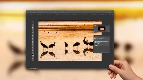
Color Correction and Adjustments in Photoshop
then if you perform color correction in photo shop, then the default settings that are often used are not often a good choice, and they can cause some issues. So if you're used to going into levels or curves to perform color correction, not everybody is used to it. But if you happen to go here ever and you ever use these eye droppers right here, if you don't use these are my droppers. This does not apply to you. But if you do the supplies to you, let me first make sure these air a default setting because I think I taught, uh, some techniques about these at a previous class, and I don't believe minor defaults. I'm gonna get mine to defaults. OK, but these eye droppers could be used to color correct a picture the way it's done. Is there three eye droppers? You'll notice. One is full of white, one is full of gray. One is full of black in the way you use them as you click on the white eyedropper, and then you move your mouse onto the brightest part of your photograph. The absolute brightes...
t part that is not a light source or a reflection of that life source on something shiny those air called speculum highlights. They're so bright they would They should be white on your picture. We're looking for, like the brightest area that would actually have a hint of detail in those light sources in, like the reflection of sun on a chrome bumper or something like that. They usually have no detail in your pictures. So you're looking for the brightest area that still has a hint of any kind of detail. In this case, it's most likely one of these clouds up here. I'm going to click on it. Then you grab the black eyedropper and you find the darkest area of your picture and you click on it. And there are techniques for finding these for locating them, and then you grab the middle eyedropper and you click on something that would be a shade of gray within your picture. Ah, shade of gray doesn't matter how bright it is, but you look through. If it's a white sheet of paper, that's a shade of gray is just a bright shade. What I mean is something that shouldn't have color. It shouldn't be yellow or orange or pink, it would be a shade of gray. And in this case, the sidewalk in here, I thought would be a shade of gray. And so that somewhat helped. Here's the issue. Whenever you use the white eyedropper and you click on your image, usually you're looking for the brightest area. That is not what's called a speculum. Highlight. Speculate. Highlight is so bright it wouldn't have any detail. You're looking for what some people call a diffused highlight, which means the highlight that still has a little hint to detail. Uh, and when you do that with this eyedropper with default settings, it's gonna trash all the detail the moment you click with it. Here's how to change that. If you double click on the white eyedropper, you get a color picker and in the color picker, I'm gonna look at how much ink would be used to print an area, and it shows me right over here. You could see that wherever I click with white eyedropper. This is how much ink it's going to use to reproduce that area. That means that if I'm clicking on the brightest area, that should have the tiniest hint to detail The moment I click, I trash that detail. I made it solid white. Here's how to fix it the lightest shade that you can usually reproduce universal, regardless of what kind of printer you use. Regardless, if it's a printing press or your desktop printer or whatever is about 3% gray. If you go any lighter than that, there's a chance in some kinds of printing. The printing process won't reproduced something that light. So what? Here's what I'm gonna dio. I first went to levels or curves, and I double clicked on the white eyedropper that brought up the color picker. Next, I'm gonna look in here, and I'm gonna click on the number next to the letter B. That's up here where it says HSB, the B stands for brightness. I'm gonna click there, and I'm going to use the down arrow key. And that means don't use white you something a little bit darker down Arrow key, but I don't know exactly where to end up, So here's how to figure out where to end up right over here. It shows me what is the amount of ink that would be used to print this and I'm gonna bring it down and tell the numbers that show up. There are at least three there now. Black isn't used in the bright party or photos, so it's OK. There's that. It's zero. It's just whatever numbers show up. I'm moving it until they turn to at least three. They're not exactly equal to three, meaning science a little higher. That's fine, but I'm doing it by adjusting the letter B for brightness, because what that does is that make sure we're still talking about a shade of gray. It's just a darker than white. You don't have to understand this. You only have do it once, and if you do it once from then on, whatever use those eye droppers to color? Correct. When you click with the white eyedropper, you'll still have detail where you click words with default settings. When you click, you're throwing away all the detail right where you click and it doesn't make it look is good. So click OK and it'll ask me, Do I want to save those whose default settings and I'll say yes. If you say yes, you only need to do it once and from now on for years to come. Whenever you go to those eye droppers and use the white one when you click, you'll still have detail where you clicked so that doesn't apply to everybody. Only applies if you use levels or curves and use those little eye droppers. And if you change the setting for the eyedropper, it will apply to anywhere where you find that eyedropper, meaning you if you change it in levels. It also is changing curves. They're the same eye droppers, all right. Then there's an issue Whenever you're adjusting color, if you're ever adjusting color in your doing, what I would call eyeballing it, meaning you're just moving around until the picture looks good. We all do it. You got to be careful. And here's why. I'm gonna load a weird picture into my Web browser. Stare at the cross here that's in the middle. And if you stare at the cross hair, see how many different colored dots there are. If you think there's more than one color dot you're wrong. There is no green dot there is no green dot there is no green dot. OK, what happens is your I adjust to whatever it seemed in right now, your eyes getting used to a pink dot being there, and when the pink dot goes away, your eyes compensated for it. It made it less pink, actually, and, uh, it's still compensating when it doesn't need to know. It's kind of weird. If you start moving your head around, you'll see. Still see some of those green things on occasion. Um, but if I actually open that file in photo shops, you can see what it's made out of. Here it is. Do you see a green dot? It's just animation that switches between these layers. You see a green dot There's not a green dot anywhere in this file. But if you stare at one of the stare at the bottom pink dot if you stare at it, do you see green for a second? Okay, stare at the next out, the one in the bottom to the left. A little bit. You see a green dot The second disappears, right, so now this means a couple things. The first is if you ever mess with the colors in your image when you think you're done, look away from your screen. Look at the rest of the room for a while, so your eyes are no longer adjusted to that image and then look back and reevaluate it. Give yourself, like, 20 or 30 seconds to look around the room or something else before you look back, because otherwise your eye has some memory. It was adjusting to that image. In the moment you change it, you're not really getting an accurate view of it. Oftentimes you'll find when you do color correction. If an image looked overly yellow when you got rid of the yellow color cast, the moment you say disappear, it looked to blue, and it's because of the same thing that magenta dot disappear. You see the opposite color. Your brain was so adjusted that image. So when you're done adjusting a color image, look away from it for a while and just a couple seconds and look back to reevaluate it because your eyes adjusting to it. The other thing about that is make sure the color that surrounds your image is gray. Do you notice that the footer shop interface every little panel in it is gray? Because if your eyes get used to these greys, there's no color in there in the more your eyes adjust to these graze, the more it's it's Ah, not being adjusted to your images. But you can end up with an issue if you come up here and there was a choice, it'll take me a moment to finance. I rarely have to go in and change it. Um, just a minute. Somewhere in here is a choice that says to turn off the frame around your image, and I'm sorry it will take me a moment. Teoh. Locate There it is to the bottom of the window menu. It's called application frame, and a lot of people like to turn this off because what it does is gets rid of that gray background that's sitting there behind your image so you can see other programs. You can see your desktop in all that if your desktop, if you love the color pink or something, and your desktop is full of a vivid pimp pink image and then you're working in photo shop and you can see that desktop in the background and it's got a lot of color in it. It's not this similar to that pink dot You saw in that, your eyes adjusting to it, and it's making it. So all the images that you're viewing your eye is not showing it quite accurate. So you want to end up keeping as much of that gray around it could. Gray doesn't have any color in it to influence your eye. So a couple things about that one is trying to keep vivid things around. Um, your images. The second is when you're done adjusting image, look away for a couple seconds, at least, and then come back and reevaluate it before you make any kind of a critical choice. And if you want to mess with your neighbor when you have a document open, you see this gray area out here. Control click on it. You can tell it first how bright it should be. And if you select color cussed custom color. Do you want to mess him up? Make it so it's not quite gray. They could pinkish gray or yellowish gray. And then there are eyes will adjust to that, and then every image they adjust, there'll be trying to make it less gray or little sa yellow. Just be careful. People can change that on you. You right? Click on it and you can change how bright the color is that surrounds your image.
Ratings and Reviews
a Creativelive Student
I loved this class - Ben is a really good teacher and the class is full of great easy to follow advice.
Bonnie
First off, the title cracked me up. The course was very good, easy to follow and Ben's a great instructor.
user 12004e
Excellent! Much better than I thought it would be. Invaluable.