Lessons
Class Introduction
01:45 2Color Sharpen Techniques in Photoshop
10:12 3Batch Retouching Photos in Photoshop
07:20 4Resolution, Sharpen, and Magnification in Photoshop
10:42 5Retouching and Adjustments in Photoshop
17:26 6Color Correction and Adjustments in Photoshop
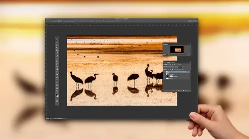
10:43 7Color Modes in Photoshop
16:03 8Spot Healing Brush in Photoshop
07:53Lesson Info
Color Modes in Photoshop
Okay, let's talk about color modes because there's all sorts of things to do with them in case you're not from there with it. Every image you open is in a particular mode, And if a double click on an image in a go to the image menu and choose mode here, it shows me what mode my picture is in. And most images are in RGB mode. But if you have an image that will be printed on a commercial printing press like you're sending out to get 100,000 brochures printed or you're sending it out and it will be reproduced in a magazine, then it's gonna be on a commercial printing press where it's being printed very quickly. And when that's the case, somebody might not be you. But somebody in that process will have to convert your image to see and why came out because on a printing press, those are the colors of ink being used, and it needs Teoh be converted. There are some issues where if you think your image is going to be printed on a printing press, it's very easy toe kind of mess things up, and so...
let's look at a few of the things that can mess you up. First off, whenever you change an image from RGB mode to see him, why came out it? Will I always ask you if your image has layers? This question, it says, Do would you like to flatten your image? We're not in a lot of people end up loving, have their layers here like I might want to make a change later. I don't want to combine those layers into one. Well, there's a reason if you ever convert your image to see him like a mode, that it always asks you this question. And that's because if your images made out of multiple layers in any of those layers, have soft edges like where they fade out and blend in with what's underneath, it's much easier to make a smooth transition if you're an RGB mode, because RGB mode is a simpler mode when you're in seen, White came out. It's more difficult to create soft transitions and to do a lot of things, and so a lot of people went up choosing Don't flatten and I'm gonna show you why that caused issues. If you look at this particular image. Do you see how we have a nice, vivid green glow around this? I'm gonna come in here and say, Don't flatten. Remember what I'm doing at the moment is converting to seem like a mode. If I choose, don't flatten, Watch my green glow. Did you see how it just changed by Choose undo before after. And I hear a lot of people complaining. I got to see my came of my colors. Look, you know, whatever. Well, if your color is fading out on the edge, blending in with something that's underneath, it's gonna look better when you go over here and convert to seem like a mode. If you choose flatten, there's a reason why it asks, and that's because it's easier for it to blend layers together. When it's an RGB mode, the results will usually look better. So if I choose Flatten, I'm in seem like a mode now. I didn't see anything change. If I choose undo, this is RGB. Just undo again. This is seem like a Does it look any different Now you can tell that I'm switching between modes because right up here it tells me the modem in and I'll just do command Z. Do you see? It's seem like a RGB um, so it's not always gonna be that dramatic as faras. The change goes, but there is a reason it asked. If you want to flatten your image or not, it will oftentimes look better. And that's mainly when you have a vivid color that has a soft edge on it that's fading into something that's on a different layer. It's better to have that done there, but there are a lot of other things you need to consider if your image will ever go to see him like a mode. And that's only for a commercial printing press. If you have a printer on your desk, you have a candidate or an absent or whatever brand it is. You don't need to go to see him. I came up. The printer itself will handle that conversion, but if it's a printing press, it's a commercial press. It needs to happen at some point, and you don't always have to do it. It might be the printing company that handles it for you, but it should be discussed with the printing company to say Do you need me to give you seeing why Kamenge is or can you handle the conversion? Eso? Here's another thing when you're choosing a color to use in this particular case, when I chose the color that I used here, the way it was created is I have some text and I add an effect called an outer glow. And the way you create that effect as you go here to the bottom of your layers panel, you click on the letters F X, and that's where you find the choice outer glow. When I went in there, I had these settings and you don't have to look at all the settings. The main thing is you have an opacity which ends up controlling how strong the effect is. And you have a size which ends up control, health, soft the edges and then this little square right here, where you can see green. That's the color of music. Well, I'm gonna click on that to choose the color that I'm using. Any time you know your image is gonna be printed on a printing press, then you can easily make a stupid move here. And that's because you can't reproduce as vivid of colors on a printing press as what you can create on your computer screen. And if you know that you're about to print something on a printing press, then whenever you choose colors for text or anything else, you want to make sure that it's not outside the range of what could be printed. And so one way you could choose green is you could just click here on green. And then if you drag up into the corner, you're getting an extremely vivid green Well, that green can't be printed on a pretty press and that Greenwood shift when converting to see him. Why came out no matter what, because it just can't be reproduced. We don't have inks that are pure enough to reproduce something that vivid, and it will tell you that any time you try to choose a color, if you ever see this little warning, that little warning, if I hover over it, it might tell me the name of it says. Out of gamut for printing, gamut means the range of colors that could be reproduced. So if you're ever picking the color, you know your image is going to be reproduced on a printing press, and you see that little guy show up. Click on it. You will now have the closest color that can be reproduced, but you should be aware also that it is dependent on a, um, setting that you have in photo shop that I don't want to spend time on, because it's something you to get settings from a printing company to know what to put in. But if you go to the edit menu, there is a choice in here called Color settings in color settings is where you set up to say, Are you going to be printing in a newspaper versus magazine versus a glossy brochure, Their settings in there that determined that because when you print in a newspaper, you can't reproduce really nice vivid colors. But if you print in a high quality brochure with that nice coated white right paper, you can get more vivid colors. So that little warning symbol that came up is connected to the settings that were in there called color settings. And you want to make sure you talk to your printing company to say what setting should I have typed in here? so that it's appropriate for the kind of putting you do. Then, if you are also pretty not a printing press, and you have an image like this one, you can have an issue. What the U issue is here is. Do you see the large areas of gray? Well, when you click on your foreground color and you pick a shade of gray, Here's the gray I've just chosen. If you look in the lower right, it will tell you how it's planning on creating that gray out of the inks that would use on a printing press. Do you notice anything odd about that? This stands for scion magenta, yellow and black. You notice it was using no black whatsoever? Well, what that means is on that printing press, they can control how much of each of those things is going on, and you can easily get to be a little bit too much of one anchor a little bit too much of one another, Inc It varies throughout the printing process, and if this is what our shadows and made out of where our grays are made out of than any difference in those will make it so that background doesn't look great. It looks slightly bluish or slightly reddish or slightly yellowish. That would make sense, wouldn't it? If the printing process is off a little bit, it's almost always off a little bit. Wouldn't it be better to make that background out of only black? So in order to do that, if you're in RGB mode, you can't. So there are some things where you might want to convert your image to seem like a mode. And when this question comes up, you might decide there's a good reason not to merge, because if you look at my layers panel right now, the layer that contains the background is separate. The layer that contains the shadow is separate, the layers that make up that bus graphic. They've been merged together into one piece, so there's not a lot of blending that's going to go on here. It's not as if like that shine that's on the windshield is on a separate layer, and it's blending into what's below. Those pieces that make those up have been combined together into one, but in this case, I might say, Don't merge, and now what can I do? to, um, get these to be fixed. Well, let's find out. I'm gonna double click on this because this is what's called a solid color layer. And if I double click in the left side, it brings up the color picker. But now I can actually change this mix as long as I'm in seeing White came out. If I was an rgb mode when you click, OK, it ignores these numbers over here and on Lee records the numbers for whatever Motorin and what that means is you can't dial in exact numbers here and expect them to stay the same. So here's what we're gonna do. Do you see the letter B here? B stands for brightness, right? Do you see the number 63? I'm gonna remember it in my head 63. Then I'm gonna come here to seem like a I'm gonna type in zero for scion, zero for magenta, zero for yellow, and I don't know what number I need for black to get the same brightness level, but I'll find out. All I'm gonna do is with the number for Black highlighted. I'll use the arrow keys on my keyboard to say increase it. Increase it in. What I'm doing is I'm looking at the letter B, which stands for brightness. What did it used to be? 63. So I'm gonna bring it until it ends up at come on. three. That means we have the same brightness as what we started with, but it's made out of the different mix of those different colors of ink. Does that make any sense? Let's do it again for the one other element we have in here. Click. OK, we're gonna come down here to this layer that contains the shadow. If I turn off its eyeball, you see before and after. That's what it contains. All double click on the left side cause it's a solid color layer and I'll come in here and see. We'll look at how much ink it's going to use all different colors this time, including black, but I want to make it a black only shadow. So what do I do? I look right here to say How bright is it currently? Just remember that number and I say no scion, no magenta, no yellow. And I just want to use black. What was the number I I honestly for 30 64 34. 34 were on the other 2nd 1 So 34. Okay, so I'm gonna bring this up, up, up. It was 34. 32 p four. So we have the same brightness, but made out of a different mix of inks. Does that make sense? So now when I click, OK, we should have the same end result visually because the brightness is the same. But if I were to come over here and open the info panel, which tells me the mix of inks were using and I put my mouse on the background and if you can see those numbers very easily, but do you see that it's only made out of black? And if I go down to where the shadow was gonna zoom out a little bit, um, it's only made out of black. So sometimes when you convert to see why I came out and asked you, do you want to flatten? There's a reason why you might not want to, and that's because you have large expanses of gray. And what happens is any time you convert to seem like a mode uh, It usually uses all the ink because it assumes you have a photo. And with a photo, little areas of gray or no problem. It's when you have huge expanses of grey, you want him to often be black on Lee. And when you're picking your your colors, remember when that little warning symbol shows up. Click on it if you know you're going to a commercial printing press now, what if you're going to be, um, adjusting an image and you're not going to a commercial printing press or you could be Doesn't matter. Maybe you're going to your desktop printer printer, and you want to see what would the colors look like? They're because your printers often can't rebirth whose colors as vivid is what your screen can. It's just the inks we have are not pure enough or we might be able to creating, said appear enough. But they be so expensive, it would be ridiculous. It's already ridiculous with the X cost, you know, um, well, what you could do then is there is a choice under the view menu, and it's called proof Colors. Proof colors means simulate a device. Simulate what this picture would look like when printed on a device like a printer, a printing press. And if I choose proof colors, you'll see the color shift a little bit, and it's simulating What would it look like there now? There again, there's a setting involved because it needs to know what we put into a newspaper or we bring your desktop printer. It doesn't know automatically, so you see a setting called Proof Set up. And here is where you can choose different ones. Ah, working seemed like a means. Whatever settings you would use when you convert to see why came out. Whatever those settings are set to be, it would use. If you were to choose custom, you could actually choose the profile that used when you print to your desktop printer your desktop printer. Usually, when you install the drivers for it, it installs a profile where when you're in the print dialog box, you can choose it. It's based on the kind of paper you're using. You'll see Epson premium glossy. You know that kind of stuff, and you could specify it in there. But when you turn on proof colors, if there's any colors in your image, that are gonna shift will shift on screen. And if I do it here, do you notice where it is? You see it on the nose of the Could you see it in here? If you ever can't tell where it ISS and it might not shift, you have mellow colors. If you want to find out where it would shift, you can come up here. And there's also a choice called gamut warning because colors that are gonna need to shift are known as being out of gamut. Gamut means the range of color. So if you choose gamut warring D. C, it puts great right on top of where it will shift. And it doesn't mean that you have to adjust the image to get the graded go away. It just means you should look there in, see if it looks messed up. And if it looks messed up, then you might want to adjust your picture to make it look better and do it in such a way where this great stuff wouldn't show up on it or do it in such a way. When you choose proof colors, it will show you how it's gonna shift you see that looks kind of dull, their tryto adjust it so it doesn't look, though. But do it when that's turned on. So do that. If you're gonna print to a printing press, you need to preview what it'll look like. They're, uh, try prove colors. But a lot of people end up just adjusting their images like crazy to get him look amazing on screen. And then they send them off. And they complained to the printer. You never print my images so they look like what I have on screen, and it's like, Well, you don't know, have any idea about the settings involved where you can actually preview that, And so proof colors means simulate another device. So you first need to set it up for that device so it knows what you're pointing to. Ah, but if you get a little bit educated about that, then you're not gonna mess up a much when you are putting on a printing press or even your desktop printer
Ratings and Reviews
a Creativelive Student
I loved this class - Ben is a really good teacher and the class is full of great easy to follow advice.
Bonnie
First off, the title cracked me up. The course was very good, easy to follow and Ben's a great instructor.
user 12004e
Excellent! Much better than I thought it would be. Invaluable.