Lesson Info
9. Printing the Swiss Alps
Lessons
Shooting for the Print
18:50 2Why Print
03:17 3Photo Edit and Test Prints
10:07 4The Big Print
04:17 5Calibrating Your Monitor
06:58 6Choosing Your Printer
02:40 7Choosing Your Paper
05:47 8Printing Italy
10:40Lesson Info
Printing the Swiss Alps
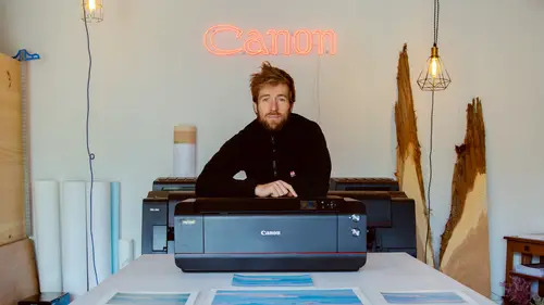
2nd image here. The Swiss alps first for us in the swiss alps we could call it about that from the get go. This is gonna be a problem here. See earlier we have this vignette problem. I'm seeing it here. So let's tackle it right now before it becomes a problem. Make a little mask up here. You can't really have to go away completely but simply make it a bit more relaxed. Right well what's going on here? Yeah, I need okay feels better now right now if you go into the soft proofing with matt photo paper I'm gonna be using we see that darks get dark, loose contrast. It's really about bringing it back. Imminence is your friend. I know the saturation is gonna suffer because I like this brown here a little money. I should same with my blue saturation up here looking a little lower aggressive on screen highlights three. That first frost idea when I hands. Okay let's give it a spin. Yeah, still using U. S. Letter 300 P. I. Standard sharpening matte paper, matte paper. South side is looking good ...
Brent. Get first prints come off, overall is looking good printing has brought a problem to life somehow. The trees have gotten red here you have to address that. Otherwise I like the blues are great. I'm gonna work on them. This paper is a tendency to make things a little more magenta than they are noticing. So something to keep in mind with the edit otherwise contract is good here. I like the information it's gonna address the orange thing here and the magenta and at the end of the day these are tama racks so they are orange in the fall so I can't go against nature. Just printing really brought back to life. That's a problem. But that's how it was on frame otherwise, contrast levels look pretty good here. Just last bit of saturation here when you get back with the brush, if you're getting these photos printed in the lab, you can't just be making fine adjustments. Right? That's why if you really want to be serious about it, you can print yourself, it's fun, you stretch, you do manual work. It's always rewarding as a photographer and you get to make them as you want. Good. Let's give it a second run. We've adjusted the sky and made a little darker, adjusted the orange needles here all to orange, little nuclear and adjusted the tent of the print to a little bit more green because this paper kinda goes towards magenta. Okay, Printing 2nd prints come out. So I really like what's up here? Those masses here trying to correct the orange tree here. I've lost a bit of that saturation. That was gonna nice in this version. So I need a happy medium between those two. I need to bring back some of the situation here, keep the chop as is Always three prints. 3rd prints come off. Oh yeah, we got the right balance, have the right white balance now, pretty similar here. I just get this pretty much the same added a bit more contrast. But you can see here compared to here and then brought this to life again because I think it's nice closing of the image. This is it. The trees here are good. Not crazy like they were here. Now we move on to more paper now let's hit it with a little thicker paper. So there's gonna be one adjustment to do. Probably at this at least one 1st off. You can see this is a little warmer than this so it's going to take that in consideration with my white balance. I'm gonna probably Cool it off a little bit maybe 5-10 points. Otherwise they're both mad papers. This is a little thicker but should react pretty similarly. Let's do it. I can load up its profile so I don't have it on this computer. So pretty simple. Mom. And try to I. C. C. There you go select your printer brand. Canon Pro Graf 1000 I'm using and tried out 1 81 19. Natural. And that okay now to install it you gotta go to the library. The best way to do this is to hit the option key. When you go in your finder up here go library. Pops up you're looking for the color sync folder profiles and then You throw that one in close quick that room. Open it. She'll be in there. So I've practiced on the cannon matte paper. The point is that I could have also practiced on mobs paper but because it's a bit more expensive, I just got my test prints down on Canon paper, dial it in and I can just simulate with the more profile and print with minimal adjustments. Let's hit our proof in here. Other we live in trailers right here. Just click it. So not much has changed. You can see with the previous profile and I can just the prince to get, don't miss anything. Looks pretty much the same. A little greener than me. Get a little purple in here. I've already adjusted my white balance and I can just print it now. You know how to install profiles. Alright. And I'm gonna make sure here I select mom and try to for the color management. Otherwise the rest is the same. The more prints come up. First glance looks very similar actually carries a bit more saturation in the blues. That's probably cause I lowered my white balance contrast looks a little better here. More richness. See how it handles better contrast. Both mad papers. But you see the difference here. I like the contrast better here. Yeah, just crispy on them. So it has a bit more punch than the cannon actually makes the image. Okay, sweet look at the difference From here to there. three test friends, you know a dollar each only have $334 expense
Ratings and Reviews
user c7bdd5
Thank you. Lots of good information. Well done.
Isaac Johnston
Through and also to the point! Well worth the watch, and I feel confident to print on my own now.
fbuser 517642fd
I would recommend it for anyone trying to understand the print process better but, I think Alex needs to work on speaking a bit clearer and maybe slow down a bit when he is moving his cursor around in LR as was difficult to keep up with him and to see what he was doing.