Lesson Info
4. Turning the Lights On
Lessons
Lesson Info
Turning the Lights On
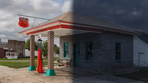
Well now I'm gonna show you how to take that further and to make it look as if light sources within your scene are turned on in illuminating part of the scene. That's gonna cause it, so wherever the light shows up from those light sources, it's gonna look like nice warm light, and the rest of the image will still look like nighttime. So let's dive in and see what's involved. I'm gonna start off with an image in the stage where it's already been converted to nighttime use. Let's start and see if a light would look okay. I'm gonna do color lookup. I'll go to that menu and let's see if moonlight might work. Not bad or, oops, up here, Ben. Let's see, we had that night from day. Well, they're not that much different. I might like moonlight a little better. But you don't have to be stuck using a single adjustment layer. Right after that, you're more than welcome to come in here and I usually do a hue and saturation if I was using that particular adjustment and put it underneath and just brin...
g my saturation down a little bit so the image doesn't feel quite as colorful, at least when it comes to the original colors from the image, because it's harder to see color at night. At this point, I just want the brightest part of the image to be slightly darker, so I'm gonna do a curves adjustment layer. I'm gonna bring down the highlights a little bit to make it really look like a darker time of night. And then I'm going to grab this little hand and just click on a darker area and bring it back up. About there. Let's see if that's doing what I want. Four's just so bright and afterwards it's feeling much more like nighttime to me. All right, well at this point I have my adjustments sitting here and if you wanna clean things up I could take these three adjustment layers, click on the bottom most one, hold shift, and click on the top one and then click the folder icon and that creates a group. And I could just call this night time. Now let's see if we can add some light sources. I'd like it to look as if there were light sources in the eaves in here. And so to do so, I'm gonna start by making a selection. I'm gonna make the selection about as wide as I think the light would fall off, meaning how wide of an area would a light bulb hit if it was up here. I'm thinking it would hit about this width. So I'm gonna go just a little bit below the area where I think it would stop hitting and I'm gonna make a selection about the width that I think it would spread across. Then I'm gonna make the height of my selection to get to the top of wherever the light bulb might be positioned. So I would say about like that. Then I'm gonna create a brand new layer to work on but I want the top of this selection to be however wide the light source would be and the bottom to be as wide as the light would spill across. To do so, I'm going to make the top part of this selection much smaller than the bottom. I'm gonna go to the select menu and that's where I'm gonna find the choice in here called transform selection. But when you choose transform selection, it's only doing what's called free transform. And I wanna use a special kind of transformation. To do so, I'm gonna go on top of my picture and I'm gonna press the right mouse button. If you only have one mouse button, then hold down the control key and click. That gives you the same menu. Here I'm gonna choose perspective. What perspective will allow me to do is when I grab one of these corners, it's either going to pull the opposite corner out or push it in depending on what direction I drag it. And I wanna pull this in until those upper two outer dots represent as wide as I think the light source might be up there. Now this is an imaginary light source so I'm just gonna guess that it was about that wide, that maybe there was a shade on it that defines its width. Then I'm gonna press return or enter. And now I'd like to fill this. I'm going to click on my foreground color and I'm gonna choose kind of a yellowish orange, whatever color light source I would like. Let's go for that one. And then I want the light to fall off. So we got a lotta light at the top and less and less light as we go down. To do so I'll just grab my gradient tool. And with the gradient tool active, I'll come up here to my gradient options, clicking this little down pointing arrow and I'm gonna choose this option. That's foreground transparent. So it'll start with the color that I've just chosen and fade out to nothing. Then over here I'm gonna click just a little bit above my selection and I'm gonna drag and I'm gonna end below this. If I were to end right here we would have no light whatsoever at the bottom of that shape. I do want some light there. So I'm gonna end up pulling further down. Down here is where we get zero and therefore up here we'd still have some. So I might pull down to about there and I might end up trying this once, choose an undo, and try it again. But yeah, there. Now we got an okay amount of light down here. Still have a good, good amount. And up here is where it's mainly showing up. So then I'm gonna get rid of my selection. I'll go to the select menu and choose deselect. Now I'd like the top of this to be blurry and the bottom of it to be really blurry. To do so, I'm gonna go to the filter menu. That's where I'm gonna find the choice called blur gallery. And that's where we have a bunch of choices and there's a few of these we could use. I could use tilt shift and if you're used to using that, go for it. But I just feel like using field blur. With field blur you get this little dot and you can move it around your screen by clicking on the middle. And I'm gonna move that to the top right where the top of the light beam is. And then there's this big dial around this. And if I grab the edge of the dial and move it, it's gonna control exactly how blurry the top of that light beam is gonna be. And so I'm gonna get it so we got an okay little blur on it. Then I'm gonna move my mouse to the bottom right where the light ends, right in the middle of the light source, and I'm gonna click. That's gonna add another one of those pins. And that gives me an independent adjustment for how blurry the bottom is going to be. And so I'm gonna start bringing this up. Now when I adjust this just so you know the color is not accurate at the time I'm dragging this do you notice the edge looks more white than it does the yellowish orange color? But the moment you let go it should recalculate and it'll give you a better idea of what that color looks like. So let's see exactly how wide I think that light source should be. Now, sometimes you get fancy. I could come in here and add an intermediate point. Maybe I want the beam to be a little more focused and then fall off more rapidly. Well, you could add another dot in the middle and now you're controlling the intermediate portion. And so just don't make it any more blurry than the bottom one. And you shouldn't though need to have three of 'em in there. Just so you know, you could control it independently. Just make sure it's getting blurrier and blurrier as you get lower. So this one's turned up. So it's about here. The middle one right now is in the middle and the top one is only about a third of the way or less around, or about a quarter I should say. But that's what gives us our softness. Now over here on the right, I have light Boca turned down all the way, same with the Boca color. Shouldn't matter in the end because this only picks up on overly bright content that's in there, but just so you know, I have that. And then I'm gonna click okay. So now we have the shape of some light and let's zoom up on it and work on just that area. And I can use my move tool and reposition it. If it seems to want to snap to things when you're dragging, 'cause sometimes it can move abruptly, you can hold down the Control key after you click your mouse to move it and that will prevent any snapping. Well I see right here it looks like a little wood beam and I'm gonna act as if the light source is right behind that. So I'll click right here and I'm gonna move it. So that is kind of behind, right there. Now at this point I wanna mask this. So the top portion doesn't show up where the wood beam is. Well I can't see the shape of the wood beam right now. So my layers panel, I'm gonna turn off the eyeballs on these two sets of layers, so I can see the original picture. I'll zoom up a bit and I'm gonna use my selection tool to say where would that light not fall. Well up here where this shape of the roof is, and then it would probably come out this way. 'Cause if it's behind this beam, it would not be lighting the beam. So I'm gonna go about like that, and then back up this way. Now let's turn those layers back on. And let's add a layer mask. The only problem is if you add a layer mask by just clicking here, the layer mask icon, it's going to only keep the area that's selected, and I want the opposite of that. I wanna hide the area that's selected. To do so, I'm gonna hold on the option key, then I'll click on the layer mask icon. Then I'll end up hiding the area that's selected. And let's zoom out a little bit. And the only thing with that is that looks way too crisp edge. So let's grab our little drop of water tool down here. That blurs things. And as long as our layer mask is active we're gonna be blurring the mask. And I'm just gonna paint there just for a second to give it a softer feeling right up there at the top. Zoom out. And now we got a beam of light. The only thing is it doesn't really look like truly light yet. Well that's because our opacity is at 100 and we haven't messed with our blending mode or anything else. So let's see if we might lower the opacity to get it to be lessened a bit. And then let's experiment with our blending mode. I'm gonna come over here and just go through them. Now this top section right in here, they're not gonna be good choices. They can only darken your picture so it's not gonna look like it's adding light. The choices in here will work because they're gonna brighten your image and you'll get a slightly different version with each. And you could just judge it, decide if there's any particular one that you like better. And in my case, this one ends up lightening the sky a lot more. I think I prefer that. Remember that's lighter of color. But then you can continue down here and you might find that you like some of these. I don't mind hard light, vivid light does not look good, linear light, and pin light. Let's say I like pin light. If it's just too much for you, again adjust your opacity, fine tune it, get what you want. If it's a color you don't like, then in your layers panel, click on that left part of the layer, 'cause that's where the color is actually located and go and choose image, adjustments, hue saturation. And in here we have hue. That's gonna change the basic color. So just look at your image as you drag it around. And you could choose any color you want in here but I might just fine tune it a little bit. See if I'd like it a little warmer or cooler. Let's say I like it about there. You can also adjust saturation, which is how colorful it is. And you're gonna find it's not gonna do that much. If you wanna make something less saturated, lightness is actually sometimes useful. If you bring it up, it's gonna look more like white light and if you bring it down, it's gonna get darker. But as you bring it up it'll look a little bit more like white light, and on occasion just a little bit higher might be more useful.