Lessons
Lesson Info
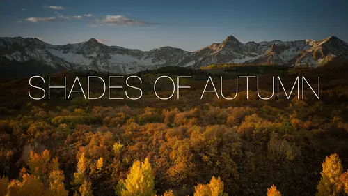
Photo Book Cover
Next one, Photo Book cover, you wanna do a Photo Book cover? So, let's pretend, as an example I am gonna do a Photo Book, let's do an eight by ten. So, eight by ten, looks good. So eight by ten, I start off with a blank canvas. That's, I know this is gonna be my Photo Book. I also know that I have a photo, so let's go with that one. And I'll use that secret little handshake trick. I'm tellin' ya, it's like impossible to find it anywhere, but for some reason it's the one I go to a lot, click and drag, hover over, nope, hover back here, and then release. So, drag my photo in. It's a little bit too small. I can free transform it. Edit, Free Transform, and make it a little bit bigger, like so. Alright, so Photo Book cover. This is not a rule, it's just something that you'll see done quite a bit. If you have multiple words, you'll see a popular technique is you put them on separate lines and varying, usually the same font, but varying sizes throughout there. So, as an example here I'm gonna...
put experiencing Iceland, so let's type in the word experiencing. I'll set my foreground to white. So, experiencing, let's move this into the center. Command or Control+T, make it a little bit bigger. I'm thinking that, just, I'll kind of walk you through my thought process. I'm thinking that Iceland is the word I'm gonna want to stand out on this Book, so I might not use quite as bold of a version of my font. I'm using, what did I use in this, Avenir? That's good, we'll stick with that one. So I'll go to maybe a regular size, or maybe even medium. Medium's good. So I got the word experiencing, I'll do my, I'll do my little trick here, Option or Alt, and kinda tuck everything in with the left or right arrow keys. Like so. Get that right into the center. If you want a quick way to center something, you can go to Select, All, and then when you do that and you have your move tool active over here, you'll see that there's a bunch of alignment icons up top here. So, one of 'em is Center Alignment. I can center it vertically, or I can center it horizontally, or both. Alright, in this case I want it to be up here a little bit. So another common technique would be, we go to our type tool again, and rather than just hit the enter key and start typing, what I'll do is I'll type the word Iceland. Get it into place, Command or Control+T for free transform, and then I'll transform it and kind of get it to fit the size of the space that we have to work with there. And so in this case what I'll usually do is I'll usually tighten the letters to where, tighten the spacing between the letters, see that one's too close, you guys see that? So we'll spread that one out a little bit, is that a little too close? You can kinda see it. So we'll spread that one out a little bit, bring that one in, and that one. So, I'll tighten the letters, and then I'll go back to free transform, and then get it to fit the space that I have. Okay, so experiencing Iceland, and I'll do one more, winter 2017. Bring that one down here. And then I'll probably choose a regular version of that font. In fact, we're gonna go back to Iceland, I know you guys were thinkin' of it, like, why didn't he choose bold? And bold's, you know, by changing it, it kind of just means we need to change the size a little bit. So experiencing Iceland winter 2017, and I won't go through the painstaking process of adjusting the letters, 'cause you guys have seen that, but that's a pretty popular layout, as you'll see. Just varying fonts and sizes, even all in the same font family, but varying fonts and sizes throughout there. And then I don't know why, but I see this all the time is we'll take white as our foreground color, and I just see like a little thin bar separating like so. So that's a very common way to do a book cover. Again, it's not the only way, but just an idea for you. And I kinda saved out, I mapped it onto, I transformed it onto a book, just so you can see, but that's kind of the idea behind something like that. Facebook cover. And, I say Facebook cover, this could be anything, guys. It could, anything that you have to add type on. But this was one that I was actually, I was adding some type to it and I thought it was a really good example, because I went in and I'm gonna type in Matt Kloskowski Photography. Let's bring it over the photo here. I didn't wanna use black, I wanted to keep the white tone of the photo going, so I specifically kept it as white. Building on our gradient technique that we had before. I had actually said, I was like for the most part we're gonna use that first gradient that we have up here, that linear gradient, which just creates it in a line. But building on that, you'll see one, it's the second one over from the right, it's called a reflected gradient. So I'll use this one a lot of times. And what you do is you start in the middle of what you want, and then you just drag the opposite way, and what it does is it reflects to the opposite. So, what you're gonna end up with is black down here, black up here as it gradients away into nothing, so here's what it looks like. So that's reflected, alright? Now, that's, of course, too much, so we just dial back the opacity a little bit, but that's a nice little trick to just hide your, you know, get your text into something, and not do a lot of work to make it fit on top of there. So, that way works. We can leave that, and then the other thing that we can do, and this goes back to what I was saying before, kind of release the notion that I'm never gonna have to modify the text. Like, there's gonna be times you have to do something to the, or modify the photo. So, just, whenever I'm stuck, whenever I'm like, man I can not get this to work, you know, I've got this on top of here, to me it still looks a little bit bright over the lettering over here. I go back to old fashioned photography techniques, and that is dodge and burn. The dodge and burn tools work great for something like this, so if you look over here, it's two below the gradient tool. You'll see like a little eye drop, and then right below that you got your dodge tool which will brighten, and then you've got your burn tool, which will darken. So I'll just take the burn tool, and I'm gonna make it on a separate layer, just press Command or Control+J to duplicate that, and then I'll go over here and now I can just selectively go and paint a little bit of that on. So, that's before, that's after. And we can see it in the before and after, 'cause you know that we did it, but if you didn't know that we did that you'd never see that I went in here and did it. Especially if I turned that off and kind of just went over here. Oops. Though, you probably have to use a bigger brush, and get a lower exposure if you're gonna do all the text here. So it's almost like doing the same thing we did with the gradient, but you're being selective about it. You're only painting it and kind of going into the areas that you want to in there. So, again, one of the oldest photography techniques that exists out there, but it'll come in handy in a pinch.
Ratings and Reviews
kasmath
Yeah! I was so excited to find another class by Matt Kloskowski at Creative Live! Matt is an amazing teacher who comes up with all kinds of ideas. He is clear, concise and easy to follow. He has a wealth of knowledge that he loves to share and his enthusiasm and love for his students comes through in his teaching. I have his Lightroom Course and am so happy and pleased with it because I have learned so much!!! I highly recommend this class of Matt's and hope you will love his classes as much as I do!
Audrey Agin
Good Teacher. Gives good practical ideas to add Fonts to your photo project & is not distracting. Thank you.
Cheryl Tarr
I loved this class. Matt provides a very clear explanation of different techniques to add text to photos. Short and sweet!