Lessons
Lesson Info
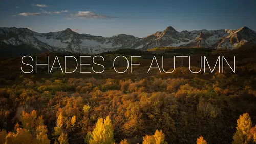
Use Opposing Colors
Now let's jump into how to use this stuff. How to make what we just took and actually make it work on a photo here, okay. Alright, first thing's first, let's take a look at one of the very, very first things that I'll look at. If I have a photo, I need to choose an opposing color. I need to choose something that's gonna contrast with what I'm about to put it over, okay. So in this case here, I'll go grab my type tool. Black would be a really, really poor choice if I was gonna put, you know, photography anywhere around in the bottom of this photo. Honestly black is not a great choice if I'm gonna put it anywhere up here in this photo either, unless it's gonna be like right over that rock. And it's still not a great choice for there. So you gotta choose an opposing color, right. White would work. I could go and take my type tool and change this over to white and white would work. I spelled photography wrong. (laughs) I said type tips for photographers, I did not say spelling tips for pho...
tographers. Jesus, there we go. (laughs) So white would work, white is not a bad color, alright. I'll even start to build off of that YouTube cover. That was a cover for one of my tutorials that I did called Advanced Brushing so I'll just put advanced and then we'll go over here and make it even larger, there we go. So white works, but colors can work too. So here's a little trick for ya. If you go, and you can just do a google search, it's called Adobe Kuler, k-u-l-e-r. It might not be called Adobe Kuler anymore. In fact, my guess is, is it's called Adobe Color CC, hence the name Adobe Color CC in the top-left corner. I know it as Kuler because that's what it came out as before, k-u-l-e-r. But I did a search for Adobe Kuler and this is what it took me to. So if you go to this website and you go under create, one of the things that you can do is upload an image. So in here I'll go ahead and grab that waterfall photo, upload an image and it goes through and it finds colors from inside the image. So those are kind of a good guideline to go and click through and see a couple of different ideas for what you might wanna use, okay. And then you can even change, like they have moods like bright, muted, deep, dark. I kinda like bright. So as an example, that's not a bad color to use. That would be another good color to use from up there. And then you can also go over here to explore and there's just a whole ton of different stuff inside of there as well. So that's another idea for you as well. If you're looking for a color, you just don't wanna use, and black and white is fine, it just gets a little bit boring sometimes. So if you're looking for a color and you can't think of one, you can do that. And of course, you can always just go and use your eyedropper. Just hit the letter I and you can kinda click around the photo and you can sample colors too. So what I'll do a lot of times is I'll use I and I'll click around and I'll find a color and then I'll, if you didn't know option delete or alt backspace will fill with your foreground color. So whatever you set as your foreground color, option delete, alt backspace will fill with that color. So that's an option there, but a lot of times I'll also go up here and then once I get into that color picker and it gets me into a general range, I'll just start to move around and pick something a little bit different, okay. I actually liked, I kinda liked a little bit of a yellow color here. Alright, so let's go in here and do what I did before, which is a little bit of just option left or right arrow and bring some of these guys closer together, like so. Probably make it a little bit bigger. Not to intersect with the waterfall, 'cause it gets hard to read over there. So there's one word. Another little trick that we use is, we alternate colors. So grab my type tool. I think this tutorial is called advanced brushing. So I can alternate, not only colors, maybe I'll go with white for that one, but also alternate fonts. So in this case, when I was creating this, what I wanted people to see was the word advanced. So what I did is, you can see I used kind of a bolder colored font for that. Then I'll come in here and use a different font and maybe one of the light versions. That's too light, let's go a little bit more. And then again, option left or right arrow keys, just to bring your spacing closer, like so. And then kinda tuck it in right there. Varying sizes and just go into free transform. You know, I can make it the same size as that or I can offset it a little bit. Again, for this one, the advanced was what I wanted to stick out so I'm gonna make sure that that's bolder, I'm gonna make sure it's the different color and then I'm gonna make the other words kinda secondary inside of there. And if you didn't catch how I did that, I just went to edit, you go down here to free transform and then you can just change that size any way you want. You don't have to go actually to the type tool and do it. Cool, alright, let's see here. I'm bringing that one a little bit closer together.
Ratings and Reviews
kasmath
Yeah! I was so excited to find another class by Matt Kloskowski at Creative Live! Matt is an amazing teacher who comes up with all kinds of ideas. He is clear, concise and easy to follow. He has a wealth of knowledge that he loves to share and his enthusiasm and love for his students comes through in his teaching. I have his Lightroom Course and am so happy and pleased with it because I have learned so much!!! I highly recommend this class of Matt's and hope you will love his classes as much as I do!
Audrey Agin
Good Teacher. Gives good practical ideas to add Fonts to your photo project & is not distracting. Thank you.
Cheryl Tarr
I loved this class. Matt provides a very clear explanation of different techniques to add text to photos. Short and sweet!