Lesson Info
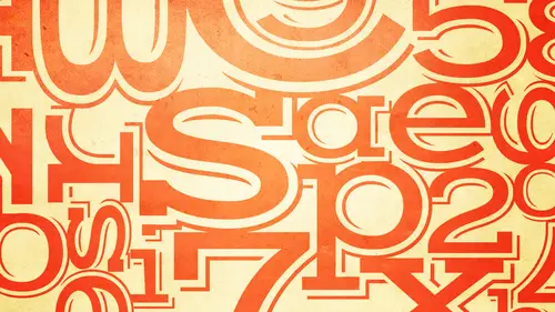
11. Are You a Type Criminal?
Lessons
Bonus Video with Purchase: 'Custom Letterforms - Gerard Huerta'
1:05:31 2Beginning of Typography
14:15 3Selecting the Right Type for the Job
40:00 4Text vs. Display
23:10 5Type Hierarchy
21:13 6OpenType Demystified
29:56 7Taking the Plunge with Type
15:28 8Think Like a Type Designer
23:10Lesson Info
Are You a Type Criminal?
So that was me now not really I'm rehabilitated now we're going to try to weigh rehabilitate everyone out there with some of these what what I called type crimes some of them you know they run the gamut from if you wantto keep with the metaphor some of them might require I'm not for the death penalty so maybe some of them require life imprisonment some of them are more like misdemeanors some of them you know, you might not even agree with some of these things are things that are hotly debated even in the type and design world but and a lot of these and you know, we start off with some that some of you might be familiar with but a lot of times people don't know the backstory why these things exist, why people are doing them and a lot of times it also relates to working with writers editors people like that clients who insist ah they're right about certain things and you're not and so what I try to do is I try to go a little more deeply into certain of these type crimes tto help not only...
educate you about them but to help give you ammunition to have conversations with clients um who might disagree that there's nothing wrong with two words spaces between sentences okay, so a lot of my my feeling and the way I tried teo teach my classes and designers is ah lot of these things do overlap what you might think is not your responsibility, which I consider all of these things you're responsibility because as you are the type setter as well as the designer, you are responsible for this some of these these things are things that come to you in manuscript that you get which I'll talk about specifically this one but some others so a lot of these things require you to almost become proofreaders, whether it's the original copy whether it's the final copy and my position is if you want to be the best designer you khun b if you want to be a value to your client to your employer to build your freelance business and to rise above other designers and creative professionals that don't pay as much attention to these details, my advice is to not just feel but that's not my job that's the way I got the copy that's the way they told me to do it, I believe it's your and our responsibility to take charge of how the final piece looks and and make changes accordingly. So having said that we'll start off with a double word spaces double word spaces between sentences which we still see all over the place we see it on the web, you see it in printed material, you see it in newspapers double word spaces are never correct in professional typography okay, the reason I stress professional typography I have seen dozens of dozens of blogged posts and comments, even two things I've written which are now out there for eternity people arguing about that this isn't right, I don't care about what you do in an email, I don't care about what you do in other instances, what I'm talking about here even though it's still not right, it doesn't matter. I'm talking about professional typography for jobs where you are typesetting material, whether it's in print, whether it's on the web, whether it's in motion graphics it doesn't matter okay, never acceptable in today's digital world of typography okay, so how did this problem start? Well, it actually didn't start with typewriters, but it sort of became mohr embedded there. You know, in the days of metal type, you can probably find instances and justify type where occasionally two spaces were added, but the most common, um, belief about how how this happened is we started using a typewriter way before computers and that's, you know, that's, my newest computer, what do you think I really could screen there can't wait to use it, uh, five hundred megabytes of memory anyway, typewriters, which we were using t type, you know, when I when I was in school and when I was not when I was in the business but when I was young so a typewriter doesn't have his many different keys and the many different possibilities as a computer okay, so typewriters also use fonts that are considered mano space typefaces. Okay, so this is this isn't the original courier from a typewriter but this is the courier on our computers that emulates what courier looked like. Okay um all right? So the concept of a typewriter was a typewriter had all these hammers which were exactly the same size so all the hammers had to accommodate a different character whether it was a thick hair white character, a narrow character everything had a fit on one hammer okay, so therefore you would have typed that looked like this are a little easier to see here where the end might be a normal looking character but because the m was so wide and had a fit on that same hammer it was made condensed in the sara ifs or made small because the iess such a narrow character thie sarah ifs on the I and other characters were made very wide. So with the exception off some very white characters that had to be made really narrow like an m ah great majority of the characters were very narrow that had to be made wide so what happened is overall you had type that looked very open you couldn't really control the space between the characters because this was a typewriter. So, um, possibly because of this, the practice of adding two spaces between the sentence was either established or continued from probably some for some earlier usage, because it was felt that it helped readability and distinguish one sentence from the next. So that's, how typing was taught and that's how some people still believe is the right way to do it. Okay, so these are the double spaces in today's world of proportional fonts. Okay, going back to this the's are mano spaced fonts. Okay, mona's space. As I said, even on a computer, every character has the same total with it's. Kind of like, um tabular figures from this morning where everything has the same total with meaning the design of the cliff plus the space. Okay, so this is taking tabular figures one step further and making a monos base typeface, which is courier. Okay, but the problem is, if you take a proportional typeface, which we use now, which means the ems can be is white is they want to be in the the eyes can be is narrow, and all the service could be consistent because type is set a little bit tighter, what happens is these double word spaces create visual holes that actually interrupt and slow down reading okay, so I'm I'm often going to tell you to squint your eyes down if you can't say I'm sure even probably see it but if you can't if you squint your eyes down you really pop out okay and this is just highlighting where they are it's actually easier to see it here so um they are not considered it's not that they're not desirable they're considered wrong absolutely wrong and professionally set typography okay the problem um with this and this is how this looks with just one care one word space okay so the idea is that you want the color or the texture of the tax when I'm in color I don't mean black on white I mean the relationship of black to white you want it to be relatively even so that people's eyes don't stop where there's a chunk of white space okay so that's the reason it's considered undesirable and considered a type prime so this is one of these instances where it's not just a misdemeanor it's really considered very unprofessional okay it's never acceptable the problem is many of us are given manuscript that has two spaces because it is so ingrained and people and I'm telling you that even young people are doing it because it must be that they're learning to type they're still teaching, typing or key they're not calling it kirschke stroking their calling a typing a cz if it were in the typewriter days so your old quite a bit younger than me and I'm sure you were all taught even though you were born in the computer age weren't you all taught to put two spaces between sentences okay most of you are saying yes okay so one day I'm going to apply for a grant to change the way they teach all that so I don't have to then tell designers not to do that but haven't done that yet so in the meantime so this is an instance where you could say well it's not my job you know what do I do about that? I'll tell you so so some of the issues and possibly some of the solutions I'm sure there's quite a number of you who have encountered boss's secretary's clients that insist that two spaces are right I'm telling you I've seen this all along so this is why I try to give you a little bit of background so you can explain you do have to help educate other people to get them so that you can do the best work you can possibly d'oh okay one of the problems is like I said you will get manuscript that has two spaces so if that's what you get sometimes you have to search replace search for two spaces and replaced with one before you even bring it into your your design document okay? You might say, well it's not my job I consider it your job because you're the typesetter as well as a designer okay didn't used to have to be that way if you have a piece and you complete a piece and it has two words spaces you put it in your portfolio and you go for a job interview what are you going to say when the client said when the possible employer says you know you work is beautiful but do you know that this is wrong to put to sea but what do you say? Well wasn't my job I got the manuscript that way okay so you know that this this session is not only about teaching this material it's helping you to advance and what you're doing is helping you to get that raise get that you know get that promotion do your own work and have your work stand above everyone else's and other people and show that you know more about typography because that's now type is hot right now okay type is hot what I mean is it's now come to the realization of so many designers firms ad agency studios that typography is critically important to good design into getting the message across okay, so anyway your work can show your understanding of good typography is going to give you a heads up or a leg up on other people so that's why even some of this seemingly unimportant stuff perhaps it's all important, one day, you're going to be called out on it? Um, one thing you khun dio, if you work in an environment, um, where you're working with the same writers all the time, or you working in an a in an environment where you're constantly giving different writing jobs to people you could create, first of all, in word, there is a preference that you can set if people are using microsoft word, where it will automatically convert to spaces toe one space as your typing. Okay, you have to I don't I'm not showing you that here, I might have a screen shell later that shows that somewhere that is what investigate that, so you can either change it for yourself. If you're working with other writers, you can create a style sheet of best practices, and you can make a list of many of the things that I'm going to be talking about, okay? Because a lot of these things also should be made aware. Two or two proof readers and copy editors, because they're two different things, but proof readers and copy editors don't always know the typographic conventions that might be important to you and or your company or your studio, okay, so, as I said, you might very well know not to do this, but you have to try to nip it in the bud, get to the source of it, help educate other people and investigate all the software you use to maybe get people to deliver copy that doesn't have those two words spaces okay next one is more complicated more back story dumb quotes okay dumb quotes smart quotes typographer sze quotes they all have have a lot of names first I want to show you the difference and then I'm going to tell you um when to use what and what not to use and sort of had again how to go about dealing with the problem okay, smart quotes adobe calls in a lot of software refers to them as as typographer sze quotes okay, you'll also hear them referred to as curly quotes although they're not all curly so these air the curly variety thes aren't curly these all right, curly? Okay those air a little bit curly okay, a smart quotes are quotation marks and apostrophe cousin apostrophe is just a closed single quote okay it's the same character, our design sensitive in other words, they're designed to match and blend with the rest of the typeface dumb quotes which you see under sometimes referred to as typewriter quotes because once again a typewriter did not have smart quotes it just had this one version it was used for everything okay, so there was no differentiation on the typewriter was really closer to a hand writing that it was to typesetting okay, so the dumb quotes typically are straight marks that go up and down sometimes they can they look like the type face a lot of times they don't okay there is not a right and a left version they're the same for the right and the left whereas the smart quotes have a right and a left or as we sometimes refer to them and open and closed and they can be single or double okay so this is just showing you some different variations of what they look like okay again it goes back to that same issue with the typewriter in the mac ah that didn't have access didn't have room for all of these okay so smart quotes also called curly quotes or typography is quotes are the only typographic lee correct cliffs for quotation marks a cz well as apostrophes as I mentioned a moment ago dumb quotes often referred to as primes ok what are primes? Primes are inch and foot marks ah but they're more accurately, accurately called typewriter quotes and here's why prime's true primes are a slightly angled okay as you see on the bottom here every slightly angled but most typewriter quotes are straight there are few fonts that contained both, which is why I indicated um are no pro that's the typeface that happens toa have both I'm not at the top of my head I don't know too many that do so typically we accept this version of typewriter quote as prime so primes are inch and foot marks how do you avoid dumb quotes well first of all you want to begin with typographic lee correct text which is not always easy it's like the two words spaces you typically get text that is has don't quotes again this is so up to you as a designer to fix this okay you remember you're the type senator the typographer as well is the designer so how do you deal with that kind of text ok well here is uh something that everybody should set as a preference inward okay if you go into microsoft word and you go along the top and you find auto correct this is not turned on by don't default it says straight quotation marks here replace as you ty okay notice over you let me go back a bit because this is you know kind of a confusing thing um by the way honestly there's so much detail in this section is going to be really hard for you guys if you don't if you're not able to go back to this section to remember all these details so um it's really you know for not not a big price it really makes sense for you too two purchases so you could look at it over because it's so much information and we're going to show you a lot of different screen captures and things that's just gonna be hard to remember anyway um okay so in order correct inward goto auto format as you type c it's one two, three go to this third aspect here replace as you type click this straight replace straight quotes with smart quotes okay, so is that going to solve all your problems no it's not it's going to solve a lot of problems but I'll show you why it's not going to solve all of them in a minute okay we still want to know howto avoid dumb quotes okay, how many of you went if you're using let's say in design when you get manuscript and it's your first job and you get a digital digital ward doc, how many of you copy and paste to put it in the indesign document? Okay, so you guys don't see but what people are sheepishly raising their hand because they thought they saw you know they're going to get told that that's not the right thing to do well I used to do that too I used to do everything that I tell you not to do that's how partly how I learned how to not do these things okay, I'll tell you why that's not a good idea and most software if you're copying dumb quotes your pasting dumb quotes you still have the problem okay guess what in design it can be really smart if you know how to allow it to do its job okay and and it might you know as I said I'm talking mostly in design there might be other software that could do similar things but this is the this is the most common application used for for design import text using the place import or get text option now I'm going to show you what happens but this really only works when you're starting a job and you're starting with a whole new manuscript it's not gonna work when you're getting corrections on emails and other things like that which we'll talk about the second okay so how do you do that? Okay let's say I'm looking to import copy and I'm not going to do that let's say want to important my to do list or whatever um in in design you go too um under there I don't know where it is under type or whatever you go you find place okay and so when you go when you find place that's also how you couldn't get pictures that's also how you get images but if you want to get type you navigate to the document okay this is what you're going to see on the bottom if this is not clicked this is not selected select show import options and I'm not sure I don't think it's turned on by default but for me it seems that once you click it and it always does in until you change it. Okay, so what's the next thing you're going to say because it's a microsoft word document if it was something else, it would know and it would give me other options it's going to come up with this and it gives me the option to use typographer is quotes so what this is going to do is this is you know what? If you have a four hundred page manuscript and it's all in dumb quotes alright this's gonna change them all for you automatically. Okay, so that's huge that's why you don't want to do the copy and paste? Because then you manually have tto look through everything okay? But you have to convert back any measurements to primes. What if you have measurements? Okay, it's, is it correct to use smart quotes when you're saying eight and a half inches by eleven inches as it is to have done quotes where you should have smart quotes so this is what's gonna happen when you do what I tell you it's going to convert not only the appropriate places it's going to convert the measurements so you know I don't know any other way it's manual you have to either read you could do a search somehow for numbers you khun visually look at it I mean the best thing to do is again to get the person submitting the text tohave it correct but I still believe that is your requirement is your responsibility to proof read this even though it might go on to a proof reader I just think that's just how I am you know and being how I am got me to the point where I can be teaching you this stuff I don't think you should ever say it's not my job because it's always going to better you and make you more valuable if you find this stuff okay so this is what's correct here this is the smart apostrophe this is the foot mark and that's the inch mork so just going back yes you've got to convert back any measurements to primes okay, so is that going to solve all your problems maybe not check for apostrophes in contractions you'll probably think this looks wrong but this is not correct this is correct this is a contraction. This should not be an open quote but your software's not so even if you have words set correctly it is not and maybe one day it will be it is not smart enough to know whether it's a contraction there's also another another instance it's not not illusion but it's something like that where where it's in replacing replacing characters that are missing okay all those things should be an apostrophe so it doesn't know it sees something like this at the beginning of a word and it's going to do an open single quote so these air things you need to look for I don't know of any other way if somebody knows a way please chat room let me know okay but you know no doubt one day perhaps they'll build in this intelligence or a lot of these words perhaps in word or something else I mean it seems to me it should be doable with all that advanced technology I talked about with open type that this should be simple but it's not here yet okay and finally proof you work carefully not fun I know even you know and get a good proof reader but I can tell you I find things that proof readers miss and I've been doing this for a very long time and I've worked with some very good proof readers and and you might know no matter how many eyes are on a job somebody always find something no matter how much time you have there's always gonna be one more mistake you're fine so you know it it's better if it's you that finds it then the client after the job is printed or something like that
Class Materials
bonus material with purchase
bonus material with enrollment
Ratings and Reviews
a Creativelive Student
Ilene's courses on Typography are jam-packed with excellent information that will elevate the quality of your work in print. She knows what's current, but also what's important in long-time standards, and why. Just an incredible amount of information! you will enjoy watching, but you will want to purchase because of the sheer amount of useful content.
a Creativelive Student
This course is packed full of the answers to questions I've had at the back of my mind for a long time. Ilene teaches with great clarity, her material is well organised, and she teaches at a good pace - with a bit of humor to lighten it up. I found it really useful.
shiran
This course taught me very well about Typography. I knew almost nothing before taking it (I barely understood then the difference between Serif and Sans-Serif...). And now, I feel that I really understand a lot. It is a very good starter to learn when, how and why to use type. Plus, Ilene is a great teacher with a big sense of humor and a lot of experience in Typography. A must have for everyone who want to understand something about types and fonts.