Lesson Info
9. Breaking Down Typeface: Bodoni
Lessons
Bonus Video with Purchase: 'Custom Letterforms - Gerard Huerta'
1:05:31 2Beginning of Typography
14:15 3Selecting the Right Type for the Job
40:00 4Text vs. Display
23:10 5Type Hierarchy
21:13 6OpenType Demystified
29:56 7Taking the Plunge with Type
15:28 8Think Like a Type Designer
23:10Lesson Info
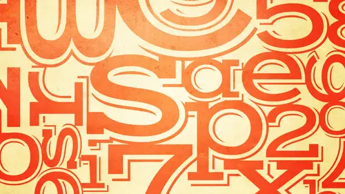
Breaking Down Typeface: Bodoni
First, I want to give you a little background about this particular typeface. Uh, because giambattista badani was a type designer who designed many different typefaces. And they all had his name, and they might have had a polly. They had different versions of it on dh and most, although there are there's probably over a dozen versions of badani existing today, including in digital version. Okay, and this one probably doesn't look much like what you used to seeing, because it has somebody asked this morning. What's the serif it's really easy to see here. These roll sara ifs. Okay, all these little extension's off of the characters here in here and so on and so forth. Okay, um, so many of the adonis that are available in the many of the adonis that people that come to mind are ones that we describe us having extreme weight contrast, in other words, they have really thin thins. They're very elegant, okay? And they have finn thins, and then the thick strokes, everything so they have this h...
ighway contrast, okay? And they're typically we think of them is used for display for large size usage. Well, one of the things I think, characteristics of metal type that was wonderful about metal type that we lost with little digital type is in metal type every single point size how toby cut individually by the person doing that okay and therefore they were able to the punch cutter is what they were called they were able to make minute adjustments in from nine point two ten point to eleven every time they went up a size or a few sizes they were able to make minute adjustments to whether it's this the width of the character the height of the excite and most importantly in terms of big tony the thickness or thinness of the thin stroke so that it looked good at all sizes okay, because a but dhoni that has a beautiful elegant thin stroke that looks good to winch is tall you reduce it too small you won't see that thin stroke at all. On the other hand, if it's made to look good at twelve point you blow it up there goes the elegance it looks big fat chunky okay, so we lost that ability for the most part when type became digital because digital type has what's referred to his one scaleable outline okay it's one outline that's used that you know outline that's described in digital terms for any size. Okay um about twenty five years ago there was an attempt by I was working in I t c doing typeface development and what we wanted to do we wanted to design a series of bad adonis that were good for three different different size ranges okay, so what happened is a number of us including summer stone who led the design team we went to parma italy it was a big sacrifice and it was really horrible was hot summer we had to go to the back tony museum and I mean it was it was it was a gift we had to go twice and stay for a week to ten days and we did actual research in the badani museum looking at the original punches the original carvings original drawings to try to get some inspiration to design three different versions one that would be good for very small type one that would be good for average texts and one that would be good for display. And so what we came up with is the eitc badani family of cib adoni six which was good for captions and really small type eitc badani twelve which was meant for text. Okay, so if this looks really chunky to you especially for a big tony that's because this is meant for ten twelve fourteen point text okay? And then there was the big tony seventy two which is that elon but the one that comes to mind the elegant beautiful thins okay, which I'm not showing you here but so that's a little bit of history that I think well it's I think it's a good story too under sand but I think it's also important to understand why this padonia looks the way it does with chunky sarah ifs okay? Because this is meant for text okay, so but tony is a, um and historic revival um little bit more challenging perhaps than the impact because they were decisions that you have to make that um you didn't really have to think about before. Okay, so the first character that er had to be drawn was a lower case a okay, now I'm going toe go backto what I mentioned before these two different kinds of a's and two different kinds of jesus one or two story and the one or two story g ok, the other one I left out the g and the impact here left out the a so if we take a look this is really just for reference for later but if we take a look and what we see here not everybody knows what kind of a two d'oh okay, I most of you have the version of the two story, eh? We've got a couple of one stories. Okay, so how do you know there's? No. As I said earlier there's no definitive way to know but I will tell you that in most historic revival typefaces such as badani casslyn baskerville century gara mont typically in the upright design which is often referred to as the roman as opposed to a talent typically in the upright. It is a two story, eh? And a two story g very often in the italic of the same type face, there will be the one story a and or ah one story g because italics typically or more kala graphic in nature, they they're not just slanted versions in these kinds of typeface, they're totally different. And if you convince jewel eyes in your head, you know what I'm talking about? So so so some people just have an instinct and they remember some people don't it's ok doesn't matter. You don't have to know you're not going to ever be tested on this it's. Just something to notice, because sometimes you deciding between two or three typefaces and they have one or two storey a's orgies and you might feel one or the other might be a better might have more ledge ability for your audience, or might have more formality for your audience. So those air things to pay attention to. Okay, so let's see if anyone got any free seats. Okay, the first characteristic is this this teardrop or this ball terminal? Depends on what you want to call it, okay, so anybody and that's characteristic. It's in the a it's in the sea it's in the f k it's in the bottom of this and it's the bottom of of the why so anybody that did any indication of that teardrop terminal was on oh, I forgot this one also has that one story. So if you if you had some indication of that like this one this one and this one you basically god you know you picked up a very good characteristic and that was that was good the others kind of missed it. Um let's see what else? The challenge for a lot of people sometimes when I see sometimes when I look at how people do these and I could actually see they're thinking I'm not sure this is true or not my guess is this person drew the one story and then said um lunch or maybe it's two story so then they added the top but of course if you add it later it's the height of a cab so it's just you know you can sort of see you thought process and that's good it means as long as you're thinking that's all good okay, so let's look at the two story eh that you guys did the other place that we're going to look at is how the stroke ends okay? And very few people get that write what people typically do is they draw serif this one also looks like we did that first that you're sarah if, um this one also has a little bit of a serif or they draw what I call a spur okay, so what's the spur look at the top of the p in the queue this is a sterile or better yet look at the bottom of the being the day because we're talking about the bottom this is a sarah if this is a spur so people might have been looking at either one of those and they the jewess spur or jewish serif even in the one story that's the serif that's the sarah okay guess what it's not either of those okay and that usually isn't and most people that again we don't look it uh characters that closely it just it has this little upstroke okay, so it does and you're going to find that in most typefaces and of this of this style um and and the rest of it I mean it's really hard it's a tough character to draw especially the two story because we're used to looking at them we're not used to drawing them, so they're a little bit challenging. Okay, so the next one okay, we'll look at the cane next and you start to see the same kinds of thinking or the things that that are going gets go wrong with some of these characters I will say that I'm I very often more than I've seen here but I would say I've been doing this exercise for seventeen years I would say twenty percent of all the case people draw our cab case okay I didn't see any of the first round I'd see one here now um this one is is just too tall this one's too tall but that's the only cab case sometimes I'll see a whole wall of capt case I don't really know what to say about that except you know that that the cap came the lower case k tend to be very similar and I'm telling you you think you know what it looks like and even designers will do it and not realize it until it's up on the wall so it just shows you are we can design with type but we don't always know so much what it looks like when push comes to shove and you have to put to the test um the important thing about this k yes this is a heavier too heavy type face but it has sarris and it's also wider than impact so there's a little more leeway for the k to take up a little bit more space okay what once again the important thing to pay attention to is where the stroke stresses where the weight is if we go here it's easier to see so upper right lower left are thin okay, upper left lower right are thick and that's the same with the k. So okay, this person got a little of it. This person did not get that this person didn't really get it. This person got that but it's you know this person got that this year I have to, you know there's no, like this here they're both thick and here they're both thin. So, um, you know, you can see it's challenging even when you have all this other information that's. Why I called think like a type designer it's about looking at all the other characters and trying to maintain a consistency. Okay, the other things to note are the stroke endings. This is a serif typeface. So there are there aren't sarah ifs on the top of those diagonals that are horizontal, just like they are in v w x and y okay, so even though this character is is sort of off balance, this person did do the right kind of sarah if this one has no sarah ifs this one, you know, it's just the weight is off, but they got the right kind of sarah ifs. This one is too highway. This this looks like like an art nouveau kind of a case, so it doesn't really match the time time frame of this typeface this one this is lovely this way say you could draw a great looking shape that's wrong okay it's wrong because it has because of really nicely drawn curved diagonal stroke but there's nothing else in this typeface that it would look like that would be a very inconsistent solution um and the same thing with this which which has this sort of ah you know table top leg kind of thing there's nothing in this typeface that looks like that here this one is off because that upper stroke has a verticality to instead of being ah horizontal so even the s can be very I'm sorry the cake can be challenging even though it doesn't seem like it's the most challenging character okay now we're onto the are ok we know a little bit about the r not everybody remember to do them let's see some of these air really not have bad I mean almost wish they were worse than I could make my point better what if they're good I can make my point so well yeah but okay so the lower case r once again has that teardrop terminal aspect okay so anybody that I suggested that okay that's I mean you know that's that's pretty nice this is missing it missing it that has its squared off so that's really missing it this has it this has it and this has it is actually some very nice ones okay um the thing that I talked about with impact in terms of its with applies to a lot of different typefaces place to everything in fact so if I were to pick this one or probably this one this one would be and this one I think what they might you know what I really think this person probably traced the end and just chopped it off that would be my guess on how that one was done okay but the thing is the lower case r well okay, so let's look at this or if you're looking at this screen it's a little bit better a little bit easier what do you think of this now? I mean, you know more than you did before but what do you think of this lower case r in this typeface in terms of the with okay well more standard but it's still thinner it's a narrower zare yeah, yeah in fact, most people in this exercise tend to because they don't know what I was going to say about the impact they tend to draw it really wide because this is a wider typeface but even in this wider typeface the lower case r is still narrower then you probably would think and I have to say whether it's was done accidentally or thoughtfully some of your ours here are even narrower than that one but are fairly narrow which is the way they're supposed to be so if we look at some words set here and I'm reminding you again this's a typeface meant for text so you're seeing a text typeface that really large okay so even with this narrow are it looks fine considering it's a text face okay, so again these are the challenging places are n r k r t r m r p because the negative space under the r creates a big kind of a hole next to other characters. So this is why I even in this typeface it's really important that the r b designed slightly narrower than you think it should be so that its spaces out as good as possible so all the other characters okay and as I mentioned, you're probably going to find this in most other typefaces and if not you might say now I noticed that space I've gotta look for a different fun you know? Okay t how many of you got to this tea and went I don't know what the heck a t looks like every people are giggling here like oh my god has just read my mind absolutely true it's happened teo you know all of us even if you think you know type so well you think you know what he looks like it's not what you think it's not this okay which is the way we learned to write it a za child so let's see what people did here okay I see a lot of l's with cross bars don't you okay so the first river version variation we see is the l with the cross far nicely done same thing here same thing here same thing here same thing here okay so we have just take your peak not en el with across more okay we have two that have this one has a teardrop terminal this I give you e for effort because the person was really thinking oh it probably has that ok it usually doesn't um this one and this one you know have a little more appropriate bottoms it does have sort of this upturned stroke in a certain way it's a little little similar to the a okay it's never going to be an l with a with a crossbar that's not what it looks like ok the other thing what else do you what else? Okay let's let's look at this or if you I want to keep your eyes in one spot you can look here and look at some of the others what's wrong with the others or what is surprising to you about this tea the height of it and the curve okay what about the height it's you exposed to t to be tall right but it isn't is it no guess what most lower case teas and typefaces are not as tall as the rest of the sender's I never say never I never say all because there's always exceptions but in general the lower case t is more like an ex high character with something that goes a little bit taller okay, the reason I kept this impact I don't know if you can still say this the reason I kept this up here because look at the word turtle even an impact with its really short ass enders the tea is not as tall as the l okay, so that is characteristic of this of most typefaces on dh somebody said the curve okay, this is something we just don't remember about these kinds of typefaces on dso typically they don't all have a curve they might have some other kind of a detail but they generally don't have a squared off um and end of that vertical stroke okay, so which is what I think everybody did nobody did it ok that well, this one has a little curve but I don't know if that was intentional or an accident it wass okay, it wasn't it wasn't anything itwas ok I thought so because that's really I mean, you have a good eye so or a good memory for design so that's good at least you had that that concept okay? So and in essence of this top is the closest that one goes off a little goes in that direction as well ok, take your eyes away from this for a second look at this t aside from everything we've talked about, what is surprising to you about this t other than the curve on the top and the shortness, what about the cross spores it's shorter and the left longer on the right? Exactly? Oh, he must have made a big mistake. You think know the asymmetry balances on the with the tail on there, exactly the asymmetry of the character. Okay, so basically you're trying to create something balance, so when you have something, something going on on the bottom, that goes off to the right, this is created to balance that off, but why not make that site is long and be lopsided? It would be lopsided, it would appear, is if it were falling backwards. Okay, that's number one, the other thing is it would probably create spacing issues, you know, next to other characters, but it would look lopsided. So I mean, you're spot on, you have a really good eye and very good instinct for tight because you're you're getting what could have other shy people but that's okay, maybe everyone sees it, but anyway, so again, these air kind of typical characteristics in a well drawn typeface that a type designers should be thinking about, okay, so the x let me see what people did this someone's this's very nice so you can see what the issues are kid again these air diagonals so what we're looking for is a thick upper right toe lower left and a thin upper I'm sorry a thick upper left toe lower right and the thin upper right toe lower left we're looking for something that looks balanced and has sarah ifs that aren't flat on the top and the bottom so yeah, that has all those things but it's top heavy and lopsided right? Those were the two things I told you can happen if you draw it the way you think it should be as well look, you know we learned to draw an x okay? This one doesn't have really enough of the way contrast to two um look like the ex thiss more like looks more like what do you think has the name of something cross a nordic crime? Whatever that is okay, so I mean it's tough so what's wrong with this is is the same thing in a sense that's wrong with this is that the stroke endings are perpendicular rather than horizontally aligned like everything else. So these don't look like any any of the other characteristics of this typeface ok, this does except this this's this has thick, you know thick strokes on the right side instead of carrying the thick stroke down and having one thin this one doesn't have much weight current conscious doesn't have much you know that one's not bad as I said that was pretty good but let's let's it's still challenging okay so let's look here look at the x on tony twelve look at the upper right and the lower left stroke do they look like they are connected to you? Okay now does it look like they're awful little does it look like they're awful lot and generally people see things differently can anyone sort of describe does it look like it's off the thickness of the thin stroke does it look like it's off the thickness of the fins of the thick stroke you have any what what do you see? Think it's off the thickness of the thins and that's that's what most people see okay do you see the same yes okay thank you are getting the bottom of the thin on the left side, huh? It's where the right side's thinness starts okay, so that's about the thickness of the skin it's shifted that much just like that much right? Okay do you see the same thing? Okay, I see the same thing watch this and this you guys it's going to be hard? Okay, I'm going to show people here and then I'm going to show you a diagram on the wall this is a little tough let me explain what I'm doing I'm taking this off the wall because what you visually see and the way a character is actually constructed are often very different. Ok, because optics make you see something one way when something has to be mechanically constructed another so when I used to do mechanicals in the old days, like when I was showing you this morning and we had to do pe steps okay, sometimes your boss would come over and if they wanted to see if everything lined up perfectly, they lifted off your board and they would look at it like this and they would go oh, that's not straight I mean, there's a way that you can seek actual mechanical alignment by looking at it sideways. Okay, so now I'm going to show you guys I want you to look at the x and you will think it's only a thin stroke north, not on ly a thin stroke apart, I want you to look at those two thin strokes this way, okay? I don't know from holding in the right place because I'm above you. Really? What is it? Does it different? Can you describe what you see very far apart very far apart? I don't think the camera can get this, but if you think you can, I just want to get people's reactions and people could okay, so look at that yeah there there it looks like the thickness of that they look totally they look like they're apart the thickness of the fixed rope not the fin stroke even though you know that when you look at it normally you still don't see that okay oh uh that's what I like e that's what I like yeah it's crazy right yeah okay so this is all optics let me see if I can show you demonstrate a little bit more I'll tell you why that's important okay so here's that x this actually when I want to show you is not even what we were seeing but I tried to show you because you know this is this is meant to be this wavy ok this was this was I told you this is for a text typeface and this imitated how type looked you know ten twelve point type in mental type it wasn't meant to be perfect that's why this typeface is warmer than very sterile looking but doni so when I took these two strokes and I extended them um it actually doesn't look as bad as what we thought we see but it still looks different than what you think okay the point being here um once again is in order to design a type is properly it's not what mechanically is correct it's what optically looks right to make it look balanced match the weight and the with of the existing typeface okay and a lot of people as people at home can see we had quite a reaction from the studio audience that you know if you won't be able to see until after you download or look at the actual axe and I urge you to do that the point being and I think the reason it happens actually is because we're viewing type and through with three dimensional eyes but you're looking at a two dimensional form so you're actually looking at it this way and so the designer has to create a letter form that looks correct when we look at it into dimension or in a flat surface because it's not a rounded character so whatever it takes to make the character look correct is what it takes to design a well designed typeface okay so they're going to always be a lot of surprise is the same thing holds true for your design the reason I focus on these things is not only so you can get a better understanding of what makes a good typeface in this respect but so that you can apply the principle to your overall type and graphic design which is whatever you have to do to make something optically look good balance that's what it is I don't care if the mechanics are off I don't care if you have to pull lines up down and around it should look good to you this way not this way okay, so that's always going to be true? Great. Now I know when people are enjoying this now, it's fascinating to see this with the baby because of this, would you say that this makes that the extent of the most difficult of the sarah's to kind of do this with? I think it definitely is, I mean, with the logistics is just looking at other tees, but to get the x to look balanced. I mean, you can ask other type designers, but I would say having evaluated many, many type faces that that it takes a lot of work because it's has to be drawn in a way that you don't think it should be. So you have to go against your instincts. If you're drawing an x and it's hard for people to do, they think it should be a certain way and it's not yeah, it is. It is difficult for those of you who are watching at home, they can print this out themselves and hold it up that way to see that different angle the way that you were showing our he's here do that because it really does look different that yeah, so if you couldn't see it on the camera, you can download this this is free with our vp printed out yourself. Holding at that level, and you can see exactly what we're talking about. The other thing is, when, when we're done with this. If you have this and you're just watching this and nobody else in your offices, give them the assignment on then you. Can you win a few points by teaching them a few things about type?
Class Materials
bonus material with purchase
bonus material with enrollment
Ratings and Reviews
a Creativelive Student
Ilene's courses on Typography are jam-packed with excellent information that will elevate the quality of your work in print. She knows what's current, but also what's important in long-time standards, and why. Just an incredible amount of information! you will enjoy watching, but you will want to purchase because of the sheer amount of useful content.
a Creativelive Student
This course is packed full of the answers to questions I've had at the back of my mind for a long time. Ilene teaches with great clarity, her material is well organised, and she teaches at a good pace - with a bit of humor to lighten it up. I found it really useful.
shiran
This course taught me very well about Typography. I knew almost nothing before taking it (I barely understood then the difference between Serif and Sans-Serif...). And now, I feel that I really understand a lot. It is a very good starter to learn when, how and why to use type. Plus, Ilene is a great teacher with a big sense of humor and a lot of experience in Typography. A must have for everyone who want to understand something about types and fonts.