Lesson Info
4. Text vs. Display
Lessons
Bonus Video with Purchase: 'Custom Letterforms - Gerard Huerta'
1:05:31 2Beginning of Typography
14:15 3Selecting the Right Type for the Job
40:00 4Text vs. Display
23:10 5Type Hierarchy
21:13 6OpenType Demystified
29:56 7Taking the Plunge with Type
15:28 8Think Like a Type Designer
23:10Lesson Info
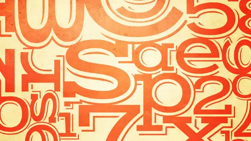
Text vs. Display
So now that we've looked at a few examples you've heard me mention um text typefaces and display typefaces so now we're going to go and that's that sometimes it's a tough distinction but I'm going to try to give you some generalities so you can have a basic understanding of the difference between a text typeface and a dissuade typeface text typefaces tend to be more subtle designs they tend to emphasize ledge ability and readability of course the readability is more something that you're in control of um and they tend to have personalities that let let's say whisper rather than shout ok and that's because the reason you know you want to read a book and not get tired of it after a few pages or not have it hurt your eyes or something like that? Text faces are meant for ah lot of reading okay? They're not usually what's used to attract the person to the piece to the website to the movie titles or something like that they're usually used for when you get into something display typefaces al...
so called headline typefaces ten to or can have because they don't always stronger personalities they can evoke things such a strength, elegance, friendliness could be child, child, child like could be danger like we saw the other book cover ahh and they tend to trade ledge ability for a more powerful feel the type faces you see on the left our text typefaces, which doesn't mean they can never be used for display. Okay, I'm just to see the thing that that is important to understand is that when a typeface is designed by a type designer, they have a particular usage or size range in mine, and so they're designing a text face or they're designing a display face. It might be able to be adapted for a broader range of use. And they might have this in their mind sometimes. So the letter forms might work well for everything, but not always the things that don't work well for everything that we are going to talk about in the next session on fine tuning and tweaking, um, or finessing is the spacing. Ok, but we'll get into that later. So what you see on the left? You see san sarah's and you see, sarah so gil san's is clearly a sands eitc century. You can clearly century stone and office senior you, khun. Well, not often seen a century and stone sands you can clearly see the sarah ifs news gothic so clearly ah, sands! So sensors can be used for tex and they can be allege a ball, okay, what you will also notice here is they all have a similar wait, so you're not going to see, as I said earlier, you're not going to see an ultra light and ultra thin, you're not going to see a heavy black wait used as a text face because they're harder to read on the right is a selection of display faces now granted, the's are extremely intricate, decorated with few will faces with big personalities that's not to say that every single display face has that news gothic is often used for headlines and display as well in the boulder waits and that's fine, but I'm just giving you an example of the kinds of things that you might see when you're looking for display typefaces, okay, so they are harder to read they have a lot more detail, they do have a lot more personality, okay, so they might be absolutely appropriate for a particular job that you're looking for. The thing that you have to consider is how many words you need to set because what might work for one, two or three words might become really hard to read for three lines of it, I like we have some questions that are coming in now we're showing these examples we have a user on facebook who wants to know is it better to have an arsenal of, say, half a dozen typefaces that, you know inside and out when you're designing or is it better to experiment more and have a wide range of different ones of you actually that's a really good question, and it speaks more to how how to build a type library, but I think it's an important of question that I'm just going to break away from this for a second and talk to you a little bit about it's, basically a combination of both here's, the way I look at it, if you're just building a type of library because you don't want to rely strictly on what you have on your computer, okay, because what you have on your computer are the fonts that you get with your operating system, although some of them might be fine, they tend to be dated, they tend to be overused, and they're not the latest greatest. You're not making a unique statement. Okay, so you do want to be open to new new fonts, okay, the way I usually recommend is job by job, become comfortable and familiar with what makes a good typeface in what might be right for a particular usage and make some basic purchases that become that you become familiar with because the only way you really get to know a typeface especially a text typeface is how it performs when you're using it you notice how it looks you notice the personnel e it has you notice the features in the fun and and sometimes if you you you have two or three of those you don't have to you never have to switch fonts for every single job some of the best type designers most award winning type designers will say I use three typefaces maybe occasionally I'll get different display face okay, so there's nothing wrong with that if that works for the things you're working on as for display, I think there's more the opportunity to explore what's out there what's really appropriate for that particular job because they're so individual that it might be rare that you're using especially these these are going to be tough to use twice unless you're using them in similar kinds of jobs okay, so as I said, my recommendation is is get a few solid text families of varying personalities ah that work for particular jobs you're using um you might be able to stick with those for a while and then be open to changing the display typefaces if the job calls for it another category we just talked about tex and display but a ever growing category of typefaces are those that fall under script kala graphic and handwriting funds, script and kala graphic fonts can overlap the text and display categories so some can be used for texts, and some can be used for display and not too many confused for both. But perhaps they tend to be there. They can be elegant, formal and classy, especially scripts, or they can be humanistic, quirky and individualistic. There's really no limit there's, no sort of set look for script and kala graphic funds. They're good for things such as invitations, announcements, headlines, initial letters. I also see them a lot using ads. In fact, I'm going to show you the whole idea of using something that's a little less formal, like like a little less formal in terms of being and historic, you know, the castle ons and the gara mines. I mean, those don't work for everything, so these kinds of faces have a different function in a different purpose and can achieve a different goal. The faces on the left are scripts and as you can see there's many different kinds of scrip, but they can have a severe slant. They can be very upright, like linus script and our redondo and fling. Okay, they can be of a normal with or they could be extremely condensed, such a zb, al morale or aristocrat uh is adora is a script but it's not as formal as something like it ward and script or being a become script so you do have a wide variety of scripts to choose from the typeface is on the right arm or kala graphic meaning they might have originally been done with a brush they're not they don't have the same formality as scripts and these airil all different ok so something like kick clearly it's very strong very dark very heavy look great in certain instances not going to look great for two three lines on a headline is going to be hard to read so that's you know some of these might not have as much ledge ability as others but they certainly have their own personality I mean things like free mouse ballerina oh cando they have specific personalities that if it's right for a job it could be spot on if it's wrong for job it could just ruin the whole job so and that's true with any of these but it's definitely true with the wide range of kala graphic typefaces that are out there I'm going to take a moment I know I'm using the words font and typeface it might seem interchangeably so I want to just stop for a moment and tell you basically the difference because in some cases they are they can be used interchangeably um a typeface is actually the design of the letter forms is the top design of the cliffs so when we talk about you know I mostly going to say typeface because that's the design of that that the designer has has uh has created a font in the digital world it is really software okay? Ah font is what you load onto your computer with a font is a digital representation of a typeface in today's world it was different in the world of metal because in metal type um a font consisted of us complete set of characters at a particular point size so if you had a font of castle on it was nine point and it was all the characters used for nine point or ten point or fifteen point or twenty four point but in the digital world it is the digital data or the intellectual property or the software that you load on your computer so that you can represent the typeface okay, so in some cases I will use them interchangeably in other cases later on I'm going to be more specific about font yes do that and does that include all the different styles the bold italic, the wide, the all of that? Well, if you're talking about a typeface you're often talking about a typeface family so a typeface family might consist of book medium bowl to tell in italic and everything and that's the same type face design or that we consider it a typeface family because they're all designed to work well together but the attack alec might be a totally different design than the upright roman but it's designed to work with it so you know, it gets a little complicated, but um, you know, you'll become more comfortable as you hear other people speaking of it people are pro trump going not no one's going to get nailed to the wall you guys for are the audience for saying the wrong thing unless you're in a highly sophisticated typographic environment with with, you know, studio award winning studio and somebody might call you wanted but I'm telling you the difference I mean and they can be used interchangeably if you say I want to use this fun or I gotta pick a font or I want to pick a typeface it's most people understand it to mean the same thing I'm just asking what has one eye hours of fun is this fun family and in that family you get all of those all the weight's, right? Well so that was my question well, that's a fun family same thing as a typeface family only the fun family is the software you load into computers so that you can print you could use that typeface so the typeface is the actual design the font is the delivery mechanism uh, technically, methane is okay, but I'm telling you, people are going to be using and interchangeably and people will understand but to be accurate that's the difference. Okay, so handwriting fonts remember I said there's there's ah, their scripts and there's kala graphic well, handwriting fonts are a little bit in in a, um a category of their own when you're deciding on and hiring running funds have gotten really, really huge now you see a lot of them out and they will have a kind of a similar look and I'll show you a few but there's many different styles of handwriting funds if you're going to use a hand writing font, you want to check the ledge ability of the caps and the lower case, sometimes they're not so ledge a ble and how alleged will do you want them to be? And you can't make them more readable if they're really poor. They don't have a lot of ledge ability you should view this is extremely important actually for everything view them at the required size range. So for instance, don't just go on to a foundry website and say, oh, this is the fun I want this is great, I got an invitation or I haven't and I want to use it for the whole ad because it comes in two weights that's not good. You need to know if you're going to use it at let's, say one inch on the cap height, and then you need to set something in fourteen point. You need to know how it's going to look at all those sizes. Okay? It might not look good at small size. It might not be as alleged ble it might lose everything. On the other hand, it might look good in a text size and look really blah and have no impact at the large size. So when you're selecting a font or a typeface to use for a job, you should try to get an idea what it's going to look like at the size range, the largest to the smallest handwriting. Fonts are fun to use, but use them with caution because a little goes a long way. The's air all some handwriting fond. Some of them actually did come from people's real handwriting's that were submitted to me when I was director of typeface development. And I see some people were submitting images that they wanted to become fonts. And, for instance, the second one delirious was submitted to me by de densmore, d'amico and she this was I mean, people weren't using computers as much, he had a whole hand written letter to me about you know, I'd love to submit this design and I saw this handwriting and I went, oh my god, this is incredible we have to make a hand where you have to make a fun out of that so ah lot of what I was doing at that time when I was with I t c in that involvement is try to introduce some handwriting's because they weren't a lot in available at that time that were unique and different and I mean that's an interesting story about that, but we don't really have time to go into that so much to say that she had to submit every character in maybe ten or twelve versions and then we decided because making a fun which are the, which is best because writing a handwriting and making a handwriting fonder different because you have to have repeated letter forms you can't have an infinite a number of changes, so all of these air different handwriting funds the one on the top of the right claire hand is similar to what you see most often today there's lots of versions of this is a very popular kind of style, but there's still a lot of different handwriting fonts that can work for different jobs could make things very unique all right, so now we're going to look at some images of, um script kala graphic and handwriting fonz um this is I mean this is lovely here's where the type is not taken you know first it's not not the focal point it's really it's maryland so you can't have crazy busy type okay but you can have something super elegant it's very easy to read you know what it is it says it all it says it very elegantly and very simply combining it's also a nice pairing of a uh I don't know if you'd call that yeah you call this a handwriting fun you see it goes with something very simple a lot of white space this is actually this was done this is a font okay if you look at some of the repeated letters it's called smack designed by jill belle and this is I know this is all music already but the's a roll fonts and it looks great so here it's not about being super ledge a ball you could read counting crows were the subhead is a little harder to read doesn't matter it's about getting the feel of the music these are some of the more current handwriting fonts from actual promotions on the web so if you go to enough of websites or web or type foundries and sites like that you're probably going to see these if you go to enough of these either type foundry websites they do really cool graphics to promote the typefaces so they give you ideas on how to use them okay um just because we're talking about typography doesn't mean it's all about phelan fonts okay sometimes the best fund for a job isn't it fun sometimes it's hand lettering okay some projects require a type treatment that cannot be achieved with an existing fun sometimes the skill of a lettering artist or a calligrapher might be the best approach so here's some examples this is something done by jill bell I don't even think I have to explain why this would be pretty much impossible to do with fonts even if you had fancy fonts because there's so everything is so interrelated and intertwined another piece she did while there might be a font more easily created out of this look if you start reducing characters and enlarging other characters you're going to have some that a heavy some that are light um so something like this um might be better given to a hand letter ah love this piece she also did this so this is not meant for children okay this is for parents to sell them on a particular language program that teaches students to work at their own pace okay so it's about it's about talking to the individual individuality and different learning needs of children so what she did is she thought about it and she said this piece you and she does all these handwriting's herself I don't know I I don't even have one good hand writing and she's got like you know zillions off him okay, so extremely clever you can read it. You does give the message it's definitely illustrates the message of individuality of you somebody's children so I think it's a brilliant solution ah gerard wear ties extremely talented a lettering artist again, this is a logo which would be very hard pressed to do like this using any font a little hard to see but I think you get that this is a highly decorated spend syrian a treatment not overly complicated but things are on an angle and and and if you I don't want to use the slanting tool of your software which will talk about later because that distorts shapes but even in the word brand the d is smaller than the a and that's not something easy to do sometimes if you want things going on an angle, the best way to get them toe look good is that haven't done by a lettering artist very cool hand writing done by the illustrator of the image um the ole you know what I know that's hand on it couldn't you could make that of tauron paper and scan it I mean there's so many ways to be creative with type that I also encourage people don't necessarily stick to type faces if you feel inclined to experiment with doing something like this um apiece done for a paper company which means you have a lot of freedom a question of identity okay, so this was done as part of one of the pages and this was hand lettering but it speaks to the message who am I what defines me? You know what makes me different so it wouldn't wouldn't really work it was just said in a castle on or gara mon here it is being said individually so that its illustrating the concept of why are we different? Um for illustrators try your hand in integrating your own type into your pieces beautiful invitation for an aids fund rised razor s o clearly we you know we know what the red ribbon is and we see the clinking glasses so you know what it is but then all the important information is integrated into the ribbon my hand hand lettering okay another again since the countess supposed her this is a concert poster. How cool is that? This is something I found recently in a magazine and I said, well I think this is him I'm pretty sure this is hand lettering I don't think this is a fun um but it actually a minute works well from a design perspective to combine the typeface you know the actual typeface treatment with a little bit of hand later so it's almost like we're you know we're writing in her own making alterations to a recipe um another instance of one page of an editorial spread, and these are things I will say, you don't always have to hire a lettering artist. If you're interested and you're brave enough, try some of this on your own. You might be able to do it. You might surprise yourself. You might have a sister, a friend, a partner, a mother, who you just say, you know, right this stuff out, you have a cool hand writing, maybe I could turn it into a type treatment, so, you know, go crazy, sometimes, try things different. This is another again, cool it in your dreams with with us, with the, you know that the headline, and I guess you'd call it a pull quote, perhaps it totally makes this spread. If this were sent set in a traditional find, it probably would be a lot more boring.
Class Materials
bonus material with purchase
bonus material with enrollment
Ratings and Reviews
a Creativelive Student
Ilene's courses on Typography are jam-packed with excellent information that will elevate the quality of your work in print. She knows what's current, but also what's important in long-time standards, and why. Just an incredible amount of information! you will enjoy watching, but you will want to purchase because of the sheer amount of useful content.
a Creativelive Student
This course is packed full of the answers to questions I've had at the back of my mind for a long time. Ilene teaches with great clarity, her material is well organised, and she teaches at a good pace - with a bit of humor to lighten it up. I found it really useful.
shiran
This course taught me very well about Typography. I knew almost nothing before taking it (I barely understood then the difference between Serif and Sans-Serif...). And now, I feel that I really understand a lot. It is a very good starter to learn when, how and why to use type. Plus, Ilene is a great teacher with a big sense of humor and a lot of experience in Typography. A must have for everyone who want to understand something about types and fonts.