Lessons
Day 1
1Class Introduction
10:02 2Color Models 101
26:46 3Color Schemes 101
45:39 4Debunking Color Fears
44:02 5Debunking Color Fears Pt. 2
25:23 6Evolution of Tobi's Color Style
42:37 7Evolution of Tobi's Color Style Pt. 2
44:12To Trend or Not to Trend
12:47 9Color & Design Trends
31:36 10Color & Design Trends Pt. 2
25:37 11Tobi's Color Inspirations
22:09 12Tobi's Color Inspirations pt. 2
23:29 13Using Inspiration Boards & Q&A
19:43 14Psychology of Color
36:34 15Color Meanings
17:04 16Psychology of Color Q&A
12:55 17What to Consider Before Choosing a Color
26:20 18The Right Color: The Entry & Living Room
19:27 19The Right Color: Family/Dining Room & Kitchen
21:19 20The Right Color: From Bathrooms to Outdoor Spaces
20:05 21Pairing Textile Elements for Success
28:49 22Pairing Wall Color, Pattern & Texture
24:42 23Floorings, Furnishings, Art & Lighting
19:04 24Intro & Top Color Palettes: NYC Showhouse
24:41 25Top Color Palettes: Hampton's & Richmond Showhouses
21:31 26More Top Color Palettes
33:46 27Layering Color Palettes in Your Home
38:16 28Transitioning Color Palettes in Your Home
28:08 29Historical Overview of Color in Design
16:47 30History of Color in Design Examples
43:59 31History of Color in Design Examples Pt. 2
16:32 32Color Mistakes to Avoid: 1-6
31:20 33Color Mistakes to Avoid: 7-10 & Final Q&A
40:06Day 2
Day 3
Lesson Info
Color Mistakes to Avoid: 1-6
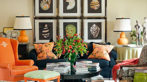
Thank you so much again, like she said, for all of you and your questions, and so I love this idea at the end of the course the tops, ten color mistakes to avoid in, please jump in as we go and I know you ladies, we're going to be bringing me more questions, more cues from the audience. I love that to see what people are needing to know before we wrap it, but so I know sally, maybe a little disappointed that I'm not just bringing you ten crazy rooms and how to not create those in your own house, but this is really more about you'll see in a second what I would call more overarching or kind of philosophies that you want to take into account as you start bringing color into your home. So I know I've given you all the rules, but now how do you really jump into them without making mistakes? Eso let's think of a few of the what knots to dok so color mistake number one, I think, is for me not starting from square one. So so what does that mean? Well, first of all, what's the consequence. If ...
you don't start from square one, well, you will tie your hands behind your back and you will shut out some amazing color. Options and possibility so this might mean a number of things and we'll look at this just a second but right off the top of your head you can think okay, well, if there's something in my house that I don't love but I'm going to force myself to design around it, that could be not starting from square one, so what I always do is a designer in any space whether I'm looking at a floor plan or a color palette is I look at the room or the the house, whatever it is we're taking into account as an entirely clean slate on I don't tie at least a hand or two behind my back because I'm trying to really keep something that may or not may not be that important s o what else happens if you don't start from square one? Well, your designs won't ever read each that potential that you're striving for and you might not even feel creatively fulfilled, right? Because a lot of times when this happens a lot with clients where they think okay, we have to use x like even in those rooms where we had to use a certain stained bid or we had to use a piece of furniture and ultimately you know what they almost always decide to do it like after we've spent all these hours and money designing around something at the end they go yeah, I just still don't like that let's go ahead and get rid of it and wouldn't it have been a lot easier and saved us money and allowed us to really move and said that's creating a design and a color palette for ourselves that we really loved if we were able to step away from that at the very beginning so I don't want you making this mistake. So how do you prevent this mistake? Well, you make no assumption about what is or what is not possible in color and design in your space you are open to everything, you see the potential in everything, not the limits and that's what I think a lot of people start with, you know, we were saying even yesterday of, well, I can't pick a bright color because my husband won't like that, and I can't picket this color because this person won't like that or I hate green. The green is not gonna work, but there's a million greens and there's a million bright color. So are you setting yourself up for failure because you're not seeing the possibilities? Sauce certainly want you to really be seeing the possibilities have a no limits approach two color when you're starting with your with your color palette in your own house, so leave that color and design baggage behind because it can only limit your creativity right and then tap into those key resource is of color and design inspiration that we've taught you here so go back to what inspires you whether it's travel or maybe it's the history of design and really start letting things flow without deciding yet if they work or not we're gonna have all the possibility is home tio the forefront to begin with and then we can always start narrowing sent some things out but start with square one okay and give yourself permission to think in a new ways and dream big that's what we wanted teo right off the best so no not starting from square one for any of you number two not putting the room purpose first so yes, we can say I've been dying to have a bright yellow room but maybe this doesn't work for me. So what happens to us when? What are the consequences for not putting your room purpose first? Well a room that looks great but doesn't function and as we've said many, many times, how does that help anybody if it looks great but it doesn't really function for you you're like, oh, I love that bright orange bedroom but I'm gonna have to sleep in the guest room because I can't get any sleep in there at night s so what are you going to do to make sure that you really bring the function piece into the color concept and make it work for you. What else is a consequence? Well, a room that really can take its toll on the people who use it because we learned this even in color psychology, right? Some kind of giving you a recap of what we've done for these last few days, so we don't want people to be overstimulated are under simulated or distracted because you forgot to really think about your color goal for the room. So how do you prevent this mistake? Well, from the start, build your color palette on an honest assessment of how the space will be used, and not just by you, right? By whom? And then what aboutthe how often piece. So remember when we talked about that a little bit yesterday? Like how often different people are using the space? So be sure that you're really setting it's, really the it's really the homework of deciding what those goals are that's going to be a big color mistake for you, and we see people do this all the time in design, they just go out and on a whim they fell in love with the color and they paint the whole room, that color, and, yes, it's beautiful, but it just it doesn't work for them in their space and that's a a mistake that I certainly want you to avoid so it's about asking the questions and put your little designer had on pretend like you're toby what would toby do on and think about how us say I asked tons and tons and tons of questions and have questionnaires and interviews with all the people that we're working with to really get underneath what needs to be happening in their spaces because, yes, there is a version of that color that you're dying to use that can someway make its its appearance in the room and you really just need to do all the homework first to know how to bring that into the space um and then again, don't forget that you can go back to this course especially those of you who are buying it that you're gonna want to go back and listen and think about or the notes that you've taken on the psychology of color and really the way they affect those moods and choices. And I know we've talked about that a lot, but you could get out of this course and get so excited by opening up those paint decks that you really skip this step and it's an important one not to skip it's going to make a huge difference in yur color success um okay here's an interesting idea when we're in the business courses I teach I teach people to start before you're ready because they're so paralyzed by stuff that I say, just go out there and try something, but I don't want you to do that at all with color, I want youto plan, plan, plan, plan and then start making the right color decisions for you. So I guess there are a few of you out there that are going to get so analysis paralysis that eventually you'll have to start before you're ready, but not on the first day, it's more about some planning that we've been talking about so let's see what happens if you don't. If you start before you're ready, well, what we don't want, and many of us ever already a pro at getting this right is a haphazard, piecemeal design or are expensive mistakes because we jump into something. I fell in love with fabric, like you said, and cover the whole self in and then it's the wrong thing, so you might as well have not done it all right cause that could be an expensive mistake and constant frustration for many of us or all of the above and that's happening because you're just making one ofthe decisions for a space or an item in a room and not really looking at the plan and even thinking this morning, if you and we'll talk in a minute about decorating and designing like the pros but remember that I don't even just play in a room in a time, but sometimes I planned an entire home, which could be really a lot of detail at once or at least think about it a little bit, so don't start before you're ready. I want you to get the plan together and you've been doing this already, right? So you can see the benefit of what that's looking like free, and he said, it gave you a lot more confidence. Um, so starting before you're ready, the way to prevent that we know is just looking at all the items together and don't forget this is a key piece toe look at those finishes on the furniture, on the lighting fixtures, the medals, the stained woods, all of that the flooring is all part of the whole color picture it's no longer just the walls or just the fabric it's every single piece in that space, so think about it all together and then maybe even creating some of those sketches and drawings we've talked about or, you know, doing kind of some little you may not be a great render, but sometimes you can even just start putting a little sketch on paper to kind of see how it's going to come together or put a little color pencil on there, play with those highlighter tools spoke about before and there's a bunch of online tools that can help you do this, like websites like polio board, which I don't know if you know that side, but it's a really interesting sign, and you can build mood boards or concept boards like ideal, but you can also build room scenes where you can plop a sofa in and put the drapes in and start really see seeing and visualizing what it's gonna look like in your space. So those air some neat tools for planning on dh not starting before you're ready on, then remember to take those paint swatches and those fabrics and a look at him in your actual space, and even at different times of the day because you don't want to be like me and have to make room and shades three times for one tiny little butler's pantry, because I looked at it at the wrong time of day on more than one occasion, and it just didn't work. S o again, lots of ideas for starting before you're ready, and then giving yourself time for your vision to evolve and change. So I'm kind of saying put the brakes on in this process and something like using a a website like pinterest even to collect ideas or olio board khun sort of give you that creative excitement and energy you need. Even before you buy, so so go spin that excitement instead of running out to the store and buying the first thing you see and use some of these cool sites that ad on the web to start vit envisioning what it's all going to look like together and then you'll be ready to start. Okay, so what's number four not taking color seriously? Well, I don't think anybody in this class is it's going to be at risk of any longer not taking color seriously, right? Maybe on the first day, but we've spent three days telling you how color is way more complex than you ever thought it was on and you know, now that may be picking your paint killer is going to be one of the last things you're going to do, so had it. What do we do, teo, avoid this guy a mistake of not taking killer seriously? Well, don't forget about those common problems like oversaturated walls or maybe neutrals that don't work because they have the wrong undertone or really that colors that compete with each other instead of cooperate. So I know many of you are going to be pulling out the old color will and seeing if things cooperate with each other again, right? Those are going to be the consequences if you don't do that, so returned all those color basic kind discussions we had and remember the tones and the tents and the shades and all those teeny little detail ls that air going to help you make sure that you really take color seriously on dh, then knowing what you want, go back to maybe even my pinterest boards and study some of those harmonious palates that were analogous or maybe a really contrast ing palate? Or maybe you get inspired like I do, but someone like dorothy draper, who loves contrast and you're gonna mimic some of those ideas that we learned in the history of designed to help take color really seriously in your space on dh, then also respecting the shifting and changing and slippery nature of color, even when you're thinking about what content fabric has and all those other little what we call nuances that are going to help you really be able, teo, as we say, dance with the color in your space, which I love that idea because I'm clearly a tap dancer. We've seen that online, right? Um and then eso don't forget all of that don't forget the texture and all that dynamic nature on how it brings color to life in your space and once again those wood and metal tones and using my trick of reading those like their colors as opposed to getting overwhelmed with which one can go in your space so we've got sequence and linen high type b I love pink, but my husband is not a fan. I'd like to use it in our spices. How do you recommend I do it? So maybe you're going to try and, uh and that maybe sig weighs in with what I was going to ask, which is what if you've got a client, maybe the behalf of the client who's just going just get it done, just get it on the plane is ready. Just get a time. That is so you have someone that may be doesn't care for the color or someone that's just may be the same. You know what I think? There's a great solution that actually covers both of those ideas, and you know what it is? Does anybody know what what I'm gonna say? Anybody have a clue? What I'm gonna say involving both of those people in the process is going to be a key, a key solution to help them. I understand why pink might work in a space are bringing them into helping decide other colors that go into the room. So remember yesterday, when I was saying there's ways to compromise and even still get the pink in a space if you let other people in your family have some of what they want in the space, too? On dh then the same thing with the second part of that because people had if you had not set through this three day course, you wouldn't have any idea that it could take this long to go through all these details, right? So involving that person that just wants to speed it along in this discussion or even showing them right here all of the consequences that I'm telling you if what can go wrong if you move too fast, that's your evidence and in that shale the sight honey, I hear you, I know that you want this to just get done, but look at all the things that could happen if we choose the wrong color so not to scare them, not to go all the way back today one and we had those color fears, but really just helping people understand the process more both for selecting a color and colors that work for the whole family and also that idea of how long it's going to take because we want this to evolve and worked for us for years to come. And that piece a lot of times, those people that want you to hurry are also the people that don't think you should re decorate very often, so if you say, you know what if you're not gonna want me to throw out the sofa in a year and buy another one then you better help me take my time here and get this decision right so it will have some longevity right? So that's where great questions thank you okay, so let's look at color mistake number five not using all available reese sources so this is again where we sort of forget what all is out there s o what's the consequence well, for one thing you will wear yourself out potentially reinventing the will with every color and designs choice if you're not looking at what some other people have already done for you so like you don't have to decide your painkillers maybe if a fabric is going to set that tone for you are the paint company has already decided what trim colored to go with your wall color there's people out there that are doing this work for you and you're just not using those available resource is so you're constantly reinventing the wheel. So how do you prevent this mistake it's exactly that you really start using your most creative energy on the things that are come that you know that it's where you're what I call in your wheelhouse or your strong suits and then go look to other people to help you in those areas where you don't feel like you have a smudge confidence some people are going to go I have no problem picking the wall color at all but where I really get stuck is say with the fabric so find a resource or a person anything from looking to designers and their work on pinterest and kind of understanding how they used it to even going into local fabric stores and having people there help you understand what's going toe work so again, we don't all have to know everything there have been many questions you've asked me through the week that I say I'm not an expert in that area and there's no way you could be an expert in every area so learn to use your resource is to help you we just said this use fabrics used the paint charts to find those undertones on dh then just use all of these available things to really set yourself up for success. Okay, so I think you're going to be surprised at how easy some of this is going to get when you go out and let those other companies and people help you they know exactly what they're doing, particularly the paint color the paint companies number six not considering the context. So what do we mean by that? Well, the consequences is those design elements that maybe singing at a place our lack that point of reference so remember all week I've talked about creating a point of reference or maybe even building your own your own transition piece to go in a room that maybe brings two elements together or maybe it's this idea we had a minute ago in the history of designer how do you bring in another period or another style and or again back to the hatter like create a mediterranean retreat in the middle of arkansas? You know, we've talked we've had all these conversations to say, how do we start blending elements to really make them work for us? Because we don't want design elements or colors or other things that really lack that point of reference it's on another consequences you really find yourself having to compensate for the gap between that architectural detail ing and the day cork. So ah lot of people use decorating is like a band aid sort of, and they keep buying more stuff and buying more stuff, thinking that suddenly their house is goingto be brilliantly designed and it's not gonna have any problems any more. Well, maybe it wasn't the decor that was the problem. Maybe it was something to do with the architecture's. So how can you start using other things to help you really build out a space that really is beautiful and functional all at the same time? Another consequence is that there's might be in the link to color palettes like we saw earlier today from one room to the next dream to the next room and we don't want you having any of these problems with context s so how are you going to make sure that that doesn't happen? Well take the time to learn about your homes maybe geographic location or its architecture er ask yourself some questions just like we studied the history of design today maybe get a little bit more into the architecture of your home some of you have a have a little hit a little leg up on this because you already have an architecture background but be sure not to ignore the structure that you're trying to enhance and then understand where your style and the style most resonant with your home structure overlap so that's a great place to sit you know it's kind of like when you're doing say branding exercises and you throw out all these words that represent your company and then you can find some key ones that sort of give a certain you know idea that you're trying to convey well write down ideas about your style and ideas for styles that would really resonate with your home and you're going to see some overlap and those might be the ones that you really jump on and start bringing into your space is that does that make sense to you um and then s o that's pretty much this just identifying those things and really using those as a key piece of your personal style and maybe that becomes that inspiration piece or that jumping off point for the entire room on dh then a home with a strong sense of place is going to be more meaningful to you personally and the design will be more thoughtful incoherent so this is that part where we talk about really being invested in the space because maybe we're using something sentimental or you know grandmother's china or like in my own house I have the piano that I took piano lessons on for my mom because she was a piano teacher when I was a kid and it's now in my house so there's things that we're gonna have meaning to you and how do you bring those in speaking of pianos I was looking at last night on the web and someone had lacquered an upright piano and I thought it was the coolest thing ever so I'm thinking now maybe I need to go home and pick a really fun color for my childhood piano on it gets to have a pop what do you think? But you know really you know, paying attention to those stories behind the design and I think you're really starting to embrace some of those ideas even thinking about to the heritage of your family and mentioning you saw a lot of your dad in one of those seventies pictures so how could you bring elements and pieces of that into your own home to make you really love it more and make it have a personal context for you because otherwise they could homes and rooms can be really, really flat, and then the big picture of design in all the rooms of your home, I should probably be in one style for the most part, with some other little pops and interesting things coming in so sort of like the idea of having one trim color through most of the house ah lot of your home is probably going to need to be pretty close to the same style. Like we said, we don't want sixties in the in the living room and seventies in the den and eighties in the kitchen, but maybe a beautiful mix of all of those things that move from room to room, or maybe one little surprise element of each that sort of makes sense in each space. Andi, remember, choose at least one link, whether it's color are something else to create that flow from space to space to space. So, like me saying the reason I could use my black and white wallpaper in the entry, and it would work next to the brown and white and green dining room, was that background color, that white color that flowed into all the walls in that dining space. So what is the link, the tie that binds that's going to make you be able to transition from one room to the next? I think I think we have ways what kind of questions do you think this one had come in from che's me earlier but it's precisely about what you're talking about saying it it just occurred to me to chase me regarding the room transitions would using a pattern for example stripes as a cohesive transition between rooms work if the colors don't have any similarities have you ever done anything like that? Actually I have some let me I'm trying to think of a scenario where I've done that something like that but yes so even in us there have been spaces that I've even taken a certain fabric and used it say in the red and white color way in this room in the blue and white color way in this room and it was really the pattern that made sense and it was sort of that you know when I said in your mind's eye you see it again and it makes sense to you so you could totally do that yes they like your house was a little like that in that way and we were looking at all those slides of the various rooms I kept thinking the footprint of the patent was sort of the same like even though the parents of the scale of the patent in each room you had a dominant pattern that was sort of the same style in different colors and different places it seems like quite a strong s so even say, have a a bold black and white striped carpet on the rug in the living room, and then maybe upstairs in my daughter's room, I had a thinner, smaller, even maybe still black and white stripes on site, some pillows and so again, it's very related, but it's not so. And even again, I have used the exact same fabric before in a house in two places, in two different colors, and we had another question before you break the rules about what we're not gonna break. The rules are way before we talk about the people that did g two asks with fabrics. Is there a rule of thumb about the proportion of the various types of fabric summit we used at the same time you did? That means the texture or they think he's me and I'm like, if you put floral and four in forty percent of the rain, do you need stripes and thirty percent of the room? You know what I'm saying? So I'm like how we said proportion of colors, too, like I was showing you. My breakdown of this room is seventy percent wide and twenty percent pink and ten percent black, they're asking is, is there a rule of thumb for pattern in the same way? Kind of in a sense, a lot of times you're gonna find that unless you're going for a look like mario buatta where you have pattern on everything and that's a very pacific look that you would make a decision to move towards, most people are going to lean towards having maybe even a cz much as sixty percent of their room in solid fabrics on sometimes we were thinking of this earlier not just the fabrics, but the wall counting the walls and ceiling is that too? So you know, if you don't have a pattern on the wall or you don't have a pattern on the sofa it's kind of that envelope, so a lot of people are gonna like to keep at least half are a little more of things, not with pattern and then maybe take the rest of the room that other forty percent and used that to vary the pattern from a large scale all the way down to something small. Does that make sense? Teo that's kind of a forty sixty rule or maybe even like thirty percent is patterned of different kinds, not all one pattern or it could be sixty and sixty percent of solid and maybe leave reserve ten percent for something even a little crazier likes pattern and color that's really strong like an accent or something else that really has a wow factor in the space has a question about the state number four the color competes on, bethany says, is it possible that color's can't go together after what we've learned and what colors would you say? I just don't go together. So as you see that, I just gave you a solution for in my own house, even the colors that you think don't go together like black and brown or black and navy can be made to go together so it's more about, I guess, the only time that you would notice that they really don't work as if you didn't use any kind of a tool to transition them from one another like people think about maybe navy and black don't go together because, like you don't typically where, you know navy pants and a black shirt, but at the same time we've seen all sorts of rooms that were, say, all wrapped in a navy wall, and then all the furnishings and other details and elements were black and white, like black and white photography and a black and white striped drugs, so even that goes together. Billy baldwin in his chocolate walls could still have black and white photography hanging on that, and brown and black then suddenly go together so it's just more about um not just haphazardly throwing them in and thinking they work together but using a lot of the tools that I've taught you over the last three days to make them transition well and sort of marry each other s so anything can work really the example you gave us between the two crayons and one was hunter green and one was pine green at those air under tens so that is a case where that's a good example of course you could still transition those together I suppose if you made your own fabric and they were both in there and you had a point of reference but it is a little bit harder to teo really have almost that harmonious idea that's pleasing to the eye if the undertones air off of two different color so that's where you want to be careful if they're closer together now that's saying you're talking about monochromatic like all green and a really yellow green versus a really blue green could really but hit if you again didn't have used some kind of a tool to make them transition together yes I'd be really careful with those undertones I just thought that was a great example that will really stick with me just think of those two crayons yeah so yeah but you can all there's almost anything can be made to work together even if you imagine some of those rooms from the seventies or I think there was a picture I didn't actually pull up, but I noticed it and everybody can go look at the my pinterest board to see a moment ago I think it was in the history of design, where they had like a dark green with a lime green together, and sometimes you would think those colors don't necessarily work together like a hunter and a line, but they were transitioned well because of what was done to put both of them on part of the architecture together so you can make them work. But yes, undertones or one of the trickiest parts of making sure colors work together. Speaking of undertones, a topping close to my heart here and I'm feeling here for jamie w because if we could touch back to the emotions of color and fleshy beige, just just putting it out poor jamie and and I'm just say out front that my answer to this is heaven onerous or you will win, but that's just made jamie says, I like color husband is a neutral conservative type. We've been fighting for twenty five years over color or not, and he always wins and the houses have been dull, neutral and boring for all twenty five years now feel like toby, you're the answer to this and you can solve jamey's problem and get the husband away from fleshy page yes, well, I might not get the husband away from fleshy beige, but give him a fleshy beige room and tell him to go in here while you digger right the rest of the house, okay, but also, don't forget that it's not just color, that makes the space exciting. We've seen many, many rooms even back to prehistoric influences. That pattern or something else can make a space really, really dynamic, so even if she has trouble bringing color into a space, she can use other things to make it exciting. But all so I think she should also try teo, involve him in the process a little bit, or maybe add one little piece. So a lot of times we get excited about a designer color we want. We want the whole thing that we want to just do it all and it's very frustrating that we have to bring it. But what if you just eased in, you know, some pillows and maybe they're in a room that he doesn't spend much time in and after a while he's going to get used to those and maybe you bring something else in and you start layering in some pieces in transitioning it in a way that it's not overtly. Um, you know, defiant and it's. Also not something that's going to really affect his quality of life, because maybe they're not in all the places. He's spending time in all the time. And at the end of the day, sometimes you just have to have a conversation about it. It's, hard to win those. And I do a lot of mediating for what I call designing for the sex is and how to bring people's design styles together. And, at the very least, I say, well, he gets to have a room in the house that you do nothing to. And you get to have a room in the house that he has no opinion on. And at least that can help a little bit. Give her sort of a space of her own, that she can go spend time in and really enjoy.
Class Materials
bonus material with enrollment
Ratings and Reviews
1st Carpet Cleaning Ltd.
Very convenient and creative! Continue In that way!
a Creativelive Student
Fantastic Course!!
Student Work
Related Classes
Interior Design