Lesson Info
29. Historical Overview of Color in Design
Lessons
Day 1
1Class Introduction
10:02 2Color Models 101
26:46 3Color Schemes 101
45:39 4Debunking Color Fears
44:02 5Debunking Color Fears Pt. 2
25:23 6Evolution of Tobi's Color Style
42:37 7Evolution of Tobi's Color Style Pt. 2
44:12To Trend or Not to Trend
12:47 9Color & Design Trends
31:36 10Color & Design Trends Pt. 2
25:37 11Tobi's Color Inspirations
22:09 12Tobi's Color Inspirations pt. 2
23:29 13Using Inspiration Boards & Q&A
19:43 14Psychology of Color
36:34 15Color Meanings
17:04 16Psychology of Color Q&A
12:55 17What to Consider Before Choosing a Color
26:20 18The Right Color: The Entry & Living Room
19:27 19The Right Color: Family/Dining Room & Kitchen
21:19 20The Right Color: From Bathrooms to Outdoor Spaces
20:05 21Pairing Textile Elements for Success
28:49 22Pairing Wall Color, Pattern & Texture
24:42 23Floorings, Furnishings, Art & Lighting
19:04 24Intro & Top Color Palettes: NYC Showhouse
24:41 25Top Color Palettes: Hampton's & Richmond Showhouses
21:31 26More Top Color Palettes
33:46 27Layering Color Palettes in Your Home
38:16 28Transitioning Color Palettes in Your Home
28:08 29Historical Overview of Color in Design
16:47 30History of Color in Design Examples
43:59 31History of Color in Design Examples Pt. 2
16:32 32Color Mistakes to Avoid: 1-6
31:20 33Color Mistakes to Avoid: 7-10 & Final Q&A
40:06Day 2
Day 3
Lesson Info
Historical Overview of Color in Design
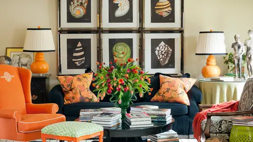
So this is again another little kind of geeky part of me that adores learning about the history of design and I hope that you like this too, but I think it's gonna be fun for you to start seeing how this has influenced a lot of the things not only in my work but another work you've seen and then maybe how you could take cues from it in your own house so we're going to run through a little timeline uh with my slides and then we'll go out to pinterest and see some examples of a lot of these after that okay, so prehistoric times color was pretty simple back in the day from the very beginning of civilization civilization up to the industrial revolution really? The only options they had were to use these pigments like carbon black bread, okra, okra, okra I'm in the south red okra uh loker and yella poker for to make all of their colors on dh so it didn't allow for as much depth and interest, and I think that people were craving something and that's what calls the innovations that allowed so...
much amazing color today because of this as a reaction to that really simple palette and we'll even see a few images on my pinterest board of prehistoric markings and cave drawings that are really interesting even though they're in a very, very neutral palette on dso then thanks to ancient egypt we started getting some of my very favorite colors in the world blues and malachite green and these were coming from substances that they had access to that they were grinding into dies and other things and making them pigments that they could use in all sorts of ways but especially in a lot of their artwork that we see and even in lays a lot of egyptian, you know, like you can imagine the things in the tombs that were created with beautiful magnificent colors is partick clearly these two colors eso were still away before b c thirty one fifty bc at this point and we're starting to see look what one of the hottest trends are really two of the hottest trends today cobalt and even that sort of jade green eso happening in these sort of prehistoric paris and then we all love the periods of the greek or at least I know I do in many of us too the classical antiquity period where greeks began to really use lead white which remained a common source for them and they could do other things with it but especially this vermillion red that was in the roman empire so greeks and romans were not only the originators of a lot of my favorite motifs but a lot of amazing color and then the next night we even see some of the motives that we love but so the byzantine period brought in mosaics and we were talking about mosaics and tiles yesterday and really using in like heller techniques to start bringing interesting pattern and color to their buildings, their architecture and this was clearly years and years and years before interior design became a profession because we'll see that in america that didn't happen until the nineteen twenties, even but from the beginning of time through through today all of this has been evolving through particularly architecture, which is a lot of of your background on it was used in all sorts of forms, so the renaissance which we can imagine all of the italian renaissance painters michael, angela, the sistine chapel and a lot of those beautiful works that we start start to see, and we will certainly look at them in a moment out on the web really started bringing in the deep rich colors that we really see today, particularly the things that I happen to love and that's where look at our color palette there is really what we're thinking that our y be primary color palette plus the green which you see really prevalent in that attack that renaissance period ah and then moving into the baroque period which very ornate in its styling but what were the color trends and the color capabilities there will think about marie antoinette or all of the louise and how you'd see them dressed in pastels and even their makeup was very pastel on. The men wore makeup and they were elaborate clothing, and we can remember seeing them and these powdery blues and and pinks s o that was really the introduction of those kinds of colors, and I love that we say in this slide, pastels were on trend, so you can see that embracing the trend of past still today is very much rooted in classic all the way back to the baroque, and we're coco period in the sixteen and seventeen hundreds, which I think is really interesting. So all the more reason to not get too caught up in something being trendy because, as I was saying when we were talking about trends and we can talk about trends a little later, if we have time in the section, I can show you some more out on the road on pinterest. But just because something is experience, sing a trend or as you on twitter, we know we call things trending, it means they're being spoken about a lot doesn't mean that it's, really trendy it's, still often rooted in very classic architecture, are interiors again here, sixteen hundreds. Some of these that don't have an image is because the images live out on pinterest and we don't necessarily have a right to use them, so we're gonna look at him there, so don't don't be too worried that we don't see us a uh an example here because we're going to see it in a few minutes but the industrial revolution which started in seventeen sixty the pallets became a bit dull and the aesthetic movement is where it was a revolt against political movements and people started really moving towards things that were more beautiful but it's sort of akin to like art nouveau and we'll see that in a minute ah lot of in lays a lot of movement on and all sorts of things from fabrics toe art, but the palettes were much duller than what we had seen from say the renaissance to that period of time and then, um regency style, which I love and when we take a look at these, a lot of you are going to see very much of a regency influence in my work like the black and white carpet the stripes stripes striped wallpaper on dh thomas hope was a person that was really instrumental in bringing this regency style toe life and we're gonna think you're gonna love looking at that but a lot of the regency style we think of even hollywood regency, which the hollywood period was happening in america and like the twenties, kind of the roaring twenties, but it dates all the way back to the eighteen hundreds, even in england and other places, so regency style, very exciting and then, as I was just saying, had alluded to art nouveau was really more about the shape in the form. Now a ton of color is being used, but a lot of them were still in muted sort of muddy tones, but we'll see some awesome examples in a minute. But one of the the prime examples and many of you have seen this many, many times, was this metro station that the gates are a perfect example of that organic art nouveau movement, which is really fun, but lots of now that you see while we're taking this at on day three, because we needed to know a lot of things before we could understand this, and we've studied analogous and harmonious palette so we can see what that means of all warm tones are all cool tens and staying on one side of the color will or not for this movement on, and it was very intentional also to prove their point and kind of get their style, ross so the roaring twenties, which many of us love their very glamorous design professionals love this period because this is when interior design as a profession in america really started, and I'm going to show you not only the work but photographs of some of these people like elsie dewolf, who's really and francis elkins, who were really credited with creating interior design as a profession in america and so lots of things happening and they were very influenced by jazz and very influenced by international style um european style, which is fun, you're going to love it. I think then the thirties came and we had the great depression, and we also were having this art deco period, which a lot of us associate with hollywood because we saw it a lot used in film, uh and it's so we'll take a look at that. But it's this kind of the chrysler building, that sort of stair step geometric shape that's happening in this image is a perfect example of what the art deco style looks like. And then one of my all time favorite designers ever who's influenced me in my work so much and I will show you a lot of what she did is dorothy draper and I alluded to her earlier when we were looking at one of my show houses, but also at the same time frank lloyd wright and his architecture were coming into popularity and you can even see in his architecture like a stained glass work and a lot of that the influence of this art deco sort of style even though he was much more about organics and more muted tones, you can understand the transition from even this sort of a space to what he did, I think, and we're gonna have some great examples of that um the fighting forties, as they call it war, war, world war two was really all that was happening there, and there was a reaction to everything in america because well and not just in america and europe, you know, because of world war two, and so we're gonna look at at on pinterest some of what was happening during this time period and also a lot of stuff starts happening kind of like we see happening today in america because of the recession I saw my client ill a little more quiet, they didn't want to be showy. They didn't want teo build an entire new construction when other people were struggling and so that's what was happening from the great depression and all the way through world war two, particularly in america, people were a little bit more reserved and then following that we see an explosion of color when we get up to like the fifties and sixties and seventies, but this kind of here it was a little more subtle um so the booming fifties um these air sort of some of the things that were happening it's like the greatest generation and the fortis and then into the fifties like a lot of classic style and we will see amazing examples of the color palette there the pleasantville aesthetic and so we'll look at those in a moment it's just easier force to get through the slides and then look at pinter's so thank you for working with us this way the groovy sixties ah lot of us know what that means, but from a political standpoint we had vietnam we had civil rights going on we can imagine now today what mad men looks like in those sets those are the kinds of interiors that were happening in that period then also the groovy psychedelic things but from a design standpoint again some of my favorite designers that I'm going to introduce you to our sister parish and albert hadley and they had a very famous design firm in america in new york city called parish hadley and albert hadley actually just passed away last year in his nineties, so if that gives you any perspective of he was a young man working under sister parish and you all will love her when you see if you don't know who she is when that introduce use, she was sort of the lady about town in new york city mayor king all the you know, design decisions for many of the wealthy people in new york city and so her style is very interesting toc and I'll show you that um and then we're gonna find that in the seventies we had disco we had another economic recession and again, like I said earlier, what happens when recession's hit is a lot of times colors get muddier people don't want to be flamboyant, they don't want to draw attention and maybe they're even a little sad so it's a reaction to some of the bright colors that we see in different periods of time so think about it what we can't have called for the last few days like brady bunch colors or those you know avocado green and harvest gold and rusty browns those were coming about during this time period. Now we did have some other pops of turquoise and some other things, but didn't we see that in a lot of rebellious young people that were wearing, you know, at woodstock and wearing all those kinds of things from the sixties and seventies they were the one bringing some of that psychedelic fund and even then to disco with john travolta and his big you know, from from our movie version of the seventies what that looked like for him so that's where we the young people were the people that often we're bringing in the stronger colors um and then we'll look at theeighties and I'll introduce you to a guy named mario buatta who's still a designer today and he is known as the prince of chance so he was bringing as thes huge chance floral designs and we were also seeing ah lot of neons and brights and of course we've alluded to some other things we were seeing to like a lot of brass and glass and some other fun design ideas there I know it's a little hard to imagine without our photos here but thank goodness for pinterest that allows us to go out in a minute and see some of these great ideas and then into the nineties we had the internet and everybody started doing their own home decor and so that's really affected a lot of stuff because we went from interiors being early on in in the nineteen hundreds just for the the a fluent in the luxury homes to people being starting teo be able to afford more across different socioeconomic um categories as we move to the nineties everybody started doing it on their own and you know what happened in the nineties the birth of hd tv so the television is what spread ideas like this to every person so they thought they could start doing their own interiors and we'll look at some of those and what that means on dh then to today social media has affected everything and pinterest and how you can start getting into any anything that you want to do on your own with the how twos had a do a faux finish all of it is right there at your fingertips right or if I say you want to go out and study the history of design you can go study this all on your own right at your fingertips on the internet s o that's made a huge difference in design for all of us and every person really has an ability to do this in their own home um and then so what? Another thing I'm gonna introduce you to is some of my favorite designers from today including suzanne casler, jamie drake many of you know kelly wearstler and jonathan adler they've really made a statement ah and interiors and then I've shown you a little bit but we're gonna look again at miles read and barbra berry and what you're gonna find when you see all of these different designers I think that you're gonna like is that there's a wide range of color palettes and looks and style so you know how we started talking about with trends that almost anything goes now and nothing really goes out of style anymore as I take you through this whole process from prehistoric times two today and you're going to like it a lot better when you can see all these images you're going to see that how interesting it is, just like in fashion. Now, at any given time, you, khun see every kind of influence from renaissance, the past tales that were given, you know, used at that time, all the way through the roaring twenties, the seventies, and then today, and all of it isn't style in some way or another in home design. So so, let's, stop using our imagination and look att pinterest now, because going to make it a lot more fun for everybody, thanks to this visual, and I'm going to sit down and we'll go back to the beginning. Thanks for indulging me that way, because it's a lot easier than flipping back and forth through our slides, and we'll start and show you some real examples of all of these things in our color timeline. Pinterest board.
Class Materials
bonus material with enrollment
Ratings and Reviews
1st Carpet Cleaning Ltd.
Very convenient and creative! Continue In that way!
a Creativelive Student
Fantastic Course!!
Student Work
Related Classes
Interior Design