Lessons
Day 1
1Class Introduction
10:02 2Color Models 101
26:46 3Color Schemes 101
45:39 4Debunking Color Fears
44:02 5Debunking Color Fears Pt. 2
25:23 6Evolution of Tobi's Color Style
42:37 7Evolution of Tobi's Color Style Pt. 2
44:12To Trend or Not to Trend
12:47 9Color & Design Trends
31:36 10Color & Design Trends Pt. 2
25:37 11Tobi's Color Inspirations
22:09 12Tobi's Color Inspirations pt. 2
23:29 13Using Inspiration Boards & Q&A
19:43 14Psychology of Color
36:34 15Color Meanings
17:04 16Psychology of Color Q&A
12:55 17What to Consider Before Choosing a Color
26:20 18The Right Color: The Entry & Living Room
19:27 19The Right Color: Family/Dining Room & Kitchen
21:19 20The Right Color: From Bathrooms to Outdoor Spaces
20:05 21Pairing Textile Elements for Success
28:49 22Pairing Wall Color, Pattern & Texture
24:42 23Floorings, Furnishings, Art & Lighting
19:04 24Intro & Top Color Palettes: NYC Showhouse
24:41 25Top Color Palettes: Hampton's & Richmond Showhouses
21:31 26More Top Color Palettes
33:46 27Layering Color Palettes in Your Home
38:16 28Transitioning Color Palettes in Your Home
28:08 29Historical Overview of Color in Design
16:47 30History of Color in Design Examples
43:59 31History of Color in Design Examples Pt. 2
16:32 32Color Mistakes to Avoid: 1-6
31:20 33Color Mistakes to Avoid: 7-10 & Final Q&A
40:06Day 2
Day 3
Lesson Info
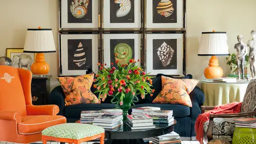
Psychology of Color
Let's talk about what color means to us or if we even sometimes they're using color and don't know why we're using it and sort of khun learn some insights about ourselves I think the interesting thing is when I work with clients or when I answer color questions for people a lot of times people think they should pick their favorite color for their home and their spices because if they love that color then certainly it's going to be a great color in their house right? But a lot of times there's a major disconnect between someone's favorite color and their interior goals and their color gold so if your favorite color is red there's still some spaces many of them in your home that you're not gonna want to put red right for a number of reasons so let's look at with delve a little deeper into why we might use colors in her house so are certain colors in our home so why is it important to know about the psychology of color are really to start analyzing colors? Well, one of the reasons it's re...
ally important to be very careful in the colors you choose is because we spend more time in our homes than we ever did before on more just in inside period many of us work for hours and hours at a desk and we're not having the opportunity to be out in nature and experience a lot of sort of mother nature's color palette which is so refreshing and so healthy for us so you have to be really careful thinking about and we even had questions yesterday people asking what color should their design work room be if there a professional designer and it's all really important because why it affects our relationships it expect it affects our own personal fulfillment it can affect our health physical health our mental health on dh then there's other more sort of significant or symbolic things about color it can tell people who we are in a number of ways it can represent important things to us like holidays or for me I'm a razorback football fans so maybe I want to bring some red into my house sometimes because of that probably not all the time I know the reason why my husband wasn't so happy that I was bringing orange in because those are not his favorite sports teams that are orange so that was a point of contention for him but there's all sorts of ways that color can show people in your home in your wardrobe excuse me who you are like think about someone wearing an all black wardrobe versus wearing a pop of color it really shows a different sort of personality right at first glance and a lot of times it is that first impression of either your home or yourself that really gives people click use about who you are on dh how, whether or not they want to engage with you, right so it's about colors about a lot of things it is it's the c plus the field plus the think components it's all of those senses um in color one o one yesterday we talked about how we see color on how the eye sees color, but color psychology is a step further it's the feelings and emotions on then it's that mental component of it it's the total experience of color. So what we see, feel and think and so think about how yesterday we were all kind of doing and eyeing thinking about how I wish I could see how she sees color or how she sees color because we had this epiphany, that color is light reflection on its different with each person's eyes will think about now, how complex it gets when we all see things differently, we all feels things differently, and we all think things differently. So each and every human being is walking around at any given moment, having their own unique color experience at that time, it's, like we all have our own little color party but it's a secret, we keep it to ourselves because other people don't know what we're thinking and feeling and seeing on, I think that's really fun, so as opposed to being a passage activity it's a real active part of our lives it's not just that passive experience that's even why I'm standing up its active it's exciting on we want to talk about all the things we can achieve with color so we're not just receiving color as is we're receiving it our eyes air seeing it and then we're making all sorts of mental associations judgments, thoughts about a color at any given time in our lives and we're at different points in different mental states all the time so it's sort of a moving target it's almost this like mysterious and intuitive process that we're all going through about color all the time um color affects mood because of a lot of things it's emotional has an emotional impact on we all know that color effects are mood right andi it's a common experience I think on a daily basis things like weather think about how you feel when you get up in the morning and it's a great day versus a really blue or sunny or bright or cheerful day it instantly affects the way you feel and it's not just the amount of sunlight but truly the color someone was saying yesterday should I live in where the minnesota or somewhere and how should I embrace gray in my house? Because it's always gray outside well that's affecting a mood and they were trying to think ahead to sort of this color theory and thinking, what kind of decisions should I be making to make my home best support me in this environment? And you also think about other experiences that you have a point of reference to in your own life history, or sometimes we'll learn later, it could even be a historical historical reference or a cultural reference that was passed down to you that you kind of don't even realize you didn't really have a logical explanation. You just know my family never used this color, it was never part of our life are in our household, so we're gonna look at some of those I think about when I was a child, and I used to go in with my mom shopping a lot. And so, depending on what stores we re and I would feel differently and it's funny, because a lot of those retail places have now, I made changes to their own environments, probably for this very reason, and I know when I was a kid, we would go to target all the time, and I love target now, because there's so much fun stuff there, but the walls usedto albee that read, that is their cut, their, you know, logo, color, and I would feel really agitated and stressed out, I remember specifically thinking that as a little child s o, you know, but then you think about how you feel when you go to a spa and usually their serene and coo all those cool, like, analogous colors, aren't they like greens and blues, and on dso, you get an actual feeling, almost even, like a sensation of a coolness like a breeze, or think about a really stark white museum on dh, how having no color on the wall can really affect you so you can feel like I can't talk, I have to be quiet because it's stark, white and everyone's on their most, you know, best and most formal and behavior, they're acting with a sense of decorum and and nobody's making any quick moves in here, you know, and part of that is thie environment that really stark environment, so color affects our moon moves for a number of reasons, but one of them is its effect on our bodies and minds. We're going to talk about this in death in a few minutes, so changes in our body and our mind can then have an emotional impact. Physical things cause us to have emotions, and it, or it could just be a thought processor or an emotion that we form for a number of reasons, but we're going to get into that that's a little hard to understand until we see some of the other details another reason our moods could be affected is because our post personal associations and memories like I was just saying or maybe like in our inspiration talk travel or thinking of your grandmother his house when you were a child like don't you remember what colors were in your grandparent's house and you have a lot of everybody smiling cause a lot of us have good associations with that andi you can think if it was black and wide or if it was pale turquoise and my childhood in the seventies like what does that mean? And so when you see those colors again you have sort of an emotional reaction in a good way to them or maybe elementary school for me was like that's kind of vintage green color a lot that may be good or bad I have three college degrees so I love education but as a child I didn't love being in school because I wanted to be creative and be out of school or be with my family or you know I didn't want all that structure and rules that's hard for you to believe in it that I don't like structure and rules but I have an association with that color it's interesting because I even like that color now the mint green I have a whole collection of jadeite but how funny that it's reminiscent of school elementary school and then, of course, there's a lot of associations we have with all sorts of brands when we're shopping way get in association with the tiffany's box or the air miz orange and chocolate box that's so luxurious and it's interesting, because we're going to look at some of these colors, and particularly orange has sort of a meaning that's not ultimately about luxury, but the way this brand has used it and combined it with other colors and then has just becomes, you know, branded it so well that has become synonymous with luxury in our mind, so there's ways that you can change the association with color, depending on how you use it, which I think is fun and exciting on dh, then social color meaning so everything all sorts of symbolic meanings in society, in a different cultures have different associations, like funerals in some cultures are associated with black, and in other cultures, they're associated with white and then in some cultures, it's purple that is dissociated with a funeral. So you have to be really careful if you're working as a designer in other cultures and other places to know also what the meaning of color is beyond what your own personal experiences, obviously red and green, we all think of christmas, or maybe, you know, blue mike you might think of hanukkah or some other kind of association a lot of times purple is a royal sort of color it denotes royalty or maybe that's red and you think of like the queen in the crown or in a cape in a red kind of velvet so that might be royal on dh then even orange sometimes what else could we think of this orange like a prison a prisoner you know so you've got luxury on one hand and you've got the complete opposite into the spectrum on dh it's all because of that color so how does color specifically affect our minds? Well there is an actual physical impact on your body because of what happens in your mind a lot with color for example certain colors can help you focus more and be more productive or they can actually cause you to not be able to focus and this is a really important one so certain colors can help you have that sustained long term focus and really be able to get things done which is important for a lot of us at work or sometimes they cause you have short burst of energy depending on what they are and if you have a really strong colors and the wrong colors we're gonna talk about what they are for long periods of time you can have total visual burnout eye fatigue things that become physical symptoms and your body from a color which is really, really interesting that it's that power. So yesterday, in one sense and our houses, we were saying, don't give paint so much power over your life meaning, like, don't get, you know, paralyzed because you can't make a paint decision, but in a sense, since color does have that much control over our lives if we use it wrong. So it's a fun reason to know and study and see why it can really affect you, it can cause tension and stress. That was that red effect on me as a child that I would feel tense just being in an environment was sort of an orange red, and we were talking yesterday, which I'll bring up again in a minute of a business that you know of that at their lowest price point brand. It uses that kind of a bright red and at their highest luxury and it's like a deep burgundy, but it's all sort of this and, um, monochromatic approach to their branding, depending on what price point they are, believe me, marketing people and pr people and branding people really understand color and use it well for many, many companies, some companies don't use it so well on we can, you know, certainly think of examples of those in their lives, too. There's all sorts of things that can cause the irritability and stress even may be just a memory, so it might not physically cause you that you're a bit better irritability or stressed, but maybe that association with a childhood for you was on the flip side stressful, and it brings back some emotions that you don't want to really think about. It also has on if your personality type can have an effect so each of us could look at one color and think of how many different reactions we could have to it. Oh, I love purple oh, that makes me so happy! Oh, that stresses me out oh that's so boring that's block why would anybody like that? I've always hated that color, you know? So in one room we could all probably have a very different experience on dh. Then again, it depends on your current state of life, so we've even mentioned several colors already that maybe I didn't like a child, but I do now or maybe I couldn't deal with that red space in my house when I was in my thirties and everything was so busy and cluttered and I had a young infant that was crying in the middle of the night and I was really stressed out, but maybe now at a different point in my life, red might be a perfect color cherie introduced so it all depends on where you are at any given time again. A moving target. Of course it can affect your energy level, good or bad. And that was the example I was just giving the energy level in my bedroom. I was way too high. I needed to relax s o the next house, you saw the picture of my dog, harley on the bed and my serene blue room. That was a complete reaction to I need the opposite of rid, but it can also be not just a stimulant like read. It can really be that depressant, and you might want to use it as a depressant to bring yourself down at the end of the long of a long day, but it might also be problematic to be a depressant if you spend a ton of time at home. Andi, you don't feel like you're engaging with other people and you could actually become physically depressed if you didn't have colors in your space that helps energize you at certain points of the day or with different activities. So everything from depression toe happiness toe energetic to relaxation. All of those things are possibilities that can be enhanced by the correct use of color. Anybody have any questions or comments so far? Yeah yeah mad lizzie does online she says when companies building out office space is do you think they keep this in mind and is that why so many officers are beige? Some companies keep it in mind and some doubt on and think about it's just like just like at home design some people really understand the value of great interior design and other people's don't other people don't value with that much so hopefully you work for companies that really are mindful of this for a number of reasons but I think most people go with beige to try to be safe it's kind of like what we won't bother you know kind of flirt she's suggesting is probably but it's not necessarily a good approach it's sort of like well let's just not rock the boat for anybody so we'll go with the safest color in the world and pick beige which is exactly what a lot of us are doing in our own homes right it's sort of safe but not necessarily taking it a step further and saying what are our company goals do we want people to be energized we need people to stay relaxed we have people working on computers all day long and I'm gonna have eye fatigue anyway you know what what is going on? Because again it's a unique set of a lot of different circumstances depending on the business on now so many businesses are like yours are tech related and people aren't computers all of the time so there's so much more that goes into it just because of technology and you know where we are in what year were in and how far we've come from twenty years ago the way workplaces in offices were at that time it's funny, isn't it? I mean bachchan this at certain fleshy color of beijing that actually makes me quite quite cranky when do you guys find that that beige is funny people science a neutral color, but doesn't it make you cranky and it's she flesh eating signed a lot of people that just feel like they live in a sea of bram like and that kind of becomes that uninspired or, you know, just like like dirty or boring, but but then again, like in the right used in the right way think of like a camel hair sportcoat or a cashmere blanket or some of the gorgeous things that are beige or some version of it that are so amazing and cozy and warm and exquisite and sophisticated my favorite word s oh yeah, you know it again it depends on how you execute it yes, you were going to say since that was wondering like how interesting this all is like it really does affect your mood why don't people redecorating hospitals like people are so sick their way you know, yesterday and I can't remember if I think some of it isn't here but it might have gone back to keller one I want some of the reason that hospitals where the killers they are our for a very specific reason so you know yesterday when we were looking at the complementary colors particularly like in emergency rooms and in um um operating rooms um the surgeons see what color all the time red and so that's why scrubs are the opposite compliment to read, which is usually like a pale green or sometimes they're blue but typical scrubs air like a green for the specific reason of helping with eye fatigue and the after image so that you can focus on when you're seeing red all the time then you can look away and see it's compliment and readjust your eye so that's for an actual physical reason but then there's certainly all sorts of other spaces and hospitals and there's a number of associations with all sorts of colors and it depends on the person that's in charge of designing and they may think, okay, well, we want it to be really clean feeling on what is that white? Maybe our somebody may want it to be cheerful so they think they pick a yellow but they may not get it quite right so and of course how hard would it be to please every person that came into the hospital waiting room? I mean they're tons of people and we just showed the complex relationship of our own eyes plus our feelings plus our thoughts so it's a really tall order to feel isn't it? But I do see a lot of improvements I've even worked with a hospital project about a year and a half ago we brought in a lot of original artwork that was real cheerful and had a lot of color and and so made people have a different sort of reaction than the typical kind of boring, depressing hospital space another thing is that think about this what if every hospital with all your favorite colors and look to design really great and then you had an experience which you're gonna have in hospitals that was sad or depressing it would sort of really kind of be a spoiler for all of your favorite things wouldn't because you might then have an association a mental association with that space so very complicated it's a big tall job order to feel for a lot of designers that air working in this environment and it's fun to think about it it can also affect our choices and our opinions and our judgments s o we've talked a little bit about this we won't get too far into that we can all think of examples in our own lives where colors have a certain social meaning or a cultural meaning even down to in the town I live in and joking about that, but not, you know are the state I live in our locals called favorite college sports team when you see the color red in arkansas, you think arkansas razorbacks when you see it in another place, it means something completely different. So on git khun b used very effectively in marketing and branding, and we're going to see in a few minutes that certain colors like red has been proven to cause people tto make impulsive buying decisions they buy on dh, so we'll talk about a little bit more in depth so that we get into looking at the color red in the moment on dh, then as faras thinking of other kind of societal associations we have with colors think about certain colors that for you would feel corporate. A lot of corporations use blue, right? So sometimes you see a website and you go, it looks like if you're designing it for yourself and you know that looks too corporate it's too buttoned up, but maybe it's even the color that because you're so used to associating things like navy and certain blues with something that that's riel business like or you might see a group of colors and think that's too childlike or playful maybe the primary colors kind of cause that effect. We were talking about that yesterday, but had to bring some of those split compliments into your room, and they were all really kind of three primary colors and green or something. Would that create a childish interior free? I don't know. It depends on how I use it. Some things could feel really, really formal with a lot of black, maybe, or maybe way too casual, too, in a space depending on the color. And then, as I said earlier, orange generally was for years has been looked at as a looked upon as a color that was more associated with something that was cheap or chiefly made. But then brown is associated with luxury in a lot of ways. So then you look at someone like air meds who puts orange with graham, and suddenly it takes on that sort of luxury connotation because of not just their packaging but their product that stands for a certain kind of quality, which is really interesting, I think so at the root of all of these things, it's, emotional and mental effects are human reactions to color that become physical and biological. They started in our brain, but they actually can affect us physically. Which I think is really interesting one of the story one of them when I was brushing up on some of this cause I've learned this for years in school and it's one of those things that like we were saying about the color will we forget to use and so when I was preparing to bring these ideas to you I took a couple of other continuing education courses that I take anyway for my design education and certification and one was on color theory and there was a study done on visually impaired individuals people couldn't see and they were actually affected the same way by a color in a space as people who could see which is mind boggling to me so it goes to show that it's not just visual but it's physical on dh so I guess even when someone can't see also with their eyes light is still coming into their eye and it's affecting them another source of way because color is ultimately liked right or lack thereof yeah it's really mind boggling, isn't it wow um so our total experience of color which is emotional and mental and symbolic and physical I can offer clues about whether a particular color experience has been either beneficial are harmful to humans not just today but throughout history so there are certain things that it's really interesting to another piece that's kind of mind boggling is that there were certain things that happened for years ago and eons ago with certain cultures that caused them to form a physical reaction to a color like, maybe for their safety that has actually passed down through generations, not really kind of unknowingly. So does that make sense to you? Like you wouldn't know why there was an aversion to something, it wasn't really a spoken something in your history, your culture, but it has actually happened because of a number of reasons, I will think about things in a minute of like certain meanings and why colors might mean warning your caution or other things because of things that happen throughout time, that we may not even know why we get a certain physical reaction to it. S o sometimes they were related to serve literally survival for certain cultures really, really interesting to me. So how color effects our bodies physically, this is the part I said we'll get back to you in a minute, visual rest versus visual fatigue. So a lot of what is tiring tow us, especially since we're on computers all the time now, and we're inside all the time now is more about visual fatigue, not even mental or physical fatigue on certain levels and durations and frequency of colors can actually damage your eyes, it can actually. Physically damaged them and it depends on the intensity of a color how long you're with the color and how frequently you are with it and you can see where maybe people have eyestrain all deer in the week but they go away for the weekend and they sort of recover from it and maybe they don't know why they're able to rest on the weekend and they're not during the week is because of the color that's in the space that they're working in every day so it's something to start paying attention to you now like you can start saying is there's something in my environment at work that's affecting me differently than at home and the duration of being with it all the time can make a difference um stimulating our relaxing your body attention it can actually physically increase our lower your pulse right again this one of those biological changes so not just eye fatigue but actually physical changes in your pulse rate and it can actually affect your aggression centre in the brain especially in children so you think about again kids that aaron spaces where they're really really hyper and maybe that's where a lot of those strong primary colors are a lot of red and you pick up your child from day care other places and you think wow, they're always so highly aggressive and energetic because of this space it might have something to do with the color maybe they can't relax, or you can't relax in a space, and you just don't really know why it is like, are there places in your house you can start thinking of? I just don't feel good in that room, like I never go in there. It just doesn't feel good. It would be interesting to start assessing what color it is in seeing, if maybe it's the color that's, causing you to not be able to relax or enjoy a space. Um, it can increase or decrease your sensory function like your memory, eh? So you could be more forgetful when there's a lot of visual noise, lack of focus, pattern and color can together can increase this effect. There was a picture which we may come back, two of a wallpaper I used that's, black and white pattern that's, almost diamond dynamic. It looks like it moves sort of plays tricks on your eyes, because the way the pattern is so oh, I don't know, energetic and that's, just in a powder room in one of my clients houses in the basement attached to their sons, that kind of hollywood retreat space. If that was your bathroom all the time, you would go crazy would be looking at one of those books, that's a mind game, and you can't I do you focus on the black or the white, and it plays tricks on you that's what that's an example of how pattern and color together can be really fatiguing in some interest instances, eh? So it's not just the wall color we're talking about it's, the total dick, or of a space, and you can kind of start to imagine that like if you had a room that had a really graphic, really high contrast pattern, and it was all over the space we've all seen where people intent intentionally chose like a really dynamic graphic pattern for the walls and the drapes and the sofa and the chairs that was to make a fun design impact. What you think I couldn't spend five minutes in that space? I would really be agitated or stressed out, or I wouldn't be able to relax. So it's that total dick or experience so you can ask yourself this about your own preferences or your client's preferences, and some people want to be energized and some people, you know, like different things than what you your assumptions might be about them. Any questions so far? Because this is exciting, but it gets a little deep and turkey right? We have quite a few on the concept of how color is affecting people and a couple of them around the research of who that includes cow would like to know whether it's found that these mood associations affect both genders the same or whether women and more strongly or less strongly affected or vice versa sometime there are some colors and spit in particular that we're going to see and talk about in a moment we're going to take colors individually and talk about there traits and characteristics and there were certainly some that appealed to mit women more than men but I think it's more about just individuals not this strict line of gender that really makes a difference because as we saw with my little equation of the site plus, you know the body plus the mind it's all of those that come together to really make people I have an association or aversion to something so I don't find as much that it falls right down the gender line but sometimes and then similarly from mad lizzie, how do the physical on biological responses differ between cultures? Is this research primarily western culture based or do you know say that asked me the question one more time? How did the physical and biological responses differ between cultures? So is what we're talking about here primarily western based in terms of culturally or is it similar showing a combination so we even gave the exam well with funerals and we're taking into account different cultures a lot of the physical reactions are the same as opposed as in meaning the symptoms the fatigue to stress and all of that but it's different colors in different cultures that cause that now some like yellow which we're going to learn is the most easy to see color the most visible color and also the most agitating so physically people are still going to have the same reaction to it but it's the combination of that kind of fatigue from yellow plus associations and cult in cultures that make them either like it or not like it does that make sense so biologically it's going to be the same but emotionally it's going to be different based on where they're from and what their history is and their family history personal history andi even in their culture and society where they live so it's it's complex you know thank you for clarifying yeah that's fun and interesting I love to think about this this is that again it's a little dickie part of me that I love the science behind it um and then okay and then um let's see what next so it can make you hungry so all of us that air wanting to lose weight or maybe the few of us in the world that actually need to gain weight what color should we have in space is where we eat? I actually went to a really cool restaurant last night with the designer friend of mine in san francisco and I was noticing it's brand new and I was noticing that the the dining room part of the restaurant was red and the bar was like a smoky blue gray and then in thinking about this today it's interesting that red increases appetite and blue decreases appetite so they made it they made a good decision there the red was in the dining room and the blue was in the bar but so notice that restaurants like, say, a fast food restaurant you can think of a number of them that use red in their their restaurants and that increases appetite and you can also think about why blue you can kind of intellectually imagine why blue decreases appetite like the color blue isn't very appetizing is it to you like there's not very much blue food? It seems you know, like it would be very an appetizing to eat something to me that was blue even when you see things like blue icing on a cupcake it's a little strange in a departure from what you expect your food to be right? You kind of don't want to eat that as much s o I think that's interesting and then when you even think of the fast food idea not only is red increase appetite, but then something like yellow eyes, an agitator, so we want you to eat a lot that we want. You ate it really fast and get agitated and get out so there's psychology of color behind using those in, say, a fast food restaurant, as opposed to a restaurant that you want somebody to linger for a long time and have a two or three our meal, and that might be a use of red that you could imagine. Lots of restaurants have rich, deep red tones and it's, like a very comfy, even like a steakhouse or a high end luxury restaurant, you could envision those kind of color is there because you want to stay a while on that increases your appetite. The audience is also really interested in real estate and the use of color, so nicky has asked what colors would use when selling a house, and dawn has taken on even further she's wondering about the staging of real estate. Do you go relaxing, or do you go bold to get them to spend? So the interesting thing is because, like we've been talking about for a few days, most people when buying a house or when decorating their own interiors, even though their gut is saying I would really like this room to be red, or will your green they don't follow their good there listening to that practical part of their head that says I should keep it beige it's gonna last longer. So there's, that whole emotional piece that most buyers I think you're going into real estate going, I need something that works with all my furniture, I need a clean plane slate, and so it can be a little challenging if you have a house that has a lot of crazy the colors in it for sure, you also would be really wanna think about, in particular, having colors that agitate people as opposed to something that was serene and soft, so you're probably going to be safer going with the soft blue like you saw in my bedroom that's going to be appealing to most people, and we're going to learn, as we've mentioned in just a minute, that blue is most people's favorite color, because if you're in resell, right, you're wanting to appeal to anybody and everybody the most people possible, you're probably not going to want a pigeonhole yourself and hoping that one buyer that once a house that's purple, green and yellow is gonna happen to show up at your place and and by now it does happen sometimes I just sold my house about a month ago when we sold it on the first day to the first buyer but it was a buyer who their real estate agent knew I was a designer and she knew her client was a fit because they were open to more daring ideas. So that was sort of like a matchmaker situation. But when your just opening up the doors to the public and hoping the right buyer comes in, you're probably gonna want to go a little safer even though it's very boring, you can do some things to make a project a little more exciting but that's not where you want to get really wild with a cobalt blue wall like exciting might mean going from beijing to slightly pale blue orb age to a little warmer gold you know, but think about how how the complex everybody's associations are and people want to be safe. So think about this. The human eye can distinguish between seven and ten million different colors meaning of course there's probably at some point a limit to the different hues. But then you take into account the shade and the tent and the tone and adding black or white to all those and think how it's just pretty much infinite the number of colors that you can come up with and the eye can perceive those and then depending on age, gender culture where your relationship with all of those colors can be very, very different so let's look at some color specifically he on dh. Some of these are my association with color, and I'll point out which ones you know, to me. I feel this way, and other ones are, um, actually, um, results from studies that have been done by people all over the world. So these aren't just my answers. But they also includes some of my perspective.
Class Materials
bonus material with enrollment
Ratings and Reviews
1st Carpet Cleaning Ltd.
Very convenient and creative! Continue In that way!
a Creativelive Student
Fantastic Course!!
Student Work
Related Classes
Interior Design